

ProseSponsored
Esc
How Prose welcomes ad traffic into its custom haircare quiz
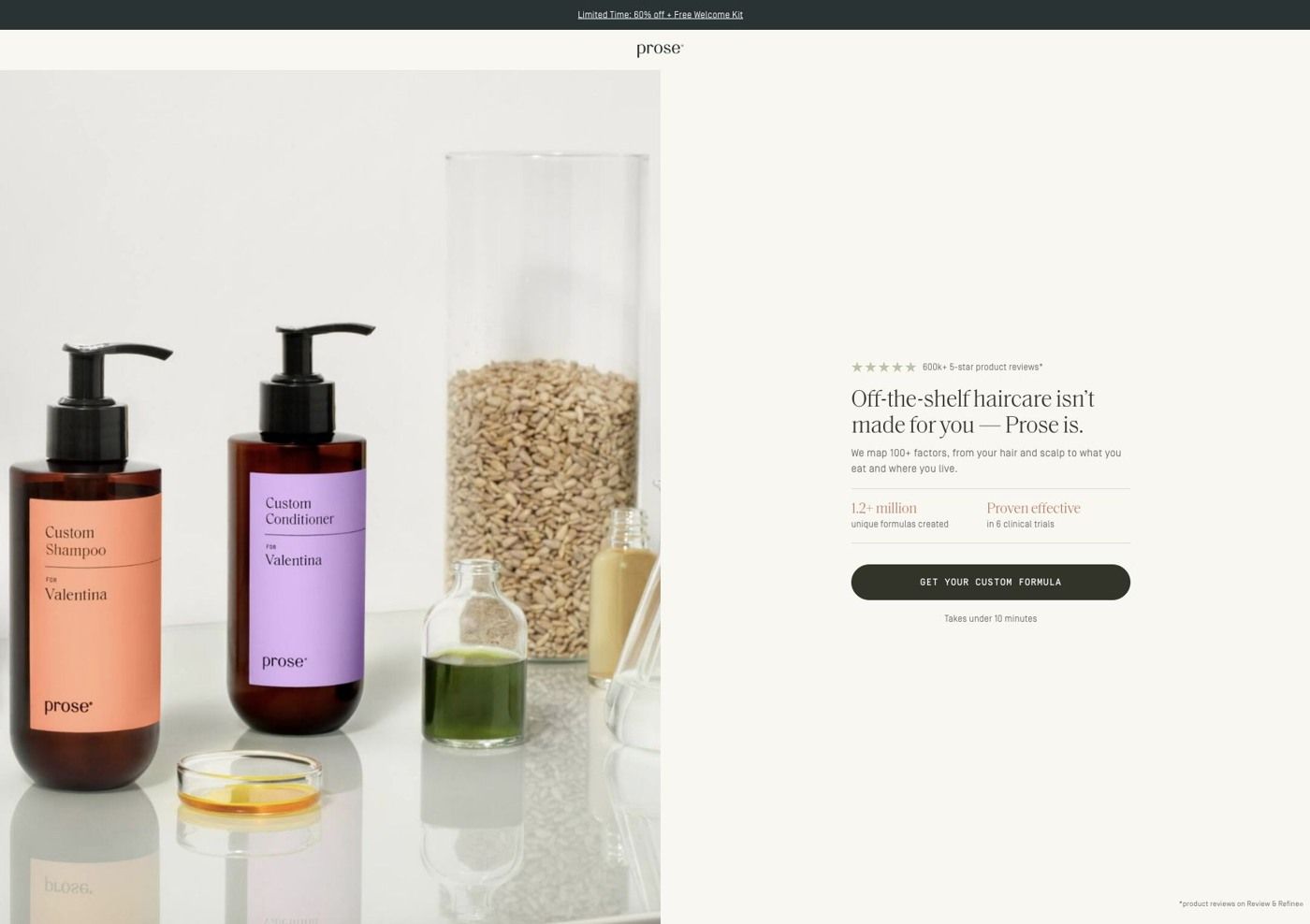
This is the welcome screen in front of Prose's haircare consultation: a minimal brand header, a product and ingredient still life beside a personalization headline, compact proof points and one button with an effort estimate. It's the destination for eight ads in the Fluid library, mostly creator stories, including one that asks about air-dried hair texture.
Prose
8 creatives lead here1 / 8


Prose · Your custom formula welcome
Public page captured October 22, 2026. Promotional sheets, chat, extension overlays and sticky cart bars were removed from the static reference; page layout and copy were preserved. No account, personal, health or payment details were supplied. Quiz captures show the observed entry screen, not the complete consultation.
Prose · Your custom formula welcome
This is the welcome screen in front of Prose's haircare consultation: a minimal brand header, a product and ingredient still life beside a personalization headline, compact proof points and one button with an effort estimate. It's the destination for eight ads in the Fluid library, mostly creator stories, including one that asks about air-dried hair texture.
- Brand
- Prose
- Page type
- Quiz welcome
- Ads leading here
- 8
- Captured
- Oct 22, 2026
- Destination
- prose.com
Selected for its design and offer structure. Ad performance isn’t available in this collection.
What this page does well
The page has one job, and everything on it points at the consultation button. The header is a minimal centered logo rather than the full store menu, so there's nowhere else to wander off to. The proof points sit right beside the button instead of further down a page, and the effort estimate answers the question most people have before starting a quiz (how long will this take?). The product and ingredient composition next to the personalization headline shows what the answers turn into, which gives the visitor a reason to start before they've seen a single question.
How the page is built
- 01Promotion strip and header
A promotion strip above a minimal centered brand header keeps the offer visible while removing the store navigation as a distraction.
- 02Personalization hero
A product and ingredient still life beside a personalization headline and short explanation answers "what will I get from this?"
- 03Proof and button
Compact proof points and one consultation button with an effort estimate answer "is this worth my time?" right where the visitor decides.
- 04Proof footnote
A small footnote at the bottom of the screen backs up the proof points.
What's missing, in the order we'd fix it
- Beside the button we captured proof and an effort estimate, but not the first-order offer the ads lead with. Put the 60% off in the line under the button, so the visitor sees the reward and the effort together.
- Most of the ads that land here feature creators, but the welcome screen is a still life with no face on it. A small creator quote or a short clip next to the headline would make the jump from video to page feel like the same conversation.
- The texture ad asks viewers a question about their air-dried hair, and the welcome screen doesn't pick that question back up. Echo it in the headline for that ad (something like "Tell us how your hair dries, and we'll build around it"), so the click feels like the start of an answer.
How the ads set it up
Most of the ads that send people here are creator stories, with angles like a routine built around your hair and "Unlock Your Best Hair Ever," plus one that asks what your air-dried texture is. A short welcome before the quiz suits that kind of traffic: the viewer has just heard a creator talk about their own hair, and this screen explains in a sentence or two that Prose will do the same for theirs. Where it could tighten up is specificity. The personalization headline speaks to everyone, so a viewer who clicked on a texture question lands on a general promise. If you run several creator angles into one welcome screen, write a variant headline for each of the biggest angles and keep the rest of the screen the same.
What to borrow for your brand
- Put a short welcome screen in front of your quiz with one headline, a picture of what the answers turn into, and a single button.
- Show an effort estimate on the button or right under it, so people know how much time they're agreeing to before they start.
- Swap your full store menu for a minimal logo header on quiz entry pages, so the only way forward is the button you want people to press.
Ads that send people here
- How Prose argues against expensive shampoo in a 3-reason creator ad
- How Prose turns a curly-girl hack fail into a two-person skit
- How Prose turns its own hair quiz into the whole ad
- How a Prose creator ad turns a comment into a curl discovery story
- How Prose uses a three-question checklist to sell its hair quiz
- How Monica Hime Henry tries Prose in a viral curl method ad
- How Prose challenges gray-hair rules for women over 50
- How Prose opens a creator ad on the before and after
Captured from prose.com in October 2026 for the Fluid Inspiration Library. Offers and prices change; this is what the page showed when we captured it.