

ProseSponsored
Esc
How Prose sells a custom shampoo before you've taken the quiz
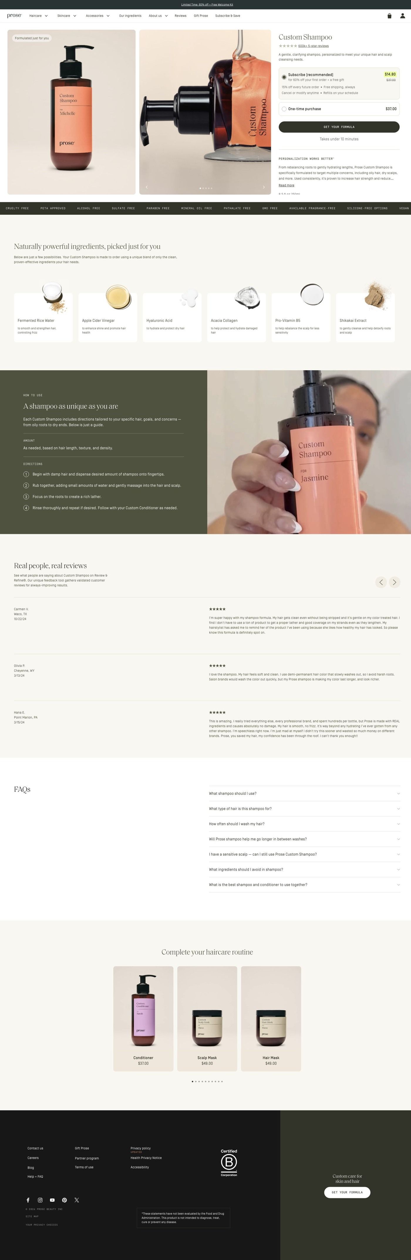
Prose's Custom Shampoo page pairs a product gallery and subscription choice with a Get your formula button, then explains personalization, ingredients, reviews and a routine. The button leads into the same hair-length consultation the brand's other ads use. Four creator-story ads in the Fluid library send people here, including a gray-hair story and a routine angle.
Prose
4 creatives lead here1 / 4


Prose · Custom Shampoo
Public page captured October 22, 2026. Promotional sheets, chat, extension overlays and sticky cart bars were removed from the static reference; page layout and copy were preserved. No account, personal, health or payment details were supplied. Quiz captures show the observed entry screen, not the complete consultation.
Prose · Custom Shampoo
Prose's Custom Shampoo page pairs a product gallery and subscription choice with a Get your formula button, then explains personalization, ingredients, reviews and a routine. The button leads into the same hair-length consultation the brand's other ads use. Four creator-story ads in the Fluid library send people here, including a gray-hair story and a routine angle.
- Brand
- Prose
- Page type
- Product page
- Ads leading here
- 4
- Captured
- Oct 22, 2026
- Destination
- prose.com
Selected for its design and offer structure. Ad performance isn’t available in this collection.
What this page does well
The hero puts everything a shopper needs for a first decision side by side: the gallery, the title, a review link, the description, a subscription choice and the Get your formula button. Prose then answers "why custom?" in order, starting with the personalization explanation, moving to ingredient cards with macro photography so the formula feels tangible, and following with a lifestyle and product split that explains the customized formula. The reviews give names, ratings and longer comments room to breathe, which reads more credible than a row of star snippets. Lower down, numbered usage instructions sit beside a creator demonstration, so the page shows how to use the product as well as telling you, and a product rail invites the shopper to complete the routine.
How the page is built
- 01Promotion strip and navigation
The promotion strip and store navigation keep the current offer and the rest of the catalog one tap away.
- 02Product hero
A gallery beside the title, review link, description, subscription choice and Get your formula button answers "what is it, how do I buy it, and do other people like it?" in one view.
- 03Personalization explanation
Personalization and benefit copy answers "why would a custom shampoo be better than the one I have?"
- 04Ingredient cards
A horizontal rail of ingredient cards with macro photography and short descriptions answers "what's actually in it?"
- 05Custom formula feature
A lifestyle and product split explains how the formula is customized, which answers "how does Prose decide what goes in mine?"
- 06Customer reviews
Reviews with names, ratings and longer comments, alongside product imagery, answer "has this worked for someone like me?" in customers' own words.
- 07How to use it
Numbered usage instructions on an olive panel beside a creator demonstration answer "what does using it look like day to day?"
- 08Complete the routine
A product rail with consistent photography and short captions suggests the rest of the routine, which is the page's way of raising order size.
- 09FAQ
The FAQ picks up the remaining questions people have before they buy.
- 10Footer
The store footer closes the page with the usual links.
What's missing, in the order we'd fix it
- The ads that send people here lead with 60% off custom haircare, but apart from the promotion strip the hero doesn't put that first-order discount next to the price and subscription choice. Show the offer (and the price it comes off) right beside the Get your formula button, so the number from the ad is visible at the moment of decision.
- The page explains ingredients well, but we didn't see before & after photos. For a product sold through creator stories about specific hair concerns, a few before & afters grouped by hair type, placed near the reviews, would answer "will this work on hair like mine?" faster than text can.
- We didn't see a guarantee or an explanation of what happens if the formula isn't right. A custom product raises exactly that worry, so if Prose has a reformulation or satisfaction policy, state it under the button in one sentence.
How the ads set it up
All four ads that land here are creator stories, including one titled "I stopped listening to gray-hair opinions" and one built around a routine made for your hair. The routine angle carries through nicely, since the page ends on numbered steps beside a creator demonstration and a rail of products to complete the routine. The gray-hair story has less to land on, because we didn't see a section that speaks to gray hair on this page. If you send a concern-specific creator ad to a general product page, add a short block (or a review) about that concern near the top, so the viewer recognizes the ad they just watched. It's also worth noting that this page sits one step before the quiz: the Get your formula button opens the same hair-length consultation that most of Prose's ads link to directly.
What to borrow for your brand
- Put the subscription choice and your main call to action inside the hero next to the gallery and review link, so a shopper can make the first decision without scrolling.
- Show ingredients as a rail of photographed cards with one-line descriptions instead of a paragraph, so people can browse what's inside at their own pace.
- Pair numbered usage steps with a short creator demonstration, so the page shows the routine in use while the steps make it easy to follow.
Ads that send people here
- How Prose sells custom shampoo with an oily roots, dry ends hook
- How a Prose creator ad sells custom shampoo with a texture close-up
- How Prose explains lost wave bounce before pitching custom shampoo
- How Prose turns gray-hair opinions into a hook for custom shampoo
Captured from prose.com in October 2026 for the Fluid Inspiration Library. Offers and prices change; this is what the page showed when we captured it.