

ProseSponsored
Esc
How Prose opens a creator ad on the before and after
A 44-second creator video for Prose that opens on dry-looking, loose waves labeled BEFORE under a caption about taking her hair from this to THIS. She says Prose nailed her custom routine, shows the hair-goals screen from the quiz and praises curl definition and volume. The copy offers 60% off with a subscription, and the link opens the consultation welcome.
Prose
8 creatives lead here1 / 8


Prose · Your custom formula welcome
Public page captured October 22, 2026. Promotional sheets, chat, extension overlays and sticky cart bars were removed from the static reference; page layout and copy were preserved. No account, personal, health or payment details were supplied. Quiz captures show the observed entry screen, not the complete consultation.
Get 60% OFF custom haircare from Prose
Visual reference: From this to this · wave transformation. A compact welcome introduces the personalization promise, product image and proof points, then sends visitors to the consultation. The promotional email sheet was removed from the saved reference. Compare the creative with the destination and explore the other ads sharing this route.
- Brand
- Prose
- Observed offer
- Advertised custom haircare offer; subscription and gift conditions apply
- Creative angle
- Personal results
- Page type
- Quiz welcome
- Ad format
- Video · 0:44
- Listed start date
- Oct 8, 2026
- Captured
- Oct 22, 2026
- Library ID
- 2346400779511367
- Destination
- prose.com
Selected for its design and offer structure. Ad performance isn’t available in this collection.
What this ad does well
Leading with the before shot puts the proof first: the viewer sees the problem state, clearly labeled, with a results-may-vary note credited to Sierra M., and has a reason to stay for the after. The quiz screen listing hair goals (more volume, shine, smoothness, curl, moisture, reducing brassiness) shows what customization looks like in a single frame. She closes by speaking to a specific person, someone learning to embrace their natural texture, which narrows the ad to the viewer most likely to care.
What's missing
The middle is mostly praise without specifics, and the video never says what she used before or what changed in her day. There's also no call to action and no offer anywhere in the video, so the click depends entirely on the button. Swap one line of praise for a concrete detail from her own routine, and end on a card that says take the quiz with the 60% off and its subscription condition, since the page the ad links to is the quiz.
Beat by beat
- 0-5sCaption about taking her hair from this to THIS, over a BEFORE shot of loose waves with a credited before & after note.
It makes the proof the hook, so viewers stay to see the after.
- 5-14sThe AFTER reveal and her line that Prose nailed her custom routine.
It pays off the hook early and names the brand at the moment of the result.
- 14-25sNot a generic leave-in but a fully customized routine, with the quiz's hair-goals screen on display.
It explains the difference and shows how the goals get chosen.
- 25-36sEvery formula is unique; she praises the curl definition, hold and volume.
It names the specific results she claims.
- 36-44sShe recommends it especially for anyone learning to embrace their natural texture.
It narrows the audience at the close so the right viewer feels addressed.
The offer
The video doesn't mention a discount; the primary text offers 60% off your first order when you subscribe, with no commitment and the Prose Promise.
Where it sends people
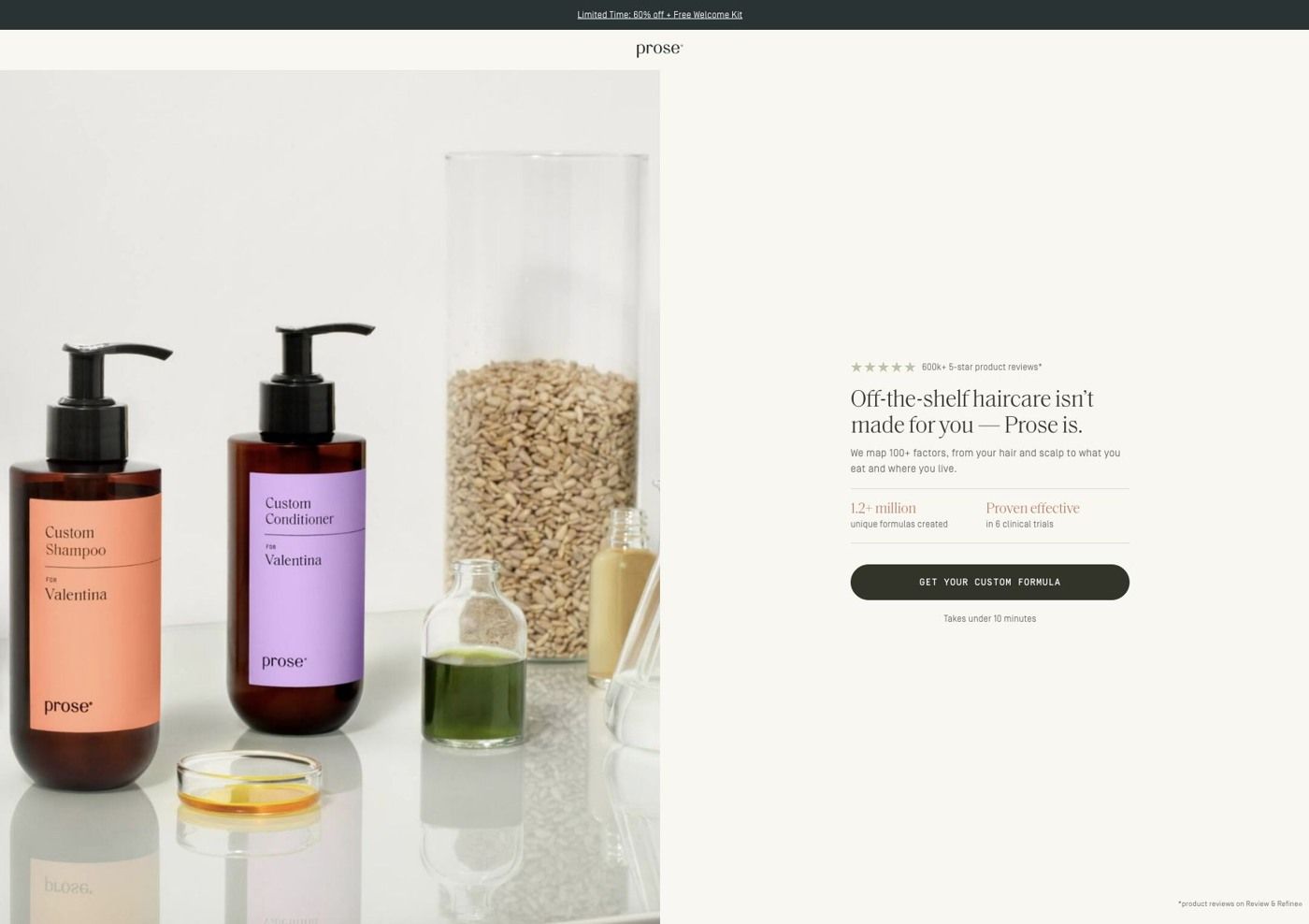
The ad opens Prose's consultation welcome: a product and ingredient composition beside a personalization headline, compact proof points and one consultation button with an effort estimate. On the persona's ladder a quiz is often the best destination, and it fits because the video already showed the hair-goals screen, so the viewer arrives at the start of something they've seen. The handoff would be stronger if the welcome echoed the before & after promise (a line about natural texture, say), since the video gives no verbal cue about what to do next. Eight of the 93 Prose ads we captured send people to this welcome.
The page it sends people to: How Prose welcomes ad traffic into its custom haircare quiz
This is the welcome screen in front of Prose's haircare consultation: a minimal brand header, a product and ingredient still life beside a personalization headline, compact proof points and one button with an effort estimate. It's the destination for eight ads in the Fluid library, mostly creator stories, including one that asks about air-dried hair texture.
How the page is built
- 01Promotion strip and header
A promotion strip above a minimal centered brand header keeps the offer visible while removing the store navigation as a distraction.
- 02Personalization hero
A product and ingredient still life beside a personalization headline and short explanation answers "what will I get from this?"
- 03Proof and button
Compact proof points and one consultation button with an effort estimate answer "is this worth my time?" right where the visitor decides.
- 04Proof footnote
A small footnote at the bottom of the screen backs up the proof points.
The first fixes we would make
- Beside the button we captured proof and an effort estimate, but not the first-order offer the ads lead with. Put the 60% off in the line under the button, so the visitor sees the reward and the effort together.
- Most of the ads that land here feature creators, but the welcome screen is a still life with no face on it. A small creator quote or a short clip next to the headline would make the jump from video to page feel like the same conversation.
Read the full breakdown of this page
Three hooks you could test
- Sell the outcome. “From flat and frizzy to defined, with one routine made for my hair.”
- Turn the benefit into a picture people get in a second. “Left: my hair last month. Right: my hair today.”
- Lead with the uncomfortable problem. “Hair that dries flat no matter what you put in it?”
What to borrow for your brand
- Open on the before shot with a clear label and its disclaimer, so the proof becomes the hook.
- Flash the quiz screen that lists goals, which shows what personalization means in one frame.
- Close by naming who the product is for, so the right viewer feels addressed in the last seconds.
Transcript
Pros nailed my custom hair care routine. Now, this is in some generically been conditioner. It is a fully customized hair care routine that is specifically formulated for your exact hair goals. So every single formula is gonna be unique. And the results speak for themselves. The curl definition is insane. Like, it was just the right amount of hold and control to give me both curl definition and all the volume in the world. Oh my goodness. 100% recommend, especially if you're trying to learn to embrace your natural hair texture. This is gonna be a game changer for you.
Text on screen
- How I took my hair from this
- to THIS
- BEFORE
- Before and after illustration taken by Sierra M. after using Prose
- he-Shampoo Hair Mask, Shampoo, Conditioner. Curt Creem, String Gel,
- got Sourcell Herbal Supplements, and Scalp Serum - results
- say var
- AFTER
- Pre-Shampoo Hair Mask, Shampoo, Conditioner, Curt Creem, Styling Gel.
- Root Source Herbal Supplements, and Scalp Serum - results may vary
- Before and afterlilustration taken by Slerra M. after using Prose
- Prose NAILED
- naited my custom
- haircare routine
- Now, this isn't some
- generic leave-in
- conditioner
- It is a fully customized
- that is specifically
- formulated
- What are your hair goals?
- MORE VOLUME
- MORE SHINE
- MORE SMOOTHNESS
- MORE CURL
- MORE MOISTURE
- REDUCE BRASSINESS
- So every single formula
- is going to be
- UNIQUE
- and the results
- Before and alter lustration
- Pre-Shampoo. he
- Shard
- The curl definition
- is INSANE
- It was just the
- right amount
- of hold and control
- both curl definition
One of 93 Prose ads in the Fluid Inspiration Library, captured from the Meta Ad Library on Oct 22, 2026. We record that an ad ran publicly, not how it performed.