How Lume built a problem-specific page for its Sweat Control Cream | Fluid
Esc

How Lume built a problem-specific page for its Sweat Control Cream

Lume's Sweat Control Cream page is a problem-specific offer page. A sweat-focused hero leads into numbered benefits with repeated savings buttons, a starter pack, reviews, an application guide, a guarantee and FAQ. It's where 19 Lume ads in the Fluid library point, mostly creator stories and savings offers built around saving over 30% plus two free items.

Lume
19 creatives lead here1 / 19
Lume · Sweat Control Cream

Public page captured October 22, 2026. Promotional sheets, chat, extension overlays and sticky cart bars were removed from the static reference; page layout and copy were preserved. No account, personal, health or payment details were supplied. Quiz captures show the observed entry screen, not the complete consultation.

Lume: full page screenshot

Lume · Sweat Control Cream

Lume's Sweat Control Cream page is a problem-specific offer page. A sweat-focused hero leads into numbered benefits with repeated savings buttons, a starter pack, reviews, an application guide, a guarantee and FAQ. It's where 19 Lume ads in the Fluid library point, mostly creator stories and savings offers built around saving over 30% plus two free items.

Brand
Lume
Page type
Benefits landing page
Ads leading here
19
Captured
Oct 22, 2026
Destination
try.lumedeodorant.com

Selected for its design and offer structure. Ad performance isn’t available in this collection.

What this page does well

This is the persona's better rung on the landing-page ladder: one problem, one product, one offer. The hero names the sweat problem straight away, with a large product cutout, labeled callouts, a single CTA and shipping reassurance, so a visitor who clicked a sweat ad knows they're in the right place. The numbered benefits alternate text and imagery and drop a button between sections, which means the offer is never more than a scroll away for someone who's already convinced. After the starter pack and the review cards, the application guide shows how to use the cream, and the guarantee sits next to the FAQ, which is a good spot for it because that's where the last doubts get answered.

How the page is built

  1. 01
    Announcement and header

    A minimal header with a repeated offer CTA keeps the discount visible without links back into the store.

  2. 02
    Sweat-specific hero

    Product imagery, a problem statement, labeled product callouts, a CTA and shipping reassurance answer "is this for my sweat problem?"

  3. 03
    Numbered benefits

    Alternating text and images walk through the reasons Lume gives for the cream, with buttons between sections, answering "why this product?"

  4. 04
    Starter-pack offer

    Product choices, bonus items and a CTA answer "what do I get and how do I start?"

  5. 05
    Customer reviews

    Review cards answer "what do other customers say about it?"

  6. 06
    Application guide

    Supporting visuals show how to apply the cream, answering "how do I actually use this?"

  7. 07
    Guarantee and FAQ

    A guarantee next to the FAQ answers "what if it doesn't work for me?" and the remaining practical questions.

  8. 08
    Final offer and footer

    The offer repeats once more above the policy footer so the visitor can buy without scrolling back up.

What's missing, in the order we'd fix it

  1. The reviews come after the numbered benefits and the offer, so the first screens are all Lume's own claims. Move a short strip of review quotes into or just under the hero, so a creator-story click lands on other customers' words first.
  2. Unlike Lume's main starter-pack page, this one has no study proof, founder story or comparison table in the blueprint. Add the comparison table (Lume against whatever the visitor uses for sweat now) between the benefits and the offer, since that's the question a sweat buyer is weighing.
  3. Several of the ads that land here run under the "For Boobs That Run Hot" headline, and the hero speaks to sweat in general. Give those ads a hero line that names the same body area so the click and the first screen say the same thing.

How the ads set it up

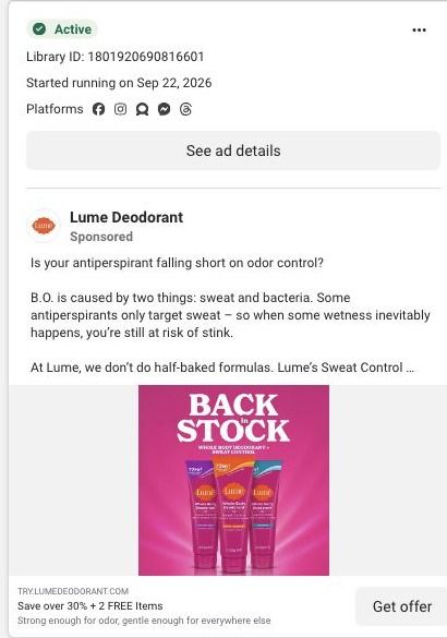
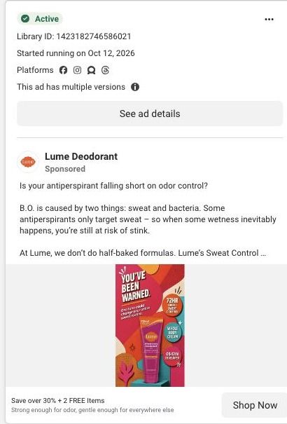
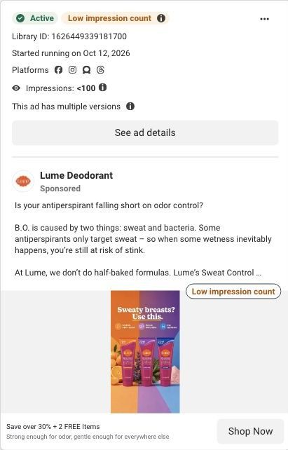
Nineteen Lume ads in the Fluid library point to this page. Most use the saving over 30% plus two free items headline, and the page holds up its end with savings CTAs in the header, between the numbered benefits and at the bottom, plus bonus items in the starter pack. The creator-story ads under the "For Boobs That Run Hot" headline set up a narrower problem than the page's sweat hero, so those visitors get the right product but have to translate the general sweat promise back to their own situation.

What to borrow for your brand

  • Build a separate landing page for each problem your product addresses, with a hero that names that problem and nothing else, instead of sending every ad to the same page.
  • Number your benefits and drop a button between each one, so a visitor who's convinced early can act without scrolling to the bottom.
  • Put the guarantee beside the FAQ, where people are already asking what happens if it doesn't suit them.

Ads that send people here

Captured from try.lumedeodorant.com in October 2026 for the Fluid Inspiration Library. Offers and prices change; this is what the page showed when we captured it.