What this ad does well
An apology is an unusual way to open an ad, and it makes the viewer wonder what went wrong, which is enough to keep them watching. The tube fills the frame right next to her face, so the product is clear from the first second. She then names the areas people actually worry about (boob sweat, thigh sweat, feet sweat) and credits mandelic acid as the ingredient she says fights odor bacteria.
What's missing
The payoff is fuzzy. She says some people have a stackable coupon and a better deal, but never says what it is or how much it saves, so the apology sets up a reveal the video doesn't deliver. That's the moment the viewer decides whether to click, and vagueness there wastes the hook. If you make one like this, state the exact deal (the over 30% off plus two free items from the ad headline) right after the apology, and show it in the cart if you can.
Beat by beat
- 0-3s
She holds the pink tube to the camera under the caption i am so sorry.An apology makes viewers curious about what they missed.
- 3-12s
She says it's not about being able to use it anywhere, then lists boob, thigh and feet sweat.The mock dismissal lets her stack use cases in a casual tone.
- 12-19s
She credits mandelic acid with fighting odor bacteria.One named ingredient gives the claim a reason the viewer can repeat to a friend.
- 19-25s
She mentions a stackable coupon and says now is the time to grab it.This beat is meant to give the reason to act now, though the deal itself stays vague.
The offer
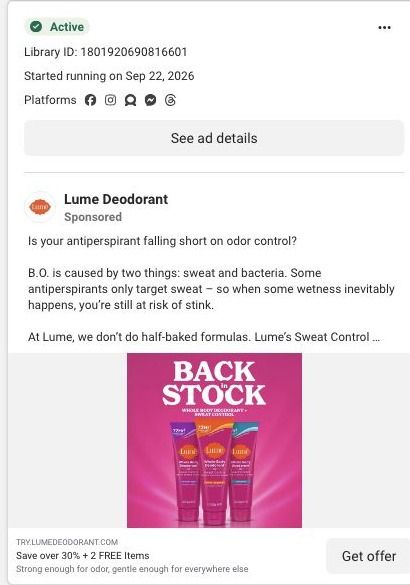
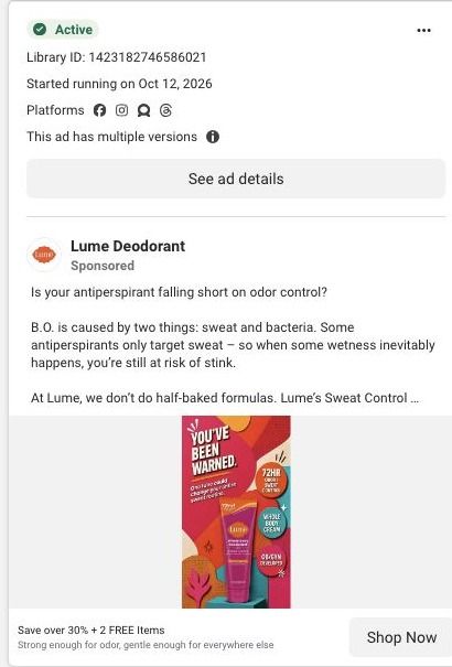
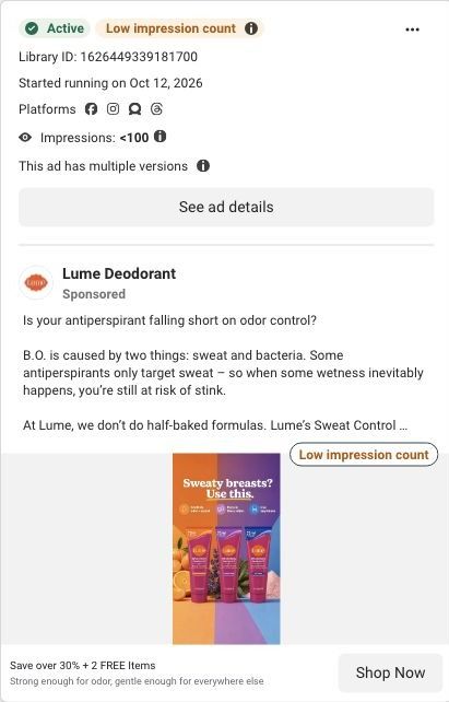
She mentions a stackable coupon and a better deal without saying what it is. The ad headline carries the specifics: over 30% off plus two free items.
Where it sends people
The ad links to Lume's Sweat Control Cream landing page, one of 19 ads in the Fluid library that send people there. It's a focused landing page, and the announcement bar and header repeat the offer with a CTA, which gives viewers the concrete deal the video only hinted at. The sweat-specific hero and the application guide line up with the areas she names. The thing to check if you borrow this format is the coupon: if a creator mentions one, the page should show it applied or explain how to stack it, or the visitor will go looking for it and stall.
The page it sends people to: How Lume built a problem-specific page for its Sweat Control Cream
Lume's Sweat Control Cream page is a problem-specific offer page. A sweat-focused hero leads into numbered benefits with repeated savings buttons, a starter pack, reviews, an application guide, a guarantee and FAQ. It's where 19 Lume ads in the Fluid library point, mostly creator stories and savings offers built around saving over 30% plus two free items.
How the page is built
- 01
Announcement and headerA minimal header with a repeated offer CTA keeps the discount visible without links back into the store.
- 02
Sweat-specific heroProduct imagery, a problem statement, labeled product callouts, a CTA and shipping reassurance answer "is this for my sweat problem?"
- 03
Numbered benefitsAlternating text and images walk through the reasons Lume gives for the cream, with buttons between sections, answering "why this product?"
- 04
Starter-pack offerProduct choices, bonus items and a CTA answer "what do I get and how do I start?"
- 05
Customer reviewsReview cards answer "what do other customers say about it?"
- 06
Application guideSupporting visuals show how to apply the cream, answering "how do I actually use this?"
- 07
Guarantee and FAQA guarantee next to the FAQ answers "what if it doesn't work for me?" and the remaining practical questions.
- 08
Final offer and footerThe offer repeats once more above the policy footer so the visitor can buy without scrolling back up.
The first fixes we would make
- The reviews come after the numbered benefits and the offer, so the first screens are all Lume's own claims. Move a short strip of review quotes into or just under the hero, so a creator-story click lands on other customers' words first.
- Unlike Lume's main starter-pack page, this one has no study proof, founder story or comparison table in the blueprint. Add the comparison table (Lume against whatever the visitor uses for sweat now) between the benefits and the offer, since that's the question a sweat buyer is weighing.
Read the full breakdown of this page
Three hooks you could test
- Call out the habit you're replacing. “Sorry if you just paid full price for regular deodorant.”
- Lead with the uncomfortable problem. “Boob sweat, thigh sweat, feet sweat: this is for all of it.”
- Make the product the whole scene. “This one tube goes everywhere you sweat.”
What to borrow for your brand
- Open with an apology to people who already bought, which creates curiosity about what changed.
- Hold the product beside the creator's face in the first frame so the brand is clear before the story starts.
- Follow the apology with the exact deal in numbers, so the curiosity pays off with something viewers can act on.
Transcript
I am so sorry if you already bought the off cream whole body deodorant. Not because you can literally use this anywhere, just for your pits. If you have boob sweat, thigh, sweat, feet sweat, because it has mandelic acid, which is actually gonna fight off that odor bacteria. I'm so sorry, because now I'm seeing some people even have a stackable coupon, getting a way better deeply meet up the one shopping cart and then come back. Only deodorant that we use. You have been eyeing this, now would be the time to grab it.
Text on screen
- 3005 (826) MELML
- iam so sorry.o...
- ar courtar
- Deoq
- TW T3M (g28) 50 0E
One of 100 Lume ads in the Fluid Inspiration Library, captured from the Meta Ad Library on Oct 22, 2026. We record that an ad ran publicly, not how it performed.