

Lume DeodorantSponsored
Esc
How Lume's Find Your Match quiz turns ad clicks into recommendations
Lume's Find Your Match page is the entry to a product-matching quiz on its main store. It opens with a product collage, a personalization promise and an email-discount callout, then asks where you want a better odor or sweat solution. Six Lume ads in the Fluid library point here, all built on taking the quiz for up to 30% off.
Lume
6 creatives lead here1 / 6


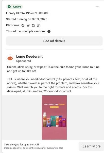
Lume · Find your match quiz
Public page captured October 22, 2026. Promotional sheets, chat, extension overlays and sticky cart bars were removed from the static reference; page layout and copy were preserved. No account, personal, health or payment details were supplied. Quiz captures show the observed entry screen, not the complete consultation.
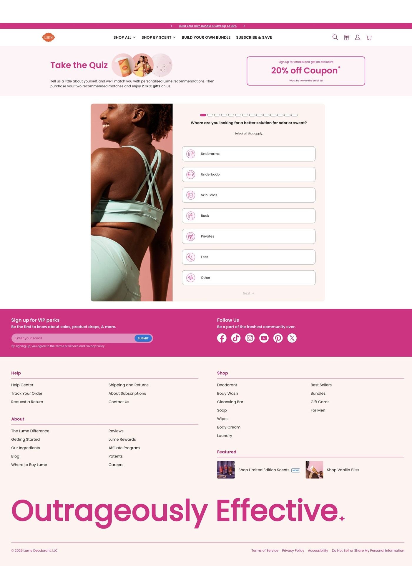
Lume · Find your match quiz
Lume's Find Your Match page is the entry to a product-matching quiz on its main store. It opens with a product collage, a personalization promise and an email-discount callout, then asks where you want a better odor or sweat solution. Six Lume ads in the Fluid library point here, all built on taking the quiz for up to 30% off.
- Brand
- Lume
- Page type
- Quiz entry
- Ads leading here
- 6
- Captured
- Oct 22, 2026
- Destination
- lumedeodorant.com
Selected for its design and offer structure. Ad performance isn’t available in this collection.
What this page does well
Sending ad traffic to a quiz is the persona's top rung, and Lume does the first part well. The introduction promises personalized product recommendations and two free gifts, and the email-discount callout ties the quiz to the discount the ads promise, so the visitor knows what they get for answering. The first question is easy to answer: a multi-select of body areas beside a lifestyle image, with progress marks that show it won't go on forever. Starting with "where" rather than a product name is smart, because it begins with the problem the visitor already knows they have and lets Lume recommend the product as the answer.
How the page is built
- 01Store header
Lume's full shop navigation with account and cart icons sits above the quiz, keeping the visitor inside the main store.
- 02Quiz introduction
A product collage, a short personalization promise and an email-discount callout answer "why should I take this, and what do I get?"
- 03Initial question
A multi-select body-area question beside a lifestyle image, with progress marks, answers "where do I start?" and starts sorting the visitor by problem.
- 04Newsletter and footer
A newsletter signup and the store footer close the page, giving another way to capture an email.
What's missing, in the order we'd fix it
- The full store navigation stays on top of the quiz, so every visitor who clicked a quiz ad has a menu of ways to leave. Strip the header down to the logo on the quiz route, the way Lume's own landing pages already do.
- The page doesn't say how long the quiz takes. Add a line like "a few quick questions" to the introduction so people commit to the first answer.
- We captured only the entry screen, so we can't judge the recommendation or email step. Whatever comes next, make sure the up to 30% off from the ad shows up again on the results screen, next to the recommended products.
How the ads set it up
Six Lume ads in the Fluid library point here, and they all use the same headline about taking the quiz for up to 30% off. That's a clean setup: the ad tells the visitor exactly what to do, and the page opens on the quiz with an email-discount callout, so the action and the reward carry over. The ads include creator stories, education and a personalization static, and the body-area question gives each of them a natural first step, because it asks about the problem the creator just talked about.
What to borrow for your brand
- Open your quiz with a question about where or when the problem shows up, not which product someone wants, so the recommendation feels like an answer to their situation.
- Put the discount callout on the quiz introduction itself, so visitors from a discount ad see the reward before they start answering.
- Use multi-select on the first question so people with more than one concern don't have to pick, and you learn more about each visitor from a single tap.
Ads that send people here
- How Lume explains perimenopause odor with an animated pH story
- How Lume's "bumpy pits" ad leads with an underarm close-up
- How Lume packs three underarm questions into a 24-second ad
- How Lume's OB/GYN founder uses an anatomy lesson as an ad
- How Lume explains aging body odor in a decade-by-decade ad
- How Lume sends shoppers to a product-matching quiz
Captured from lumedeodorant.com in October 2026 for the Fluid Inspiration Library. Offers and prices change; this is what the page showed when we captured it.