How Lemme's Daily Multi page compares itself with a generic bottle
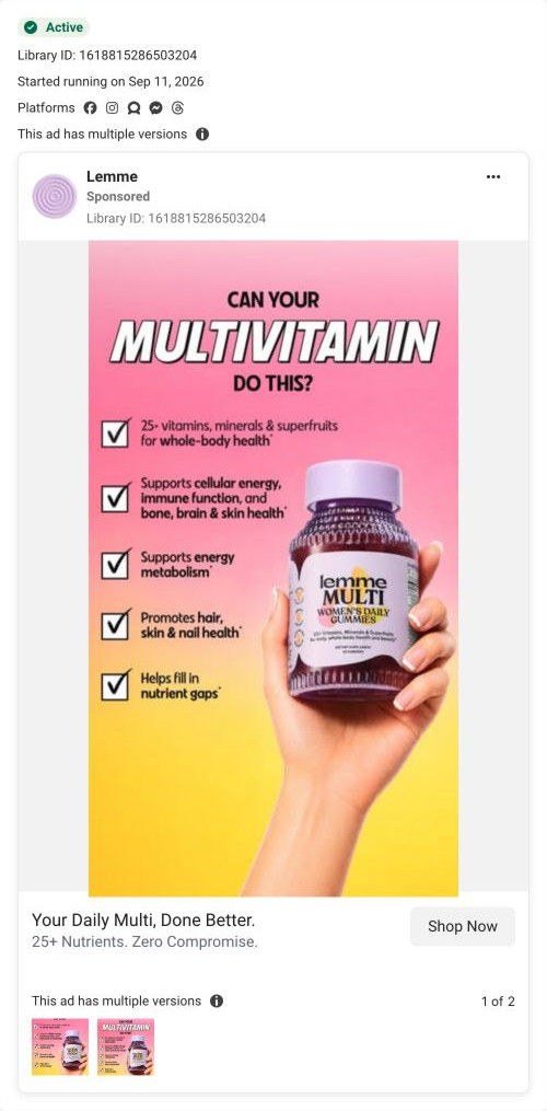
Lemme's landing page for its Women's Daily Multi gummies. It's a single-product lander with a short hero and subscribe button, a subscription-first offer selector, a versus graphic against a generic bottle, nutrient cards and reviews, closing on a daily-boost prompt. 4 Lemme ads in the library send people here, all challenging the reader's current multivitamin.

Captured while scrolling the public page. The page reflects the offer visible on October 20, 2026; it may differ from the original ad.
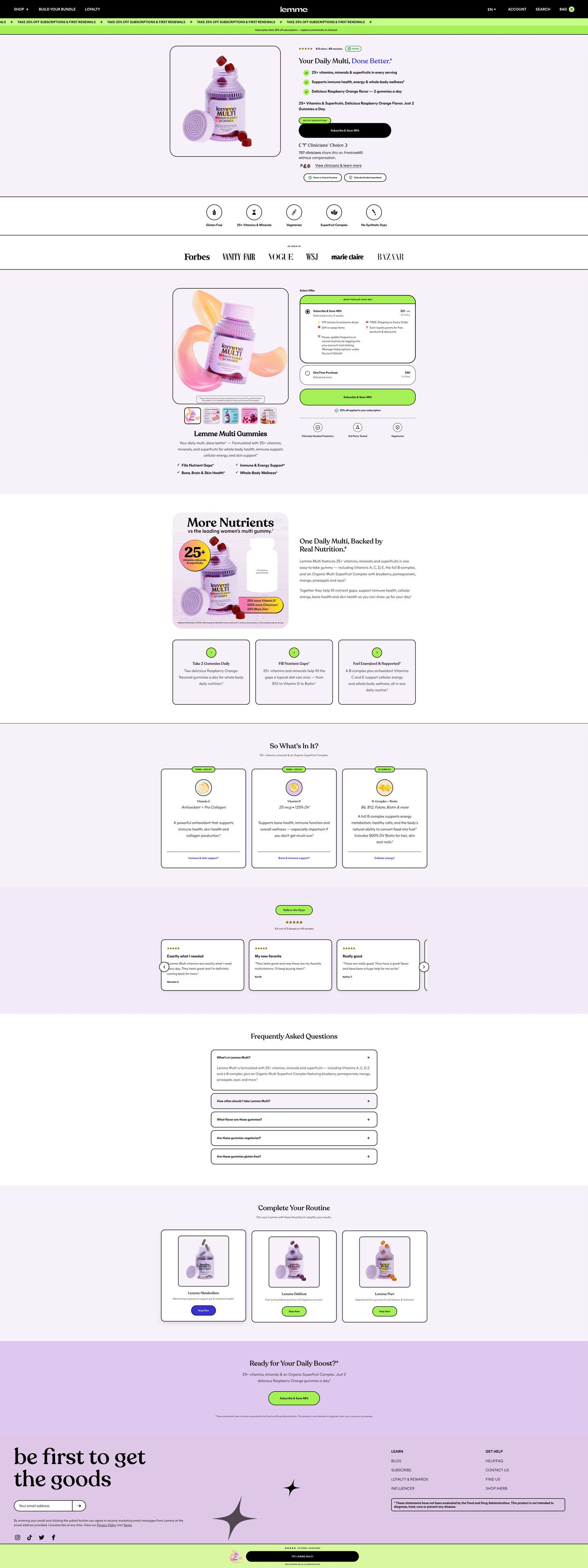
Lemme · Daily Multi gummies
Lemme's landing page for its Women's Daily Multi gummies. It's a single-product lander with a short hero and subscribe button, a subscription-first offer selector, a versus graphic against a generic bottle, nutrient cards and reviews, closing on a daily-boost prompt. 4 Lemme ads in the library send people here, all challenging the reader's current multivitamin.
- Brand
- Lemme
- Page type
- Product landing
- Ads leading here
- 4
- Captured
- Oct 20, 2026
- Destination
- lemmelive.com
Selected for its design and offer structure. Ad performance isn’t available in this collection.
What this page does well
The page carries the ads' challenge into a real comparison. The versus section sets the Lemme bottle beside a blank generic bottle with callouts of how much more it contains, which is exactly the question the ads raise (can your multivitamin do this?). The hero repeats the ads' done-better promise with check bullets and a direct Subscribe & Save button, so it works as a mini buy box for ready buyers. The clinician-choice badge in the hero continues the Clinicians' Choice band two of the ads carry, and the subscription discount runs in a lime marquee with a note that it's applied automatically.
How the page is built
- 01Header and promo marquee
A black header with shop, bundle and loyalty links and a lime marquee of the subscription discount applied at checkout, answering whether there's a deal and how to get it.
- 02Hero
A product photo beside a star rating, a headline echoing the ads' done-better promise, check bullets, a Subscribe & Save button and a clinician-choice badge, answering what it is and why to trust it.
- 03Attribute strip
Line icons with dietary and formula labels, answering whether it fits your diet.
- 04Press row
An As seen in label over magazine logos, answering whether the brand has outside credibility.
- 05Offer selector
A product gallery with benefit checks beside a pre-selected subscription card with perks and price per delivery and a one-time card, answering how to buy and what you save.
- 06Versus section
An infographic comparing the bottle with a blank generic bottle, two paragraphs and numbered cards on how to take it and what it fills, answering why switch from your current multi.
- 07Nutrient cards
“So what's in it?” cards with a category tag, nutrient name and dose line, answering what's inside and how much.
- 08Review carousel
A “Believe the hype” pill, a rating with count and review cards, answering whether other buyers liked it.
- 09FAQ
A centered stack of accordions, answering the remaining questions.
- 10Cross-sell
“Complete your routine” product cards, offering a way to add to the order.
- 11Closing CTA band
A daily-boost question headline with a Subscribe & Save button, giving a last prompt.
- 12Newsletter, footer and sticky bar
An email signup, links, a disclaimer and a lime sticky bar with rating and a try button, keeping the purchase in reach.
What's missing, in the order we'd fix it
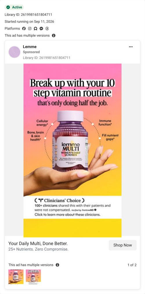
- The versus graphic compares against a blank generic bottle, which is easy to dismiss. Compare against the routine the ads call out (several separate bottles, as in the 10-step headline), so the reader sees their own shelf being replaced.
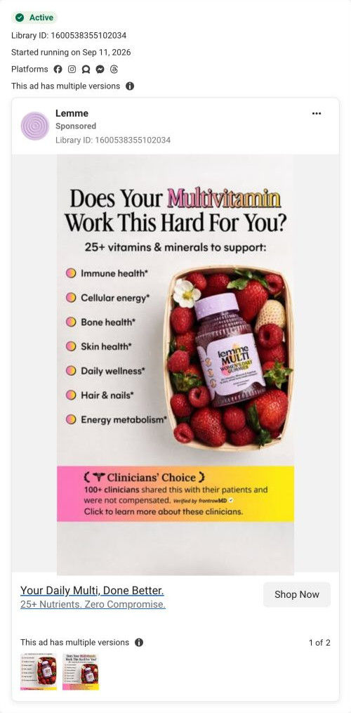
- The Clinicians' Choice detail in the ads (100+ clinicians, not compensated, verified by frontrowMD) is reduced to a badge on the page. Put that full line beside the badge, so the proof is as specific on the page as it was in the ad.
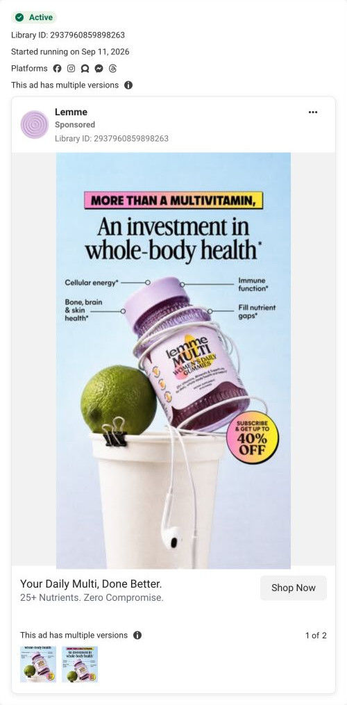
- Two of the ads carry an up-to-40% subscription badge, and the page's marquee shows its own discount. Make sure the number matches, and state it in the hero tag, so the offer a visitor clicked on is the one they see.
How the ads set it up
All 4 Lemme ads that land here challenge the reader's current multivitamin, and the page's versus section is built to answer that challenge. The checklist and berry-basket ads ask whether your multi does this much, the break-up ad names the 10-step routine, and the investment ad frames the gummy as worth paying for. The hero repeats the done-better line from the link cards, and the clinician-choice badge repeats the endorsement band. The investment ad's subscription badge lines up with the page's lime discount marquee.
What to borrow for your brand
- Repeat the ad's headline as the hero headline, so the visitor knows they've landed on the right page.
- Add a versus graphic that sets your product beside the alternative with callouts, so the switch argument is visual.
- Run the subscription discount in a scrolling marquee with an applied-automatically note, so nobody leaves to hunt for a code.
Ads that send people here
- How Lemme Multi challenges your current multivitamin
- How Lemme Multi frames a daily gummy as an investment
- How Lemme Multi adds a clinician endorsement band to a static
- How Lemme Multi calls out the 10-step vitamin routine
Captured from lemmelive.com in October 2026 for the Fluid Inspiration Library. Offers and prices change; this is what the page showed when we captured it.