How Lemme Multi challenges your current multivitamin
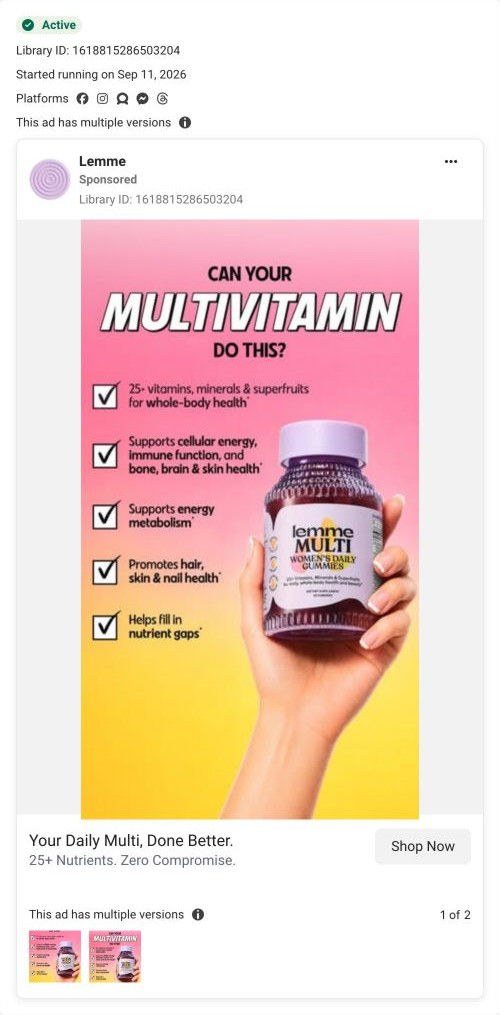
A static image ad for Lemme's Women's Daily Multi gummies that ran on Meta from Sep 11, 2026, in two versions. A hand holds the bottle beside a checked list of claimed benefits under a headline asking if your multivitamin can do this. The link card says 25+ nutrients. There's no offer. It links to the Multi landing page.

Captured while scrolling the public page. The page reflects the offer visible on October 20, 2026; it may differ from the original ad.
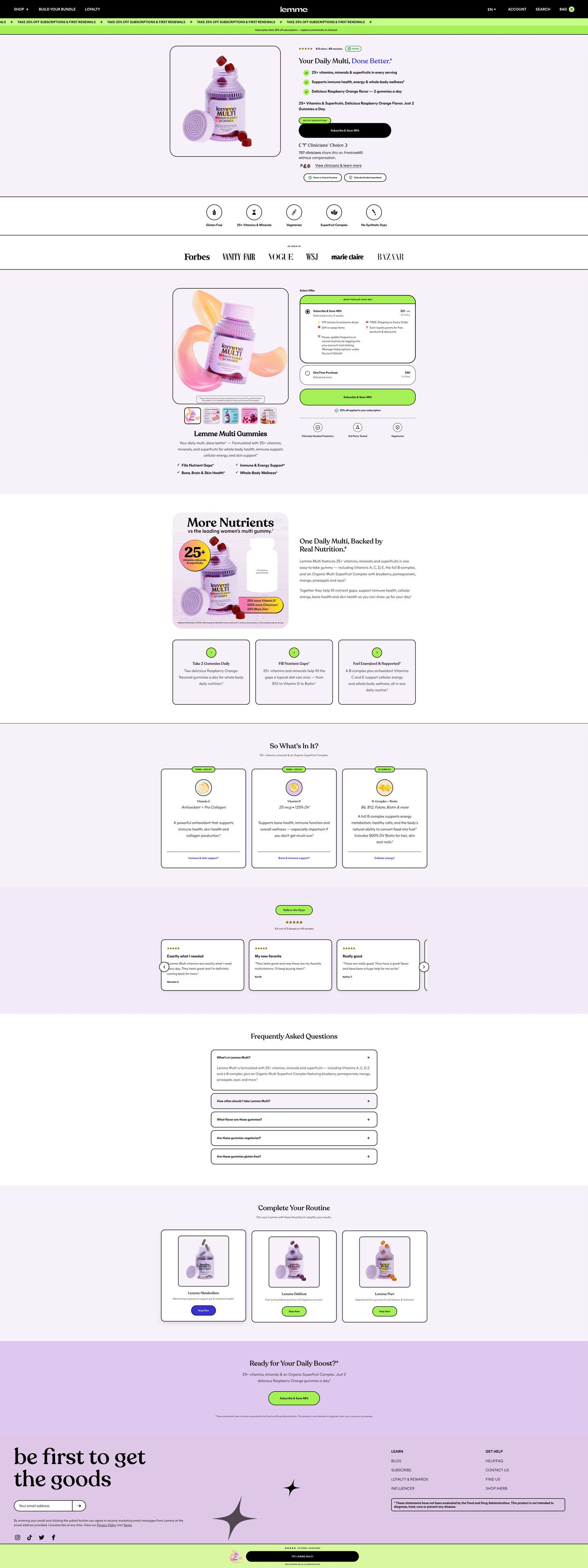
Your Daily Multi, Done Better.
A concise daily-multivitamin headline uses an advertised nutrient count to introduce the product. The recorded CTA points to the Multi landing URL. Compare the creative with the destination and explore the other ads sharing this route.
- Brand
- Lemme
- Observed offer
- Daily multivitamin with 25+ nutrients advertised
- Creative angle
- Product benefits
- Page type
- Product landing
- Ad format
- Image
- Listed start date
- Sep 11, 2026
- Captured
- Oct 20, 2026
- Library ID
- 1618815286503204
- Destination
- lemmelive.com
Selected for its design and offer structure. Ad performance isn’t available in this collection.
What this ad does well
The headline calls out the habit the viewer already has. Most people who'd consider this already take a multivitamin, and “Can your multivitamin do this?” makes them compare without naming a competitor. The checklist then gives them the comparison in a format that reads in seconds, with ticked boxes for whole-body health, energy metabolism, and hair, skin and nails. A real hand holding the bottle adds just enough human presence to feel native.
What's missing
The checklist claims a lot but shows nothing to back it. Every line is a starred brand claim, and there's no review, rating or clinician cue on this version, even though other Multi ads in the library carry a Clinicians' Choice band. There's also no price or offer. If you make one like this, keep the checklist and add one proof line at the bottom (a rating or the clinician band), plus the subscription saving.
Beat by beat
- ImageA hand holds up a Lemme Multi bottle on a pink-to-yellow gradient, beside a column of checked boxes.
The hand makes the ad feel personal, and the checklist format promises a quick comparison.
- HeadlineBold text asks whether your multivitamin can do this.
The question makes the viewer think about the product they already take, so the ad is a switch prompt rather than an introduction.
- ChecklistFive ticked lines claim 25+ vitamins, minerals and superfruits plus support for energy, immunity, bone, brain, hair, skin and nails.
Ticks turn a long benefit list into something the eye scans in one pass.
- CTAThe link card reads Your Daily Multi, Done Better with the line 25+ Nutrients. Zero Compromise, and a Shop Now button.
The card repeats the nutrient count as the single number the viewer should remember.
Where it sends people
The ad sends people to the Multi landing page, a focused product page rather than the homepage. The page picks up the challenge well: the hero headline echoes the done-better promise, and a versus section sets the Lemme bottle beside a blank generic bottle with callouts of how much more it contains, which is the same comparison the ad started. The nutrient cards under “So what's in it?” add dose lines the checklist left out. The hero's Subscribe & Save button and the lime discount marquee introduce the offer.
The page it sends people to: How Lemme's Daily Multi page compares itself with a generic bottle
Lemme's landing page for its Women's Daily Multi gummies. It's a single-product lander with a short hero and subscribe button, a subscription-first offer selector, a versus graphic against a generic bottle, nutrient cards and reviews, closing on a daily-boost prompt. 4 Lemme ads in the library send people here, all challenging the reader's current multivitamin.
How the page is built
- 01Header and promo marquee
A black header with shop, bundle and loyalty links and a lime marquee of the subscription discount applied at checkout, answering whether there's a deal and how to get it.
- 02Hero
A product photo beside a star rating, a headline echoing the ads' done-better promise, check bullets, a Subscribe & Save button and a clinician-choice badge, answering what it is and why to trust it.
- 03Attribute strip
Line icons with dietary and formula labels, answering whether it fits your diet.
- 04Press row
An As seen in label over magazine logos, answering whether the brand has outside credibility.
- 05Offer selector
A product gallery with benefit checks beside a pre-selected subscription card with perks and price per delivery and a one-time card, answering how to buy and what you save.
- 06Versus section
An infographic comparing the bottle with a blank generic bottle, two paragraphs and numbered cards on how to take it and what it fills, answering why switch from your current multi.
- 07Nutrient cards
“So what's in it?” cards with a category tag, nutrient name and dose line, answering what's inside and how much.
- 08Review carousel
A “Believe the hype” pill, a rating with count and review cards, answering whether other buyers liked it.
- 09FAQ
A centered stack of accordions, answering the remaining questions.
- 10Cross-sell
“Complete your routine” product cards, offering a way to add to the order.
- 11Closing CTA band
A daily-boost question headline with a Subscribe & Save button, giving a last prompt.
- 12Newsletter, footer and sticky bar
An email signup, links, a disclaimer and a lime sticky bar with rating and a try button, keeping the purchase in reach.
The first fixes we would make
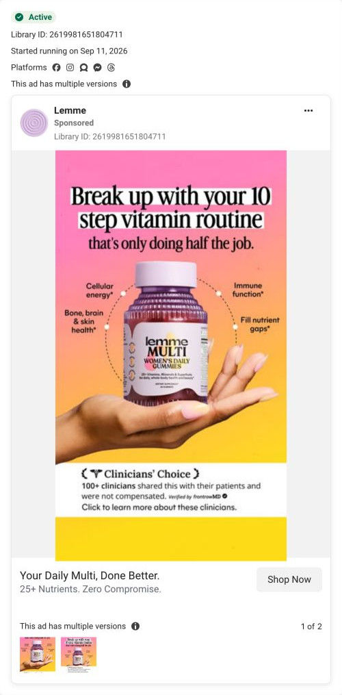
- The versus graphic compares against a blank generic bottle, which is easy to dismiss. Compare against the routine the ads call out (several separate bottles, as in the 10-step headline), so the reader sees their own shelf being replaced.
- The Clinicians' Choice detail in the ads (100+ clinicians, not compensated, verified by frontrowMD) is reduced to a badge on the page. Put that full line beside the badge, so the proof is as specific on the page as it was in the ad.
Read the full breakdown of this page
Three hooks you could test
- Call out the habit you're replacing. “Is the vitamin you take every morning doing all of this?”
- Turn the benefit into a picture people get in a second. “One gummy, a whole column of checkmarks.”
- Sell the outcome. “Skip the pill organizer and still cover the basics.”
What to borrow for your brand
- Ask whether the viewer's current product can do what yours does, so they compare without you naming a competitor.
- Turn your benefit list into a checklist with ticked boxes, so it reads in one glance.
- Repeat one memorable number in the link card, so it's the fact people carry to the landing page.
One of 25 Lemme ads in the Fluid Inspiration Library, captured from the Meta Ad Library on Oct 20, 2026. We record that an ad ran publicly, not how it performed.