How Smooche paired a dryness question with a discount quiz
A static Smooche ad with a split-portrait graphic and a dryness hook asking about skin that's less glowing and more dry, showing 60% off plus a free gift. The copy claims collagen creams can't absorb and offers a 30-day risk-free trial, and Learn More opens Smooche's one-minute discount quiz.

The current destination was captured on October 20, 2026. Video references show captured frames. Page offers may differ from the original ad.
Collagen creams can't absorb. This serum can.
A split-portrait graphic and dryness hook open the same discount-quiz entry screen as the laugh-lines creative. Compare the creative with the destination and explore the other ads sharing this route.
- Brand
- Smooche
- Observed offer
- 60% off plus free gift shown
- Creative angle
- Problem / solution
- Page type
- Quiz entry
- Ad format
- Image
- Listed start date
- Sep 10, 2026
- Captured
- Oct 20, 2026
- Library ID
- 1091732823320328
- Destination
- quiz.smooche.com
Selected for its design and offer structure. Ad performance isn’t available in this collection.
What this ad does well
A split portrait gives the viewer a before and after in one image, and a question about dryness names something she can check in her own mirror, so the hook passes the persona's test of a recognizable problem. The graphic adds 60% off and a free gift, which lines up with what the quiz promises on its first screen (a discount and a mystery gift), so the offer carries across the click. It started running on Meta on Sep 10, 2026, one of 2 ads that open this quiz.
What's missing
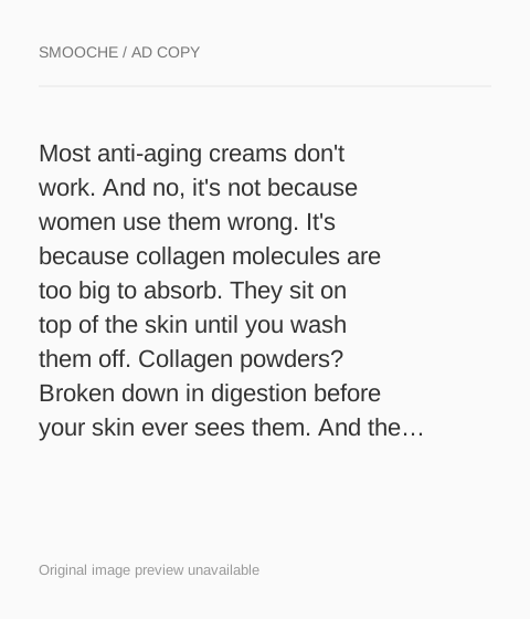
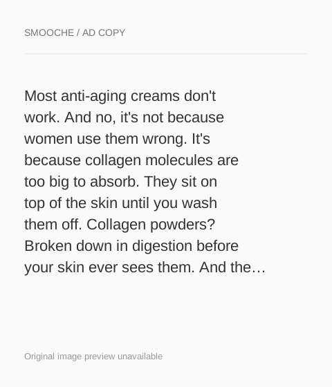
The hook is about dryness, but the copy underneath is the shared collagen-absorption argument and never returns to dry skin. A viewer who stopped for the dryness question reads a paragraph about molecule size instead of hearing how the serum's hyaluronic acid, which the copy lists, relates to her problem. Write a short version of the copy that follows the hook (dry, dull skin, what the brand says the serum does about it, the trial), and save the long argument for the collagen-focused version.
Beat by beat
- ImageA split portrait sits under a question about skin that's less glowing and more dry, with 60% off and a free gift shown.
It shows a before and after and names a problem the viewer can check herself.
- CopyThe text claims anti-aging creams fail because collagen molecules are too big to absorb.
It gives a reason past products disappointed, though it moves away from the dryness hook.
- CopyIt introduces a peptide serum with hydrolyzed collagen, hyaluronic acid and sodium DNA, plus a 30-day risk-free trial.
It names the ingredients and lowers the risk of trying.
- HeadlineThe link line says collagen creams can't absorb but this serum can.
It compresses the argument next to the Learn More button.
The offer
60% off plus a free gift on the graphic, with a 30-day risk-free trial in the copy.
Where it sends people
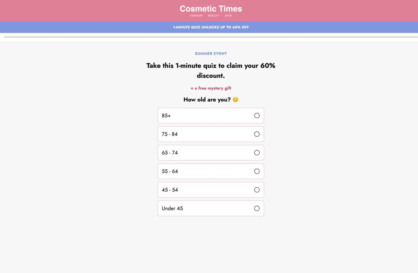
Learn More opens the quiz entry, the persona's often-best destination because it finds out what the visitor is dealing with and can follow up on it. The first screen promises a discount for a one-minute quiz plus a free mystery gift, which matches this ad's 60% off and free gift better than the laugh-lines version does. The first question asks the visitor's age, an easy first tap for this audience. Only the opening screen was captured, so whether later questions ask about dryness isn't known; if you build one, make sure an early question names the problem your ad opened on.
The page it sends people to: How Smooche's one-minute quiz opens with a discount and age question
Smooche's quiz entry page, captured on its first screen only: a stripped-down layout with an editorial-style masthead, a discount strip, a progress bar, a headline promising a discount and mystery gift for a one-minute quiz, and an age question. 2 ads in the Fluid library land here, both problem-and-solution serum graphics.
How the page is built
- 01Masthead
A pink band with an editorial-style publication name and three category tags replaces the brand logo and nav, framing the quiz as content rather than a store.
- 02Offer strip
A blue bar says the quiz unlocks a discount, answering what's in it for me.
- 03Progress bar
A thin empty bar across the width signals that the quiz is short and has steps.
- 04Quiz intro
A seasonal eyebrow, a bold headline promising the discount for a one-minute quiz and a pink free-mystery-gift line answer why to start.
- 05First question
An age question with six full-width answer rows, oldest band first, gives the visitor an easy first tap.
The first fixes we would make
- Neither ad that lands here mentions a quiz, and the first screen doesn't mention the serum or the problem the ads described. Add one line under the headline that ties the quiz to the ad (find the routine for your skin), so the visitor knows she's on the right path.
- Only the opening screen was captured, so it's not clear whether an early question asks about the visitor's main concern. If you build one like this, put a problem question (dryness, fine lines, dullness) right after age, so the recommendation and any follow-up can speak to it.
Read the full breakdown of this page
Three hooks you could test
- Lead with the uncomfortable problem. “Skin feeling tight and looking dull by 3pm?”
- Turn the benefit into a picture people get in a second. “The glow you had in your thirties, back in your mirror.”
- Show a specific moment of use. “Pat it in after your shower, before the moisturizer.”
What to borrow for your brand
- Use a split portrait so the before and after fit in one image.
- Make the offer on the ad match the reward on the quiz's first screen, so the click confirms what the viewer was promised.
- Write copy that follows the hook's problem, so a dryness question leads into a dryness answer.
One of 25 Smooche ads in the Fluid Inspiration Library, captured from the Meta Ad Library on Oct 20, 2026. We record that an ad ran publicly, not how it performed.