How Smooche opened a bundle ad with a fake-out complaint
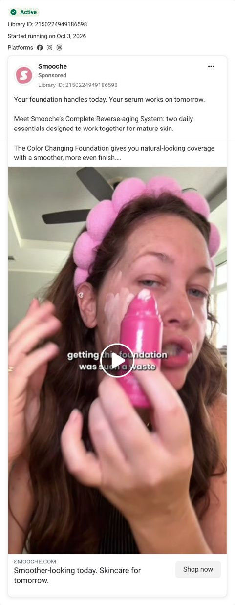
A creator video for Smooche's Complete Reverse-aging System: a woman with her hair held back by a pink puffy band applies the foundation from the bottle, white formula streaked on her cheek, under a caption saying getting this foundation was “such a waste”. The copy pitches foundation for today and serum for tomorrow, and Shop now opens the bundle page.

The current destination was captured on October 20, 2026. Page offers may differ from the original ad.
Smoother-looking today. Skincare for tomorrow.
A creator wearing pink rollers applies foundation while the copy introduces the complete two-product routine. Compare the creative with the destination and explore the other ads sharing this route.
- Brand
- Smooche
- Observed offer
- Free blender, gift and shipping advertised
- Creative angle
- Bundles
- Page type
- Bundle landing
- Ad format
- Video
- Listed start date
- Oct 3, 2026
- Captured
- Oct 20, 2026
- Library ID
- 2150224949186598
- Destination
- smooche.com
Selected for its design and offer structure. Ad performance isn’t available in this collection.
What this ad does well
The caption sounds like a bad review, and complaints get read, so viewers stay to see what went wrong. Meanwhile the frame shows the color-change demo in progress, which gives the skeptical viewer something to judge for herself. The copy explains the bundle with Smooche's clearest logic (one product for today, one for over time) and lists a free blender, a free gift and free shipping as the reason to choose the system. It started running on Meta on Oct 3, 2026, one of 3 ads that send people to the bundle page.
What's missing
A fake-out complaint only lands if the turn comes fast and is clearly the creator's honest view, otherwise it reads as a trick. The frame we captured shows only the foundation, so the serum, half of what the ad sells, isn't in the scene. Have the creator flip the complaint within the first few seconds (it was a waste because she'd been buying the wrong things before, for example), and show both bottles before the video ends.
Beat by beat
- 0-3sA creator applies foundation from the pink bottle, formula streaked on her cheek, under a caption saying getting it was such a waste.
A complaint-style opening earns attention, and the demo in progress lets viewers judge for themselves.
- CopyThe text frames the system as foundation for today and serum for tomorrow, made to work together for mature skin.
It gives the bundle a simple reason to buy both.
- CopyBullets claim color-adapting coverage, daily peptide care and a free blender, gift and shipping.
It stacks benefits and extras to make the kit feel generous.
- HeadlineThe link line reads smoother-looking today, skincare for tomorrow.
It repeats the two-job logic at the tap.
The offer
A free blender, a free gift and free shipping with the foundation-and-serum system.
Where it sends people
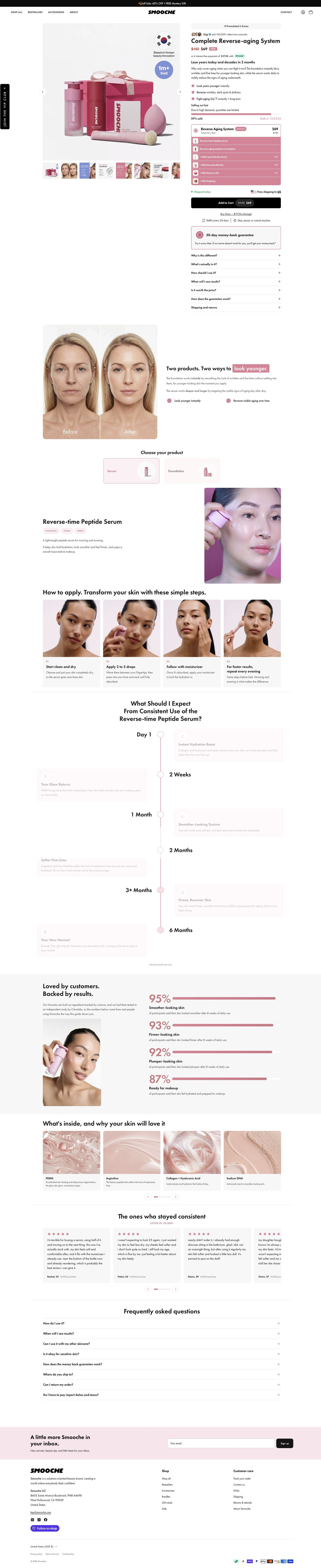
Shop now opens the Complete Reverse-aging System, a focused bundle page. A scarcity bar sits above one offer card that lists both products and the free extras with struck values, and the buy column's accordions include whether it's worth the price, which is the question a such-a-waste caption plants. The two-products explainer and a tab toggle for each product then introduce the serum this video never showed. A four-step how-to-apply section and a results timeline from day one to months out round out the case.
The page it sends people to: How Smooche's bundle page makes two products feel like one routine
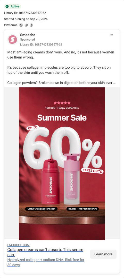
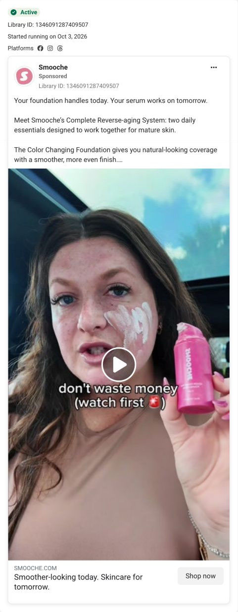
Smooche's Complete Reverse-aging System, a bundle product page for its foundation and serum. One offer card itemizes the kit and free extras under a scarcity bar, then the page explains each product, the routine, a results timeline and a study. 3 ads in the Fluid library land here, all bundle creatives: two creator videos and a summer-sale graphic.
How the page is built
- 01Announcement bar and header
A sale-plus-gift line and a simple nav answer whether there's an offer today.
- 02Buy box
A gift-boxed kit image with badges beside an origin pill, social-proof line, struck-through price, installments line, a bold promise and three bullets answers what the kit is and what it costs.
- 03Scarcity and offer card
A percent-sold bar with countdown sits above one bundle card listing both products and free extras at struck values, answering what's included and why now.
- 04Checkout cluster
A ships-today line, Add to cart with the sale price, a buy-once link, refill and skip-or-cancel terms and a money-back box answer what I'm committing to.
- 05Objection accordions
Questions on why it's different, what's in it, how to use, when results show, price, guarantee and shipping answer the last doubts in the buy column.
- 06Two-products explainer
A before-and-after portrait beside paragraphs on the instant product and the long-term product answers why I need both.
- 07Product toggle
Two tab cards switch between the products, each with attribute chips, a description and an application photo.
- 08How to apply
Four photo step cards walk through the routine, answering how hard it is to use.
- 09Expectations timeline
A vertical timeline from day one to months out with an individual-results-vary note answers what to expect and when, per the brand.
- 10Study results
A paragraph about an independent study and four stat bars give the brand's percentage-based proof.
- 11Ingredients and reviews
Four ingredient cards and a reviews carousel about customers who stayed consistent, with first name, age and verified purchase, answer what's inside and who uses it.
- 12FAQ and footer
Eight accordions on use, timing, compatibility, sensitive skin, guarantee, shipping, returns and duties, then the newsletter and footer, close the page.
The first fixes we would make
- The summer-sale ad's copy argues that collagen creams can't absorb, and that argument doesn't open the page. Either rewrite that ad's text around the two-jobs story the page tells, or add a line in the serum tab that picks up the absorption claim.
- The creator videos are the page's main source of traffic among captured ads, but the reviews carousel sits near the bottom. Move a few customer selfies or a creator clip up beside the offer card, so visitors from creator ads meet a real person before the price.
Read the full breakdown of this page
Three hooks you could test
- Call out the habit you're replacing. “Every foundation I bought before this was the waste.”
- Sell the outcome. “Coverage for today, skincare that keeps going, one routine.”
- Make the product the whole scene. “Two bottles on my counter replaced six.”
What to borrow for your brand
- Open with a caption that sounds like a complaint, then flip it fast, so curiosity carries viewers to the payoff.
- Show the demo in progress under the caption, so skeptical viewers can judge the product themselves.
- When an ad sells a bundle, make sure every product in it appears on screen.
One of 25 Smooche ads in the Fluid Inspiration Library, captured from the Meta Ad Library on Oct 20, 2026. We record that an ad ran publicly, not how it performed.