How Smooche's adaptive foundation page catches its creator ads
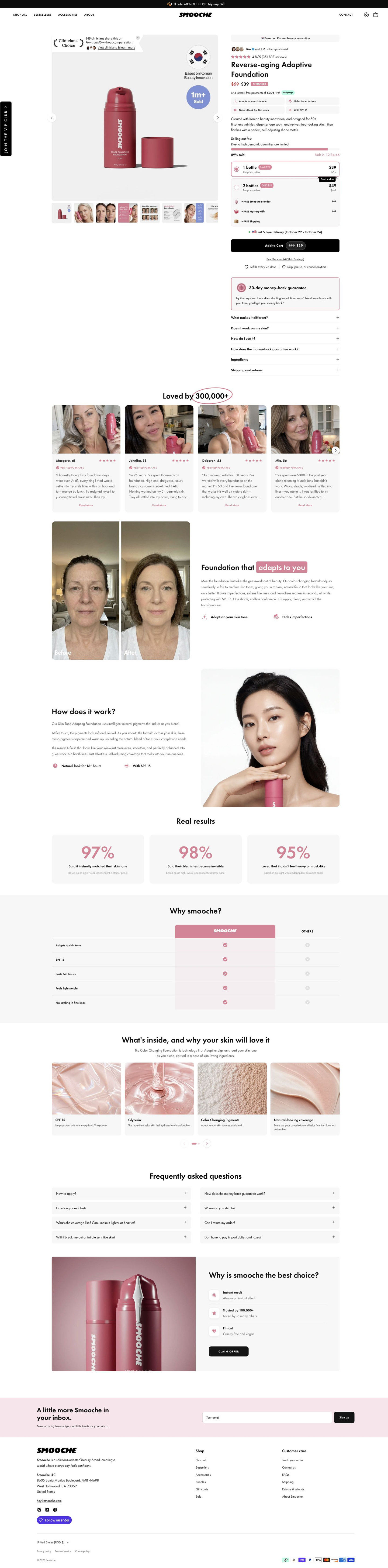
Smooche's Reverse-aging Adaptive Foundation product page: urgency, quantity tiers with free gifts and a guarantee card fill the buy box, then customer stories, a before-and-after, stats and a comparison table back it up. 8 ads in the Fluid library land here, mostly creator videos and demos, plus a humor video and a final-bottles scarcity graphic.

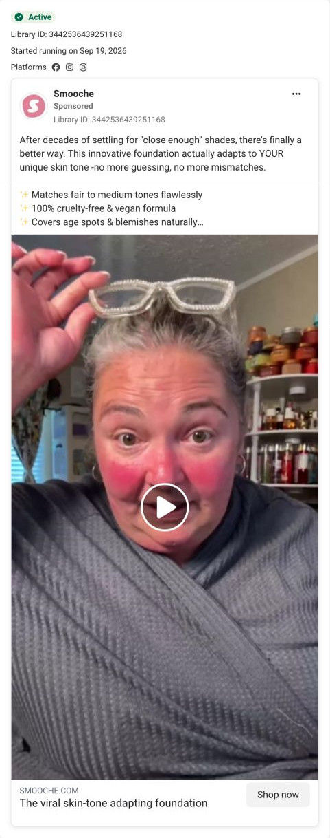
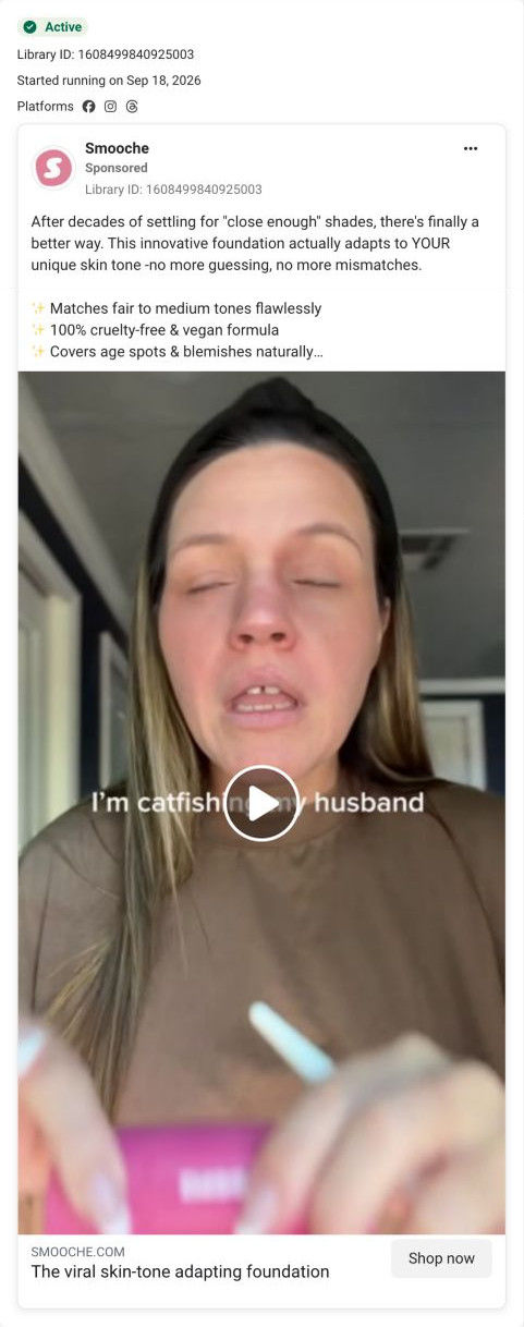
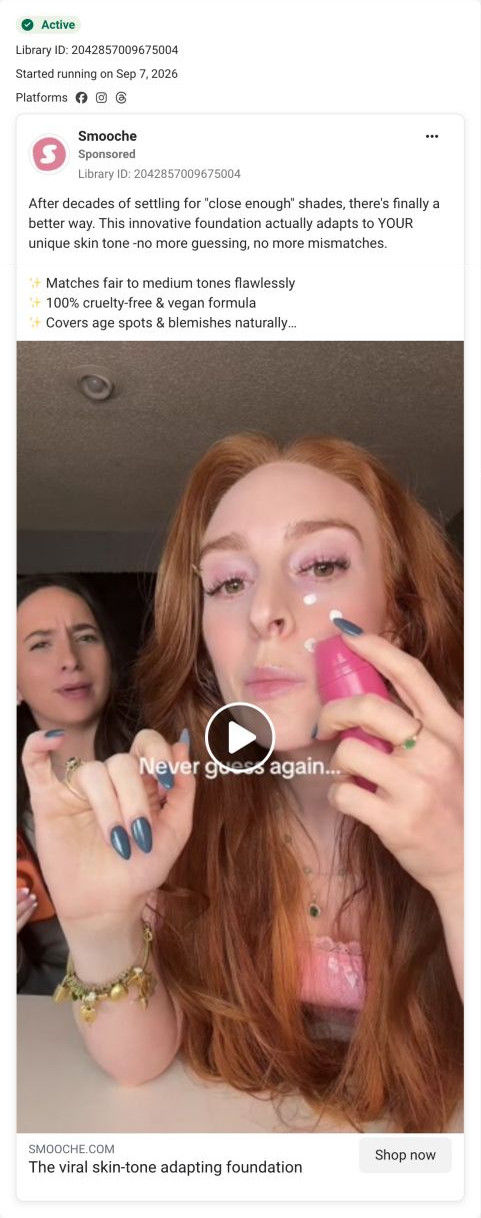
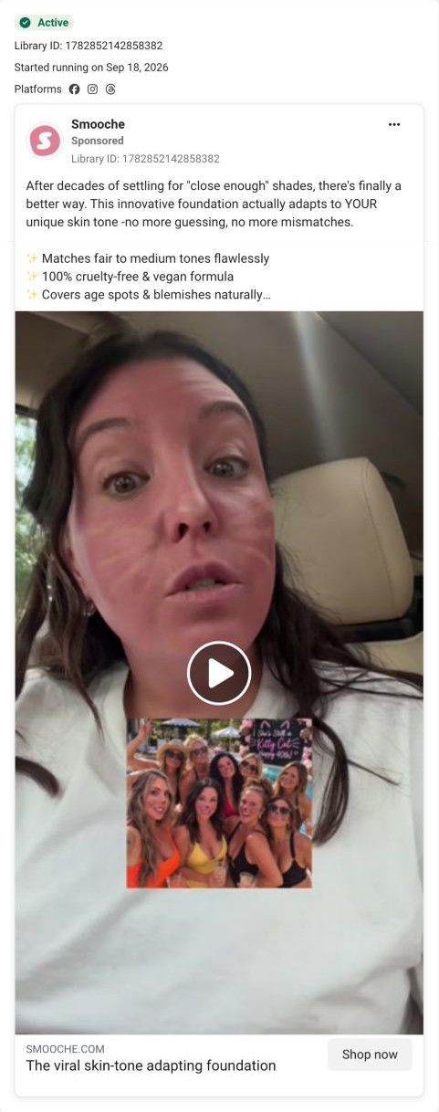
The current destination was captured on October 20, 2026. Page offers may differ from the original ad.
Smooche · Reverse-aging Adaptive Foundation
Smooche's Reverse-aging Adaptive Foundation product page: urgency, quantity tiers with free gifts and a guarantee card fill the buy box, then customer stories, a before-and-after, stats and a comparison table back it up. 8 ads in the Fluid library land here, mostly creator videos and demos, plus a humor video and a final-bottles scarcity graphic.
- Brand
- Smooche
- Page type
- Product page
- Ads leading here
- 8
- Captured
- Oct 20, 2026
- Destination
- smooche.com
Selected for its design and offer structure. Ad performance isn’t available in this collection.
What this page does well
This page is built to receive a lot of different ads, and its buy box works for all of them. The scarcity stack (a stock bar, percent sold and a countdown) sits right above the offer cards, which pays off the scarcity ad directly. Two radio cards with free gifts listed as line items at struck values make the larger tier read as more value, and the one-time purchase is demoted to a text link marked as no savings, so the subscription is the default without hiding the alternative. For the creator ads, a customer-stories carousel with a selfie, first name and age sits right after the buy box, so a visitor who tapped on a real person meets more real people.
How the page is built
- 01Announcement bar and header
A sale-plus-mystery-gift line and a simple store header answer whether there's an offer today.
- 02Gallery
A pack shot with a clinician-choice seal, an origin badge and a units-sold circle, plus eight thumbnails of customer faces, infographics and before-and-afters, answers what results look like.
- 03Buy box top
An origin pill, an others-purchased avatar line, a star rating, a struck-through price with a Bestseller tag, an installment line and four benefit chips answer what it is and whether others trust it.
- 04Urgency and offer tiers
A stock bar with percent sold and countdown, two quantity cards, free-gift rows at struck values and a delivery date answer why now and how much to buy.
- 05CTA area
Add to cart with the sale price, a no-savings one-time link, refill and cancel terms, a money-back card and six accordions answer what I'm committing to and what if it doesn't suit my skin.
- 06Customer stories
Selfie cards with first name, age, stars and a verified label under a hand-circled customer count answer whether people like me use it.
- 07Before-and-after split
Side-by-side face crops with a highlighted headline show the change the brand claims.
- 08How it works
Three short paragraphs beside a model holding the product explain the claimed adaptive mechanism.
- 09Results stats
Three cards with large survey figures and a source note give the brand's percentage-based proof.
- 10Comparison table
A highlighted brand column against Others across five rows answers why this foundation.
- 11Ingredients and FAQ
Four ingredient texture cards and a two-column FAQ on use, wear, sensitivity, guarantee, shipping and returns answer what's inside and the last practical questions.
- 12Closing offer card and footer
A product photo with three icon reasons and a Claim Offer button gives a final way to buy, followed by the newsletter and footer.
What's missing, in the order we'd fix it
- The creator videos are the page's biggest traffic source in the library, and none of that creator footage appears on the page. Put a short creator clip of the color change in the gallery's first slots, so the visitor sees the same demo that made her tap.
- The page is titled Reverse-aging Adaptive Foundation while the scarcity ad calls the product Color Changing Foundation. Use one product name across ads and page so shoppers know they've landed on the right item.
- Several creator ads open on a specific age or life stage, and the page's headline area speaks to everyone. A tagline naming the buyer (women who've spent decades guessing their shade, as the ads say) would make the hand-off feel continuous.
How the ads set it up
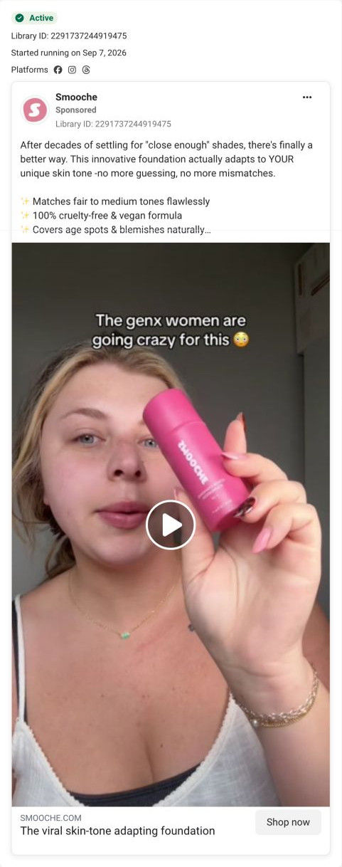
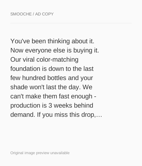
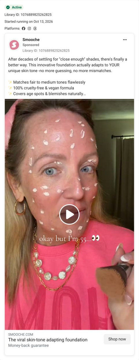
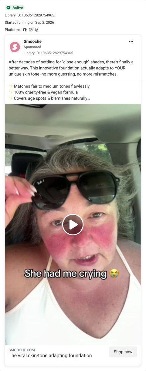
Most of the ads landing here are creator videos that share one block of copy about decades of close-enough shades, plus a final-bottles scarcity graphic. The page answers the scarcity ad almost word for word with its stock bar and countdown, and it answers the creator ads with age-tagged customer selfies right after the buy box. What it doesn't do is show the demo moment those videos open on (white formula turning to skin), which is the single promise all the creator ads share.
What to borrow for your brand
- Demote the one-time purchase to a text link marked as no savings under the main button, so the subscription is the clear default without hiding the alternative.
- Place the scarcity stack directly above the offer cards when a scarcity ad points to the page, so the claim is repeated where the shopper chooses.
- Follow the buy box with customer selfies labeled by first name and age when creator ads feed the page, so real-person ads land on real-person proof.
Ads that send people here
- How Smooche used a creator's Gen X callout to sell foundation
- How Smooche built a foundation ad around a final-bottles claim
- How Smooche's “okay but I'm 55” creator video makes age the hook
- How Smooche used a sunglasses reveal to open a foundation video
- How Smooche staged a foundation demo as a real morning routine
- How Smooche turned a foundation demo into a catfishing joke
- How Smooche matched a never-guess-again caption to a live demo
- How Smooche framed a creator's before-and-after with a photo inset
Captured from smooche.com in October 2026 for the Fluid Inspiration Library. Offers and prices change; this is what the page showed when we captured it.