How MUDWTR's starter offer page leads with a mystery-gift coupon
MUDWTR's Rise starter offer, a dark, logo-only landing page built around a ticket-shaped coupon: 43% off a first starter kit plus a mystery gift. Creator quotes, topic-tabbed reviews and an itemized buy box follow. It's the destination for 21 ads in the Fluid library, mostly creator-led coffee-swap videos plus discount statics.

A browser shopping-extension badge appears in the upper-right margin of this capture.

The Rise starter offer
MUDWTR's Rise starter offer, a dark, logo-only landing page built around a ticket-shaped coupon: 43% off a first starter kit plus a mystery gift. Creator quotes, topic-tabbed reviews and an itemized buy box follow. It's the destination for 21 ads in the Fluid library, mostly creator-led coffee-swap videos plus discount statics.
- Brand
- MUDWTR
- Page type
- Dedicated offer
- Ads leading here
- 21
- Captured
- Oct 19, 2026
- Destination
- mudwtr.com
Selected for its design and offer structure. Ad performance isn’t available in this collection.
What this page does well
This page is built for the click it receives. The logo-only header removes every exit, and the hero puts the whole offer on one ticket-shaped coupon (43% off your first starter kit on one side, a mystery gift worth $25 on the other) with a “Redeem My Mystery Gift” button and a 30-day money-back guarantee right underneath. Because creator-led ads send most of the traffic, a creator quote band sits directly under the hero and a creator carousel comes before the customer reviews. The buy box then counts the value up at the moment of decision, listing each free item with a struck-through value and FREE before the auto-refill terms.
How the page is built
- 01Hero with ticket coupon
A top-down mug photo sits beside a star rating with review and member counts, the coupon, a redeem button, a guarantee line and four icon benefits, answering what the deal is and whether it's safe to try.
- 02Creator quote band
One centered creator testimonial with avatar, name and role carries over the creator voice from the ads.
- 03Benefit ticker
A scrolling marquee of two-word benefit phrases restates the claimed benefits for skimmers.
- 04Product intro
A pack shot with ingredients and an organic seal sits next to flavor and feeling blocks and a nine-item spec list, answering what it tastes like and what's in it.
- 05Creator carousel
Practitioners and athletes appear with large quotes and portraits, answering who else drinks it.
- 06Review tabs
Pill tabs for taste, benefits, caffeine and focus filter review cards, so each visitor can find reviews about their own worry.
- 07Starter kit buy box
A Discount Applied pill, struck-through and sale price, benefit tags, a Get Started button, a pay-later line and a mystery-gift card answer what it costs and how to pay.
- 08What's included and accordions
Each kit item is listed with its struck-through value and FREE, ending with the auto-refill terms, followed by a creator quote and accordions for benefits, subscription perks and nutrition facts.
- 09Ingredient grid
Photo cards give each ingredient a category tag and one line, answering what each one is there for.
- 10Comparison table
The product column is raised and outlined against two unnamed competitors across four rows, answering why this one over the alternatives.
- 11Product grid and FAQ
Tagged product cards and a long accordion FAQ handle range questions and remaining objections.
- 12Brand story, retail, press and footer
Founding story, an app perk and giveback rows lead into retailer logos with a store locator, journal cards, social photos, press logos, a newsletter and a disclaimer with study references.
What's missing, in the order we'd fix it
- Most of the ads that land here promise a free frother, and the hero never mentions it; it only appears in the buy box's itemized list. Add the frother to the coupon or a line under it so the ad's promise is confirmed on the first screen.
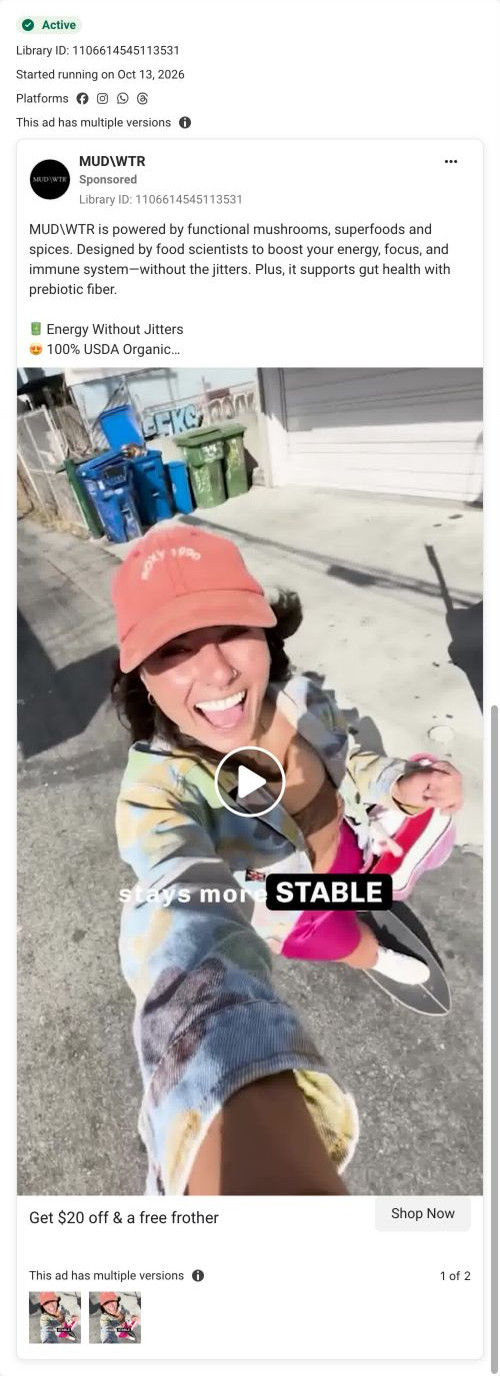
- Some ads that land here offer $20 off, while the coupon says 43%. Either send those ads elsewhere or rewrite them around 43%, so no visitor arrives to a different number than the one they clicked for.
- The comparison table, the most direct answer to the category-warning and what's-the-difference ads, sits below the buy box and the ingredient grid. Move it up next to the product intro so skeptical visitors meet it before they reach the price.
- The page carries several health-adjacent benefit lines (gut health, immunity) in the hero and ticker. Keep those attributed and close to the study references, which currently live in the footer disclaimer.
How the ads set it up
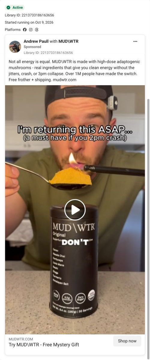
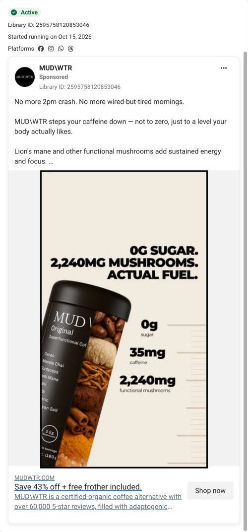
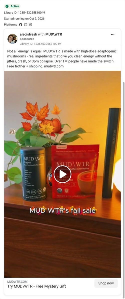
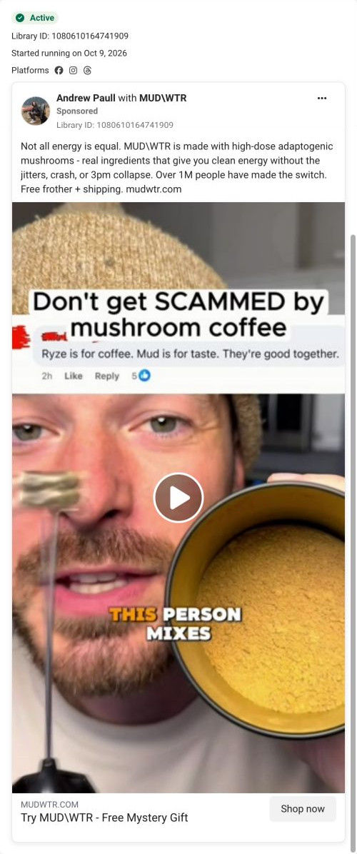
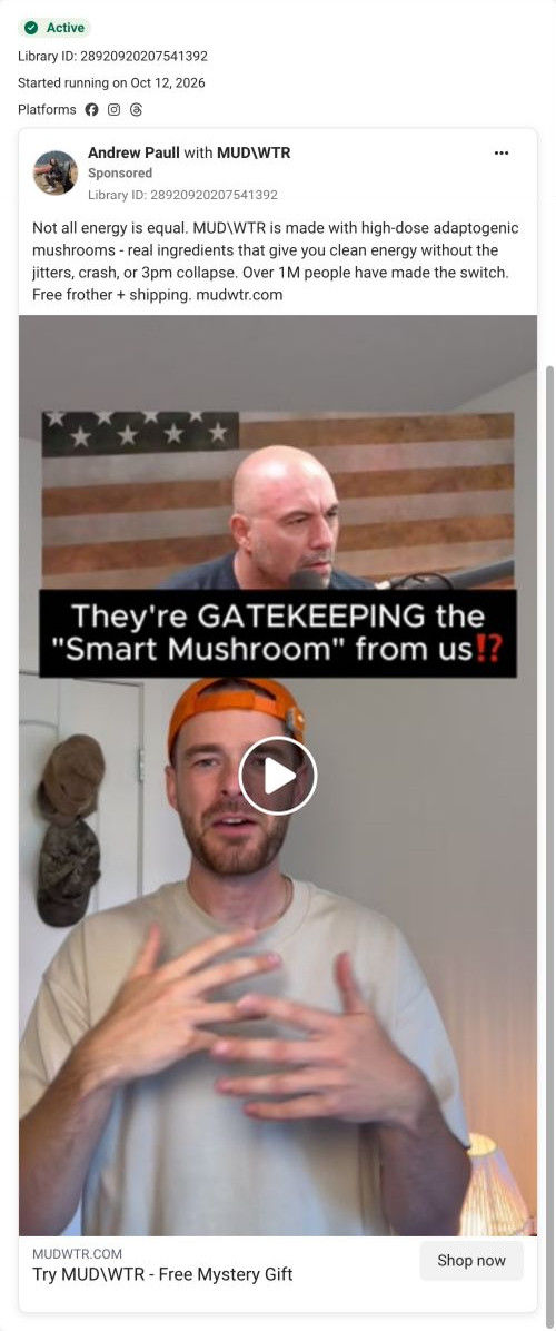
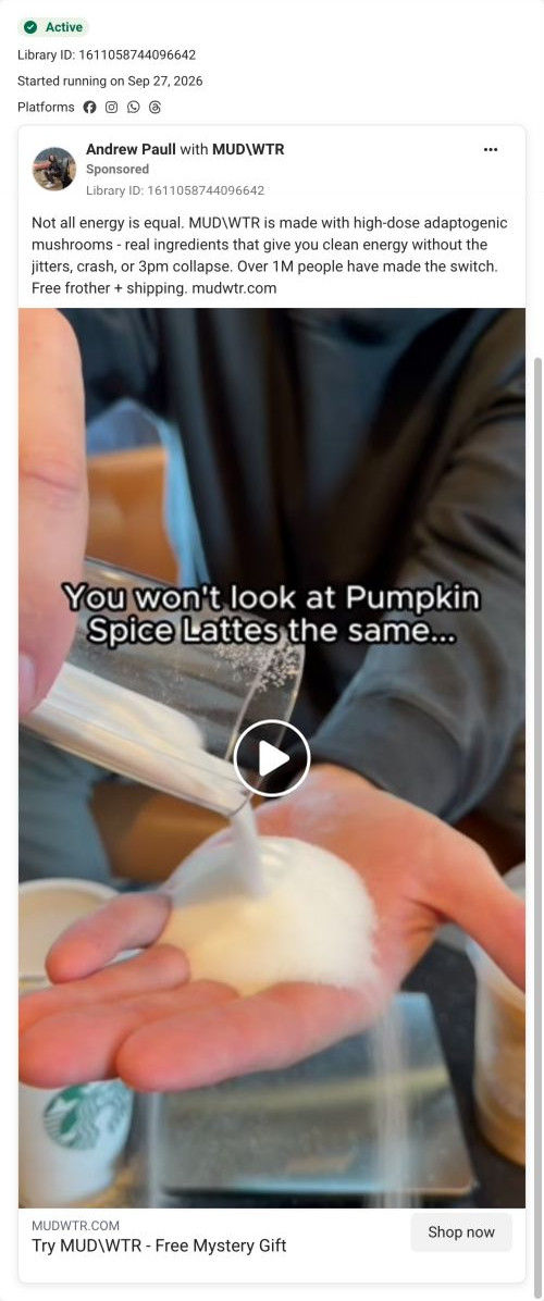
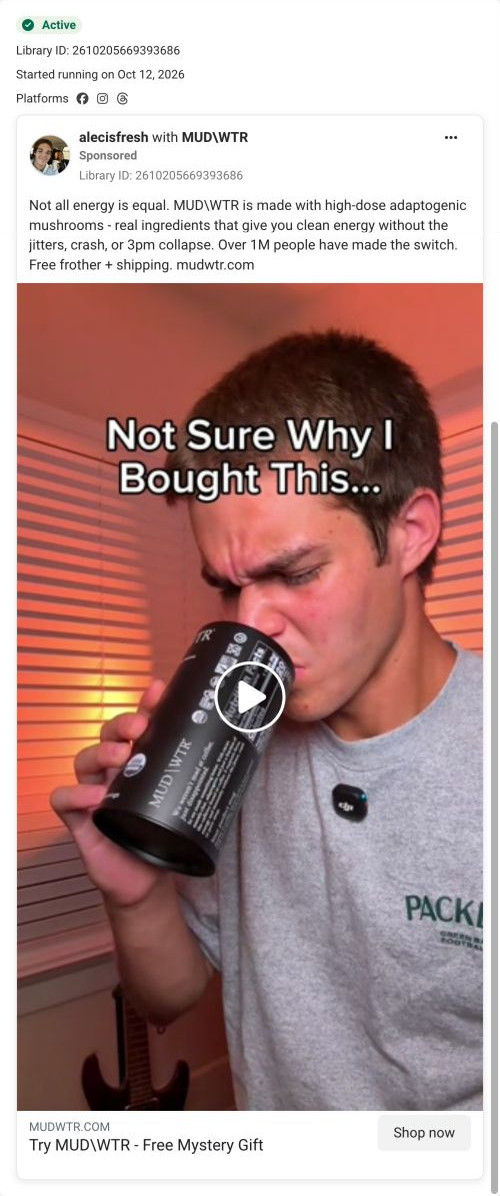
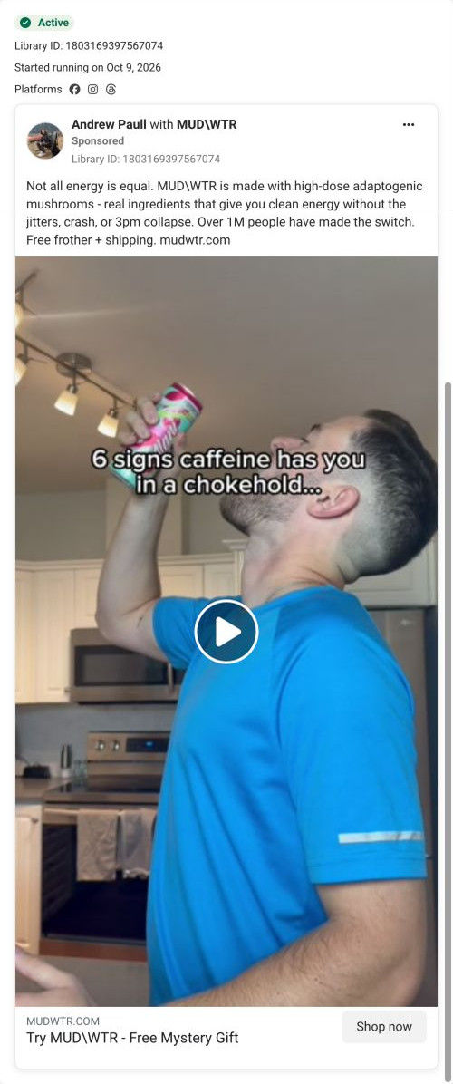
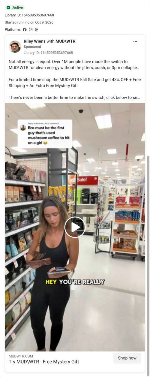
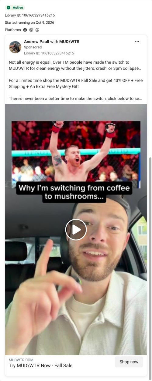
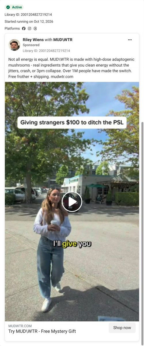
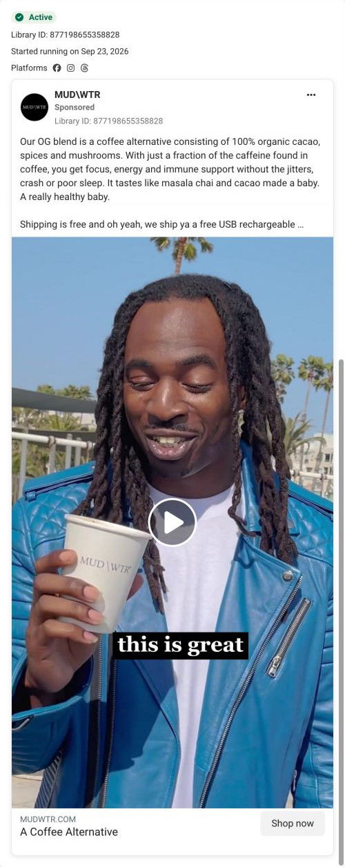
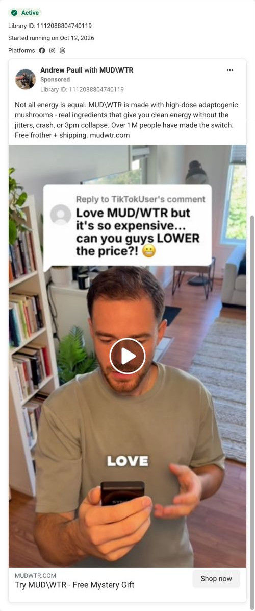
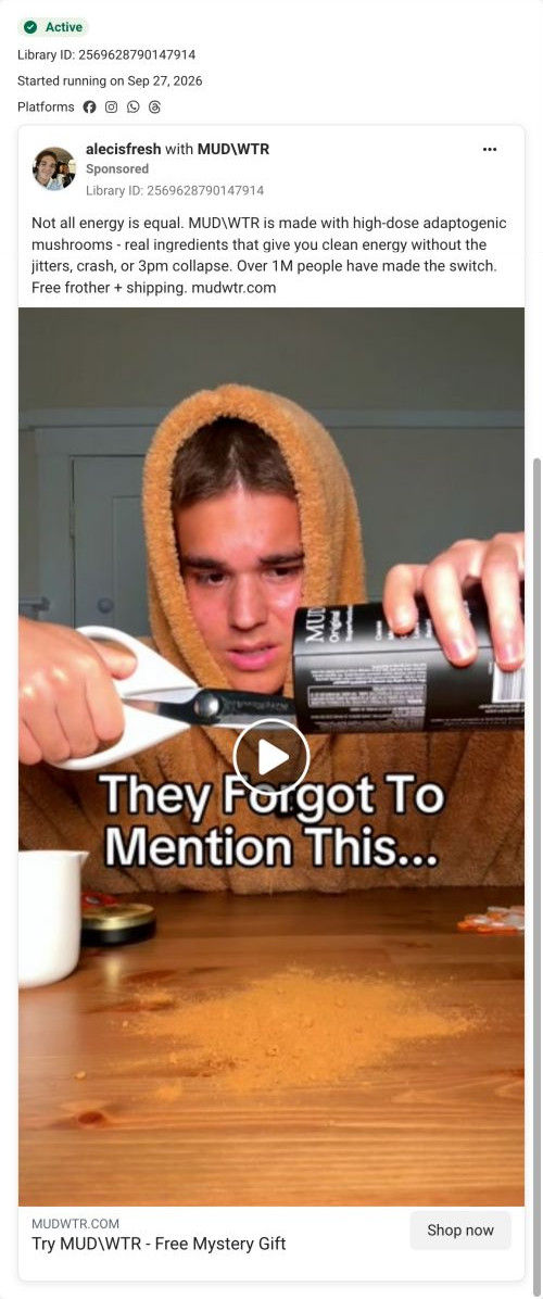
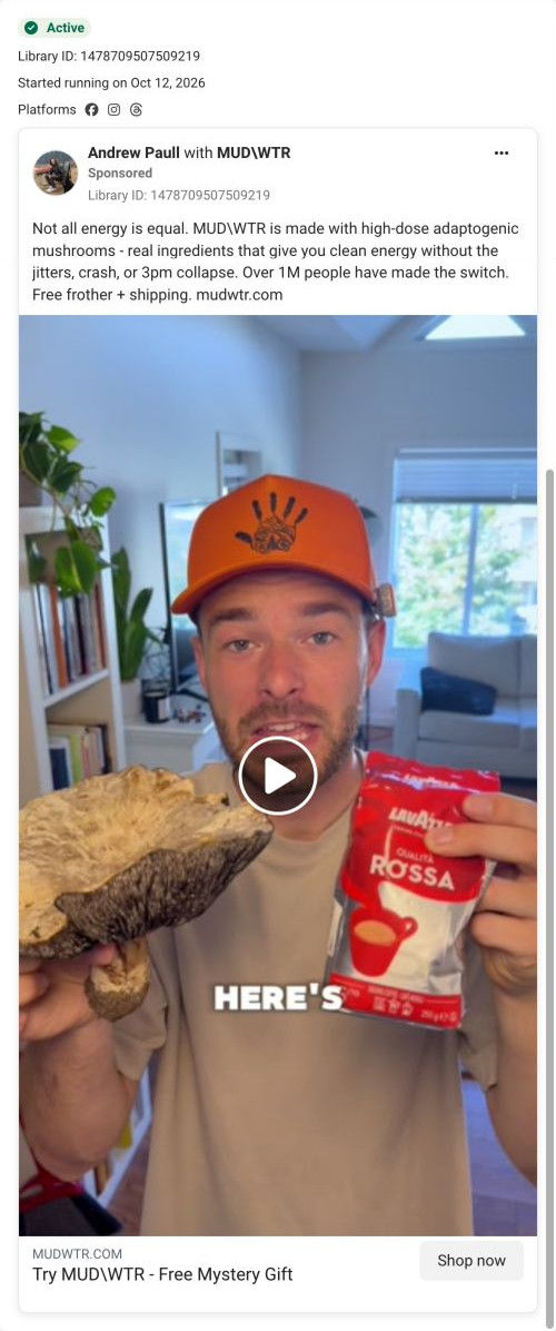
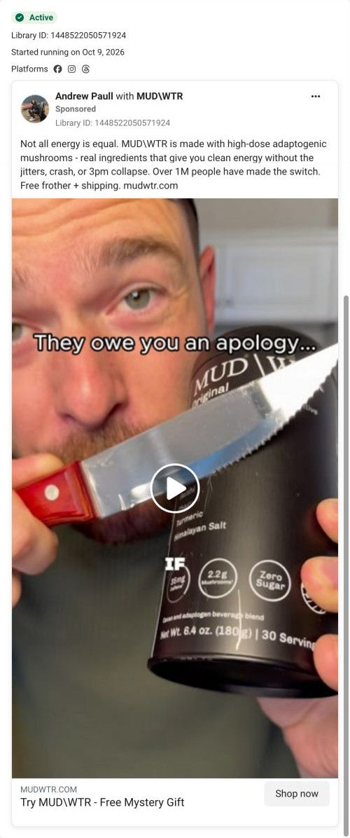
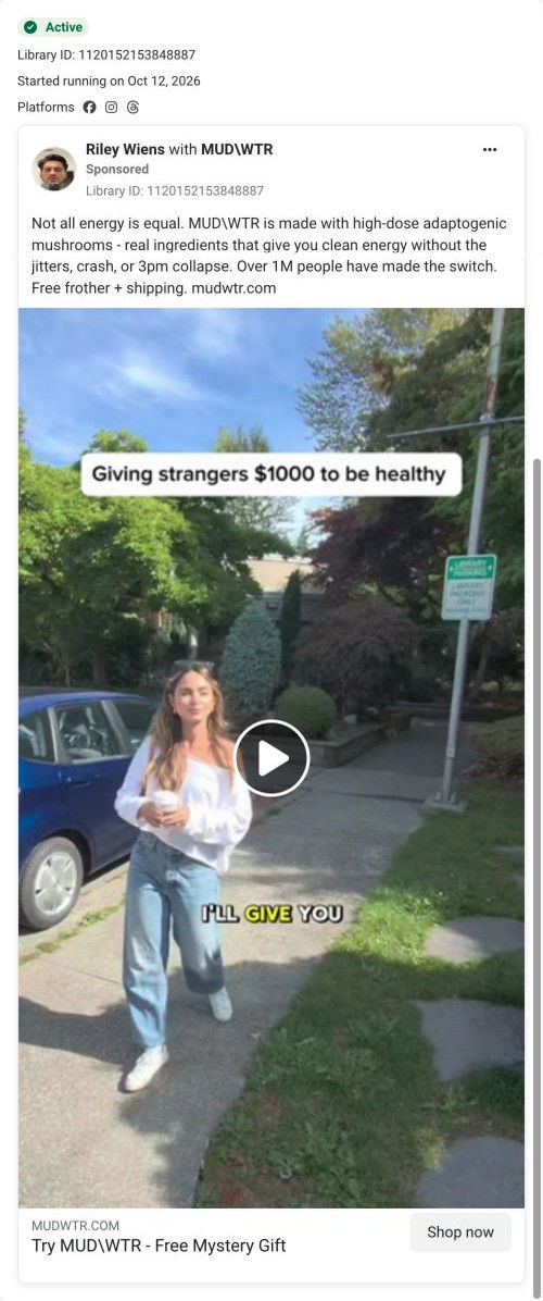
The ads that land here are mostly Andrew Paull, Riley Wiens and alecisfresh creator videos with MUDWTR's coffee-swap copy, plus a few discount statics. The creator band and carousel near the top continue that voice well, and the discount ads (43% off with a mystery gift) match the coupon exactly. The weak link is the creator ads' free frother and the occasional $20-off headline, neither of which the hero repeats, so those visitors have to scroll to the buy box to confirm their deal.
What to borrow for your brand
- Put your whole offer on one ticket-shaped coupon in the hero (the discount on one side, the gift and its value on the other) with a single button and a guarantee line under it.
- List every kit item in the buy box with a struck-through value and FREE, so the value adds up where the visitor decides.
- Use a logo-only header on paid landing pages and keep site links in the footer, so ad visitors have one path forward.
Ads that send people here
- How MUDWTR turns a fake product return into a 2pm-crash pitch
- How MUDWTR sells a coffee swap with three numbers on a tin
- How alecisfresh frames MUDWTR's fall sale as a seasonal shelf
- How MUDWTR uses a comment and a scam warning to open a creator ad
- How MUDWTR opens a creator ad with a podcast clip and a secret
- How MUDWTR uses a sugar pour to question the pumpkin spice latte
- How alecisfresh plays skeptic in a MUDWTR first-try ad
- How MUDWTR uses a signs-list hook to call out caffeine habits
- How MUDWTR turns a joking comment into a store-aisle street ad
- How MUDWTR frames a coffee switch as a creator's personal decision
- How MUDWTR turns a $100 street challenge into a coffee-swap ad
- How MUDWTR uses an outdoor first-sip reaction to sell a swap
- How MUDWTR turns a price complaint into a creator ad hook
- How alecisfresh uses a tin-cutting stunt to open a MUDWTR ad
- How MUDWTR uses a joyful street selfie to sell steady energy
- How MUDWTR stages a mushroom-versus-coffee comparison
- How MUDWTR opens an ad with a knife, a tin and an apology
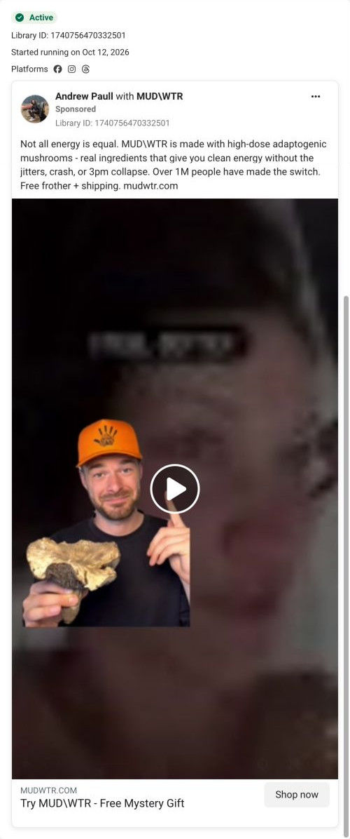
- How MUDWTR uses a mushroom prop and a cutout creator
- How MUDWTR raises the stakes in a street-challenge ad
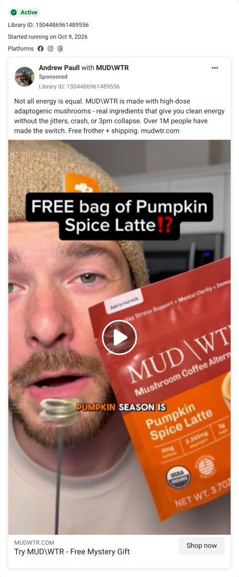
- How MUDWTR uses a free seasonal flavor as a creator ad hook
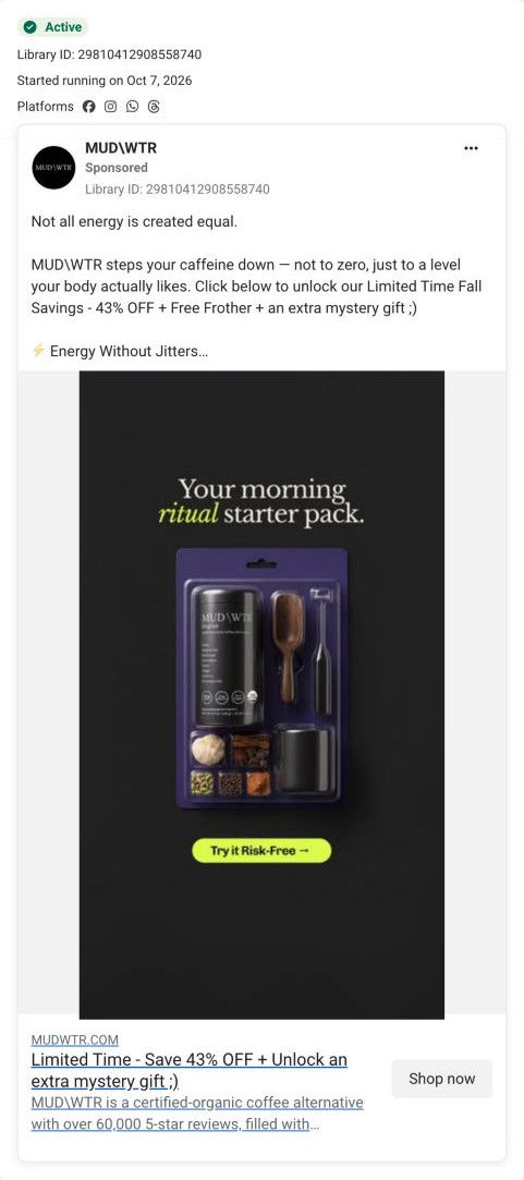
- How MUDWTR sells a starter pack as a risk-free trial
Captured from mudwtr.com in October 2026 for the Fluid Inspiration Library. Offers and prices change; this is what the page showed when we captured it.