How alecisfresh frames MUDWTR's fall sale as a seasonal shelf
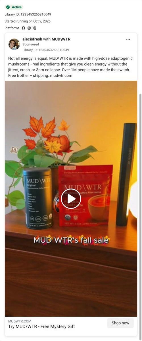
A partnership video from creator alecisfresh that opens on a shelf styled for autumn: the MUDWTR tin, a red pumpkin spice bag, a frother and a pumpkin, under the overlay “MUD WTR's fall sale.” The copy is MUDWTR's standard coffee-swap pitch with a free frother and shipping, and the ad links to the Rise starter offer page.

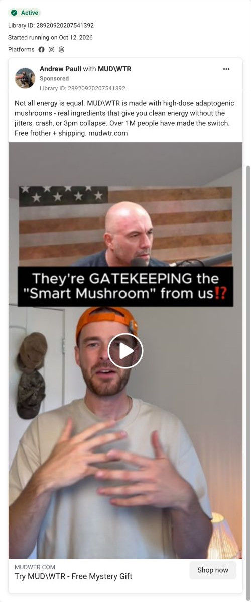
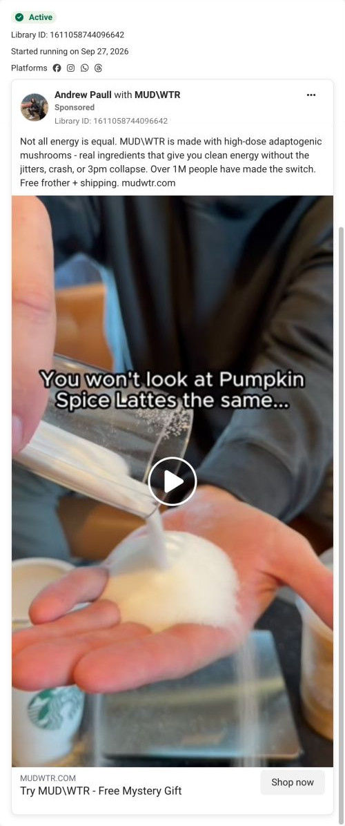
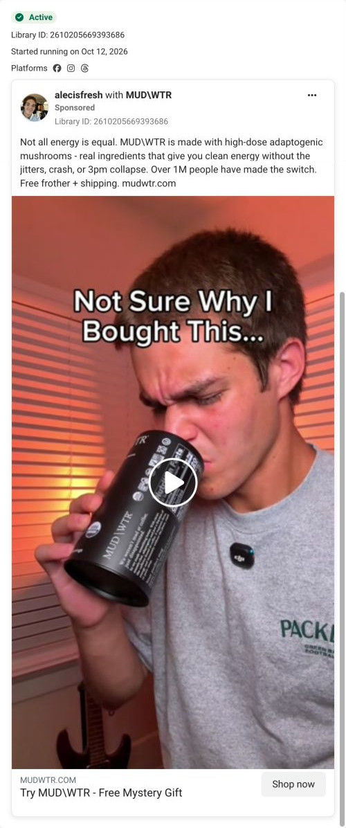
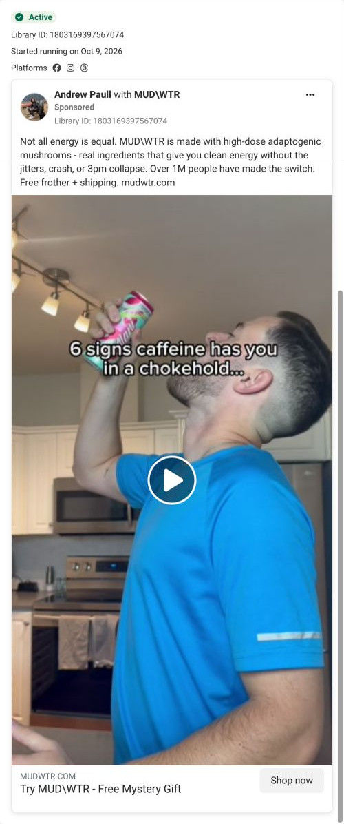
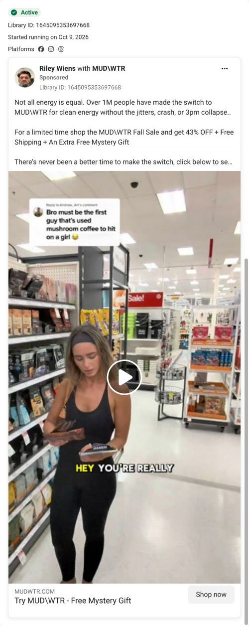
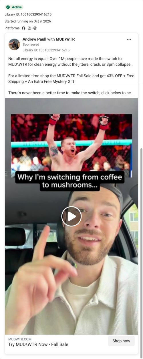
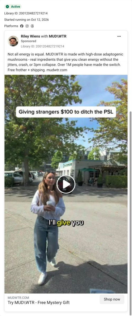
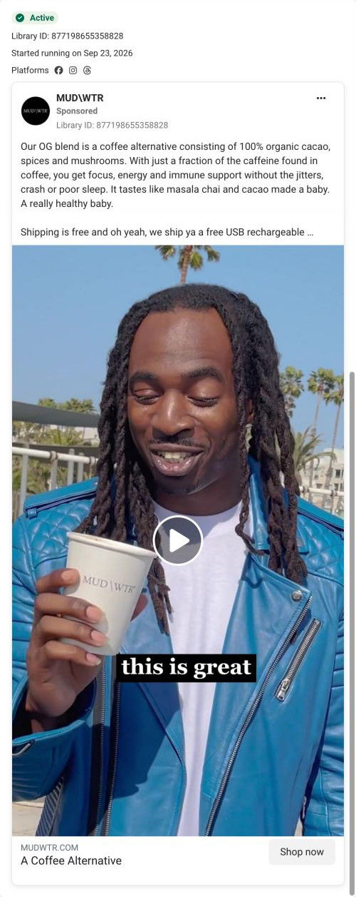
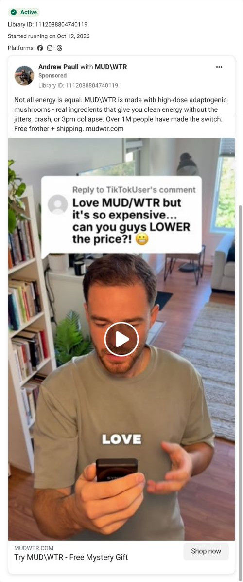
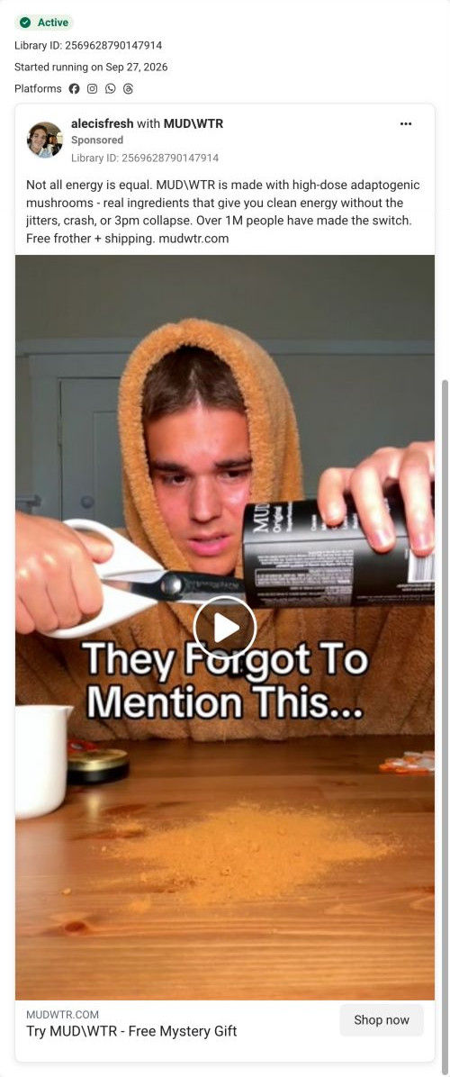
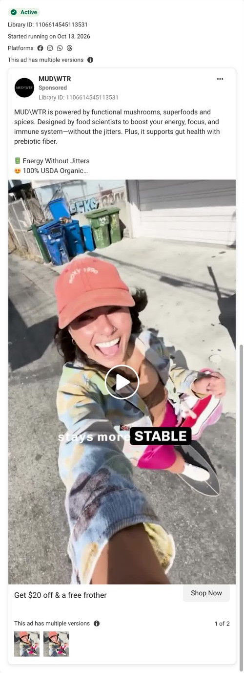
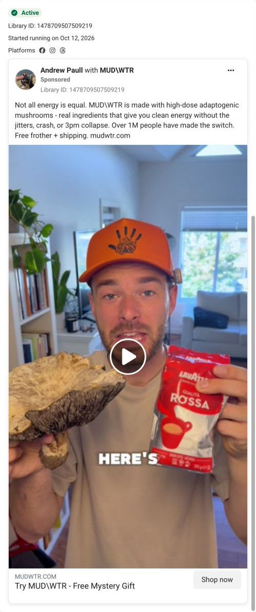
A browser shopping-extension badge appears in the upper-right margin of this capture.

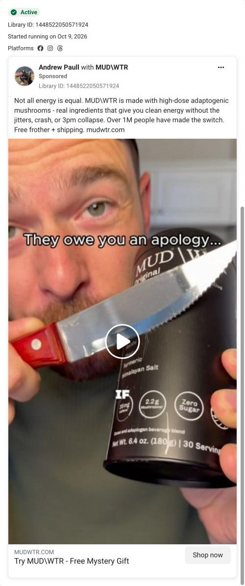
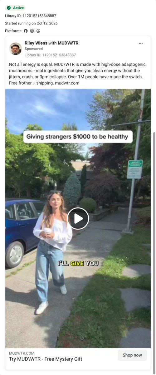
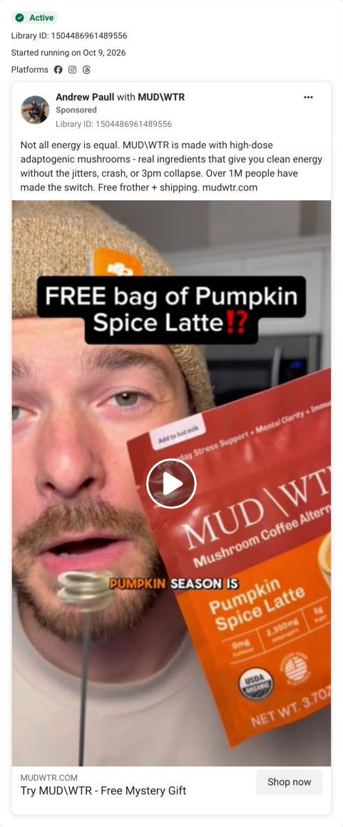
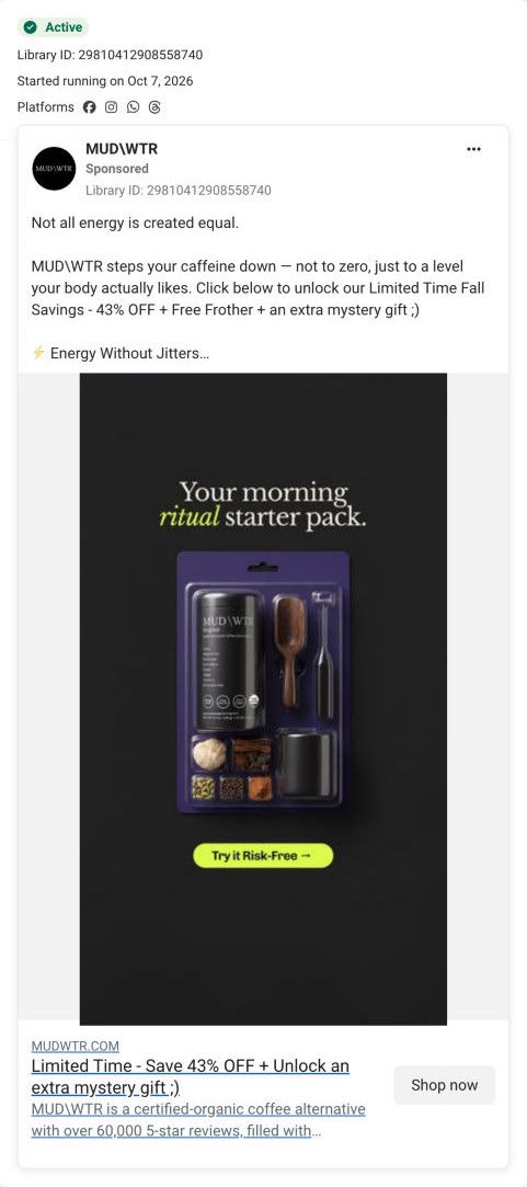
Not all energy is equal
A coffee-swap message introduces the mushroom blend, followed by free frother and shipping framing and a mystery-gift CTA. The CTA leads to the Rise 2 starter-offer route, shared by several ads in this collection. Compare the creative with the destination and explore the other ads sharing this route.
- Brand
- MUDWTR
- Observed offer
- Advertised free frother + shipping; mystery-gift CTA
- Creative angle
- Creator-led
- Page type
- Dedicated offer
- Ad format
- Video
- Listed start date
- Oct 9, 2026
- Captured
- Oct 19, 2026
- Library ID
- 1235453255810049
- Destination
- mudwtr.com
Selected for its design and offer structure. Ad performance isn’t available in this collection.
What this ad does well
The opening frame looks like a creator's seasonal post rather than an ad, which suits a partnership placement. Leaves, a pumpkin and warm light put the product in a moment people already associate with buying something new for fall, and the red pumpkin spice bag next to the black tin shows there's a seasonal flavor without a word of copy. Saying “fall sale” in the first second tells the viewer there's a deal before they decide whether to watch.
What's missing
The hook announces a sale but doesn't say what the sale is, and the copy underneath never mentions it either: it offers a free frother and shipping, while the landing page leads with 43% off. That leaves the viewer with three different ideas of the deal. If you run a seasonal sale ad, put the actual number in the overlay or the headline, and make the copy, the link headline and the page hero name the same offer.
Beat by beat
- 0-3sA fall-styled shelf shows the MUDWTR tin, a pumpkin spice bag and a frother, with a fall sale overlay.
It sets a seasonal buying moment and signals a deal before the viewer commits to watching.
- CopyThe primary text says not all energy is equal, claims mushroom energy without the jitters or 3pm collapse, cites over 1M switchers and offers a free frother and shipping.
It supplies the reasons to switch that the seasonal visual leaves out.
- HeadlineThe link card offers a free mystery gift with a Shop now button.
It gives the click its own incentive, separate from the sale.
The offer
The overlay promises a fall sale, the copy offers a free frother and shipping, and the link headline adds a free mystery gift. No percentage appears in the ad.
Where it sends people
It sends people to the Rise starter offer, a focused landing page with a logo-only header and no navigation, and one of 21 ads in the Fluid library that land there. The hero leads with a ticket-shaped coupon (43% off your first starter kit on one side, a mystery gift worth $25 on the other), a “Redeem My Mystery Gift” button and a 30-day money-back guarantee line. Further down, the buy box lists each free item with a struck-through value and FREE, so the kit's value adds up right where people decide. The 43% coupon finally gives the fall sale a number, which is good news for the visitor but arrives later than it should; putting that same number in the ad's overlay would make the page feel like a confirmation.
The page it sends people to: How MUDWTR's starter offer page leads with a mystery-gift coupon
MUDWTR's Rise starter offer, a dark, logo-only landing page built around a ticket-shaped coupon: 43% off a first starter kit plus a mystery gift. Creator quotes, topic-tabbed reviews and an itemized buy box follow. It's the destination for 21 ads in the Fluid library, mostly creator-led coffee-swap videos plus discount statics.
How the page is built
- 01Hero with ticket coupon
A top-down mug photo sits beside a star rating with review and member counts, the coupon, a redeem button, a guarantee line and four icon benefits, answering what the deal is and whether it's safe to try.
- 02Creator quote band
One centered creator testimonial with avatar, name and role carries over the creator voice from the ads.
- 03Benefit ticker
A scrolling marquee of two-word benefit phrases restates the claimed benefits for skimmers.
- 04Product intro
A pack shot with ingredients and an organic seal sits next to flavor and feeling blocks and a nine-item spec list, answering what it tastes like and what's in it.
- 05Creator carousel
Practitioners and athletes appear with large quotes and portraits, answering who else drinks it.
- 06Review tabs
Pill tabs for taste, benefits, caffeine and focus filter review cards, so each visitor can find reviews about their own worry.
- 07Starter kit buy box
A Discount Applied pill, struck-through and sale price, benefit tags, a Get Started button, a pay-later line and a mystery-gift card answer what it costs and how to pay.
- 08What's included and accordions
Each kit item is listed with its struck-through value and FREE, ending with the auto-refill terms, followed by a creator quote and accordions for benefits, subscription perks and nutrition facts.
- 09Ingredient grid
Photo cards give each ingredient a category tag and one line, answering what each one is there for.
- 10Comparison table
The product column is raised and outlined against two unnamed competitors across four rows, answering why this one over the alternatives.
- 11Product grid and FAQ
Tagged product cards and a long accordion FAQ handle range questions and remaining objections.
- 12Brand story, retail, press and footer
Founding story, an app perk and giveback rows lead into retailer logos with a store locator, journal cards, social photos, press logos, a newsletter and a disclaimer with study references.
The first fixes we would make
- Most of the ads that land here promise a free frother, and the hero never mentions it; it only appears in the buy box's itemized list. Add the frother to the coupon or a line under it so the ad's promise is confirmed on the first screen.
- Some ads that land here offer $20 off, while the coupon says 43%. Either send those ads elsewhere or rewrite them around 43%, so no visitor arrives to a different number than the one they clicked for.
Read the full breakdown of this page
Three hooks you could test
- Show a specific moment of use. “First cold morning of the year, and this is what's in my mug.”
- Make the product the whole scene. “My whole fall setup, and the one thing on this shelf I'd restock.”
- Sell the outcome. “Fall mornings that feel cozy and still get you out the door.”
What to borrow for your brand
- Style the opening shot for the season you're selling into, so the ad looks like a creator's seasonal post and the deal feels timely.
- Show a limited flavor next to your core product in the first frame, so viewers see what's new without needing a caption.
- When the hook says sale, put the actual number in the same overlay so viewers don't need the landing page to learn the deal.
One of 34 MUDWTR ads in the Fluid Inspiration Library, captured from the Meta Ad Library on Oct 19, 2026. We record that an ad ran publicly, not how it performed.