
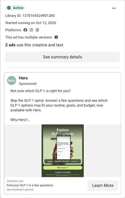
Not sure which GLP-1 is right for you? Skip the GLP-1 spiral. Answer a few questions and see which GLP-1 options may fit your routine, goals, and budget, now available with Hers. Why Hers? ✅ Wegovy®, Zepbound®, and Foundayo™ available ✅ Pills and pens, first month $39* ✅ 100% online, licensed provider support Quiz results aren't a prescription. A separate provider consultation is required. Take the quiz today. *$39 first month, then $149/mo. Cost of medication not included. An active Hers Weight Loss Membership is required ($39 for the first month, auto-renews at $149/month thereafter). Membership is billed separately and does not include or guarantee a prescription. Medication is not available without a membership. Not available in all 50 states. Prescription required. Wegovy® is a registered trademark of Novo Nordisk A/S. Zepbound® and Foundayo™ are trademarks of Eli Lilly and Company. Hims & Hers is not affiliated with, endorsed by, or sponsored by these companies. Weight Loss by Hers is a holistic program that includes nutrition support, technological tools, and medications prescribed based on what a licensed provider determines is medically appropriate and necessary for you. See website for full details, important safety information, and restrictions.
How Hers pairs GLP-1 products with a lifestyle photo in one ad
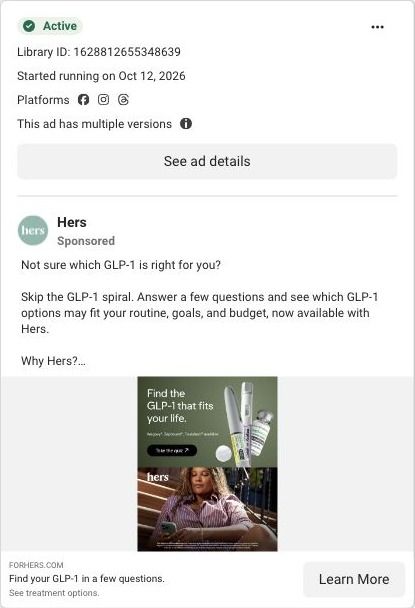
A Hers split static image ad: the top half shows a pen, a vial and a pill under "Find the GLP-1 that fits your life" with a "Take the quiz" button, and the bottom half shows a woman sitting outdoors. The copy lists a $39 first month. It links to a GLP-1 matching quiz page.
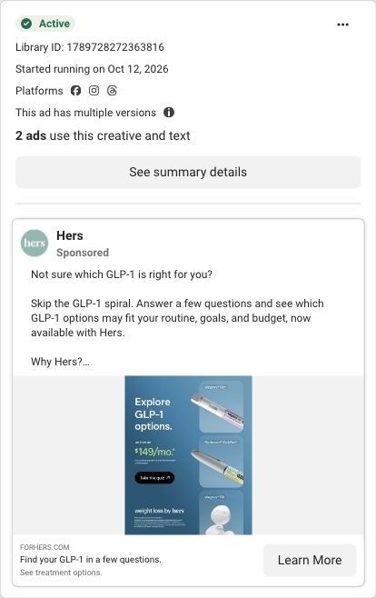
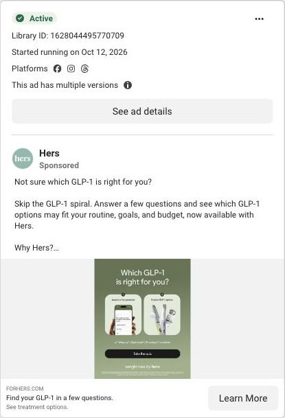
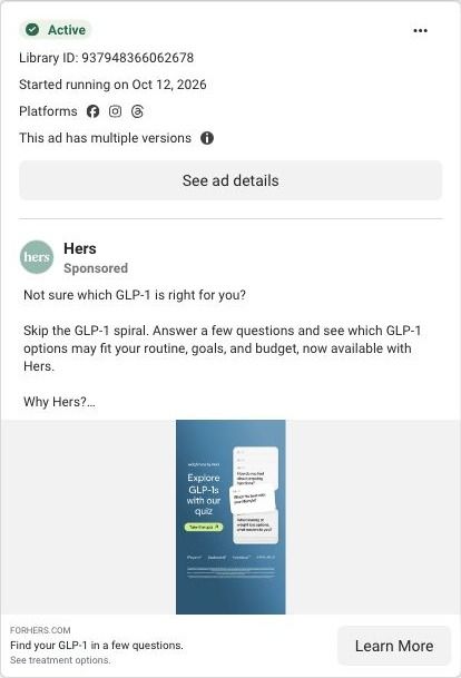
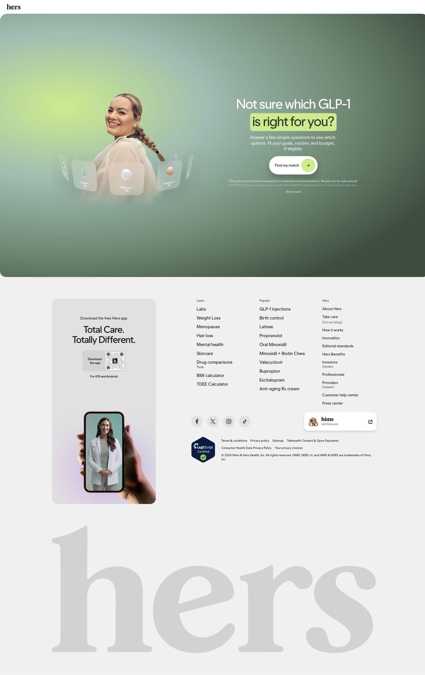
Public destination captured October 22, 2026. The reference retains the page layout and loaded imagery; shopping-extension UI is removed. Offers may change. No health answers were supplied.
Find your GLP-1 in a few questions.
Visual reference: Find the GLP-1 that fits your life. A single Find my match call to action opens a seven-step matching quiz in a modal. The captured next screen asks about injection preference; no answers or quiz result were supplied. Compare the creative with the destination and explore the other ads sharing this route.
- Brand
- Hers
- Observed offer
- GLP-1 matching quiz; membership and medication terms shown separately
- Creative angle
- Product choice
- Page type
- Quiz entry
- Ad format
- Image
- Listed start date
- Oct 12, 2026
- Captured
- Oct 22, 2026
- Library ID
- 1628812655348639
- Destination
- forhers.com
Selected for its design and offer structure. Ad performance isn’t available in this collection.
What this ad does well
"Fits your life" moves the decision away from the clinical (which drug) toward the personal (which routine), and the split layout backs that up: products on top, a relaxed woman in an everyday setting below. Showing a pen, a vial and a pill together makes the range of formats clear, which is the real reason a matching quiz exists. It reads as a lifestyle ad without losing the product.
What's missing
"Fits your life" is a broad promise, and the image never says what about her life it fits (her schedule, her comfort with injections, her budget). The copy names routine, goals and budget, but the image doesn't. If you make one like this, give the photo a caption that names one specific fit, like a once-daily pill for someone who doesn't want injections, so the lifestyle half is doing explaining, not just setting a mood.
Beat by beat
- ImageTop: a pen, a vial and a pill on green under the headline with a "Take the quiz" button. Bottom: a woman sitting outdoors with the hers logo.
It pairs the product range with a person, so the choice feels personal rather than clinical.
- Headline"Find the GLP-1 that fits your life" on the image, with "Find your GLP-1 in a few questions." as the ad headline.
It frames the decision around the viewer's routine.
- CopyOptions that may fit your routine, goals and budget, the brand list, a $39 first month and membership fine print.
It spells out what "fits" means and what it costs to start.
The offer
The offer is the quiz itself; the copy lists pills and pens with a $39 first month, then explains in fine print that this is a membership that renews at $149/month, that medication costs extra and that a separate provider consultation is required. The copy is upfront that quiz results aren't a prescription.
Where it sends people
The click lands on a GLP-1 matching quiz page, one of 6 ads in the Fluid library that point there, which is the quiz rung of the landing-page ladder in its purest form. The hero headline repeats the ad copy word for word, "Not sure which GLP-1 is right for you?", over a smiling model surrounded by product tiles (Wegovy Pen, Wegovy Pill, Foundayo Pill), with a line about seeing which options fit your goals, routine and budget, if eligible, a single "Find my match" button that opens a multi-step quiz in a modal, and a disclaimer that the quiz isn't a clinical assessment. Below the hero the page goes straight to the footer. The page's subline about fitting your goals, routine and budget picks up this ad's "fits your life" promise directly, and the smiling model in the hero continues the lifestyle half of the image.
The page it sends people to: How Hers sends GLP-1 shoppers into a matching quiz with one button
Hers's GLP-1 matching page is a single hero asking which GLP-1 is right for the visitor, a short subline about goals, routine and budget, and one Find my match button that opens a seven-step quiz in a modal. The rest is footer. 6 ads in the Fluid library send people here, all product-choice ads.
How the page is built
- 01Header
A logo-only header keeps the page free of navigation, so the quiz is the only path.
- 02Hero
A portrait surrounded by floating product cards sits beside the headline, a subline naming goals, routine and budget, and a Find my match button, answering "which option fits me?" with a quiz.
- 03Quiz disclaimer
Small print with a Show more link says the quiz is educational and not medical advice, answering "is this a diagnosis?" before anyone starts.
- 04Quiz modal
Find my match opens a seven-step quiz whose captured next screen asks about injection preference, so the matching begins with a practical choice.
- 05Footer
An app-download card, link columns for conditions and treatments, social icons, a sister-brand card, a certification badge and a giant wordmark close the page.
The first fixes we would make
- The button doesn't say how long the quiz is or what you get at the end. Add a short line next to Find my match that names the seven questions and what the result screen shows (the options that fit, and that a licensed provider makes the final call), so the commitment is clear before the modal opens.
- There's nothing below the hero for someone who isn't ready to tap, like a price range, the membership or a member story. Add one short strip under the hero with the "from" monthly prices for the options shown and a line on what the membership includes, so a cautious visitor can get their answer and still come back to the quiz.
Read the full breakdown of this page
Three hooks you could test
- Sell the outcome. “Find the option that fits your week, not the other way around.”
- Make the product the whole scene. “Pill, pen or vial? Here's how to choose.”
- Show a specific moment of use. “Can't do a weekly shot with your schedule? There's a pill for that conversation.”
What to borrow for your brand
- Split one static into product and person, so the viewer sees both what it is and who it's for.
- Frame a confusing choice around the customer's routine ("fits your life") and then name one specific way it fits.
- Show every format side by side when the point of your funnel is getting people to choose between them.
One of 125 Hers ads in the Fluid Inspiration Library, captured from the Meta Ad Library on Oct 22, 2026. We record that an ad ran publicly, not how it performed.