
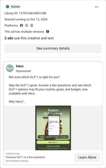
Not sure which GLP-1 is right for you? Skip the GLP-1 spiral. Answer a few questions and see which GLP-1 options may fit your routine, goals, and budget, now available with Hers. Why Hers? ✅ Wegovy®, Zepbound®, and Foundayo™ available ✅ Pills and pens, first month $39* ✅ 100% online, licensed provider support Quiz results aren't a prescription. A separate provider consultation is required. Take the quiz today. *$39 first month, then $149/mo. Cost of medication not included. An active Hers Weight Loss Membership is required ($39 for the first month, auto-renews at $149/month thereafter). Membership is billed separately and does not include or guarantee a prescription. Medication is not available without a membership. Not available in all 50 states. Prescription required. Wegovy® is a registered trademark of Novo Nordisk A/S. Zepbound® and Foundayo™ are trademarks of Eli Lilly and Company. Hims & Hers is not affiliated with, endorsed by, or sponsored by these companies. Weight Loss by Hers is a holistic program that includes nutrition support, technological tools, and medications prescribed based on what a licensed provider determines is medically appropriate and necessary for you. See website for full details, important safety information, and restrictions.
How Hers previews its GLP-1 quiz questions inside the ad
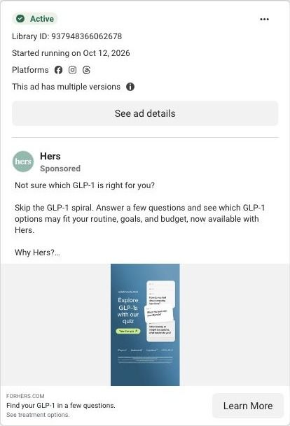
A Hers static image ad on blue with the headline "Explore GLP-1s with our quiz" and a "Take the quiz" button on the left, and a stack of sample quiz question cards on the right. Product names run along the bottom above fine print. The copy lists a $39 first month. It links to a GLP-1 matching quiz page.
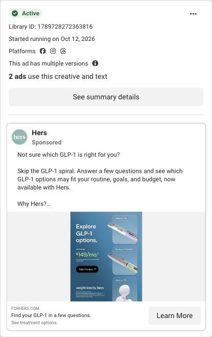
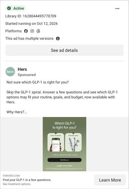
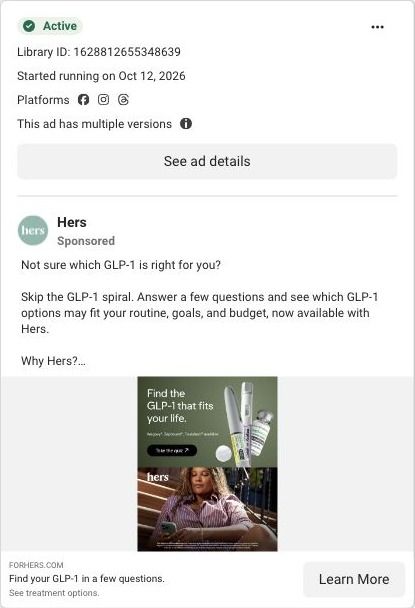
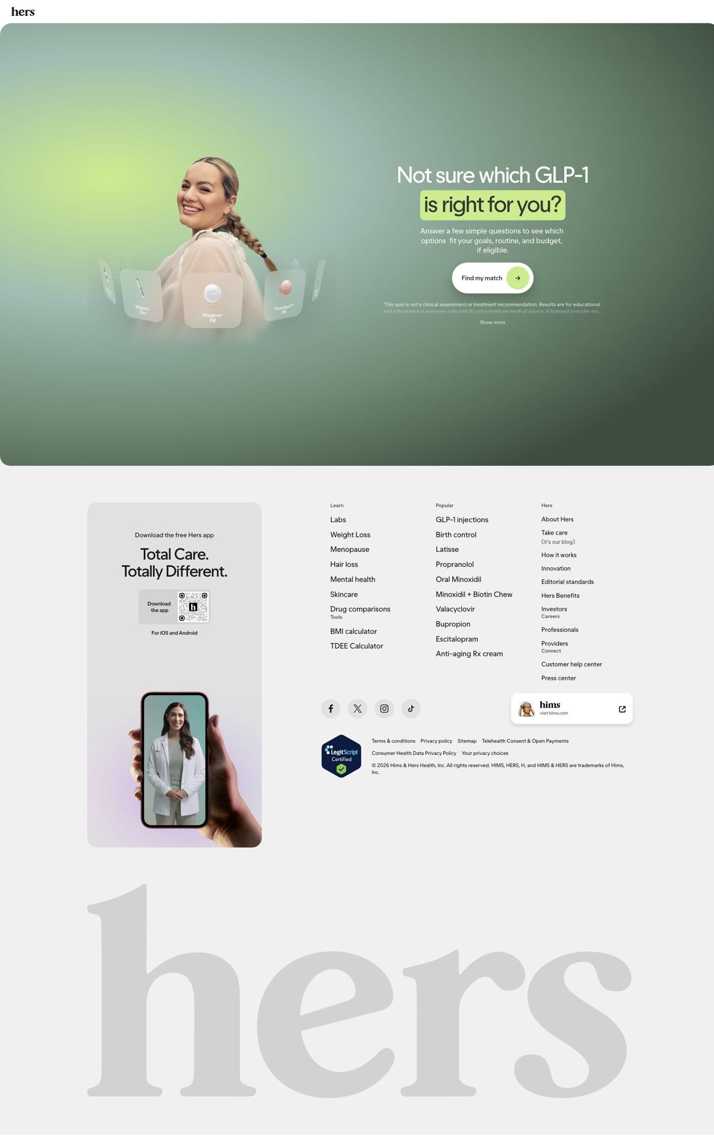
Public destination captured October 22, 2026. The reference retains the page layout and loaded imagery; shopping-extension UI is removed. Offers may change. No health answers were supplied.
Find your GLP-1 in a few questions.
Visual reference: Explore with our quiz. A single Find my match call to action opens a seven-step matching quiz in a modal. The captured next screen asks about injection preference; no answers or quiz result were supplied. Compare the creative with the destination and explore the other ads sharing this route.
- Brand
- Hers
- Observed offer
- GLP-1 matching quiz; membership and medication terms shown separately
- Creative angle
- Product choice
- Page type
- Quiz entry
- Ad format
- Image
- Listed start date
- Oct 12, 2026
- Captured
- Oct 22, 2026
- Library ID
- 937948366062678
- Destination
- forhers.com
Selected for its design and offer structure. Ad performance isn’t available in this collection.
What this ad does well
Showing the questions themselves is the smartest part of this ad. The stacked cards let the viewer see that the quiz is short and conversational before she commits, which takes the mystery out of the click. It's the same move good quiz funnels make on the page, pulled forward into the creative.
What's missing
The question cards are too small to read at feed size, so the preview only reads as "there are questions" rather than showing which ones. The headline also leads with the tool ("our quiz") instead of the viewer's confusion. If you make one like this, enlarge one question so it's readable (a format preference, say pill or pen). Then lead with the problem in her words, like the copy's "Not sure which GLP-1 is right for you?"
Beat by beat
- ImageA stack of sample quiz question cards beside a "Take the quiz" button, with product names along the bottom.
It previews what the quiz feels like so the click seems quick and low-risk.
- Headline"Explore GLP-1s with our quiz" on the image, with "Find your GLP-1 in a few questions." as the ad headline.
It tells the viewer what the tool is and that it's short.
- Copy"Not sure which GLP-1 is right for you?" with the brand list, a $39 first month and membership fine print.
It names the confusion the quiz is built to resolve.
The offer
The offer is the quiz itself; the copy lists pills and pens with a $39 first month, then explains in fine print that this is a membership that renews at $149/month, that medication costs extra and that a separate provider consultation is required. The copy is upfront that quiz results aren't a prescription.
Where it sends people
The click lands on a GLP-1 matching quiz page, one of 6 ads in the Fluid library that point there, which is the quiz rung of the landing-page ladder in its purest form. The hero headline repeats the ad copy word for word, "Not sure which GLP-1 is right for you?", over a smiling model surrounded by product tiles (Wegovy Pen, Wegovy Pill, Foundayo Pill), with a line about seeing which options fit your goals, routine and budget, if eligible, a single "Find my match" button that opens a multi-step quiz in a modal, and a disclaimer that the quiz isn't a clinical assessment. Below the hero the page goes straight to the footer. The captured next screen of the quiz asks about injection preference, which is exactly the kind of question this ad previews, so the visitor finds what the cards promised.
The page it sends people to: How Hers sends GLP-1 shoppers into a matching quiz with one button
Hers's GLP-1 matching page is a single hero asking which GLP-1 is right for the visitor, a short subline about goals, routine and budget, and one Find my match button that opens a seven-step quiz in a modal. The rest is footer. 6 ads in the Fluid library send people here, all product-choice ads.
How the page is built
- 01Header
A logo-only header keeps the page free of navigation, so the quiz is the only path.
- 02Hero
A portrait surrounded by floating product cards sits beside the headline, a subline naming goals, routine and budget, and a Find my match button, answering "which option fits me?" with a quiz.
- 03Quiz disclaimer
Small print with a Show more link says the quiz is educational and not medical advice, answering "is this a diagnosis?" before anyone starts.
- 04Quiz modal
Find my match opens a seven-step quiz whose captured next screen asks about injection preference, so the matching begins with a practical choice.
- 05Footer
An app-download card, link columns for conditions and treatments, social icons, a sister-brand card, a certification badge and a giant wordmark close the page.
The first fixes we would make
- The button doesn't say how long the quiz is or what you get at the end. Add a short line next to Find my match that names the seven questions and what the result screen shows (the options that fit, and that a licensed provider makes the final call), so the commitment is clear before the modal opens.
- There's nothing below the hero for someone who isn't ready to tap, like a price range, the membership or a member story. Add one short strip under the hero with the "from" monthly prices for the options shown and a line on what the membership includes, so a cautious visitor can get their answer and still come back to the quiz.
Read the full breakdown of this page
Three hooks you could test
- Show a specific moment of use. “Pill or pen? That's the first question, and it's easy.”
- Lead with the uncomfortable problem. “Overwhelmed by all the options? We'll narrow it down.”
- Make the product the whole scene. “Here's every question we'll ask you. That's it.”
What to borrow for your brand
- Put a real quiz question in the ad, large enough to read, so the viewer knows what she's agreeing to.
- Make sure the first question on the page matches the one previewed in the ad.
- Lead with the viewer's confusion in the headline and present the quiz as the answer.
One of 125 Hers ads in the Fluid Inspiration Library, captured from the Meta Ad Library on Oct 22, 2026. We record that an ad ran publicly, not how it performed.