How AG1 sent a broad Stronger mornings ad to a GLP-1 page
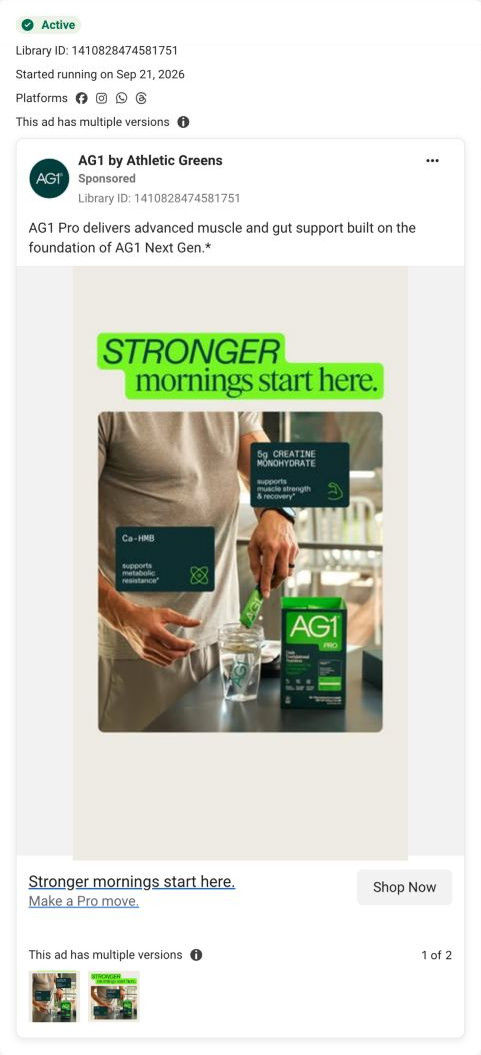
A static image ad for AG1 Pro that ran on Meta from Sep 21, 2026. A man pours a stick pack into a shaker beside the Pro box, with callouts for 5g creatine and Ca-HMB under the headline Stronger mornings start here. The copy is one line on muscle and gut support, but the link opens a GLP-1 page.

A browser shopping-extension badge appears in the upper-right margin of this capture.
A broad hook, a specific audience page
The ad says “Stronger mornings.” Its link opens a page explicitly built for GLP-1 users, a narrower audience than the visible ad copy. Compare the creative with the destination and explore the other ads sharing this route.
- Brand
- AG1
- Observed offer
- AG1 Pro · $99 monthly subscription + free Pro Shaker
- Creative angle
- Audience offer
- Page type
- Dedicated offer
- Ad format
- Image
- Listed start date
- Sep 21, 2026
- Captured
- Oct 19, 2026
- Library ID
- 1410828474581751
- Destination
- try.drinkag1.com
Selected for its design and offer structure. Ad performance isn’t available in this collection.
What this ad does well
The image shows the daily routine in one gesture: a man in a grey tee pours an AG1 Pro stick pack into a shaker at a counter, with the box beside it. Two dark callout cards put the lead additions on the image with doses and the claim the ad makes for each (5g creatine monohydrate for muscle strength and recovery, Ca-HMB for metabolic resistance). The neon headline, with STRONGER in heavy italic, is a positive promise anyone can picture. The landing page reuses this exact creative as its hero image, so the click looks continuous.
What's missing
The ad is broad and the page is narrow. Stronger mornings speaks to anyone, while the page beside the reused image names GLP-1 users, so most people who tap land on a page written for someone else, and the GLP-1 users the page is for get no signal that this ad is meant for them. The ad also leaves out the page's offer ($99 a month with a free Pro shaker). If you make one like this, either name the audience in the ad (the way AG1's GLP-1 creator video does) or send the broad version to a general Pro page, and put the offer in the link headline.
Beat by beat
- HeadlineSTRONGER in heavy italic on a green tab, then mornings start here. in serif.
A broad benefit line that doesn't narrow the audience.
- ImageA man in a grey tee pours an AG1 Pro stick pack into a shaker at a counter, with the Pro box beside it.
It shows the daily routine in a single gesture.
- ImageTwo dark callout cards: 5g creatine monohydrate, which the ad says supports muscle strength and recovery, and Ca-HMB, which it says supports metabolic resistance.
It puts the two lead additions on the image with doses and claims.
- CopyOne line saying AG1 Pro delivers advanced muscle and gut support built on the foundation of AG1 Next Gen.
It positions Pro as an upgrade to a product people already know.
- CTAStronger mornings start here., with Make a Pro move. and Shop Now.
It repeats the headline and the campaign line at the click.
Where it sends people
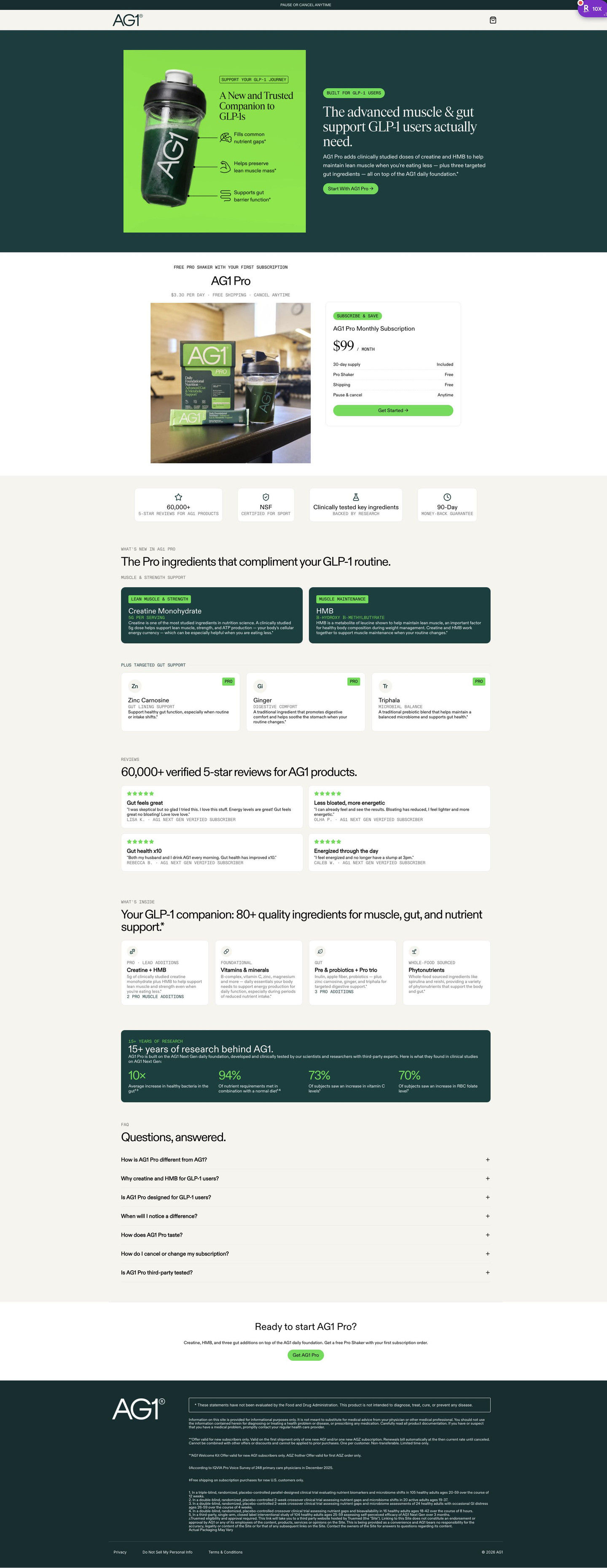
The ad goes to a focused offer page with navigation stripped to logo and cart, the persona's “better” rung, and it reuses this ad's creative as the hero image. But the headline beside that image names GLP-1 users and their need, a much narrower audience than the ad's morning promise. The rest of the page is built for that reader: a single subscription card itemizing the free gift, shipping and cancel terms as receipt rows, lead-ingredient cards, reviews, research stats and an audience-specific FAQ. It's the only ad in the Fluid library that points to this page.
The page it sends people to: How AG1 reuses its ad creative as the hero of a Pro lander
AG1's Pro gut and muscle page is an audience-specific offer with stripped navigation. The ad creative reappears as the hero image, a single subscription card follows, then new ingredients, reviews, what's inside, research stats and an audience FAQ. One audience-offer image ad in the Fluid library sends people here.
How the page is built
- 01Announcement bar and header
One line on pausing or cancelling above a logo-and-cart header, answering am I locked in.
- 02Hero
The ad creative as the hero image beside an audience tag, a headline naming the audience's need and a CTA, answering is this the thing I clicked.
- 03Offer block
A free-gift eyebrow, a per-day price line and one plan card with receipt rows answer what do I get and what does it cost.
- 04Trust tiles
Review count, sport certification, tested ingredients and a money-back guarantee answer can I trust it.
- 05New ingredients
Two large dark cards for the lead additions and three smaller cards for gut support answer what's added for me.
- 06Reviews
A verified count and a two-by-two grid of short reviews answer what do other people think.
- 07What's inside
Four category cards note how many additions are new.
- 08Research stats
Four stat figures with captions on a dark panel answer is there evidence for the claims.
- 09FAQ
Accordions on the difference from the base product, suitability, timing, taste, cancelling and testing.
- 10Closing CTA and footer
A headline restating the additions and the free gift, then disclaimers and numbered study footnotes.
The first fixes we would make
- The research stats sit near the bottom, well after the offer block. Move one or two of those figures into the hero or beside the plan card, so the gut and muscle claims have support where the visitor decides.
- There's no cost comparison against buying gut and muscle supplements separately, though AG1 uses that table on other Pro pages. Add it after the new-ingredient cards to show what the one subscription replaces.
Read the full breakdown of this page
Three hooks you could test
- Sell the outcome. “Wake up and still have the strength you had last year.”
- Show a specific moment of use. “Poured before the kettle finished, done before the first email.”
- Lead with the uncomfortable problem. “Eating less and feeling weaker by the week?”
What to borrow for your brand
- Reuse your ad image as the landing-page hero so the click feels like the same piece.
- Put your two lead ingredients on the creative as callout cards with the dose and the claim.
- Make sure the audience your ad speaks to is the audience your page is written for, or run separate versions for each.
One of 65 AG1 ads in the Fluid Inspiration Library, captured from the Meta Ad Library on Oct 19, 2026. We record that an ad ran publicly, not how it performed.