

Em Miller with AG1 by Athletic GreensSponsored
Esc
How AG1 sold Pro's creatine with a creator selfie in a parked car
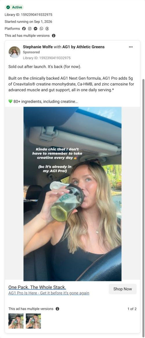
A static creator post from Stephanie Wolfe, run with AG1 by Athletic Greens, showing her drinking AG1 Pro from a shaker in the driver's seat. The angle is convenience: creatine is already in her daily drink. The copy frames Pro as back in stock after selling out, and Shop Now goes to AG1's Pro performance page.
AG1
9 creatives lead here1 / 9
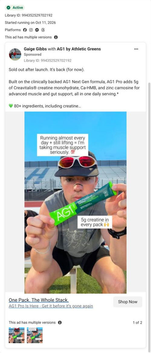
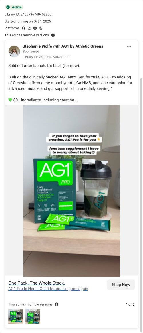
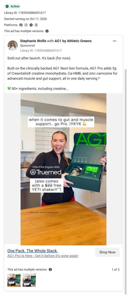
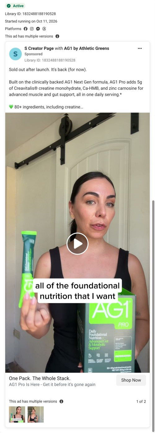
AG1 Pro for high performers
A browser shopping-extension badge appears in the upper-right margin of this capture.
One Pack. The Whole Stack.
A back-in-stock message introduces the ingredient stack and the muscle and gut benefits advertised for AG1 Pro. The CTA goes to the dedicated Pro performance route. Compare the creative with the destination and explore the other ads sharing this route.
- Brand
- AG1
- Observed offer
- AG1 Pro — advertised as back in stock
- Creative angle
- Product launch
- Page type
- Dedicated offer
- Ad format
- Image
- Listed start date
- Sep 1, 2026
- Captured
- Oct 19, 2026
- Library ID
- 1592390419332975
- Destination
- drinkag1.com
Selected for its design and offer structure. Ad performance isn’t available in this collection.
What this ad does well
The caption does the selling in her voice: she doesn't have to remember a separate creatine anymore, because it's already in her AG1 Pro. That names a small daily chore anyone taking creatine knows, and the mid-sip car selfie makes it look like a story post from a friend rather than an ad. The first line of copy, "Sold out after launch. It's back (for now).", gives you a reason to look today without inventing a deadline. Then "One Pack. The Whole Stack." under the image restates the same consolidation idea right next to the button.
What's missing
The ad never says what Pro costs or that the page gives a free gift with the first subscription, so the strongest reason to act now only shows up after the click. The proof is also thin: it's her caption plus an ingredient list, with no result, review or comparison. If you make one like this, add a second caption with the concrete payoff (the gift, or the separate tub she stopped buying) so the image carries both the problem and the reason to buy today.
Beat by beat
- ImageStephanie Wolfe drinks green AG1 Pro from a branded shaker in her car, with a two-line caption saying she doesn't have to remember creatine because it's already in her AG1 Pro.
It shows the product inside a real routine and states the one new benefit in her own words before anyone reads the copy.
- CopyThe text opens on the restock line, then explains that Pro adds 5g of creatine monohydrate, Ca-HMB and zinc carnosine to the Next Gen formula, with an FDA disclaimer.
It gives a reason to look now and hands the spec sheet to people who expand the copy.
- Headline"One Pack. The Whole Stack." with a subline telling you to get Pro before it's gone again.
It repeats the consolidation promise and the scarcity cue right beside the Shop Now button.
The offer
No price or gift in the ad. The copy frames AG1 Pro as back in stock after selling out, and the subline warns it could go again.
Where it sends people
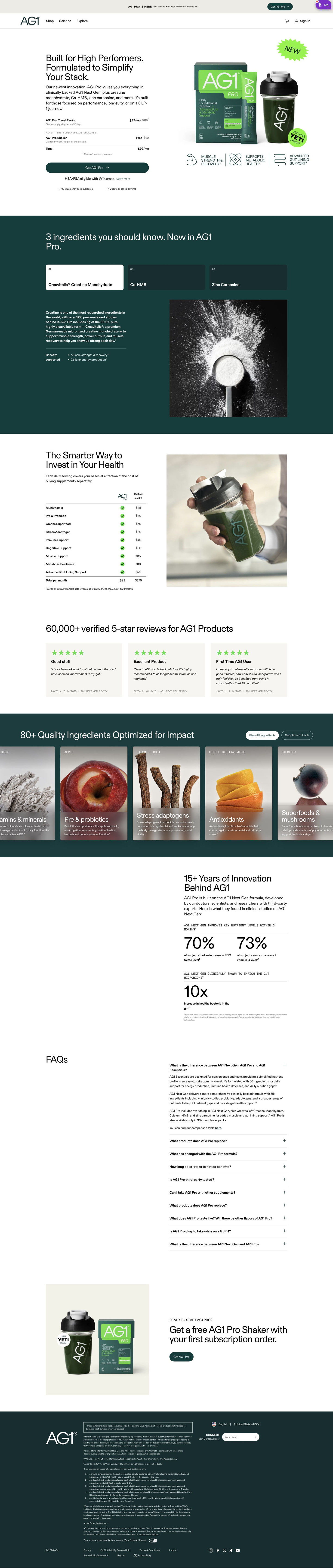
Shop Now goes to drinkag1.com/pro-performance, a focused landing page rather than the homepage or a basic product page, and it's where 9 of the AG1 ads in our library send people. The hero promises to simplify your stack and the next section tabs through only the added ingredients, so the creatine-already-in-it caption gets picked up immediately. The launch line in the announcement bar and a NEW starburst on the pack shot carry the back-in-stock framing. The page's receipt-style order summary adds a free first-subscription gift this ad never mentions, which is a nice surprise but would do more work if the ad set it up.
The page it sends people to: How AG1 sells its Pro launch with a receipt in the hero
AG1's Pro launch page sells a premium tier to high performers. A two-column hero shows the offer as a receipt-style order summary, followed by new-ingredient tabs, a cost table, reviews, an ingredient carousel, research stats, FAQ and a closing gift band. Nine ads in the Fluid library land here, seven of them "One Pack. The Whole Stack." launch ads.
How the page is built
- 01Announcement bar and header
A launch line with a welcome-kit mention and its own small button tells visitors something new is on offer before they read the hero.
- 02Receipt hero
A headline naming the audience sits above an order summary (subscription line, free gift, total) and a full-width button, answering what do I get and what does it cost.
- 03New-ingredient tabs
Three numbered tabs on a dark band explain the added ingredients, answering what's different about Pro.
- 04Cost comparison
A table prices each covered category bought separately against the single subscription, answering whether Pro is worth the money.
- 05Review cards
A verified review count and three quote cards answer whether other people are happy with it.
- 06Ingredient carousel
Tall scrolling cards show each ingredient with a photo, category and short description, with buttons for the full list and supplement facts.
- 07Research stats
A headline about years of development leads into grouped stat figures with footnotes, answering whether there's science behind the claims.
- 08FAQ
An accordion opens on a question comparing the product line-up, answering which version is right for me.
- 09Closing offer band
The free-gift-with-first-subscription hook returns beside a pack shot with one button, giving people who read to the end a clear way to buy.
- 10Newsletter and footer
A dark band holds the disclaimer, footnotes, newsletter field and legal links.
The first fixes we would make
- The first proof on the page is the review section, which sits below the ingredient tabs and the cost table. Put the star rating and verified review count in the hero, right next to the order summary, so the promise and the proof arrive together.
- We didn't see a money-back guarantee near the button. Add one line under the CTA naming the guarantee window, because a first-time buyer committing to a premium subscription is weighing exactly that risk.
Read the full breakdown of this page
Three hooks you could test
- Call out the habit you're replacing. “No more separate tub on the counter. It's already in my morning drink.”
- Show a specific moment of use. “Parked outside the gym, finishing the one drink that covers everything.”
- Sell the outcome. “One scoop in the morning and your whole supplement routine is done for the day.”
What to borrow for your brand
- Put the single new ingredient in a creator caption on the image, written as something she no longer has to remember, so the benefit lands before the copy is read.
- Open the copy with an honest restock line if your product really sold out, because it gives a reason to look today without a fake countdown.
- Shoot the creator in an everyday spot like a parked car so the post reads as a story from a person, not a studio ad.
One of 65 AG1 ads in the Fluid Inspiration Library, captured from the Meta Ad Library on Oct 19, 2026. We record that an ad ran publicly, not how it performed.