How Wuffes built a five-reason advertorial for its joint chews
Wuffes' joint-chew page is a five-reason listicle advertorial with a veterinarian byline. Each reason uses a different proof format (benefit chips, a before and after video, an ingredient list, a timeline, certification icons) before one offer card, with a countdown bar on top and a sticky discount bar. Four ads in the Fluid library send people here, all education-led joint statics.

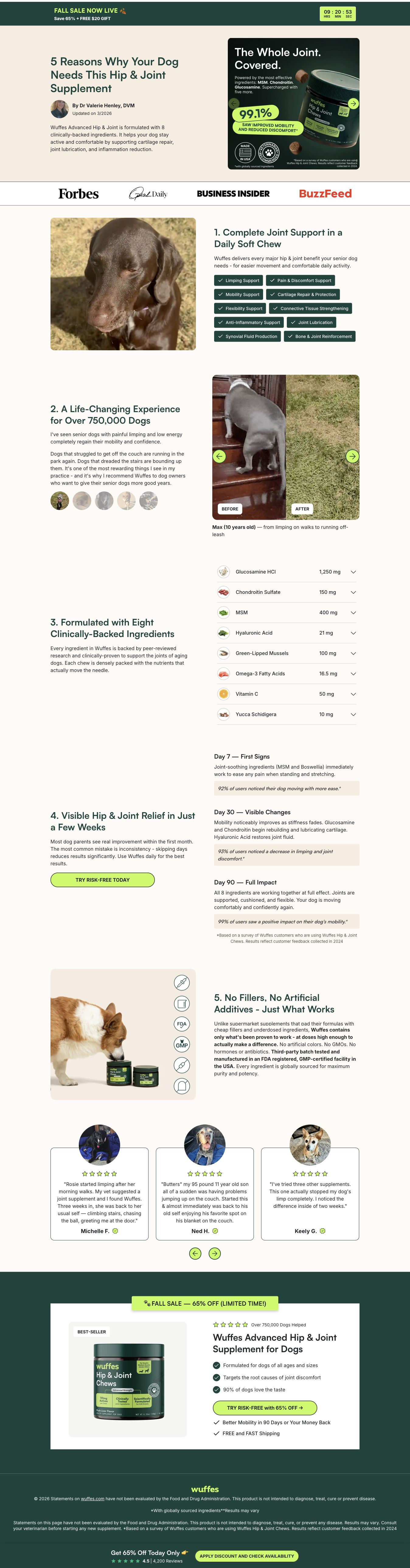
Five reasons for joint support
Wuffes' joint-chew page is a five-reason listicle advertorial with a veterinarian byline. Each reason uses a different proof format (benefit chips, a before and after video, an ingredient list, a timeline, certification icons) before one offer card, with a countdown bar on top and a sticky discount bar. Four ads in the Fluid library send people here, all education-led joint statics.
- Brand
- Wuffes
- Page type
- Advertorial
- Ads leading here
- 4
- Captured
- Oct 19, 2026
- Destination
- try.wuffes.com
Selected for its design and offer structure. Ad performance isn’t available in this collection.
What this page does well
The best idea on this page is that each numbered reason uses a different kind of proof, so the listicle doubles as full product education. Reason one is a grid of check-tag chips naming support areas, reason two is the vet's first-person voice beside a before and after video of a senior dog, reason three is an accordion of eight ingredients with amounts, reason four is a three-milestone timeline with survey quotes, and reason five shows certification and free-from icons. The vet byline with photo and credentials gives the article an editorial frame. With only two inline buttons, the countdown sale bar at the top and the sticky bottom bar (“Apply discount and check availability”) keep the offer in view the whole way down.
How the page is built
- 01Sale bar
A sale and free-gift line with a live countdown timer answers is there a deal and how long does it last.
- 02Article header
The listicle headline, a vet's avatar and credentials, an updated line and an ad-style product card answer who's telling me this and why trust them.
- 03Press bar
Four publication logos answer has anyone else covered this brand.
- 04Reason one
A dog photo beside a grid of check-tag chips naming support areas answers what does it claim to support.
- 05Reason two
The vet's first-person copy, a row of dog avatars and a before and after video of a senior dog answer what does it look like in a real dog.
- 06Reason three
An accordion of eight ingredients with icons and amounts answers what's in it and how much.
- 07Reason four
Consistency copy, a “Try risk-free today” button and a three-milestone timeline with survey quotes answer how long until I see a difference.
- 08Reason five
A product photo with certification and free-from icons beside no-fillers copy answers is it made well.
- 09Reviews carousel
Three cards with dog photos, stars, quotes and verified owner names answer what do other owners say.
- 10Offer card
A Best-Seller product card with a rating, three check bullets, a discount button and guarantee and shipping lines answers what do I get and what's the risk.
- 11Footer and sticky bar
Disclaimers and a sticky today-only discount bar with a rating and an apply-discount button keep the offer one tap away.
What's missing, in the order we'd fix it
- The proof leans on the brand's own survey (the timeline quotes are customer-survey quotes, and the page section title claims 750,000 dogs). Add the survey's sample size and date next to the timeline, so the numbers carry their source in the same spot.
- The press bar shows logos but doesn't say what those publications said. Replace or pair the logos with a one-line quote from each, so the press mention is proof rather than decoration.
- The offer card is the only place the plan options appear, and it's at the very end. Add a compact offer box after reason four's timeline (where the first button already sits) that shows the price and the free gift, so a reader convinced early doesn't have to scroll to the bottom.
How the ads set it up
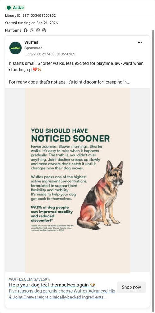
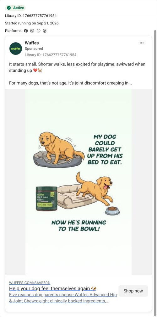
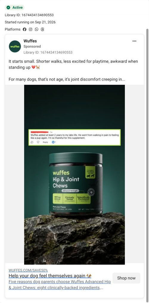
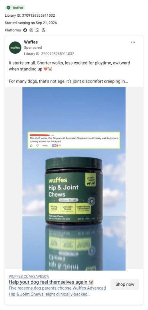
Four ads land here, all sharing one piece of copy about the small signs of joint discomfort, with different images: a text-heavy slow-signs static, a two-panel cartoon from bed to bowl, and two customer comments over the jar. The page continues their education tone instead of jumping to price, and its senior-dog before and after video and reviews carousel give the comment and cartoon ads a real-dog follow-up. The SAVE50% link path in the ads is picked up by the sale bar and sticky discount bar.
What to borrow for your brand
- Give each numbered reason in a listicle its own proof format (chips, video, ingredient list, timeline, badges) so the article becomes complete product education.
- Put an expert byline with a photo, credentials and an updated date under the headline, and use their first-person voice in one reason.
- Keep a countdown sale bar on top and a sticky discount bar at the bottom of a long article, so the offer stays in view with only a couple of inline buttons.
Ads that send people here
- How Wuffes sold joint chews with a “you should have noticed” static
- How Wuffes told a joint-chew story in a two-panel cartoon
- How Wuffes paired a customer comment with a hero shot of its jar
- How Wuffes used one senior dog comment to sell joint chews
Captured from try.wuffes.com in October 2026 for the Fluid Inspiration Library. Offers and prices change; this is what the page showed when we captured it.