How Smooche sent a collagen-serum argument into a one-minute quiz
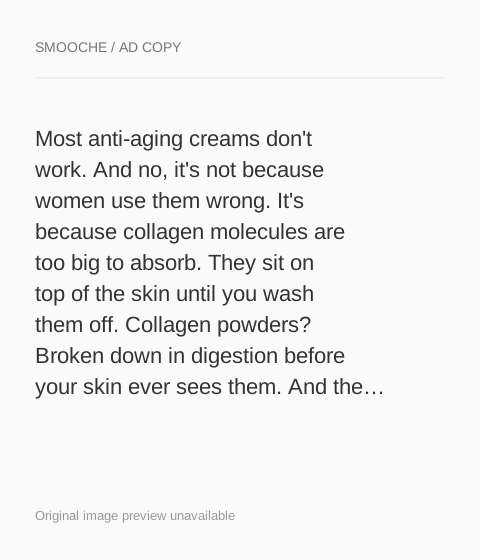
A static Smooche ad for the Reverse-Time Peptide Serum, titled “Laugh lines are sexy. Dull skin is not.”, with long copy claiming that collagen creams can't absorb and powders break down in digestion. It offers a 30-day risk-free trial and sends Learn More to a one-minute discount quiz instead of a product page.

The current destination was captured on October 20, 2026. Video references show captured frames. Page offers may differ from the original ad.
Collagen creams can't absorb. This serum can.
A serum benefit graphic opens a discount quiz rather than a product page. Compare the creative with the destination and explore the other ads sharing this route.
- Brand
- Smooche
- Observed offer
- 30-day risk-free trial advertised
- Creative angle
- Problem / solution
- Page type
- Quiz entry
- Ad format
- Image
- Listed start date
- Sep 10, 2026
- Captured
- Oct 20, 2026
- Library ID
- 1059032787107822
- Destination
- quiz.smooche.com
Selected for its design and offer structure. Ad performance isn’t available in this collection.
What this ad does well
The copy builds a full argument before naming the product: it claims creams sit on the skin, powders get digested and clinic treatments cost hundreds per session, and then the serum arrives as the option left standing. That's the persona's problem-then-solution structure, and naming three alternatives the reader has probably tried makes the argument easy to recognize. The title line flips the usual anti-aging message by accepting laugh lines and targeting dullness instead, which is a kinder angle for an older audience. The 30-day risk-free trial at the end lowers the stakes for anyone still skeptical.
What's missing
The claims are big (the copy promises fresher-looking skin in days and firmer skin in weeks) and the ad offers nothing to back them: no customer, no before-and-after, no study. With a skeptical buyer in a category full of promises, one piece of proof next to the claim matters more than another paragraph of explanation. There's also a jump between the copy, which sells a serum, and the click, which opens a discount quiz. Tell the viewer what the quiz does (find your routine and unlock the discount) in the CTA line so the jump makes sense.
Beat by beat
- ImageA serum benefit graphic carries the laugh-lines line.
It accepts one sign of age and targets another, so the ad feels on the reader's side.
- CopyThe text claims most anti-aging creams fail because collagen molecules are too big to absorb, and that powders are digested first.
It gives the reader a reason her past products disappointed her, which opens her to a new one.
- CopyIt introduces a Korean-formulated peptide serum with hydrolyzed collagen, hyaluronic acid and sodium DNA, then lists three check-marked claims.
It names the ingredients as the answer to the problem it just explained.
- HeadlineThe link headline says collagen creams can't absorb but this serum can, with a 30-day risk-free description.
It compresses the whole argument and the risk reversal into the line beside the button.
The offer
A 30-day risk-free trial, stated at the end of the copy and in the description. The discount and mystery gift only appear once the quiz opens.
Where it sends people
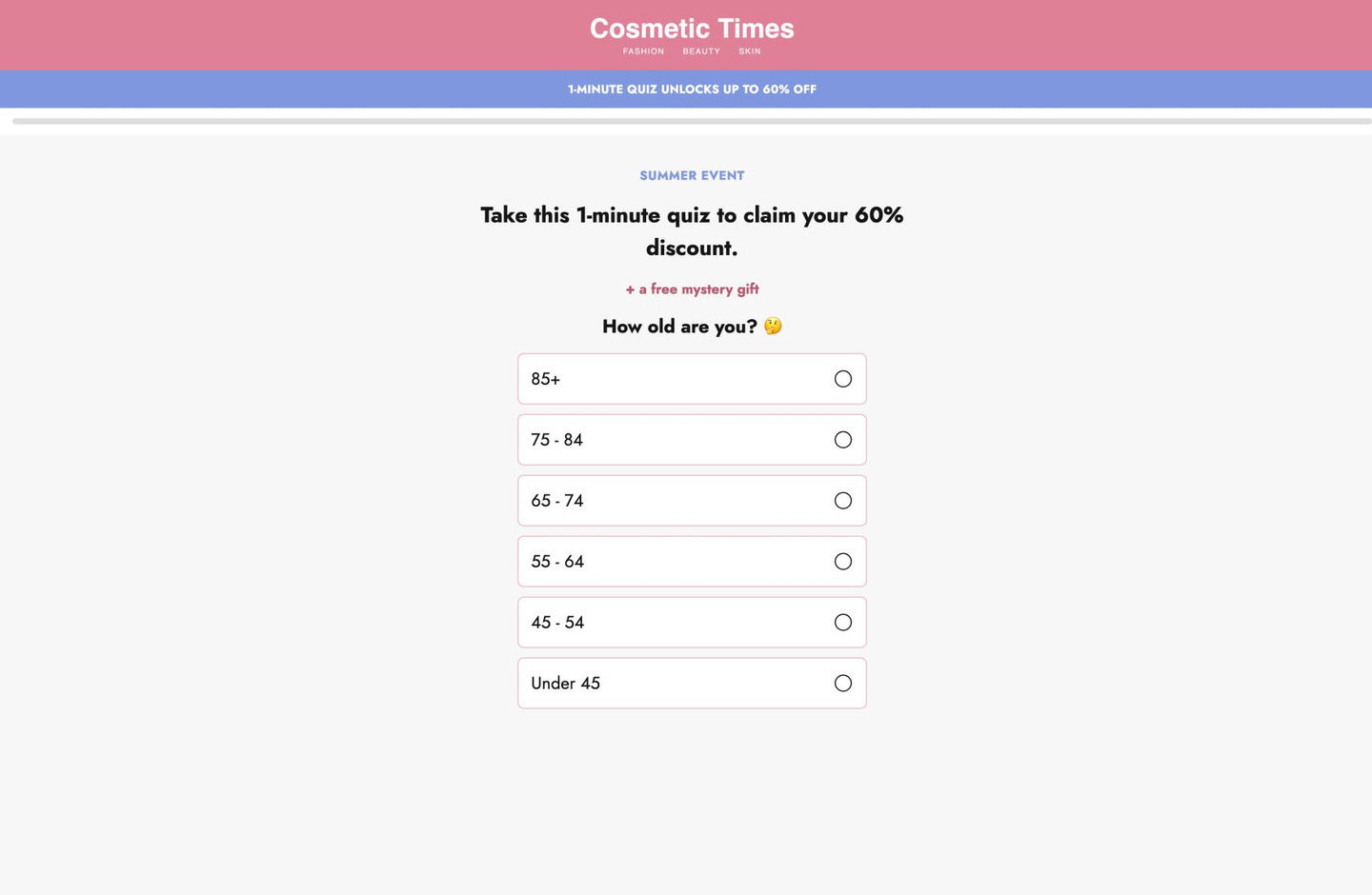
Learn More opens a quiz entry, which the persona ranks as often the best destination because it learns what the visitor is dealing with and can capture an email even without a sale. Only the first screen was captured: no nav, a blue strip saying the quiz unlocks a discount, a headline promising that discount for a one-minute quiz plus a free mystery gift, and a first question asking the visitor's age. The age question fits this audience and takes no thought. The weak point is message match, since the ad argues about collagen absorption and nothing on the first screen mentions the serum or that problem.
The page it sends people to: How Smooche's one-minute quiz opens with a discount and age question
Smooche's quiz entry page, captured on its first screen only: a stripped-down layout with an editorial-style masthead, a discount strip, a progress bar, a headline promising a discount and mystery gift for a one-minute quiz, and an age question. 2 ads in the Fluid library land here, both problem-and-solution serum graphics.
How the page is built
- 01Masthead
A pink band with an editorial-style publication name and three category tags replaces the brand logo and nav, framing the quiz as content rather than a store.
- 02Offer strip
A blue bar says the quiz unlocks a discount, answering what's in it for me.
- 03Progress bar
A thin empty bar across the width signals that the quiz is short and has steps.
- 04Quiz intro
A seasonal eyebrow, a bold headline promising the discount for a one-minute quiz and a pink free-mystery-gift line answer why to start.
- 05First question
An age question with six full-width answer rows, oldest band first, gives the visitor an easy first tap.
The first fixes we would make
- Neither ad that lands here mentions a quiz, and the first screen doesn't mention the serum or the problem the ads described. Add one line under the headline that ties the quiz to the ad (find the routine for your skin), so the visitor knows she's on the right path.
- Only the opening screen was captured, so it's not clear whether an early question asks about the visitor's main concern. If you build one like this, put a problem question (dryness, fine lines, dullness) right after age, so the recommendation and any follow-up can speak to it.
Read the full breakdown of this page
Three hooks you could test
- Call out the habit you're replacing. “Your collagen cream might just be sitting on top of your skin.”
- Lead with the uncomfortable problem. “Spent hundreds on creams and still look tired?”
- Show a specific moment of use. “Two drops after you wash your face, morning and night.”
What to borrow for your brand
- Name the alternatives your buyer has already tried and explain, in your own claimed terms, why each falls short before you introduce your product.
- Reframe a sensitive topic so the ad sides with the reader, accepting one thing about her and offering to change another.
- When an ad sends people to a quiz, say in the CTA what the quiz gives them, so the click doesn't feel like a detour.
One of 25 Smooche ads in the Fluid Inspiration Library, captured from the Meta Ad Library on Oct 20, 2026. We record that an ad ran publicly, not how it performed.