How Smooche dressed a foundation sale in Prime Day styling
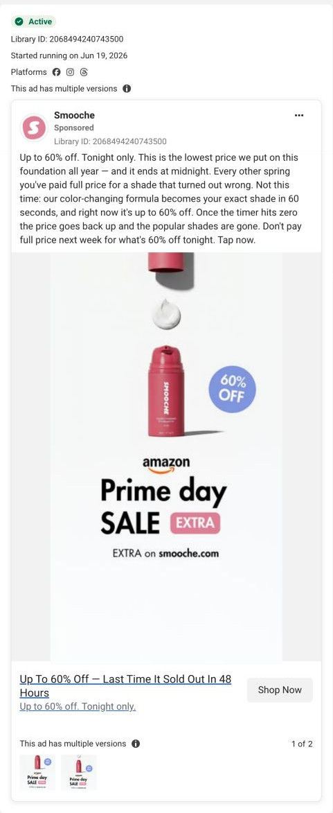
A static Smooche ad that sets the pink Color Changing Foundation above an Amazon Prime Day-style sale banner and a round 60% OFF badge. The copy pushes a tonight-only discount and a claimed 60-second shade match, and Shop Now opens the foundation product page inside Smooche's bestsellers collection.

The current destination was captured on October 20, 2026. Video references show captured frames. Page offers may differ from the original ad.
Up To 60% Off — Last Time It Sold Out In 48 Hours
A product-on-white graphic pairs the bottle with a Prime Day-style sale treatment; its actual CTA opens Smooche’s store. Compare the creative with the destination and explore the other ads sharing this route.
- Brand
- Smooche
- Observed offer
- Up to 60% off
- Creative angle
- Offer-led
- Page type
- Product page
- Ad format
- Image
- Listed start date
- Jun 19, 2026
- Captured
- Oct 20, 2026
- Library ID
- 2068494240743500
- Destination
- smooche.com
Selected for its design and offer structure. Ad performance isn’t available in this collection.
What this ad does well
Borrowing the look of a shopping event people already know means the viewer reads big sale before reading a word of copy. The layout is clean: the bottle, a dollop of white formula, a blue 60% OFF badge and a line saying the extra discount is on smooche.com, which also tells you where to buy. The copy names a real frustration (paying full price for a shade that turned out wrong) before explaining the color-changing formula, so the discount has a reason behind it. It started running on Meta on June 19, 2026, with more than one version listed.
What's missing
Almost everything in this ad is urgency (tonight only, a midnight deadline, a timer, and a headline claiming it last sold out in 48 hours), and very little is proof that the shade match is real for someone like the viewer. The copy claims the formula becomes your exact shade in 60 seconds, but there's no face, no before-and-after and no reviewer. If you run an event-style sale, keep the event framing in the image and give the copy one piece of proof, like a swatch on three skin tones, right next to the deadline. Also check your rights before using another company's event branding.
Beat by beat
- ImageThe pink foundation bottle stands on white with a dollop of the white formula above it and a blue 60% OFF badge.
It shows the product and the discount together, so the deal is clear before any reading.
- ImageAn Amazon Prime Day-style sale banner sits under the bottle with a line pointing the extra discount to smooche.com.
It borrows the urgency of a known shopping event and tells the viewer where the deal lives.
- HeadlineThe link headline promises up to 60% off and says the last sale sold out in 48 hours.
It adds a scarcity claim to the discount at the moment of tapping.
- CopyThe text calls it the lowest price of the year, names the wrong-shade problem, claims a 60-second shade match and repeats the midnight deadline.
It gives the discount a reason (stop paying for wrong shades) and pushes for a decision tonight.
The offer
Up to 60% off, framed as a tonight-only price that ends at midnight, with the headline adding that the last sale sold out in 48 hours.
Where it sends people
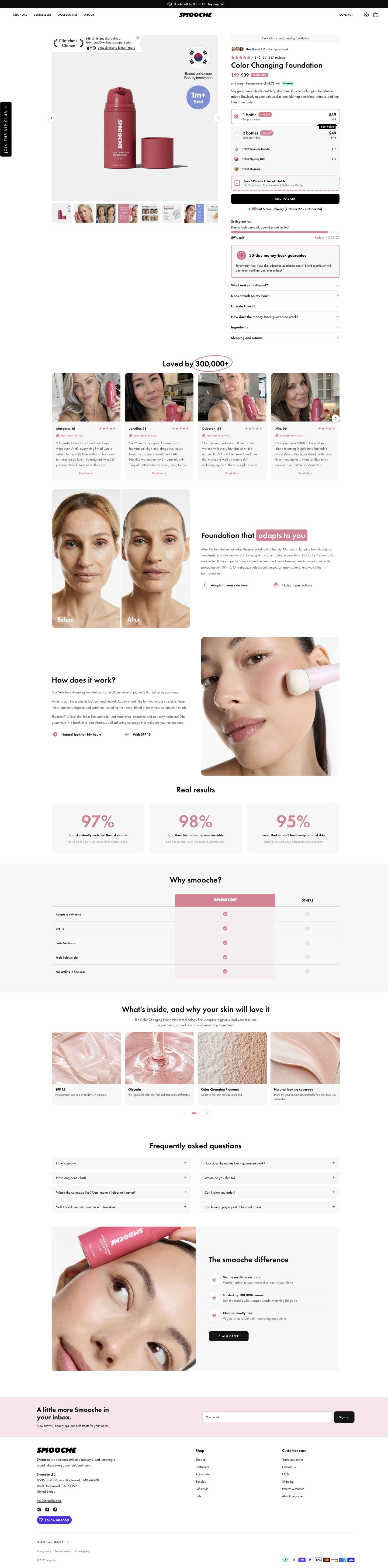
Shop Now goes to a product page rather than a sale landing page, but it's a product page built to carry an offer. The buy box opens with a struck-through and sale price, two quantity cards with free add-ons listed at struck values, and a stock bar with a countdown right under Add to cart, so the ad's deadline shows up where the shopper decides. Age-tagged testimonial cards and a before-and-after explainer follow, which supply the proof the ad left out. The page was captured in October and its offers can differ from the ad, so keep the ad's 60% figure and the page price in sync if you copy this setup.
The page it sends people to: How Smooche's foundation page stacks offers, urgency and proof
Smooche's Color Changing Foundation product page, reached through the bestsellers collection path. A compact buy box with quantity offers, free add-ons, a stock bar and a guarantee leads into age-tagged testimonials, a before-and-after, survey results, a comparison table and ingredients. 1 ad in the Fluid library lands here, a Prime Day-style 60% off sale graphic.
How the page is built
- 01Announcement bar and header
A black bar states the sale and free gift, and the header adds a vertical VIP club tab, answering whether there's a deal today.
- 02Gallery and buy column
A product shot with badges sits beside a buyer-count avatar row, star rating, struck-through sale price with a Bestseller tag and an installment line, answering what it is, what it costs and whether others buy it.
- 03Quantity offers
Two radio cards, free add-ons at struck values, a subscription checkbox and Add to cart answer how much to buy and what's included.
- 04Urgency and objections
A stock bar with countdown, a money-back guarantee card and six accordions answer why now, what if it doesn't work and whether it suits my skin.
- 05Testimonials
A carousel of selfie cards with first name, age and a verified badge answers whether people like me use it.
- 06Before-and-after explainer
A split before-and-after photo beside a headline and two icon benefits shows the result the brand claims.
- 07How it works
Three short paragraphs beside an application close-up explain the brand's claimed mechanism.
- 08Real results
Three cards of survey figures with a panel footnote give the brand's percentage-based proof.
- 09Comparison table
A pink brand column against Others across five rows answers why this instead of another foundation.
- 10Ingredients carousel
Four texture cards with an ingredient name and one line answer what's inside.
- 11FAQ and closing card
A two-column FAQ grid is followed by a card with three differentiators and a Claim offer button, giving one last way to buy.
- 12Newsletter and footer
A pink signup band and the store footer with payment icons close the page.
The first fixes we would make
- The ad sends people here for a 60% off event, but the page's top section reads the same as any visit to the product. A short line near the price confirming the event offer would tell the visitor she found the deal she tapped for.
- The survey results and the clinician badge carry a lot of trust, and the page's proof is easier to believe when its source is close by. Put the panel's size and date next to the figures rather than in a footnote.
Read the full breakdown of this page
Three hooks you could test
- Lead with the uncomfortable problem. “Paid full price for the wrong shade again?”
- Call out the habit you're replacing. “Stop buying three shades to find the one that matches.”
- Turn the benefit into a picture people get in a second. “White in the pump, your shade on your skin.”
What to borrow for your brand
- Dress a sale in the visual language of a shopping event your buyers already know, so the discount registers before they read.
- Put one sentence of the buyer's real frustration ahead of the discount, so the deal solves a problem instead of just being cheap.
- Land the ad on a buy box that repeats the deadline under the button, so the urgency is confirmed at the moment of purchase.
One of 25 Smooche ads in the Fluid Inspiration Library, captured from the Meta Ad Library on Oct 20, 2026. We record that an ad ran publicly, not how it performed.