

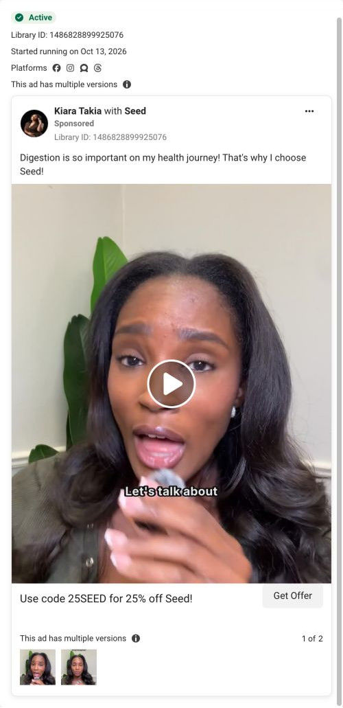
BobbyParrish with SeedSponsored
Esc
How Seed targets high-protein eaters with a review static ad
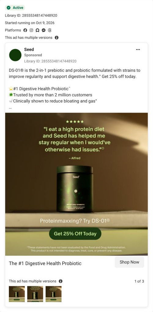
A Seed static image ad built around a five-star customer quote from Alfred about eating a high-protein diet and staying regular. The DS-01 jar sits on a ledge under the quote, with a line asking if you're proteinmaxxing and a Get 25% Off Today button. The copy adds ranking and customer-count claims, and the ad opens Seed's quiz.
Seed
43 creatives lead here1 / 43










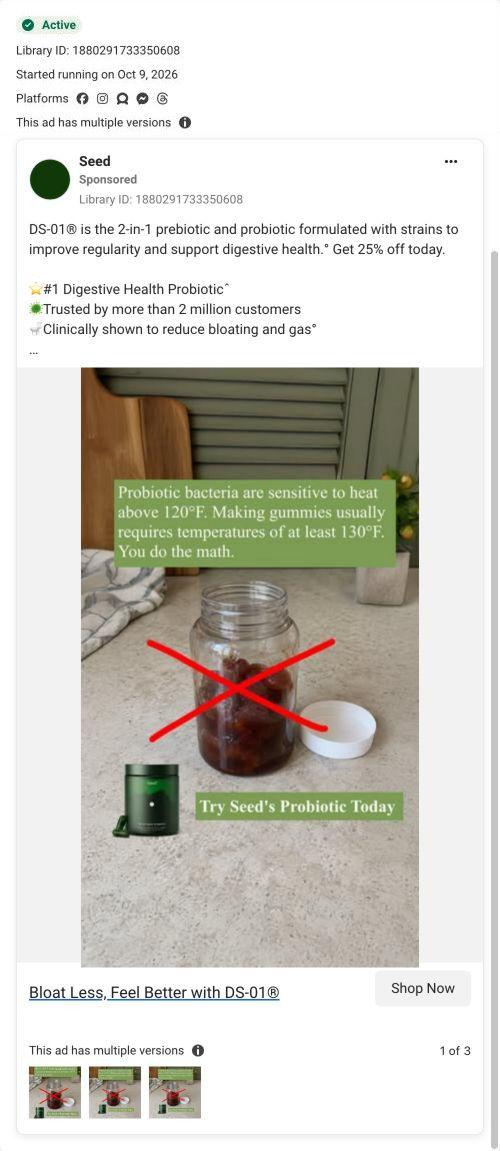
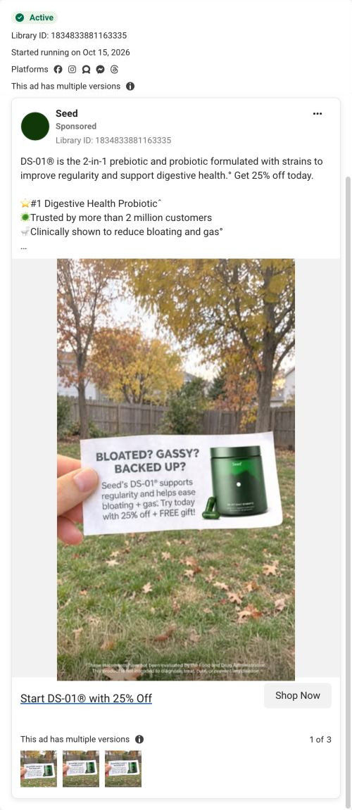
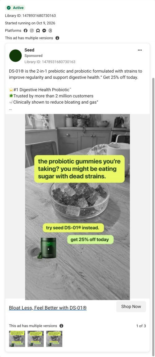
The Seed DS-01 quiz entry
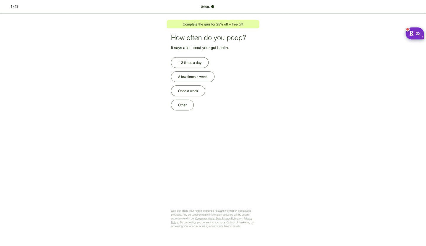
Quiz entry screen only; personal health questions were not answered. A browser shopping-extension badge appears in the upper-right margin of this capture.
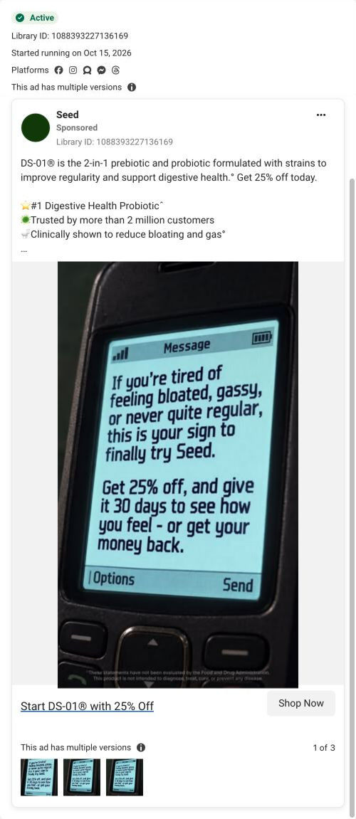
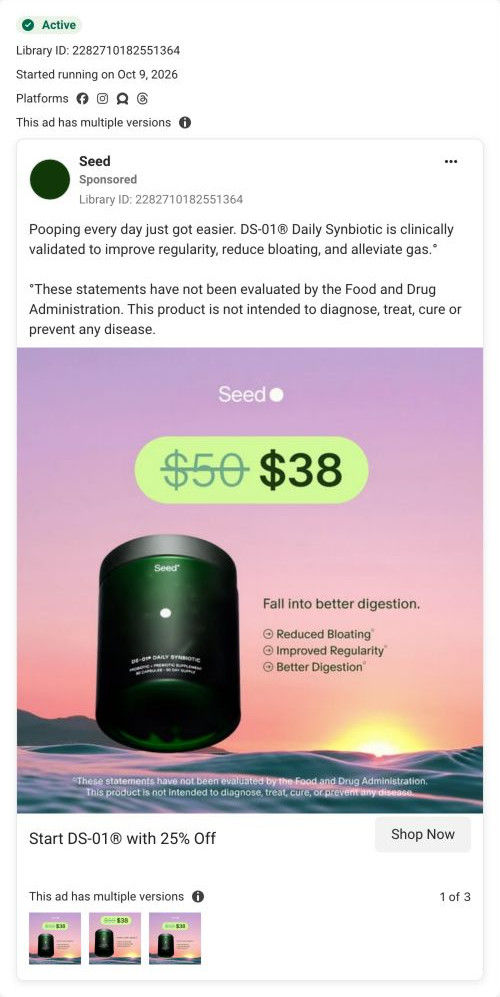
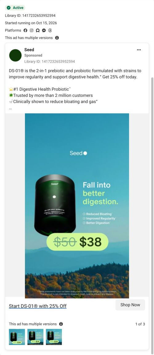
The #1 Digestive Health Probiotic
The ad combines a two-in-one product explanation with ranking and customer-count claims, then adds a 25% offer. The CTA now opens a 13-step quiz starting with “How often do you poop?” and promoting 25% off plus a free gift for completion. Compare the creative with the destination and explore the other ads sharing this route.
- Brand
- Seed
- Observed offer
- Advertised 25% off DS-01
- Creative angle
- Product benefits
- Page type
- Quiz
- Ad format
- Image
- Listed start date
- Oct 9, 2026
- Captured
- Oct 19, 2026
- Library ID
- 28555348147448920
- Destination
- seed.com
Selected for its design and offer structure. Ad performance isn’t available in this collection.
What this ad does well
The ad picks one specific person and talks to them. Someone eating lots of protein knows exactly what the review is about, and the line underneath turns a current internet term into a direct callout. The proof is placed right on the image, with five stars and a named reviewer, so the viewer reads the claim from a customer before reading anything from the brand. The copy then stacks Seed's own claims (number one digestive health probiotic, more than 2 million customers, and that it's clinically shown to reduce bloating and gas), each with a footnote or source line.
What's missing
The image does its job, but the copy above it is the same block Seed uses on other ads and never mentions protein. A viewer who stopped for the protein angle reads a generic product description next, which breaks the thread. If you make one like this, rewrite the first line of copy for the audience the image calls out, so the whole ad speaks to high-protein eaters. The 25% off is clear, but there's no reason given to claim it today rather than next week.
Beat by beat
- ImageA five-star quote from Alfred about eating high protein and staying regular sits above the DS-01 jar on a dark ledge.
A named customer describing a specific situation makes the proof feel real and tells the right viewer this is for them.
- ImageUnder the jar, a line asks if you're proteinmaxxing and a green button says Get 25% Off Today.
The callout names the audience in their own language, and the button puts the offer right next to the product.
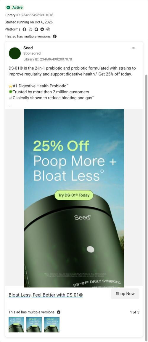
- CopyA two-in-one product description, then three emoji-led claims: number one digestive health probiotic, 2 million-plus customers, clinically shown to reduce bloating and gas.
Stacking the brand's claims under the customer quote adds scale and authority for viewers who keep reading.
- HeadlineThe #1 Digestive Health Probiotic, with a Shop Now button.
The headline restates the ranking claim as the last thing before the tap.
The offer
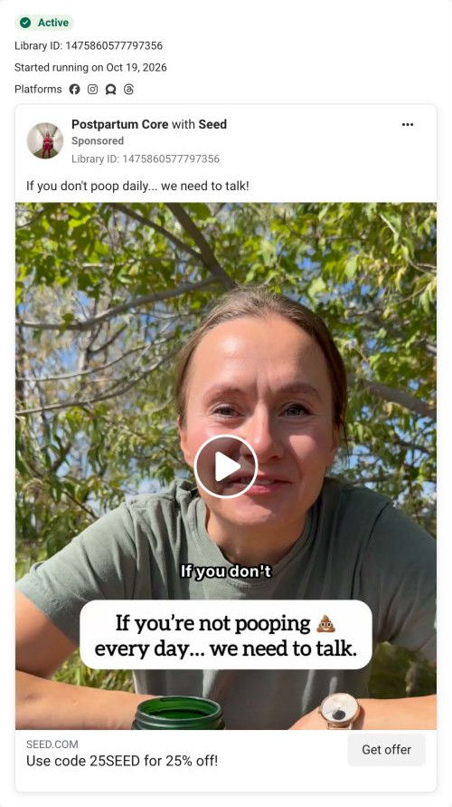
25% off, shown as a button on the image and repeated in the copy as get 25% off today. The quiz frames 25% off plus a free gift as a reward for finishing.
Where it sends people
The ad opens Seed's quiz, which sits above a homepage or product page on the landing-page ladder because it asks about the visitor first. The first question is about a daily bathroom habit, which fits the review's focus on staying regular. The banner restates the discount and adds a gift, so the image's 25% off button carries through. The quiz screen has no reference to protein or diet, so a viewer who tapped for that angle loses it on the first screen until a later question picks it up.
The page it sends people to: How Seed's DS-01 quiz turns every ad into the same first question
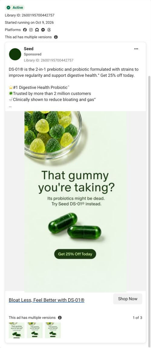
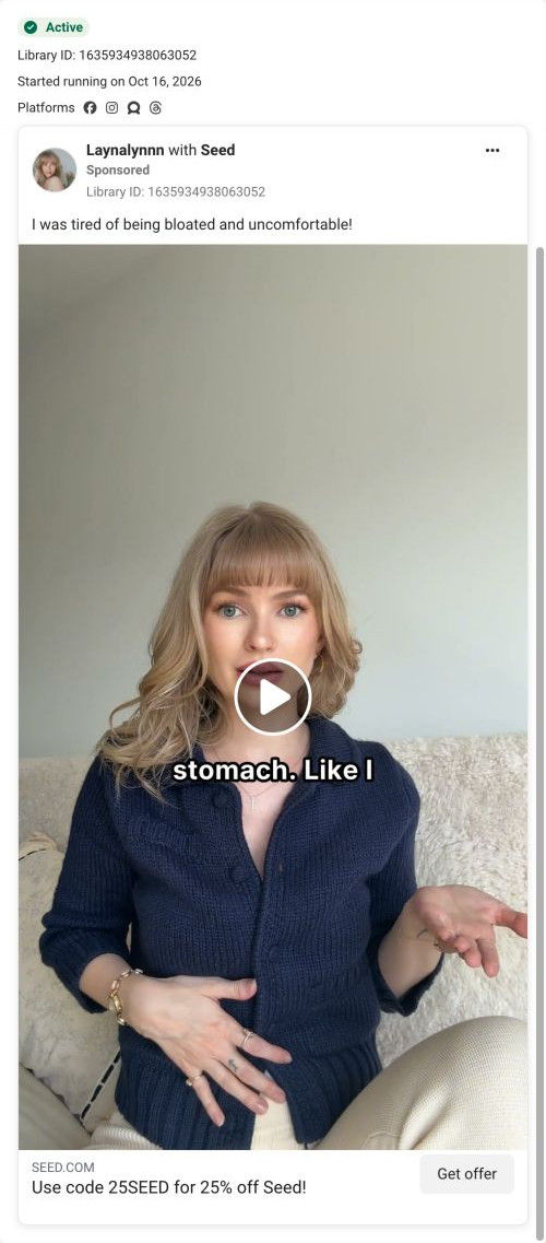
Seed's DS-01 quiz entry is a 13-step quiz captured on its first screen: a step counter, a banner offering 25% off plus a free gift for finishing, one tap-only question and a consent note. Forty-three ads in the Fluid library send people here, from creator promo-code videos to problem-led, bloating and discount ads.
How the page is built
- 01Header
A 1 / 13 step counter, the centered logo and a thin progress bar answer how long this is going to take.
- 02Offer banner
A highlighted pill promises 25% off plus a free gift for completing the quiz, which answers what the visitor gets for finishing.
- 03Question
A large question about a daily habit, with a one-line reason it matters, answers why Seed is asking.
- 04Answers
Four stacked pill buttons with frequency options let the visitor answer in one tap, with no Next button to find.
- 05Consent note
Small privacy and data-use text at the bottom answers what happens to the health information they share.
The first fixes we would make
- Creator traffic arrives with a code in the URL (25BOBBY, for example), but the banner reads the same for everyone and never mentions the creator. Add a line like "Bobby's 25% off is applied" for coded traffic, so a viewer who just watched that creator knows they're in the right place.
- The screen doesn't say what the visitor gets at the end besides the discount. Add one short line under the banner saying the quiz ends with a recommendation on whether DS-01 fits them (the page address already asks that question), so 13 steps feel worth finishing.
Read the full breakdown of this page
Three hooks you could test
- Call out the habit you're replacing. “Eating for your macros? Your gut has opinions about that.”
- Show a specific moment of use. “Protein shake in one hand, this in the other.”
- Lead with the uncomfortable problem. “High-protein diet and things got backed up? You're not the only one.”
What to borrow for your brand
- Choose a customer review that names a specific lifestyle, and put it at the top of the image so the audience recognizes itself.
- Turn the review's lifestyle into a short callout line in your buyer's own slang, right under the product.
- Rewrite the first line of the primary text for each audience-specific image instead of reusing one block of copy everywhere.
One of 50 Seed ads in the Fluid Inspiration Library, captured from the Meta Ad Library on Oct 19, 2026. We record that an ad ran publicly, not how it performed.