

SeedSponsored
Esc
How Seed turns one customer quote into a probiotic static ad
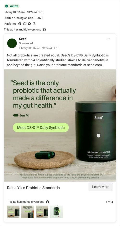
A static image from Seed: a customer quote attributed to Jen M. in large green type beside the DS-01 jar and two capsules on a cork coaster. The copy opens with "Not all probiotics are created equal" and cites 24 scientifically studied strains. There's no price or discount, and Learn More opens Seed's homepage.
Seed
7 creatives lead here1 / 7

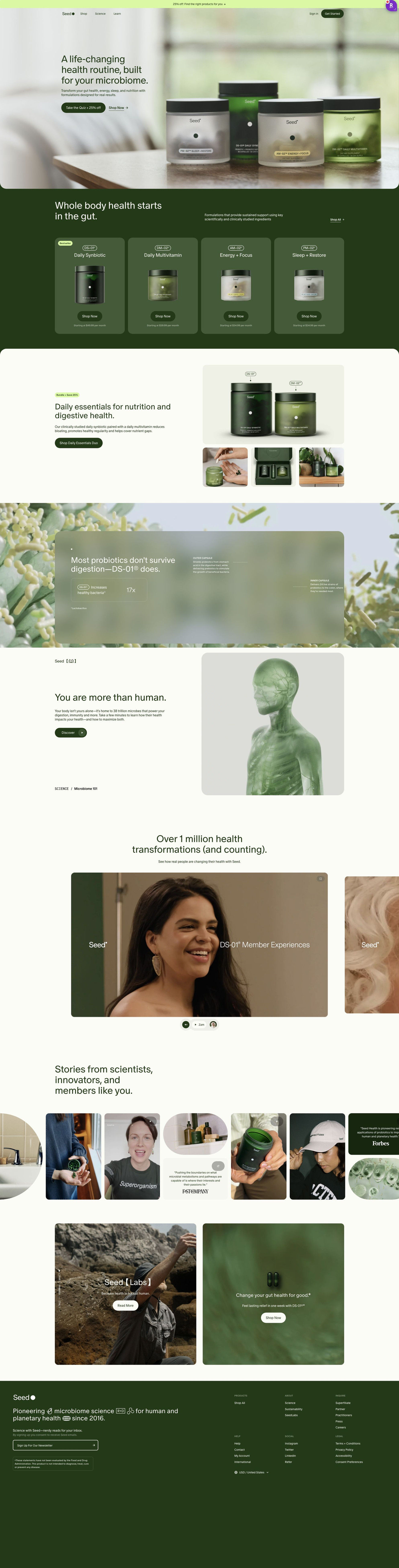
The Seed microbiome homepage
A browser shopping-extension badge appears in the upper-right margin of this capture.
Raise Your Probiotic Standards
A “not all probiotics” hook introduces the brand’s strain-count and research framing. The Learn More CTA leads to Seed’s homepage. Compare the creative with the destination and explore the other ads sharing this route.
- Brand
- Seed
- Observed offer
- DS-01 Daily Synbiotic; no price or discount stated
- Creative angle
- Education
- Page type
- Homepage
- Ad format
- Image
- Listed start date
- Sep 8, 2026
- Captured
- Oct 19, 2026
- Library ID
- 1696959124743170
- Destination
- seed.com
Selected for its design and offer structure. Ad performance isn’t available in this collection.
What this ad does well
The quote is the headline, and it's a strong one to lead with because it's comparative: Jen M. says Seed is the only probiotic that made a difference in her gut health. That speaks straight to someone who has tried others and been let down, and it comes from a customer instead of the brand. The styling is calm and real (a cork coaster, soft light, two capsules), so the product feels like part of an ordinary routine. The FDA disclaimer sits under the image, which keeps the claim properly framed.
What's missing
The quote says something changed but never says what, so the viewer has to imagine the outcome for themselves. A specific detail (less bloating, more regular, how long it took) would do much more than "made a difference." The ad also has no reason to act now. If you make one like this, pick a customer quote that names the before and after in concrete words, and add the offer under the Meet DS-01 pill.
Beat by beat
- HeadlineA customer quote in large green type saying Seed is the only probiotic that made a difference in her gut health, signed Jen M.
It leads with comparative customer proof aimed at people who've tried other probiotics.
- ImageThe DS-01 jar beside two green capsules on a cork coaster, with a Meet DS-01 Daily Synbiotic pill and an FDA disclaimer.
It places the product in an everyday setting and keeps the health claim framed.
- Copy"Not all probiotics are created equal" followed by the brand's claim of 24 scientifically studied strains.
It backs the customer's comparison with the brand's own reason the product is different.
- CTARaise Your Probiotic Standards with Learn More.
It invites the viewer to rethink their current probiotic without pushing a purchase.
Where it sends people
Learn More opens Seed's homepage, the weakest landing choice on the ladder, though the hero offers a clear next step with a discounted quiz as the main button. The page's stories strip mixes customer photos, video thumbnails and press quotes, and there's a member-video carousel further down, so a visitor who clicked for Jen M.'s quote will find more customer voices. They're far down the page, though, behind the product range, a bundle feature and the science sections. A landing page that opens with more quotes like Jen's, then the offer, would match the ad's proof-first approach.
The page it sends people to: How Seed's homepage routes visitors to a quiz or its product range
Seed's homepage is a router: a hero with a quiz-plus-25%-off button and a Shop Now link, a four-product range, a bundle offer, a capsule mechanism explainer, member videos and a press-and-UGC strip. Seven ads in the Fluid library send people here, led by education and product-benefit statics and videos about Seed's probiotic standard.
How the page is built
- 01Announcement bar
One line offers 25% off for finding the right products, which answers whether there's a deal before the page even loads.
- 02Header
Shop, Science and Learn links plus a Get Started pill give returning and curious visitors their own way in.
- 03Hero
A photo of four jars on a table, a broad headline and the quiz-plus-discount button answer where a new visitor should start.
- 04Product range
Four cards with code names, jar images and starting monthly prices answer what Seed sells and what it costs.
- 05Bundle feature
The Daily Essentials Duo pairs DS-01 with the multivitamin at 25% off, which answers whether there's a better-value way to buy.
- 06Mechanism explainer
A frosted card with labeled capsule layers and a stat chip answers how the product is built, as the page describes it.
- 07Education teaser
A short science headline with a rendered human-figure illustration and a Discover button invites visitors deeper into the science content.
- 08Member videos
A carousel of member videos with a member count answers whether real people take this.
- 09Stories strip
UGC photos, video thumbnails and press quote cards share one horizontal scroll, so every type of proof sits together.
- 10Closing cards
Two photo cards point to Seed's research arm and a product, giving one last route for researchers and shoppers.
- 11Footer
A mission line, newsletter signup, disclaimer and region selector catch anyone who scrolled all the way down without choosing.
The first fixes we would make
- The ads that land here talk about one probiotic (Seed's digestive health probiotic and its standard), but the page opens on four jars and a whole-routine headline, so the visitor has to find DS-01 in the range band on their own. Send those ads to the quiz or the DS-01 product page instead, or give ad traffic a hero that names DS-01 and repeats the ad's headline.
- The hero promise is broad: it's a "life-changing health routine" with a subhead that lists gut health, energy, sleep and nutrition all at once. Name the specific problem a visitor arrives with (the bundle copy already talks about bloating and regularity), so someone recognizes themselves in the first line.
Read the full breakdown of this page
Three hooks you could test
- Call out the habit you're replacing. “"I tried four [category] before this one. This is the only one I kept."”
- Sell the outcome. “"Two weeks in, I stopped [problem] after lunch."”
- Show a specific moment of use. “"I take it with my morning coffee and haven't missed a day."”
What to borrow for your brand
- Use a comparative customer quote as the headline, so the proof speaks to people who've tried competitors.
- Style the product in a plain everyday setting so the quote feels like it came from a real routine.
- Put a first name and initial on every customer quote you run as a headline.
One of 50 Seed ads in the Fluid Inspiration Library, captured from the Meta Ad Library on Oct 19, 2026. We record that an ad ran publicly, not how it performed.