

BobbyParrish with SeedSponsored
Esc
How Seed dressed its DS-01 price offer in autumn colors
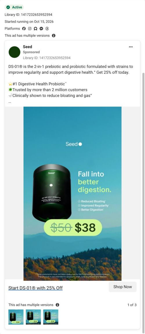
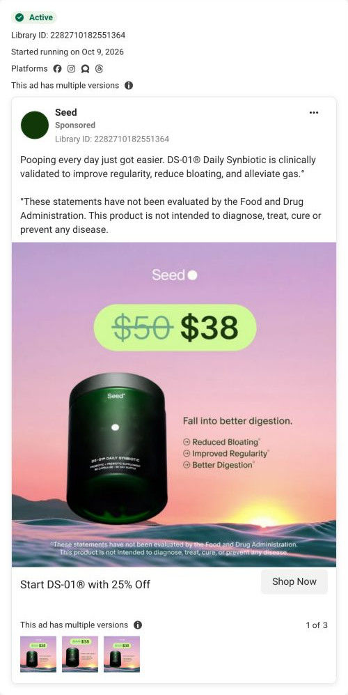
A Seed static: the DS-01 jar floats against a blue sky over autumn trees, next to Fall into better digestion and benefit ticks, with a badge showing $50 crossed out for $38. The copy adds Seed's #1 ranking and customer-count claims. It ran on Meta from Oct 15, 2026 and links to the DS-01 quiz.
Seed
43 creatives lead here1 / 43

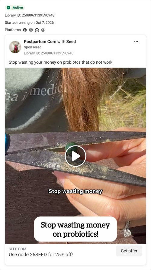
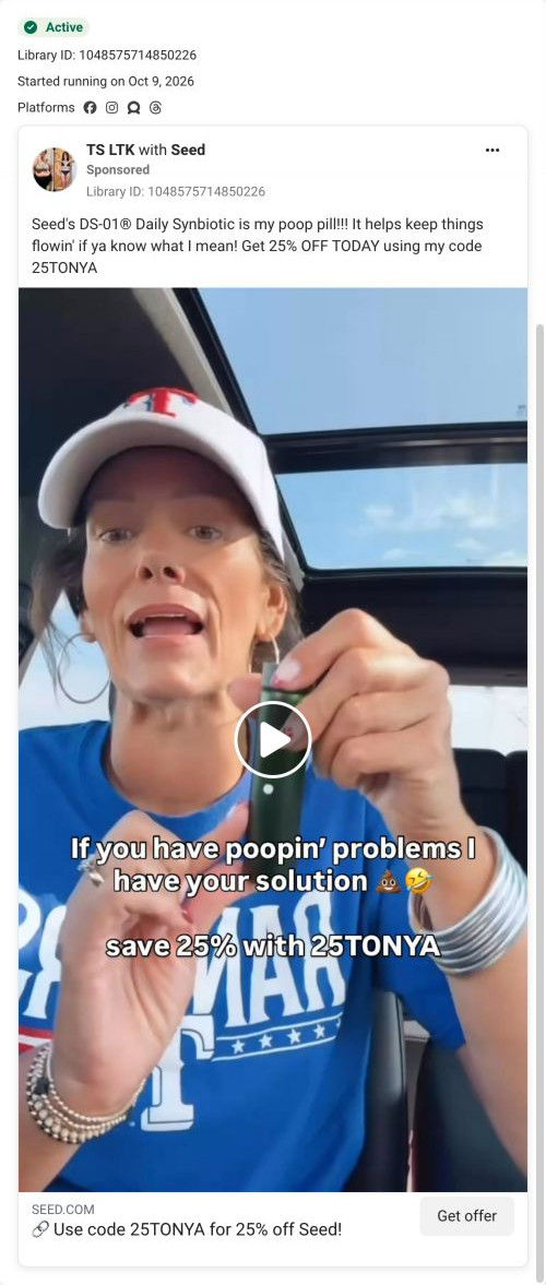


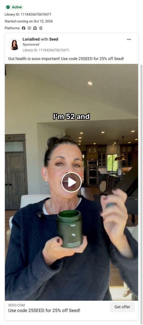
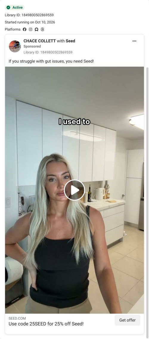


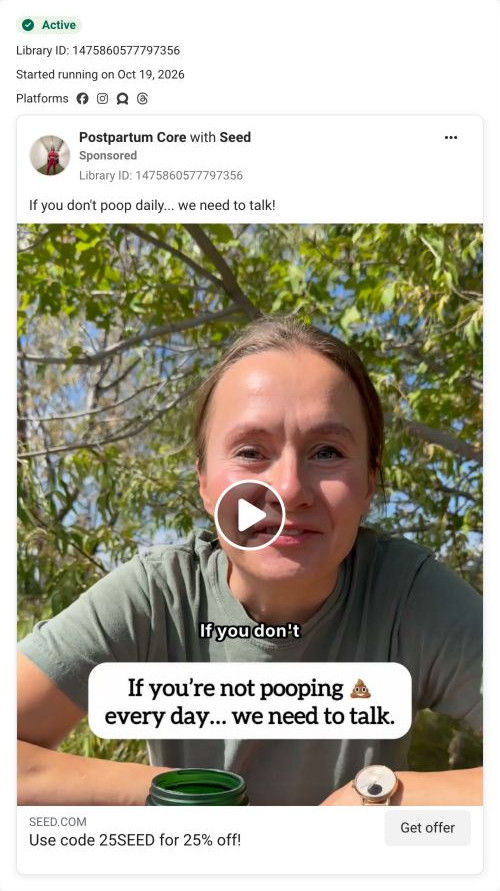
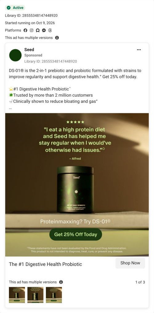


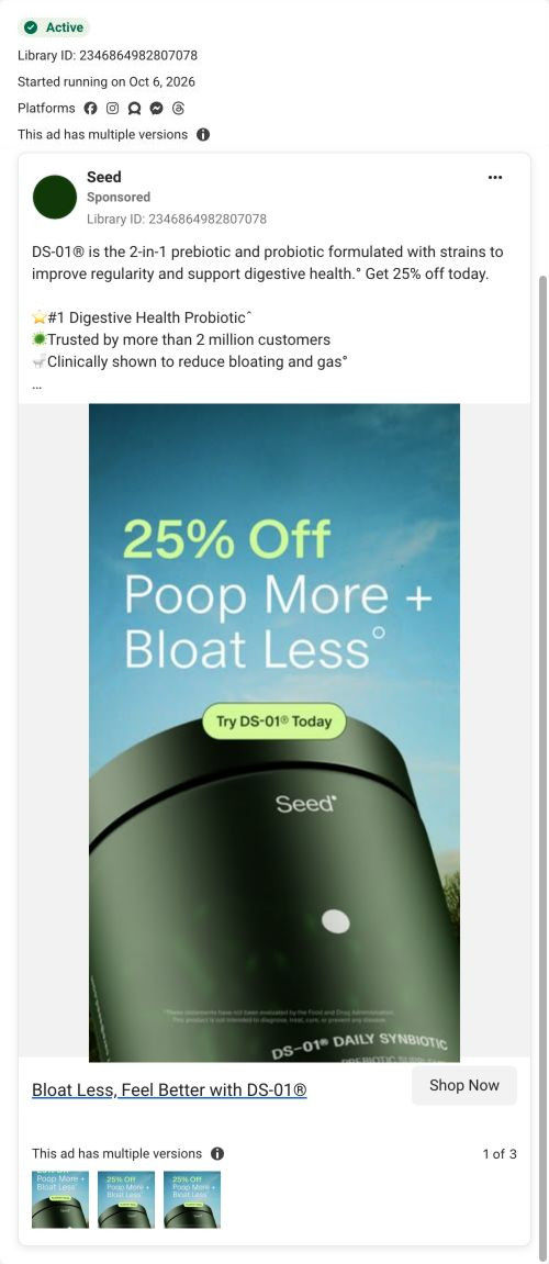
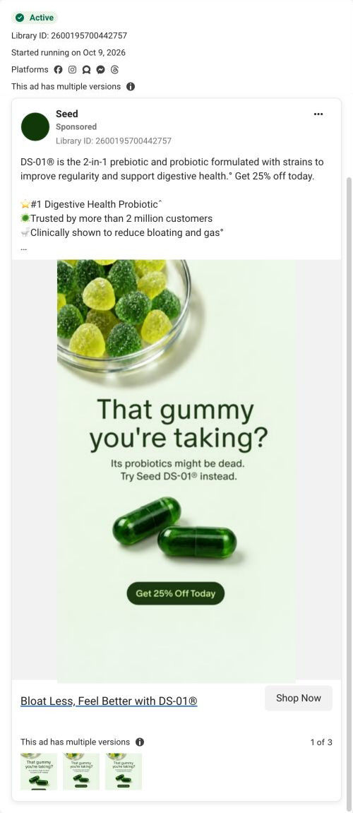



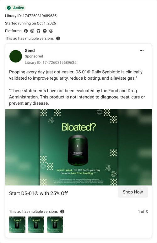
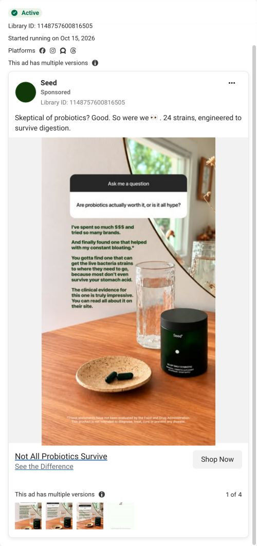
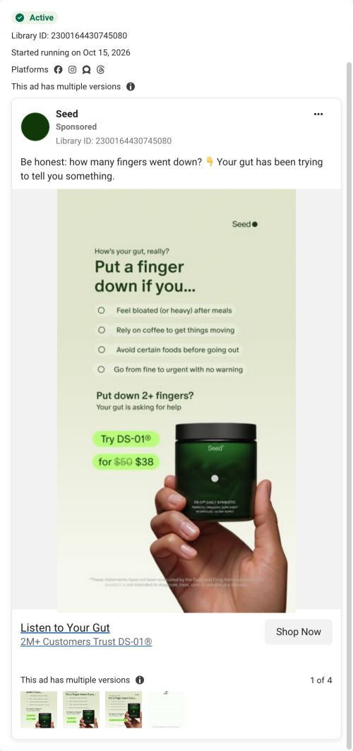
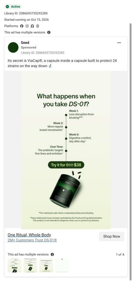
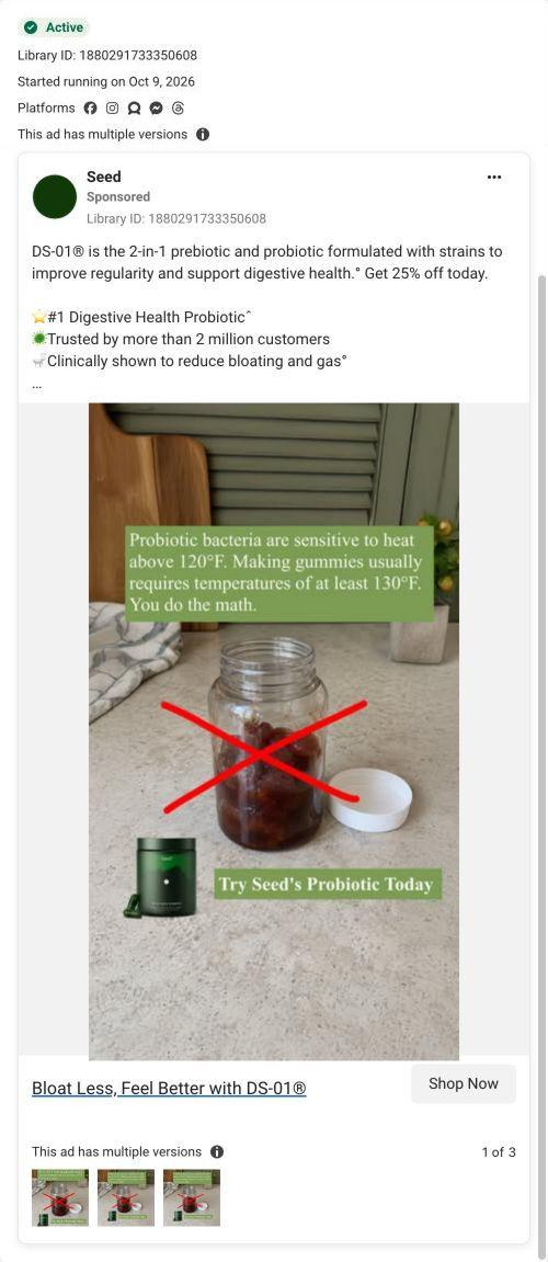
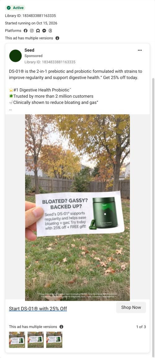
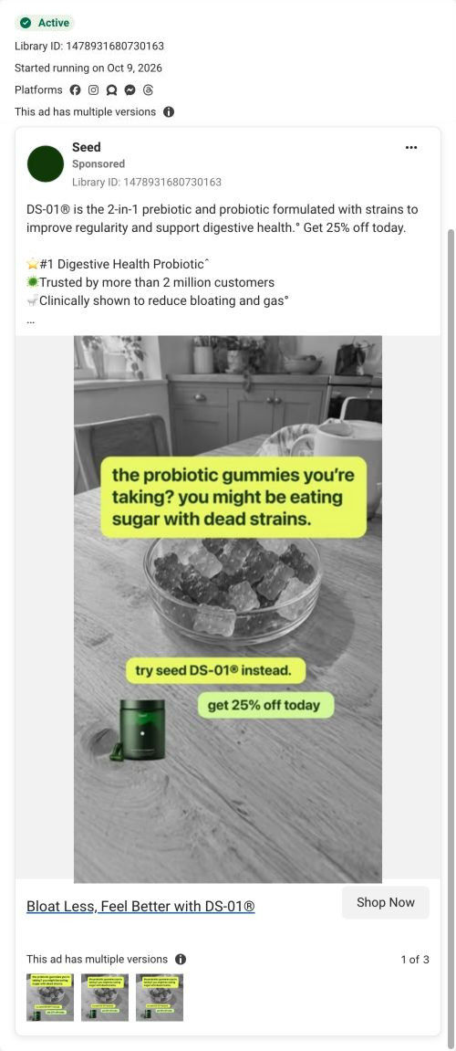
The Seed DS-01 quiz entry
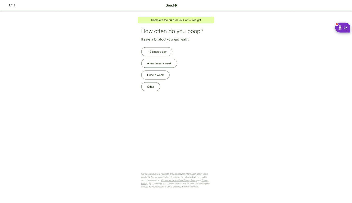
Quiz entry screen only; personal health questions were not answered. A browser shopping-extension badge appears in the upper-right margin of this capture.
Start DS-01 with 25% Off
The ad combines a two-in-one product explanation with ranking and customer-count claims, then adds a 25% offer. The CTA now opens a 13-step quiz starting with “How often do you poop?” and promoting 25% off plus a free gift for completion. Compare the creative with the destination and explore the other ads sharing this route.
- Brand
- Seed
- Observed offer
- Advertised 25% off DS-01
- Creative angle
- Product benefits
- Page type
- Quiz
- Ad format
- Image
- Listed start date
- Oct 15, 2026
- Captured
- Oct 19, 2026
- Library ID
- 1417232653952594
- Destination
- seed.com
Selected for its design and offer structure. Ad performance isn’t available in this collection.
What this ad does well
This version of Seed's fall creative puts the headline beside the jar and the price badge underneath it, so the eye goes product, promise, price. The autumn trees make the pun land visually without explaining it. The copy carries the proof the image doesn't: it claims DS-01 is the #1 digestive health probiotic (citing SPINS sales data), says more than 2 million customers trust it, and claims it's clinically shown to reduce bloating and gas.
What's missing
Like Seed's sunset version of this creative, the image lists benefits instead of a problem the viewer feels, and “better digestion” doesn't say what changes in someone's day. The ranking and customer count are strong proof, and they're stuck in copy that most people won't expand. If you make one like this, move one proof line onto the image (a small #1 badge or the customer count) and swap a benefit tick for a specific moment, so the creative persuades on its own when the copy is cut off.
Beat by beat
- ImageThe DS-01 jar floats on a blue sky above autumn trees, with Fall into better digestion beside it.
The fall colors make the pun obvious and give the ad a seasonal feel.
- ImageBenefit ticks for bloating, regularity and digestion, then a large lime badge with $50 crossed out for $38.
Reading top to bottom, the viewer gets the benefits first and lands on the price, which is where the decision happens.
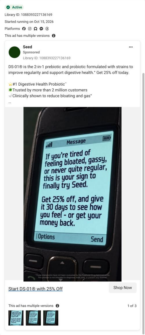
- CopyDS-01 described as a 2-in-1 prebiotic and probiotic, with Seed's #1 ranking claim, customer count and clinical claim.
It stacks proof behind the image for people who read on.
- HeadlineStart DS-01 with 25% off.
It restates the deal as a percentage.
The offer
DS-01 for $38 against a crossed-out $50 on the image, framed as 25% off in the headline and copy.
Where it sends people
The ad sends people to Seed's DS-01 quiz, the persona's preferred landing format because it learns about the visitor before recommending anything. The entry screen keeps the deal alive with a banner promising a discount and a free gift for finishing, and since the copy and headline already said 25% off, the switch from the $38 badge doesn't feel like a different offer. The ranking and customer-count proof from the copy doesn't appear on the first screen, which is only a progress bar, the banner and a one-tap question about how often you poop.
The page it sends people to: How Seed's DS-01 quiz turns every ad into the same first question
Seed's DS-01 quiz entry is a 13-step quiz captured on its first screen: a step counter, a banner offering 25% off plus a free gift for finishing, one tap-only question and a consent note. Forty-three ads in the Fluid library send people here, from creator promo-code videos to problem-led, bloating and discount ads.
How the page is built
- 01Header
A 1 / 13 step counter, the centered logo and a thin progress bar answer how long this is going to take.
- 02Offer banner
A highlighted pill promises 25% off plus a free gift for completing the quiz, which answers what the visitor gets for finishing.
- 03Question
A large question about a daily habit, with a one-line reason it matters, answers why Seed is asking.
- 04Answers
Four stacked pill buttons with frequency options let the visitor answer in one tap, with no Next button to find.
- 05Consent note
Small privacy and data-use text at the bottom answers what happens to the health information they share.
The first fixes we would make
- Creator traffic arrives with a code in the URL (25BOBBY, for example), but the banner reads the same for everyone and never mentions the creator. Add a line like "Bobby's 25% off is applied" for coded traffic, so a viewer who just watched that creator knows they're in the right place.
- The screen doesn't say what the visitor gets at the end besides the discount. Add one short line under the banner saying the quiz ends with a recommendation on whether DS-01 fits them (the page address already asks that question), so 13 steps feel worth finishing.
Read the full breakdown of this page
Three hooks you could test
- Turn the benefit into a picture people get in a second. “Leaves fall on schedule. So can you.”
- Sell the outcome. “Make this the season your stomach stops running your plans.”
- Call out the habit you're replacing. “Swap the third coffee for a capsule that does the job.”
What to borrow for your brand
- Build several seasonal backdrops around the same headline and price, so you can test the setting while keeping the offer constant.
- Order the image so the eye moves from product to promise to price, ending on the number.
- Move your strongest proof point from the copy onto the image, because most viewers never expand the text.
One of 50 Seed ads in the Fluid Inspiration Library, captured from the Meta Ad Library on Oct 19, 2026. We record that an ad ran publicly, not how it performed.