
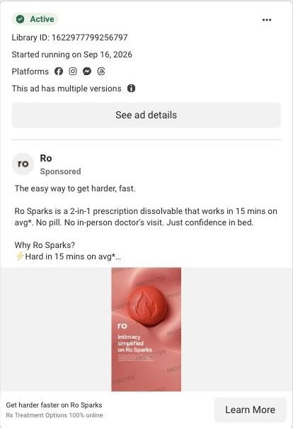
The easy way to get harder, fast. Ro Sparks is a 2-in-1 prescription dissolvable that works in 15 mins on avg*. No pill. No in-person doctor's visit. Just confidence in bed. Why Ro Sparks? ⚡ Hard in 15 mins on avg* 💧 Dissolves under the tongue ⏱️ Lasts in system long 🛏 Have sex more often 📦 100% online, discreet delivery Get started with an online visit. Connect with a Ro-affiliated provider, and if prescribed, get treatment 100% online with discreet delivery. *After medication dissolves. **Dual-action treatment contains tadalafil. Sparks is a compounded prescription drug that contains sildenafil and tadalafil and is used to treat erectile dysfunction (ED). Compounded drugs are permitted to be prescribed under federal law, but are not FDA-approved and do not undergo FDA safety, effectiveness, or manufacturing review. Do not take Sparks more than once in any 24-hour period or within 24 hours of taking any other ED medications or PDE-5 inhibitors, such as tadalafil or sildenafil. See full ISI: https://ro.co/safety-info/ro-sparks/
How Ro stacks three results in one Ro Sparks image ad
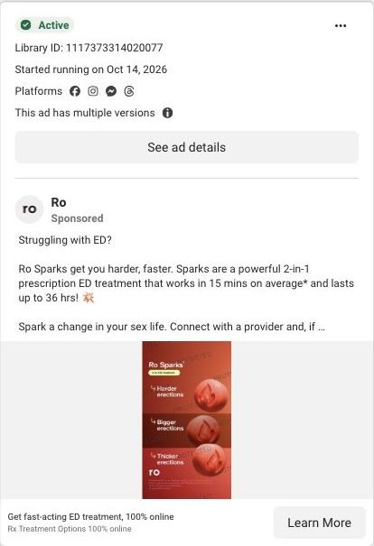
A static Ro image ad in red with three stacked panels, each pairing a dissolving tablet with a result the ad names (harder, bigger and thicker erections). The copy opens on a problem question and claims Sparks works in 15 minutes on average. It lands on Ro's Sparks product quiz.
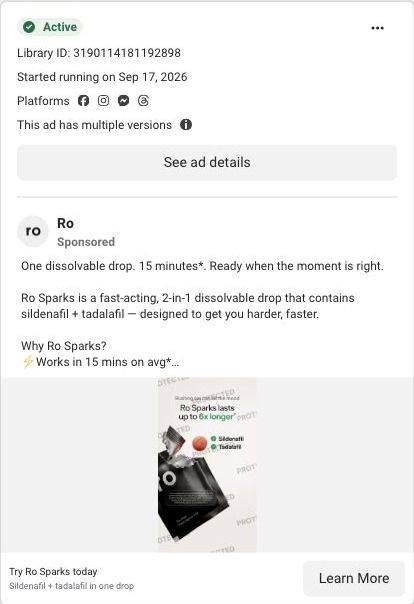
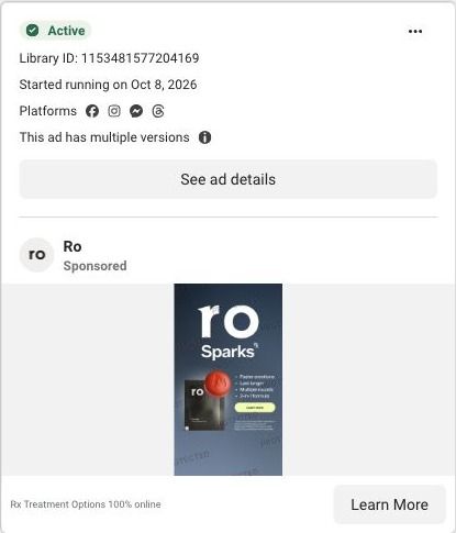
Public page captured October 22, 2026. Promotional sheets and temporary interface overlays were dismissed or removed in the static reference. No personal or medical information was entered. Captured entry screens do not reproduce the complete consultation.
Get fast-acting ED treatment, 100% online
Visual reference: Ro Sparks · three-result product still. Product and benefits stills open a four-step quiz entrance with a goal question and a direct online-visit bypass. The first-order offer was dismissed before capture; no health or sexual-history answers were entered. Compare the creative with the destination and explore the other ads sharing this route.
- Brand
- Ro
- Observed offer
- Online prescription ED visit; first-order promotion shown on captured page
- Creative angle
- Product benefits
- Page type
- Quiz entry
- Ad format
- Image
- Listed start date
- Oct 14, 2026
- Captured
- Oct 22, 2026
- Library ID
- 1117373314020077
- Destination
- ro.co
Selected for its design and offer structure. Ad performance isn’t available in this collection.
What this ad does well
The copy opens with "Struggling with ED?", a direct question that names the problem the viewer already knows they have. The image turns the benefits into a ladder of three panels, each with a tablet and one named result, so the eye moves down the image like a list. Keeping it in a single red color with the Ro mark at the bottom makes it recognizable as a Sparks ad. The copy adds the specifics the image can't, with the ad's claims on speed and duration and the compounded-drug disclosure.
What's missing
The strongest line, the problem question, lives in the primary text, which many people won't read, while the image only shows results. There's also no offer in the ad, even though the page shows $15 off. If you make one like this, put the problem question at the top of the image above the result panels, and add the offer as a small badge.
Beat by beat
- ImageThree stacked red panels each show a dissolving tablet beside a named result.
Breaking the benefits into a vertical list makes them easy to scan.
- HeadlineA Ro Sparks 2-in-1 ED treatment label sits at the top of the image.
It names the product and the format before the results.
- CopyThe primary text opens on a problem question and claims Sparks works in 15 minutes on average and lasts up to 36 hours.
Naming the problem first makes the claims feel relevant.
- CTAThe link headline reads Get fast-acting ED treatment, 100% online, with a Learn More button.
It promises convenience as the next step.
Where it sends people
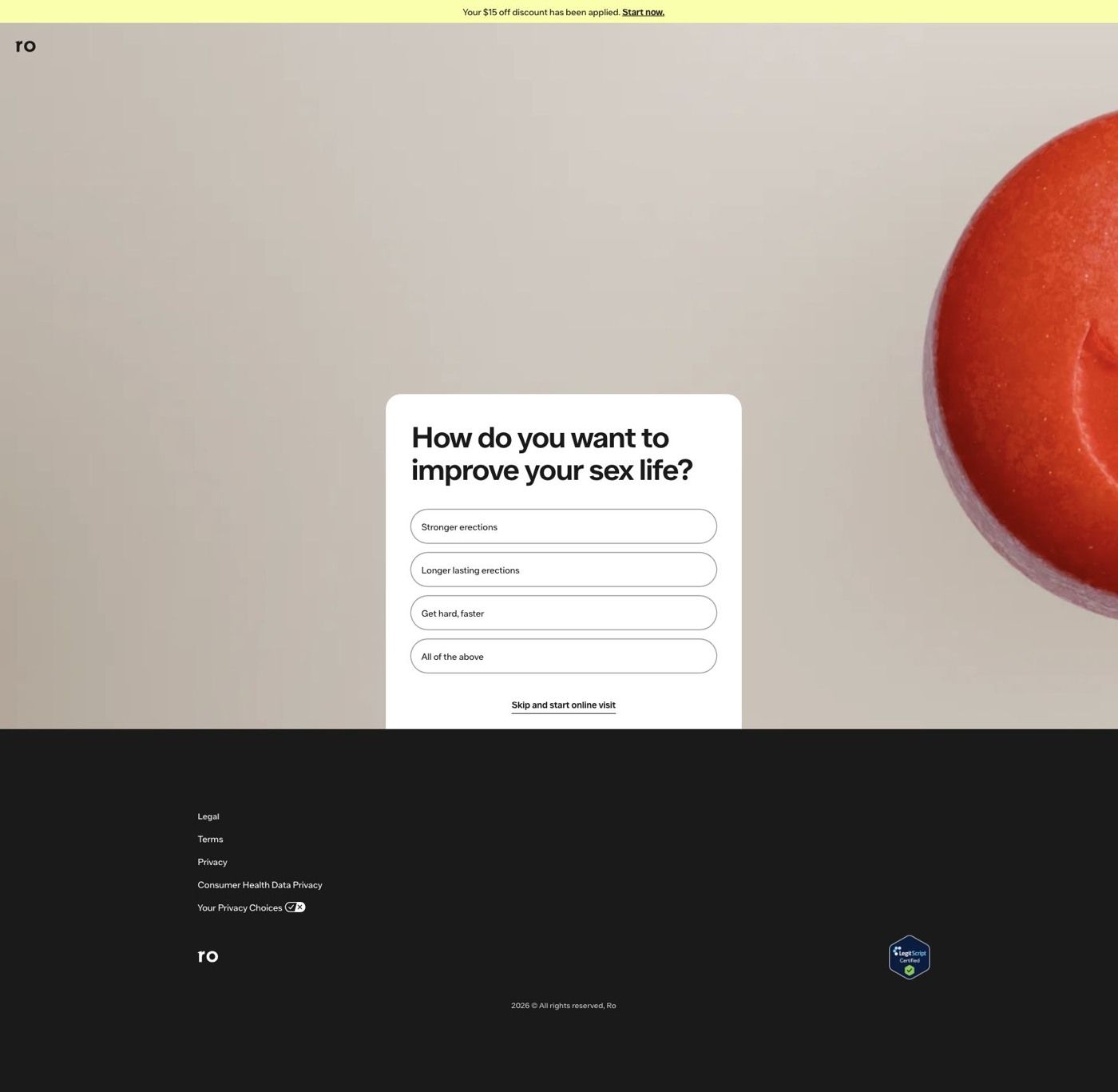
The ad sends people to Ro's Sparks product quiz, one of 5 ads in the Fluid library that land there. It's a quiz entry, usually the strongest place to send ad traffic: the captured page shows a large red Sparks tablet on a beige background, a card asking how you want to improve your sex life (stronger, longer-lasting, get hard faster, or all of the above), and a Skip and start online visit link. A yellow banner says a $15 off discount has been applied. The answer options on the card mirror the result panels in the ad, so the viewer can pick the result they came for. If you build a page like this, match the wording exactly between the ad's panels and the answer buttons.
The page it sends people to: How Ro's Sparks quiz entry picks up its product ads
Ro's Sparks quiz entry pairs a close-up of the red Sparks tablet with a card asking how you want to improve your sex life, plus a skip link to an online visit. It's the destination for 5 Ro ads in the Fluid library, mostly product-benefit stills (Get harder faster on Ro Sparks, Try Ro Sparks today) and one creator video.
How the page is built
- 01Discount banner
A yellow strip says your $15 off discount has been applied with a Start now link, answering 'is there a first-order deal?'
- 02Product close-up
A large red Sparks tablet fills the right side of the frame, tying the page to the product stills that sent the visitor.
- 03Goal question
The card asks how you want to improve your sex life, starting the quiz with the outcome the visitor cares about.
- 04Skip link
Skip and start online visit sends decided visitors straight to the consultation, answering 'can I skip this?'
- 05Quiz screen with progress bar
The next captured screen moves to a plain layout with a progress bar and asks about your goals for having better sex, showing how far the quiz has to go.
- 06Footer
Legal and privacy links and a LegitScript Certified badge sit below the entry card for anyone who scrolls.
The first fixes we would make
- There's no headline or product name on the entry screen, so the only thing connecting the page to Ro Sparks is the tablet photo. Put Ro Sparks and the ad's one-line promise above the question, so a visitor knows what they're qualifying for.
- The captured next screen asks about your goals for having better sex with options (Get hard faster, Stay hard for longer, Both) that overlap the entry question the visitor just answered. Carry the first answer forward and skip the repeat, so the quiz feels like it's listening.
Read the full breakdown of this page
Three hooks you could test
- Lead with the uncomfortable problem. “Struggling with [problem]? You're not the only one.”
- Turn the benefit into a picture people get in a second. “Three panels, three results, one product.”
- Sell the outcome. “Get the result you want, on your schedule.”
What to borrow for your brand
- Stack your top benefits as vertical panels with the product repeated in each, so the image reads like a checklist.
- Match the answer buttons on your quiz to the benefit panels in your ad.
- Keep one brand color across every panel so the ad is recognizable at a glance.
One of 100 Ro ads in the Fluid Inspiration Library, captured from the Meta Ad Library on Oct 22, 2026. We record that an ad ran publicly, not how it performed.