

ProseSponsored
Esc
How Prose turns an Irish vs Nordic curl comparison into a quiz ad
A Prose split-screen video showing two women from behind, one labeled Irish curls and one Nordic curls, asking which one you have. A voiceover compares spiral, pattern and density, says each needs a different routine, and shows Prose formulas built on curl pattern, density and goals. It offers 60% off and goes to the consultation.
Prose
64 creatives lead here1 / 64
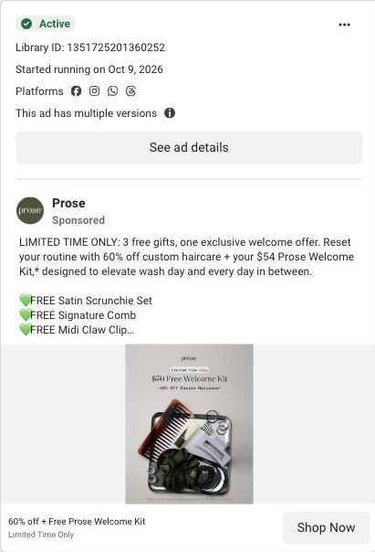


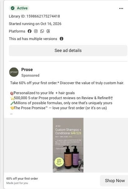


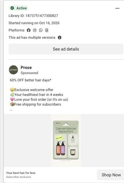

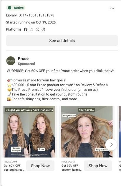


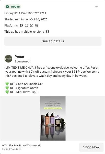
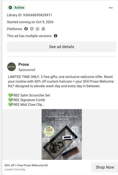


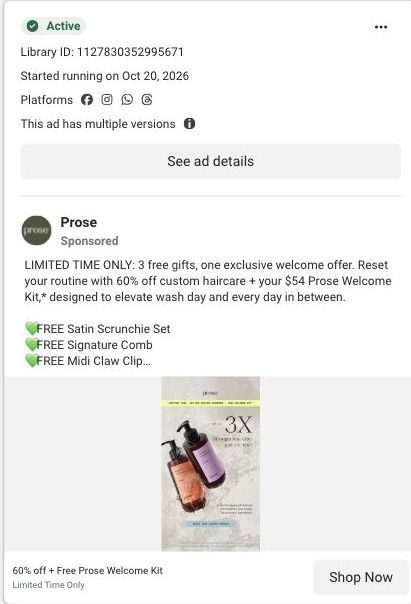


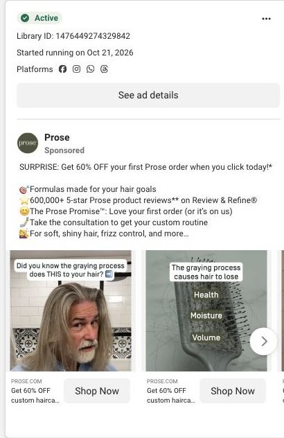


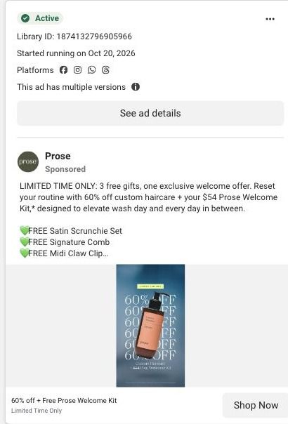
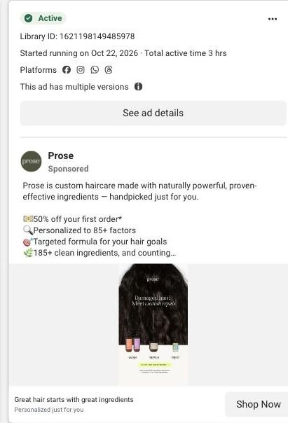

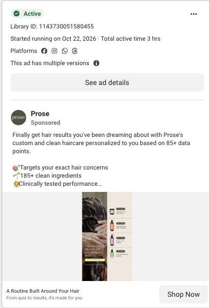






Prose · Haircare consultation
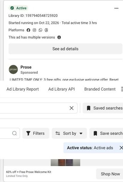
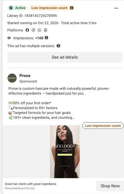
Public page captured October 22, 2026. Promotional sheets, chat, extension overlays and sticky cart bars were removed from the static reference; page layout and copy were preserved. No account, personal, health or payment details were supplied. Quiz captures show the observed entry screen, not the complete consultation.
Irish curls vs. Nordic curls
Visual reference: Irish curls vs. Nordic curls. Most selected ads go directly into the haircare consultation. The first-question URL redirects to a hair-length choice, with visible progress stages and a visual guide. No consultation answers were entered. Compare the creative with the destination and explore the other ads sharing this route.
- Brand
- Prose
- Observed offer
- Advertised custom haircare offer; subscription and gift conditions apply
- Creative angle
- Creator stories
- Page type
- Quiz entry
- Ad format
- Video · 0:38
- Listed start date
- Oct 21, 2026
- Captured
- Oct 22, 2026
- Library ID
- 2379370926154388
- Destination
- prose.com
Selected for its design and offer structure. Ad performance isn’t available in this collection.
What this ad does well
The split screen sets up a question viewers want to answer about themselves. Two heads of hair, side by side with simple labels, make the comparison instant, and the voiceover gives each type concrete traits (tight spirals and fine hair versus loose spirals, a mixed pattern and denser hair). The line that they may look similar but need completely different routines does the selling, because it turns curiosity about your curl type into a reason to get a routine made for it. The close is tidy: one quiz, one formula, zero guesswork, then the offer.
What's missing
The comparison earns attention, but the ad doesn't show what goes wrong when you use the wrong routine for your type, so the stakes stay abstract. A viewer who learns they have Irish curls still doesn't know what problem they've been living with. Add one beat after the comparison that shows the cost (curls that fall flat, frizz on top, a crunchy cast) so the quiz is the fix for something they've felt. The before-and-after illustrations are there, but they're labeled as illustrations with results may vary, so a real customer clip would be stronger proof.
Beat by beat
- 0-4sTwo women stand back to the camera, labeled IRISH CURLS vs NORDIC CURLS, with the caption asking which one you have.
It opens with a question about the viewer's own hair, which invites them to watch to the end to find out.
- 4-15sLabels list Nordic curls as tight spiral, defined pattern and fine hair, and Irish curls as loose spirals, mixed pattern and medium or dense hair.
It gives viewers concrete traits to compare against their own hair.
- 15-20sThe voiceover says they may look similar but need completely different routines.
It turns a fun comparison into a reason to care about getting the routine right.
- 20-30sProse formulas are shown as built on curl pattern, hair density and goals, with before-and-after illustrations and healthy, defined, bouncy on screen.
It shows the inputs behind personalization and the outcome the viewer is after.
- 30-38sOne quiz, one formula, zero guessing, then 60% off if you subscribe today and a call to take the Prose quiz.
It compresses the promise into three beats and adds a reason to click now.
The offer
60% off if you subscribe today, shown on screen as a first-order exclusive. The caption frames it as a surprise for clicking, with no commitment and cancel anytime.
Where it sends people
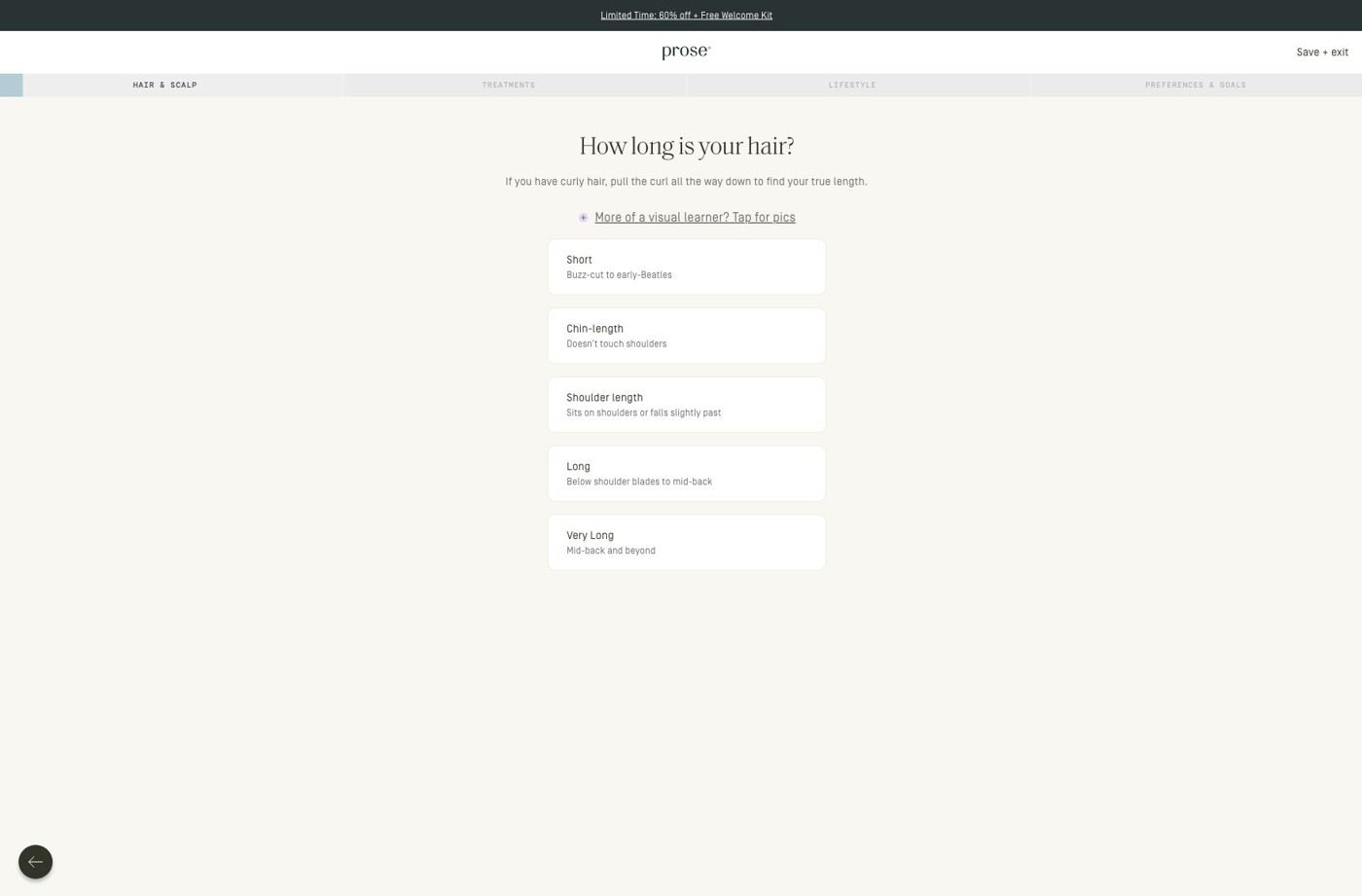
The link goes into the Prose consultation, which opens on a hair-length question with progress stages, a visual guide and stacked choices. A quiz is the natural follow-through here, since the ad has just asked the viewer to figure out their curl type. The entry screen doesn't continue the Irish versus Nordic thread, though, so the viewer's question (which one am I?) gets set aside for a length question first. It's one of 64 Prose ads in the Fluid library that point at this consultation.
The page it sends people to: How Prose starts its haircare quiz with one hair-length question
This is the first screen of Prose's haircare consultation: a slim promotion strip, a progress bar that names the consultation stages, and one hair-length question with large stacked choices and an optional visual guide. It's the destination for 64 ads in the Fluid library, mostly creator videos about curls and waves plus 60%-off offer ads.
How the page is built
- 01Promotion strip and header
A compact promotion strip sits above the logo and a save/exit control, so the offer stays visible and the visitor knows they can step out without losing their place.
- 02Progress stages
The consultation stages are named across the top, which answers "how much of this is there?" before the first tap.
- 03Hair-length question
One question with short explanatory copy, an optional visual guide and large stacked choices answers "what do I do here?" and makes the first answer easy to give.
- 04Back control
A back control lets people change an earlier answer, and the later consultation questions continue past what we captured.
The first fixes we would make
- Apart from the promotion strip, the entry screen doesn't restate what the visitor gets when they finish. Add one line under the progress stages that names the result (a formula built from these answers, plus the first-order offer the ads promised), so the effort of answering is tied to a reward.
- There's no proof on this screen, even though most of the ads sending people here are creator stories. A small strip with a customer quote or a still of a creator from the ads would carry that trust into the quiz without adding another step.
Read the full breakdown of this page
Three hooks you could test
- Turn the benefit into a picture people get in a second. “Two hair types, side by side. Which one is yours?”
- Lead with the uncomfortable problem. “Your curls look like hers but act completely different. Here's why.”
- Sell the outcome. “Find your curl type in one quiz, and get the routine made for it.”
What to borrow for your brand
- Put two named versions of your customer's problem side by side and ask which one they are, which turns a product ad into a quick self-test.
- Give each type three short traits on screen so viewers can sort themselves without hearing the audio.
- End with a three-part promise like one quiz, one formula, zero guessing, which states the whole mechanism in a line people remember.
Transcript
Irish pearls versus Nordic pearls. Which one do you have? Nordic curls form tight spirals with a defined curl pattern, but the hair itself is usually very fine, while Irish curls usually have loose spirals and a mixed curl pattern, straighter on top and curlier underneath. They may look similar, but they need completely different routines. That's where prose hair care comes in. Pros asks about your curl pattern, density, and goals, then builds a formula just for you. Get curls that are healthy, defined, and bouncy. One quiz, one formula, 0 guesswork. Plus, if you subscribe today, you can get 60% off. Take the pros quiz and find your perfect routine.
Text on screen
- IRISH
- CURLS
- NORDIC
- Which one do you have?
- NORDIC CURLS
- Tight spiral
- - NORDIC CURLS
- Defined curl pattern
- Fine hair
- IRISH CURLS
- Loose spirals
- Mixed curl pattern
- Medium or dense hair
- They may look similar...
- But they need
- completely different routines
- That's where Prose comes in
- Before and after illüstration taken by Hannish
- Prose Shampoo, Conditioner, Curl Cream.:
- Herbal Supplements and Scalp Serum
- Prose creates a
- formula based on
- Curl pattern
- Hair density
- Goals
- Get curls that are
- Healthy
- Before and after k
- caration taken by Eillana R. after using
- Prof
- Shampoo. Conditioner. Cort Cream. Root Source®
- Herbal Supplements and Scalo Serum - results may vary
- Defined
- Bouncy
- Beforeland after illustration taken by Lillana R. after uslog
- Prose Shampoo. Conditionen Curl Cream, Root Soutcet
- Herbal Supplements and Scalp Serum- results tay vary
- One quiz
- One formula
- Before and after illustratior
One of 93 Prose ads in the Fluid Inspiration Library, captured from the Meta Ad Library on Oct 22, 2026. We record that an ad ran publicly, not how it performed.