

ProseSponsored
Esc
How Prose put its review count at the center of a static ad
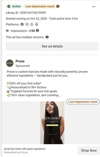
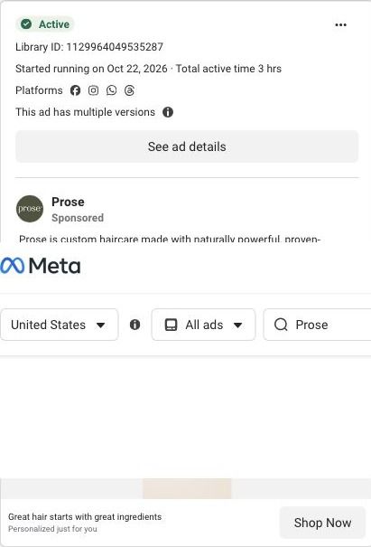
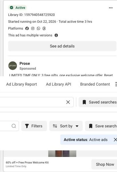
A Prose static that started running October 22, 2026: a portrait of a woman with long, sleek dark hair, with 600,000+ five-star Prose product reviews in large type. The copy promises haircare personalized to 85+ factors and 185+ clean ingredients, with 50% off a first order with a subscription. It links into the Prose haircare consultation.
Prose
64 creatives lead here1 / 64




















Prose · Haircare consultation
Public page captured October 22, 2026. Promotional sheets, chat, extension overlays and sticky cart bars were removed from the static reference; page layout and copy were preserved. No account, personal, health or payment details were supplied. Quiz captures show the observed entry screen, not the complete consultation.
Great hair starts with great ingredients
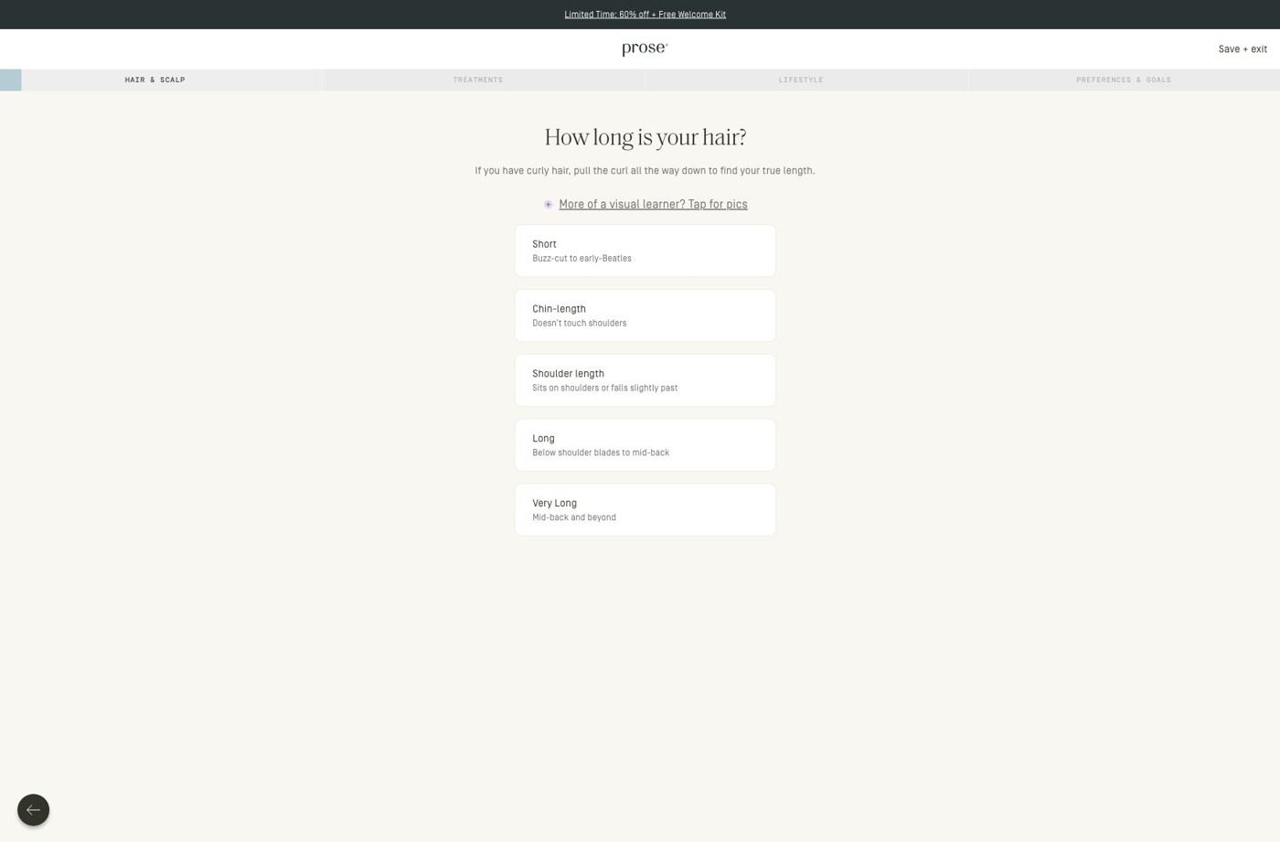
Visual reference: 600,000+ reviews · sleek-hair portrait. Most selected ads go directly into the haircare consultation. The first-question URL redirects to a hair-length choice, with visible progress stages and a visual guide. No consultation answers were entered. Compare the creative with the destination and explore the other ads sharing this route.
- Brand
- Prose
- Observed offer
- Advertised custom haircare offer; subscription and gift conditions apply
- Creative angle
- Product benefits
- Page type
- Quiz entry
- Ad format
- Image
- Listed start date
- Oct 22, 2026
- Captured
- Oct 22, 2026
- Library ID
- 1838143724270595
- Destination
- prose.com
Selected for its design and offer structure. Ad performance isn’t available in this collection.
What this ad does well
The review count is the biggest thing in the frame, so social proof lands before anything else, which is useful for a brand asking people to trust a formula they've never seen. The portrait of long, glossy hair gives the viewer an outcome to want, and putting proof on top of it ties the two together. The copy adds specifics (85+ factors, 185+ clean ingredients) that explain why the reviews might be so positive. That pairing of a visible result with a proof number is the strongest thing this static does.
What's missing
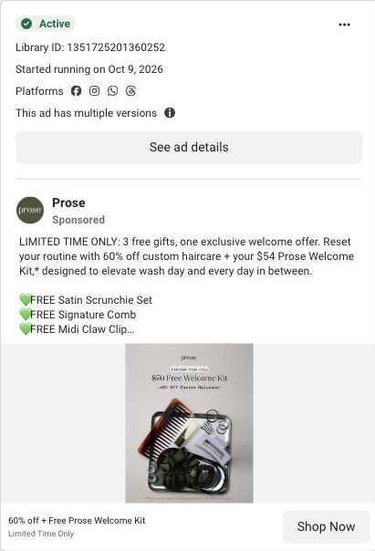
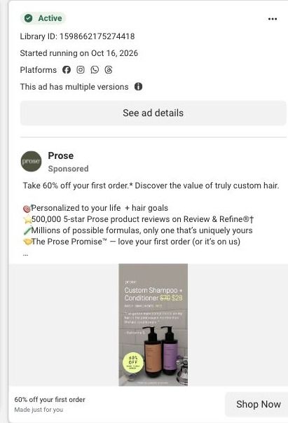
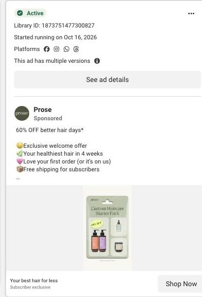
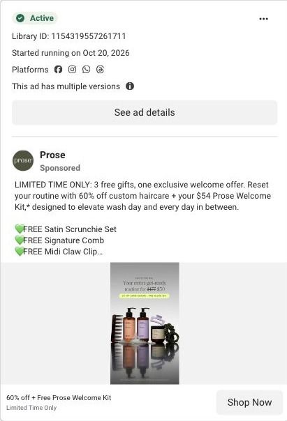
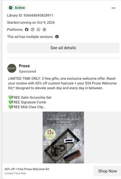
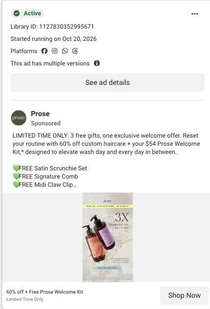
The ad has proof and a picture but no problem, so it doesn't tell the viewer which kind of hair or concern it's for. A big review count persuades people already considering the brand, while a cold viewer still needs a reason the ad is about her. If you make one like this, add a short line naming one concern next to the number (for example, frizz or dry ends) so the proof attaches to a problem. The copy offers 50% off while other Prose ads in the same week offer 60%, so check that each version runs the offer you intend.
Beat by beat
- ImageA portrait of a woman with long, sleek dark hair carries 600,000+ five-star Prose product reviews in large type.
It leads with proof and pairs it with a visible outcome.
- HeadlineThe headline says great hair starts with great ingredients, with a personalized-for-you description.
It gives a reason behind the reviews.
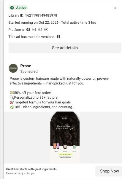
- CopyThe copy lists 50% off a first order, 85+ personalization factors, a targeted formula and 185+ clean ingredients.
It backs the image with specific numbers and the offer.
The offer
50% off a first order when you subscribe to haircare, with no commitment, listed first in the copy.
Where it sends people
The ad links into the Prose haircare consultation, a quiz, which the persona's ladder rates as often the best destination because it diagnoses and recommends from the visitor's answers. The captured entry screen shows a compact promotion strip, progress navigation naming the stages and a hair-length question with stacked choices. A visitor who clicked on a review count lands on a question with no proof on screen, so the trust the ad built has to carry her through. A small reminder of the review count near the progress bar would keep that proof in view while she answers.
The page it sends people to: How Prose starts its haircare quiz with one hair-length question
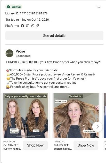
This is the first screen of Prose's haircare consultation: a slim promotion strip, a progress bar that names the consultation stages, and one hair-length question with large stacked choices and an optional visual guide. It's the destination for 64 ads in the Fluid library, mostly creator videos about curls and waves plus 60%-off offer ads.
How the page is built
- 01Promotion strip and header
A compact promotion strip sits above the logo and a save/exit control, so the offer stays visible and the visitor knows they can step out without losing their place.
- 02Progress stages
The consultation stages are named across the top, which answers "how much of this is there?" before the first tap.
- 03Hair-length question
One question with short explanatory copy, an optional visual guide and large stacked choices answers "what do I do here?" and makes the first answer easy to give.
- 04Back control
A back control lets people change an earlier answer, and the later consultation questions continue past what we captured.
The first fixes we would make
- Apart from the promotion strip, the entry screen doesn't restate what the visitor gets when they finish. Add one line under the progress stages that names the result (a formula built from these answers, plus the first-order offer the ads promised), so the effort of answering is tied to a reward.
- There's no proof on this screen, even though most of the ads sending people here are creator stories. A small strip with a customer quote or a still of a creator from the ads would carry that trust into the quiz without adding another step.
Read the full breakdown of this page
Three hooks you could test
- Sell the outcome. “Hair this smooth, in a formula built from your answers.”
- Turn the benefit into a picture people get in a second. “Hundreds of thousands of five-star reviews, one portrait.”
- Lead with the uncomfortable problem. “Tried everything for frizz? Here's what reviewers switched to.”
What to borrow for your brand
- Make your biggest proof number the largest element in the image, so trust lands before the viewer reads anything else.
- Place that proof on a picture of the outcome, so the number and the result read as one message.
- Keep the offer identical across versions of the same creative, so a shopper who sees two ads doesn't wonder which price is real.
One of 93 Prose ads in the Fluid Inspiration Library, captured from the Meta Ad Library on Oct 22, 2026. We record that an ad ran publicly, not how it performed.