

PoppiSponsored
Esc
How Poppi's Raspberry Rose static sells a soda swap in pink
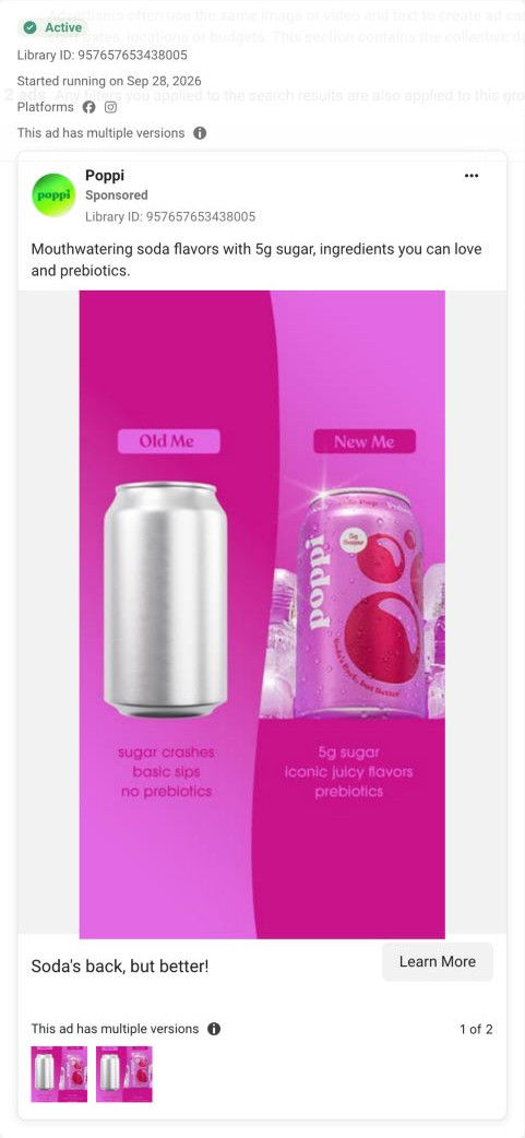
A pink split-screen static from Poppi. A plain silver can stands under Old Me, and a sparkling Raspberry Rose Poppi stands under New Me, each above a short list. The headline is “Soda's back, but better!” and the button says Learn More. There's no price or offer, Meta shows multiple versions, and it links to the Poppi homepage.
Poppi
20 creatives lead here1 / 20




Poppi brand homepage
Native screenshot captured from the public Meta Ad Library. Destination captured while scrolling on October 20, 2026; current offers and default variants may differ from the original creative.
Old Me / New Me: Raspberry Rose
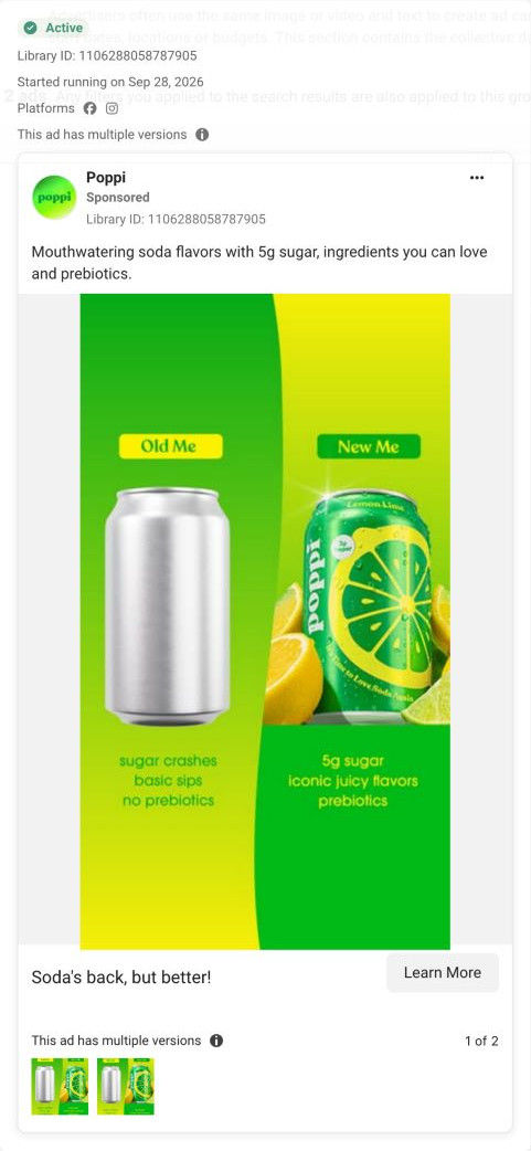
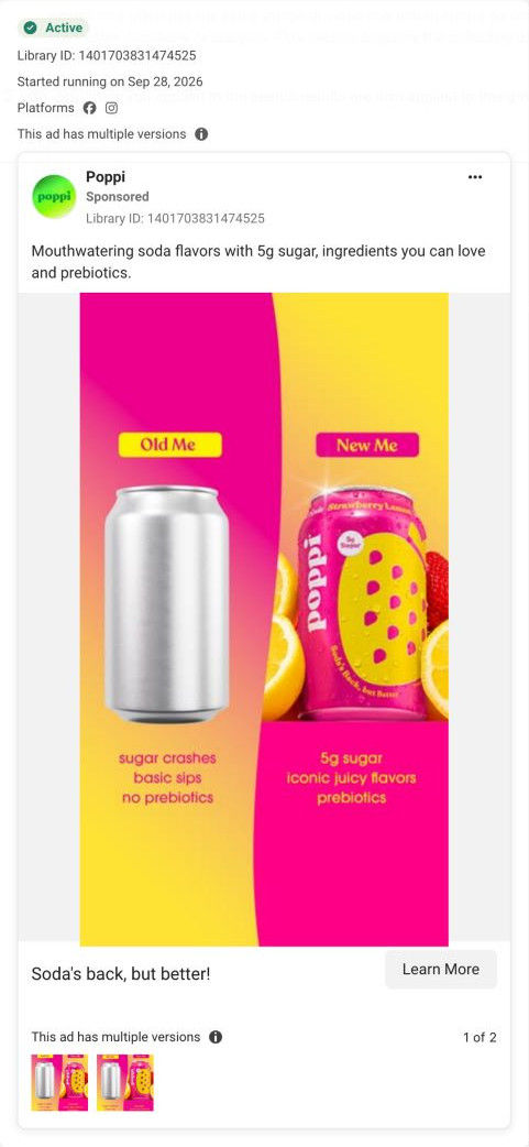
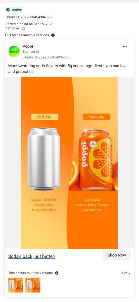
Pink split-screen artwork contrasts an unbranded silver can with Raspberry Rose Poppi. All 20 selected ads link to the same brand homepage. The observed destination leads with a colorful product video, then uses a tiled mix of flavor, shopping, community and retail content rather than a creative-specific sales page. Compare the creative with the destination and explore the other ads sharing this route.
- Brand
- Poppi
- Observed offer
- Advertised 5g sugar, flavors and prebiotics
- Creative angle
- Brand comparison
- Page type
- Homepage
- Ad format
- Image
- Listed start date
- Sep 28, 2026
- Captured
- Oct 20, 2026
- Library ID
- 957657653438005
- Destination
- drinkpoppi.com
Selected for its design and offer structure. Ad performance isn’t available in this collection.
What this ad does well
The all-pink palette makes this version feel softer than the brighter citrus ones, which suits a floral flavor like Raspberry Rose. The Poppi can gets condensation, a sparkle and ice behind it, while the plain can is flat and dry, so the left side looks like an afterthought before you read anything. The mirrored lists carry the same three-for-three argument as the rest of the template, which keeps the series consistent.
What's missing
Everything on the New Me side is Poppi's own claim, and nothing backs it up: no review, no rating and no quote from someone who made the switch. A static has room for one line of proof, and without it the viewer is asked to take the comparison on faith. If you make one like this, add a short customer quote or your review score under the New Me list (only if you have it), so the comparison has a voice other than yours.
Beat by beat
- ImageA pink split screen sets a flat, plain silver can against a sparkling Raspberry Rose Poppi with ice behind it.
Styling only one side makes the better choice obvious at a glance.
- HeadlineThe Soda's back, but better! headline sits under the image with a Learn More button.
It frames the product as an upgrade within soda instead of a health drink.
- CopyThe primary text names mouthwatering flavors, 5g sugar, ingredients you can love and prebiotics.
It repeats the New Me list for people who read the caption.
Where it sends people
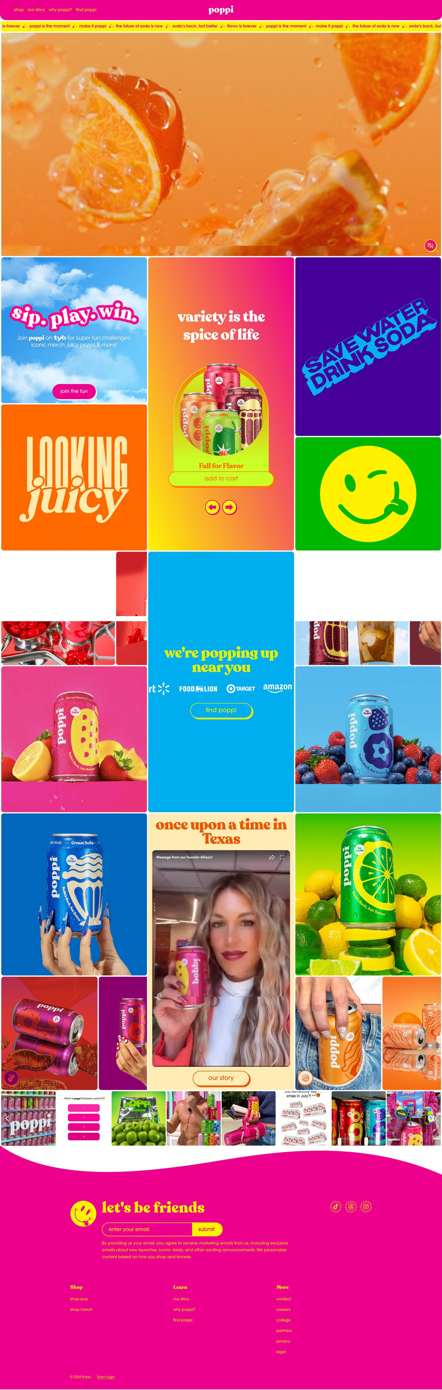
The ad sends people to the Poppi homepage, the weakest rung of the landing-page ladder for a flavor-specific static. The first screen is a muted fruit video with no headline, and the product tile in our capture shows a Fall for Flavor variety pack, so Raspberry Rose and the comparison don't carry through. A Raspberry Rose product page with the Old Me / New Me lists near the price, or a landing page built around the comparison, would keep the promise the ad makes.
The page it sends people to: How Poppi's bento-grid homepage handles traffic from every ad
Poppi's homepage is a colorful bento grid with a muted fruit video in place of a headline, then tiles for a variety pack, a loyalty program, a retail locator, a founder video and social posts. All 20 Poppi ads in the Fluid library link here, from Sour Apple launch videos and recipes to campus sweepstakes creators and Old Me / New Me statics.
How the page is built
- 01Header
A pink bar with shop, our story, why poppi? and find poppi links and a centered logo answers where to go next for each kind of visitor.
- 02Slogan ticker
A thin scrolling strip of taglines like soda's back, but better repeats the brand's lines so the page sounds like the ads.
- 03Hero video
A full-width muted macro video of fruit in fizzing liquid sets the mood but answers no buying question, since it has no headline or button.
- 04Bento grid: shop and loyalty
Tiles for the loyalty program, a variety-pack carousel with Add to Cart, and bold slogan and icon tiles answer what can I buy and why join.
- 05Retail locator
A popping up near you tile with retailer logos and a Find button, surrounded by flavor-can photos, answers where can I buy it in a store.
- 06Founder story
A tile with a storytelling headline, an embedded founder video and an Our Story button answers who's behind this brand.
- 07Social strip
A horizontal carousel of social posts and UGC thumbnails shows real people with the cans, which answers whether other people actually drink this.
- 08Newsletter and footer
A wavy band with a mascot, a let's be friends email sign-up, socials and link columns gives visitors who aren't buying today a way to stay in touch.
The first fixes we would make
- The hero has no headline, so a visitor arriving from a Sour Apple launch ad or a Kroger sweepstakes ad doesn't see their reason for clicking on the first screen. Either send the biggest ad groups to their own pages, or add a rotating tile right under the hero for the current launch (Sour Apple, with Add to Cart) and the current promotion.
- The campus creator ads ask viewers to submit a Kroger receipt for a Homefield gift card, and nothing on the page lets them do it. Add a sweepstakes tile to the grid with the receipt entry, the prize and the end date, placed next to the retail locator.
Read the full breakdown of this page
Three hooks you could test
- Call out the habit you're replacing. “Old me: a plain can and no thought. New me: something I actually look forward to.”
- Turn the benefit into a picture people get in a second. “Make your product sparkle and leave the generic one flat, so the upgrade is visible before it's readable.”
- Sell the outcome. “Soda that feels like a treat instead of a habit.”
What to borrow for your brand
- Light and style only your side of a comparison image so the contrast does the persuading.
- Match each version's palette to the flavor's mood, which keeps a templated series from feeling repetitive.
- Reserve one line of the static for real proof, such as a customer quote or review score, so the comparison isn't only your word.
One of 20 Poppi ads in the Fluid Inspiration Library, captured from the Meta Ad Library on Oct 20, 2026. We record that an ad ran publicly, not how it performed.