

OSEASponsored
Esc
How OSEA shows its skincare quiz inside a 22-second video ad
A 22-second OSEA video ad that opens on a sunlit close-up of skin with the word READY, then screen-records the brand's site: a free-shipping banner, the family story, a Build Your OSEA Malibu Routine prompt and the quiz itself, through to an AM routine result. The copy invites viewers to take the quiz, and the link opens it.
OSEA
3 creatives lead here1 / 3
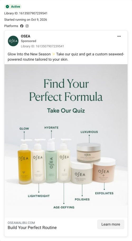
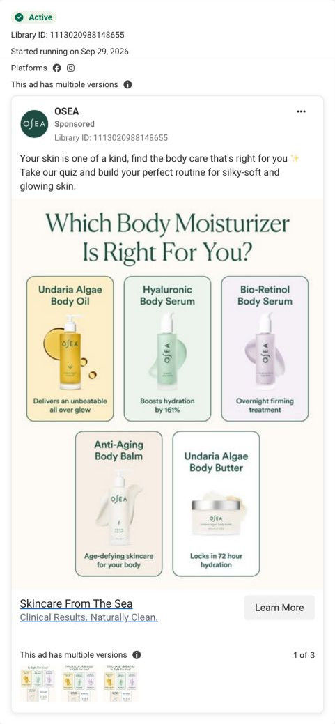
Find Your Body Care Routine
Initial quiz step only. No quiz answers or contact details were submitted.
Build Your Perfect Routine
The ad invites shoppers to build a routine tailored to their skin, using a new-season prompt to start the interaction. The Learn More CTA opens OSEA’s quiz entry page before any product selection. Compare the creative with the destination and explore the other ads sharing this route.
- Brand
- OSEA
- Observed offer
- Body-care routine quiz
- Creative angle
- Personalization
- Page type
- Quiz entry
- Ad format
- Video · 0:22
- Listed start date
- Sep 29, 2026
- Captured
- Oct 19, 2026
- Library ID
- 1771442340646491
- Destination
- oseamalibu.com
Selected for its design and offer structure. Ad performance isn’t available in this collection.
What this ad does well
The ad shows the quiz rather than describing it, which removes the biggest worry about quizzes: how long will this take? Viewers see the promise of finding the best products for your skin in less than a minute, then watch the actual questions go by (face, body or both, skin type, then concerns like dryness and redness) and land on a routine. That makes the click feel easy and the payoff concrete. The site footage also slips in Subscribe & Save 10% and free shipping. OSEA ran several versions of this ad on Meta from September 29, 2026.
What's missing
The opening close-up is beautiful but doesn't name a problem, so a viewer has to watch the screen recording to understand why they should care. The copy's angle, a routine for the new season, never shows up on screen as a specific change in their skin. Open with the concern the quiz asks about ("dry, tight skin as the weather turns?") over that close-up, and the rest of the video becomes the answer. A clear line about what you get for finishing, like the 10% subscription saving, would also give people a reason to complete it.
Beat by beat
- 0-3sA sunlit close-up of skin and a fingertip with the word READY on screen.
It sets a warm, sensory mood and starts a sentence the viewer wants finished.
- 3-8sA screen recording of the OSEA site shows the free-shipping banner, Clean Since 1996 and the family story.
It introduces the brand's heritage and the shipping offer before asking for anything.
- 8-12sThe Build Your OSEA Malibu Routine prompt promises the best products for your skin in less than a minute.
It sets the effort level low, which is what gets people to start a quiz.
- 12-20sQuiz screens go by: what routine you're building, skin type, then skin concerns such as dryness and dullness.
It shows the real questions, so viewers know what to expect and see the quiz is personal.
- 20-22sThe recording reaches an AM ROUTINE result.
It previews the payoff, a ready-made routine, so the click has a clear reward.
The offer
No direct offer in the copy. The screen recording briefly shows a limited-time free-shipping banner and Subscribe & Save 10%, which reads as background rather than a reason to act.
Where it sends people
The ad links straight to the quiz, which the persona's landing-page ladder often ranks as the strongest destination: it finds out what the visitor is dealing with and recommends products as the answer. The match is tight, because the quiz opens on its first question with no intro screen, and that question (face, body or both) is the one the video shows. A progress bar with a step count tells people how long it is. The capture only shows that first step, so we can't judge the results page the ad previews.
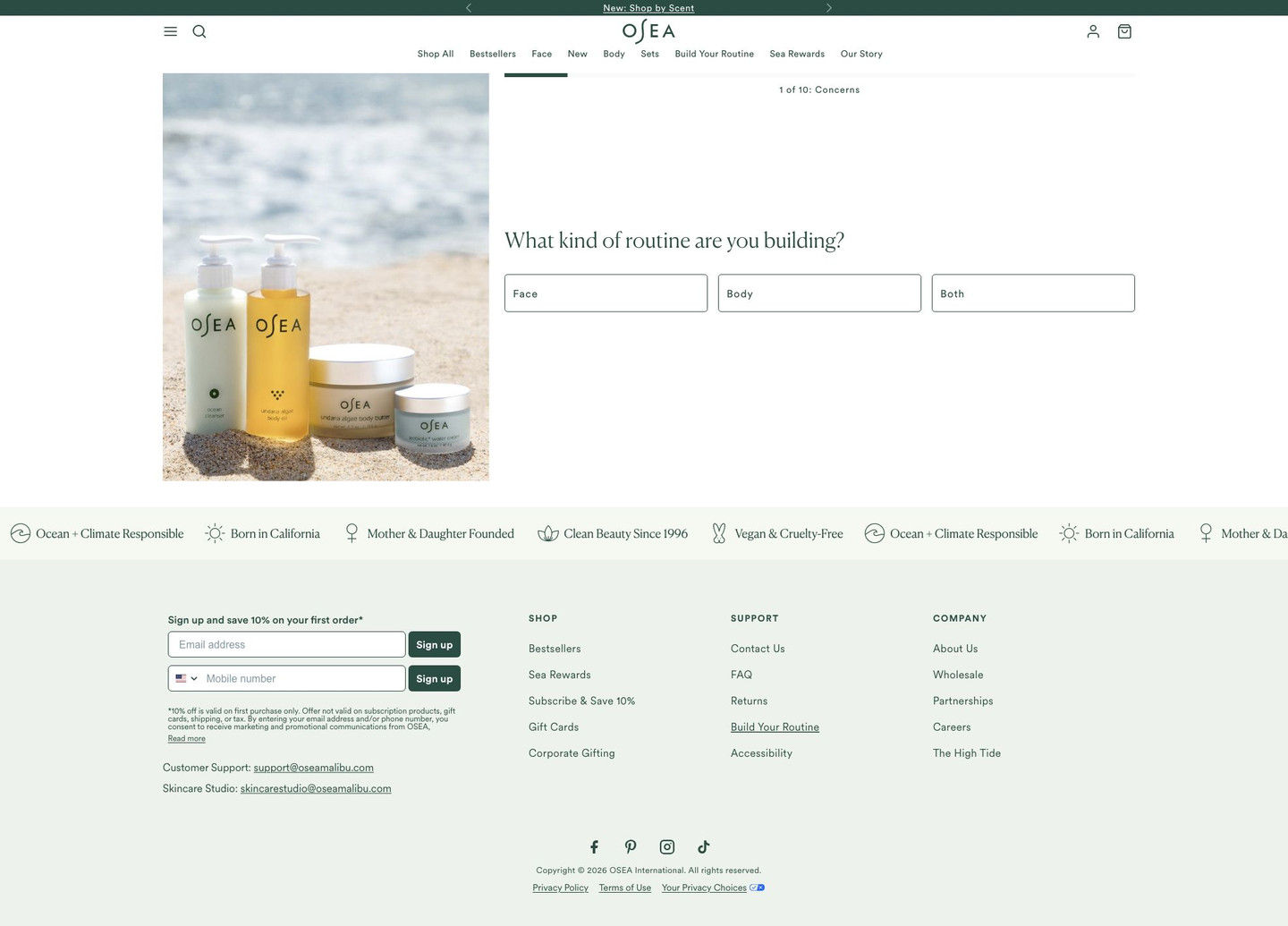
The page it sends people to: How OSEA's routine quiz opens straight on the first question
OSEA's routine quiz page, captured at its first step: a lifestyle photo beside a progress bar and one question about what kind of routine you're building, with face, body and both as answers, followed by a values ticker and footer. Three OSEA ads in the Fluid library send people here, all personalization ads inviting viewers to take the quiz.
How the page is built
- 01Announcement bar
A rotating line links to a new shop-by-scent feature, a secondary path for people not ready for the quiz.
- 02Header
Menu, search, logo, account, bag and a nav row that includes build-your-routine and rewards links keep the full site one tap away.
- 03Quiz step
A lifestyle photo beside a progress bar, a serif question about your routine and three answer buttons (face, body, both) start the quiz with almost no effort.
- 04Values ticker
Scrolling icons for climate responsibility, origin, founders, clean beauty and vegan answer whether the brand shares the shopper's values.
- 05Footer
Email and SMS sign-up with a first-order discount, support emails and links catch people who leave the quiz.
The first fixes we would make
- The first screen doesn't say what you get for finishing. Add one line above the question ("Get your routine in under a minute" plus any offer) so the reward is visible from the start.
- Two of the ads are body-specific, but the quiz asks face, body or both every time. Pass a parameter from those ads to skip to the body branch so shoppers don't repeat a choice.
Read the full breakdown of this page
Three hooks you could test
- Lead with the uncomfortable problem. “Skin feeling tight the second the weather turns?”
- Sell the outcome. “A morning routine picked for your skin in under a minute.”
- Show a specific moment of use. “Answer four questions on your couch, get your routine before the kettle boils.”
What to borrow for your brand
- Screen-record your own quiz in the ad so viewers see how short it is and what it asks before they tap.
- End the recording on the result screen so the reward of finishing is visible.
- Link the ad directly to the quiz's first question, with no intro page in between.
Transcript
There's no speech in this video. The on-screen text and music carry the message.
Text on screen
- READY FOR YOUR
- 1:40
- 1130
- Limited Time: Free Shipping on US Orders
- 10% Off
- Clean Since 1996
- Today it's called clean beauty, but in our
- family, it is what it has always been: a
- simple, holistic phitosophy that our
- connection to nature is essential to aur
- collective wallbeing. tea the Bifference®
- OUR FAMILY STORY
- Build Your OSL
- Malibu ™ Routine
- Discover the beat producte for your
- skin in lose fian a mute
- oseamalibu.com
- imited Time: Free Shipping on US Orders
- day its called clean beauty, but in our
- mily, it is what it has always been: a
- mple, holistic philosophy that our
- connection to nature is essential to our
- collective wellbeing. Sea the Difference®
- Build Your OSEA
- Malibu™ Routine
- Discover the best products for your
- skin in less than a minute
- TAKE QI
- 10% O
- Subscribe & Save 10%
- / 10% off every order
- / Free shipping forever
- 1 of 10: Concerns
- What kind of routine are you
- building?
- Body
- Face
- Both
- 3 of 11: Skin Type
- How would you describe
One of 8 OSEA ads in the Fluid Inspiration Library, captured from the Meta Ad Library on Oct 19, 2026. We record that an ad ran publicly, not how it performed.