How MUDWTR reuses a podcast-stitch hook for a second landing page
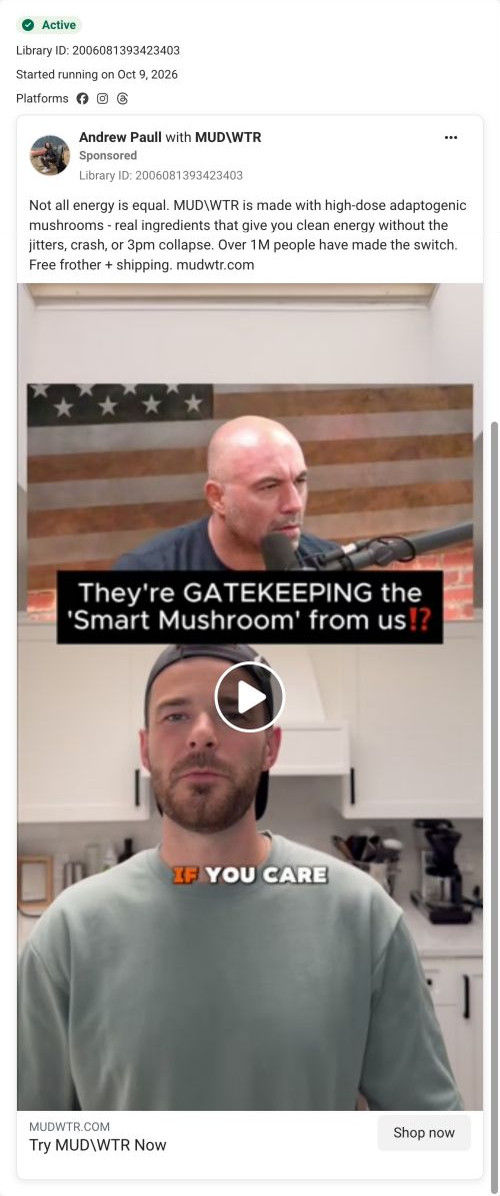
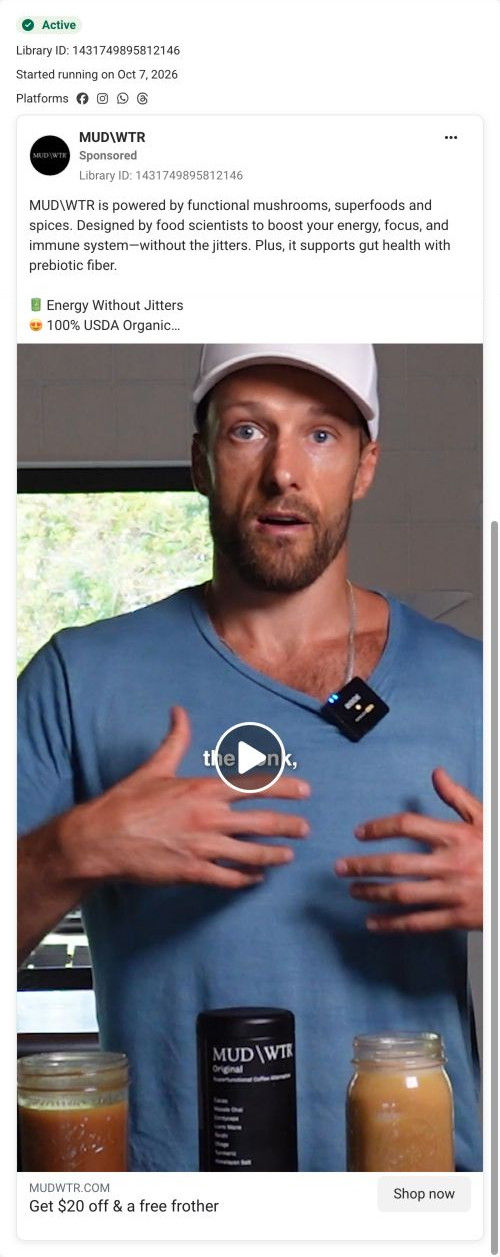
An Andrew Paull partnership video that stacks a podcast clip over Andrew speaking in a kitchen, with the overlay “They're GATEKEEPING the 'Smart Mushroom' from us⁉” and a caption beginning “IF YOU CARE.” It's a recut of the gatekeeping hook with MUDWTR's coffee-swap copy, and it links to the Rise 2 campaign page instead of the starter offer.

A browser shopping-extension badge appears in the upper-right margin of this capture.

Not all energy is equal
A coffee-swap message introduces the mushroom blend, followed by free frother and shipping framing and a mystery-gift CTA. The CTA leads to the Rise 2 starter-offer route, shared by several ads in this collection. Compare the creative with the destination and explore the other ads sharing this route.
- Brand
- MUDWTR
- Observed offer
- Advertised free frother + shipping; mystery-gift CTA
- Creative angle
- Creator-led
- Page type
- Dedicated offer
- Ad format
- Video
- Listed start date
- Oct 9, 2026
- Captured
- Oct 19, 2026
- Library ID
- 2006081393423403
- Destination
- mudwtr.com
Selected for its design and offer structure. Ad performance isn’t available in this collection.
What this ad does well
Reusing a strong hook with a new setting and caption is exactly how a brand builds volume without new ideas every week. This cut puts Andrew in a kitchen in a plain sweatshirt, which feels even more casual, and the caption about caring adds a values angle to the curiosity. The podcast clip above still lends weight to the topic.
What's missing
As with the other gatekeeping cut, the secret is never named in writing, so the hook only pays off for viewers with sound. This version also sends people to a different page than its twin, and the copy's free frother and shipping doesn't match the page's 43% button. If you recut a hook for a second page, make sure the copy's offer matches that page, and name the ingredient in the text.
Beat by beat
- 0-3sA podcast clip sits above Andrew in a kitchen, with the gatekeeping overlay and a caption about caring.
It reuses a curiosity hook and adds a values angle.
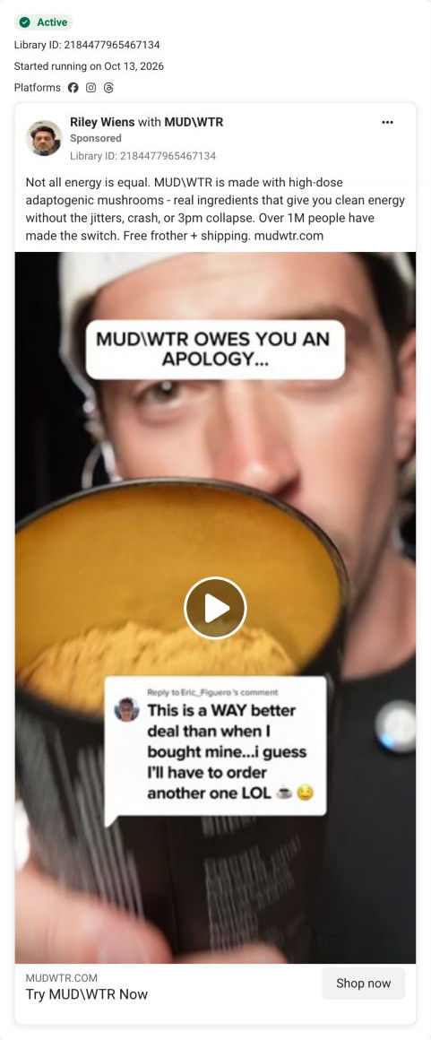
- CopyThe text claims high-dose adaptogenic mushrooms give energy without the jitters, crash or 3pm collapse, cites over 1M switchers and offers a free frother and shipping.
It connects the teased ingredient to the product.
- HeadlineThe link card reads Try MUDWTR Now.
It's a plain call to action without an incentive.
The offer
Free frother and shipping in the copy; no discount in the ad itself.
Where it sends people
It sends people to the Rise 2 campaign page, a long, focused landing page with a logo-only header, and one of 10 ads in the Fluid library that land there. The hero names the category (Super Functional Coffee Alternative) with a “Try it & Save 43%” button, a 30-day money-back guarantee line and four icon benefits framed as coffee without its drawbacks. That button and guarantee repeat after the product block, the comparison table and the review section, so every proof block ends in the same action. The ingredient grid on this page is where the smart mushroom would be explained, and the founder video adds a human origin story the ad doesn't have. The ad's offer (free frother and shipping) doesn't match the 43% button, so a line in the copy naming the saving would make the arrival feel expected.
The page it sends people to: How MUDWTR's Rise 2 page ends every proof block with the same offer
MUDWTR's Rise 2 campaign page, a dark, long-form landing page with a logo-only header. It names the coffee-alternative category up top and repeats one 43% savings button with a guarantee line after each proof block. It's the destination for 10 ads in the Fluid library, mostly habit-switch videos and statics with a couple of creator cuts.
How the page is built
- 01Logo-only header
A black header with only the logo removes navigation so ad visitors stay on the offer.
- 02Hero
An overhead cup photo sits beside a rating with review and member counts, a category headline, the savings button, a guarantee and four benefit bullets, answering what this is and what it costs to try.
- 03Testimonial band and ticker
A creator quote with avatar and a scrolling strip of benefit words add an early human voice.
- 04Product block
A pack shot with ingredients sits next to a morning-ritual headline, flavor and feeling columns, a checklist of attributes and certifications, and the button again, answering what's in it and how it tastes.
- 05Founder video
An Our Founding Story card with a one-line origin and a Play button answers who's behind the brand.
- 06Comparison table
The product column is raised and outlined against two rival products with star ratings and four attribute rows, then the button, answering why this one over other blends.
- 07Creator carousel
A Loved By Creative Minds carousel pairs a large quote with portraits, answering who else drinks it.
- 08Customer proof
A Join The Movement headline, topic tabs filtering review cards, a carousel of UGC video thumbnails and the button again answer whether people like it.
- 09Ingredients grid
Eight cards with texture photos, benefit tags and one sentence each explain what every ingredient is there for.
- 10Product range
A Popular Products grid with status tags (new, popular, zero caffeine) shows the wider line.
- 11FAQ
A long accordion covers caffeine, sugar, sourcing, pregnancy, preparation and taste, answering the remaining objections.
- 12Brand story, retail and footer
Founding story, a partner-app perk and giving rows lead into retailer logos, a humorous ad video, journal cards, social photos, press logos, a newsletter and footer citations and disclaimer.
The first fixes we would make
- Several ads that land here offer $20 off and a free frother, and the button says 43%. Rewrite those ads around 43% or route them to the classic Rise page, which leads with $20, so the number never changes between the ad and the page.
- The free frother and the mystery gift that some ads promise don't appear in the hero. Add a short line under the button listing what comes free, so the offer from the ad is confirmed on arrival.
Read the full breakdown of this page
Three hooks you could test
- Sell the outcome. “The ingredient that keeps people sharp all afternoon, and why it's hard to find.”
- Lead with the uncomfortable problem. “If you've tried everything for your afternoon fog, you haven't tried this.”
- Show a specific moment of use. “What I add to my morning before a long day of calls.”
What to borrow for your brand
- Recut a hook you already have with a new setting and a new caption, so you test framing without a new concept.
- When a recut goes to a different landing page, rewrite the copy's offer to match that page.
- Add a values line (if you care about what you drink) to a curiosity hook to widen who it speaks to.
One of 34 MUDWTR ads in the Fluid Inspiration Library, captured from the Meta Ad Library on Oct 19, 2026. We record that an ad ran publicly, not how it performed.