How MUDWTR shows a coffee swap as a cup you want seconds of
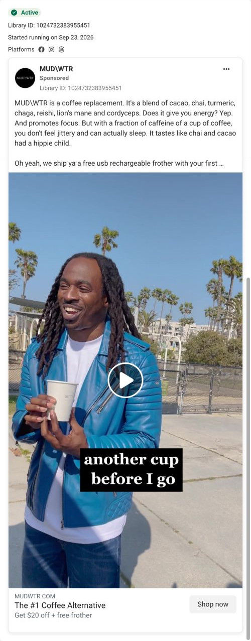
A brand-page video of a man in a blue leather jacket laughing outdoors among palm trees, holding a MUDWTR cup, with the caption “another cup before I go.” The copy lists the ingredients and claims energy and focus with less caffeine, and the headline reads The #1 Coffee Alternative with $20 off, linking to the classic Rise page.

A browser shopping-extension badge appears in the upper-right margin of this capture.

Get $20 off & a free frother
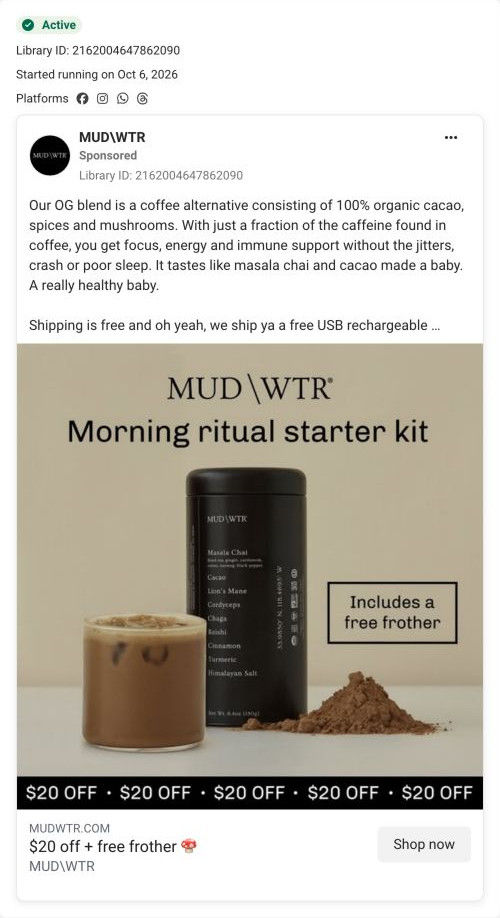
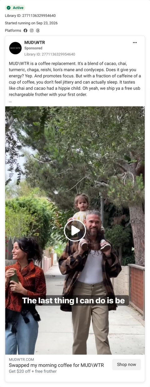
The copy introduces the mushroom blend and its advertised benefits, while the CTA makes the $20 saving and free frother explicit. The CTA leads to the Rise 2 starter-offer route, shared by several ads in this collection. Compare the creative with the destination and explore the other ads sharing this route.
- Brand
- MUDWTR
- Observed offer
- Advertised $20 off + free frother; free shipping in the copy
- Creative angle
- Habit switch
- Page type
- Dedicated offer
- Ad format
- Video
- Listed start date
- Sep 23, 2026
- Captured
- Oct 19, 2026
- Library ID
- 1024732383955451
- Destination
- mudwtr.com
Selected for its design and offer structure. Ad performance isn’t available in this collection.
What this ad does well
Wanting a second cup is a quiet but persuasive taste signal, and the caption shows it as a moment rather than claiming it. The copy is one of the most readable in the set: it names every ingredient (cacao, chai, turmeric, chaga, reishi, lion's mane, cordyceps), answers its own question about energy with a casual yep, and ends on the joke that it tastes like chai and cacao had a hippie child. That voice makes a functional product sound fun.
What's missing
The headline claims #1 Coffee Alternative without saying by what measure, and the ad offers no outside proof (a review count or rating) to back it up. The copy's claim that you can actually sleep is attributed only to the brand. If you make one like this, either support a ranking claim with a source or swap it for a specific proof point, like a review count, that you can show.
Beat by beat
- 0-3sA man in a blue leather jacket laughs outdoors holding a MUDWTR cup, captioned about having another cup before he leaves.
It shows the product as something people go back for.
- CopyThe text lists the ingredients, says the drink gives energy and promotes focus with a fraction of coffee's caffeine so you don't feel jittery and can sleep, and jokes about the taste.
It explains what's in it and why it's different, with personality.
- HeadlineThe link card reads The #1 Coffee Alternative with $20 off and a free frother.
It pairs a category claim with a dollar saving.
The offer
$20 off plus a free frother in the headline, and the copy mentions a free USB rechargeable frother with the first order.
Where it sends people
It sends people to the classic Rise campaign page, an older-style page with a full header (menu, account and cart), and one of 3 ads in the Fluid library that land there. An announcement bar offers a free Pumpkin Spice Latte bag with a starter kit, and the hero headline, Energy & focus without the jitters, sits over an ingredient list, a “Try It – Save $20” button and a 30-day money-back guarantee. The $20 saving in the ad matches the button, so the promise carries through. The weak spots are the menu, account and cart links (easy exits from a campaign page) and the ingredient bands below the explainer, which looked like unloaded images in our capture.
The page it sends people to: How MUDWTR's classic Rise page explains a coffee swap
MUDWTR's classic Rise campaign page, an older-style layout with the full store header. A jitter-free-swap hero with a $20 savings button leads into a what-is-it explainer, one band per ingredient, an FAQ and starter-kit tiles. It's the destination for 3 ads in the Fluid library, all habit-switch ads offering $20 off and a free frother.
How the page is built
- 01Announcement bar
A bright band offers a free Pumpkin Spice Latte bag with an Original or Coffee Starter Kit, giving a seasonal reason to buy now.
- 02Header
A menu toggle, centered logo, account and cart give the full store navigation.
- 03Hero
A hand holding the tin sits beside the jitter-free headline, a playful description, an ingredient list, the $20 button, a guarantee and two perks, with a star rating and creator quote below, answering what it is, what it costs and whether others like it.
- 04Explainer
What-is-it copy, how-to-drink instructions, a nutrition facts table, the full ingredient list and certification badges answer what you're switching to and how to make it.
- 05Ingredient bands
Full-width bands give each ingredient a name and a short paragraph on why it's included, answering what each one does.
- 06FAQ
An Ask us anything accordion opens on caffeine content and covers sugar, sourcing, pregnancy, samples, wholesale and certification.
- 07Starter kits
Colored flavor tiles with caffeine-level labels lead to a shop-all link with struck-through and sale price and the kit contents, restating the offer.
- 08Best sellers carousel
Product cards with struck-through and sale prices show the wider range.
- 09Founder image
A large founder photo with no copy adds a face to the brand.
- 10Newsletter and footer
A newsletter headline, link columns, research citations, a disclaimer and a slogan ticker close the page.
The first fixes we would make
- The full store header (menu, account, cart) gives ad visitors easy exits that MUDWTR's newer campaign pages remove. Use a logo-only header here too, so the $20 offer is the only path forward.
- The ingredient bands looked like unloaded gray backgrounds in our capture, which leaves a long stretch of the page without images. Check that those background images load on mobile, or replace them with inline photos that can't fail silently.
Read the full breakdown of this page
Three hooks you could test
- Show a specific moment of use. “I was halfway out the door and came back for a second cup.”
- Turn the benefit into a picture people get in a second. “It tastes like chai and hot chocolate, and it won't keep you up.”
- Sell the outcome. “A morning drink you want seconds of, that still lets you sleep tonight.”
What to borrow for your brand
- Show the repeat moment (reaching for seconds) as your taste proof instead of claiming it tastes great.
- List every ingredient by name in the copy when they're part of the appeal, so curious buyers don't need to click to find out.
- Answer your own question in the copy with a casual one-word reply, so it sounds like a person talking.
One of 34 MUDWTR ads in the Fluid Inspiration Library, captured from the Meta Ad Library on Oct 19, 2026. We record that an ad ran publicly, not how it performed.