

ugc_nusrat with MedicubeSponsored
Esc
How Medicube's gel mask page turns pack sizes into a bigger order
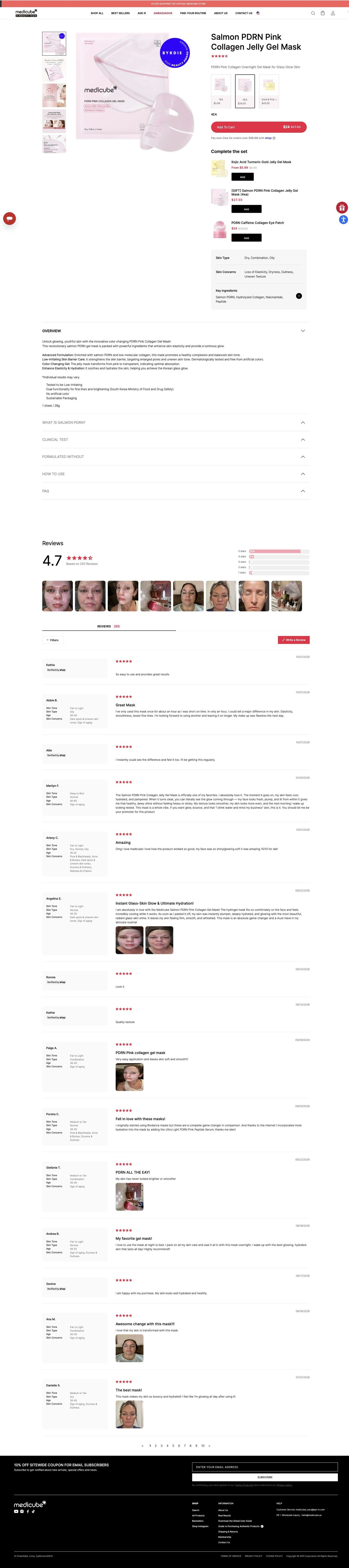
Medicube's PDRN Pink Collagen Gel Mask page is a compact catalog product page: pack-size cards and a Complete the set list in the buy box, a skin-fit card, collapsed accordions, then a long photo-heavy review list. Three Medicube ads in the Fluid library link here, built on creator family demos, mask-timing demos and couple humor.
Medicube
3 creatives lead here1 / 3


PDRN Pink Collagen Gel Mask
Page captured October 20, 2026. The current offer may differ from the original ad.
PDRN Pink Collagen Gel Mask
Medicube's PDRN Pink Collagen Gel Mask page is a compact catalog product page: pack-size cards and a Complete the set list in the buy box, a skin-fit card, collapsed accordions, then a long photo-heavy review list. Three Medicube ads in the Fluid library link here, built on creator family demos, mask-timing demos and couple humor.
- Brand
- Medicube
- Page type
- Product page
- Ads leading here
- 3
- Captured
- Oct 20, 2026
- Destination
- medicube.us
Selected for its design and offer structure. Ad performance isn’t available in this collection.
What this page does well
The buy box does nearly all the selling. Pack sizes appear as image cards with a price under each, the multipack is selected by default, and the Add To Cart button repeats the sale and struck-through price with a pay-over-time line below. Right under it, Complete the set offers related items with one-tap Add buttons, including a gift-labeled multipack, so a bigger order takes no extra page. The grey fit card (skin types, concerns, key ingredients) answers "is this for me?" before anyone opens an accordion. And the reviews are built for finding people like you: each one sits next to the reviewer's skin tone, type, age range and concerns, with a strip of customer photos on top.
How the page is built
- 01Announcement bar and header
An official-store line and the logo, nav, search and cart answer whether this is the brand's own store.
- 02Gallery
Thumbnails of the pack, an infographic, a model and the ingredients sit beside a large pack shot with an award badge, answering what you're buying.
- 03Buy box
Name, star rating, subtitle, pack-size cards with prices and a full-width Add To Cart with sale price and pay-over-time line answer how much it costs and which size to get.
- 04Complete the set
Stacked cross-sell rows with thumbnails, sale prices and small Add buttons answer what else goes with it.
- 05Fit card
A grey panel lists suited skin types, concerns and key ingredients, answering whether the mask fits your skin.
- 06Accordions
Overview opens by default with benefit lines the page claims, followed by closed ingredient, clinical test, formulated-without, how-to-use and FAQ panels for shoppers who want detail.
- 07Reviews
An average rating, customer photo strip and reviews paired with reviewer skin profiles answer whether it worked for someone like you.
- 08Newsletter and footer
A black band offers a coupon for email signup, giving shoppers who aren't ready a reason to stay in touch.
What's missing, in the order we'd fix it
- One ad is built on mask timing, but how long to leave it on is buried in a closed How to use accordion. Pull a one-line timing note into the buy column next to the fit card, so that viewer gets the answer the ad set up without hunting.
- Sheet masks get used up and rebought, yet this buy box shows no subscribe option. Add a subscribe-and-save choice under the pack cards, so the multipack buyer can turn one order into a repeat one.
- The creator ads lean on family and couple moments, and the page has no creator video at all. Put one short creator clip in the gallery, so people arriving from those ads see the same kind of scene they clicked on.
How the ads set it up
The three ads that link here take different routes (a creator using the mask with family, a timing demo and a couple joke), and the page stays a neutral catalog page rather than echoing any one of them. That works as a shared landing spot, and the customer selfies in the reviews stand in for creator content. The timing ad is the one most likely to feel let down, since its payoff sits inside a closed accordion.
What to borrow for your brand
- Show pack sizes as image cards with a price under each and preselect the multipack, so the bigger order is the default choice.
- Put a Complete the set list with one-tap Add buttons directly under Add to Cart, and label one item as a gift to make the add-on feel like a bonus.
- Pair every review with the reviewer's skin type, tone, age range and concerns, so shoppers can find people like them in seconds.
Ads that send people here
- How Medicube turned a sibling mask-sharing joke into an ad
- How a timed test shows Medicube's gel mask turning clear
- How Medicube uses a couple's mask-sharing joke to sell its gel mask
Captured from medicube.us in October 2026 for the Fluid Inspiration Library. Offers and prices change; this is what the page showed when we captured it.