

Magic Spoon CerealSponsored
Esc
How Magic Spoon ran a new-product taste test for its treats
A 21-second creator video for Magic Spoon Protein Treats. A woman in her car opens with “Alright guys, new product taste test,” says she found them at Harris Teeter and loves the brand's cereal, tries the marshmallow bar and gives her verdict. Captions list the brand's nutrition claims. It links to the treats variety pack page.
Magic Spoon
8 creatives lead here1 / 8
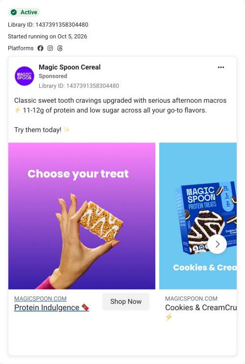
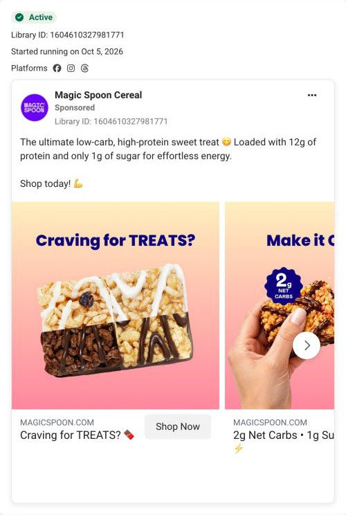
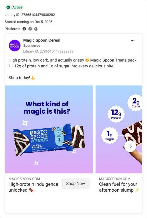
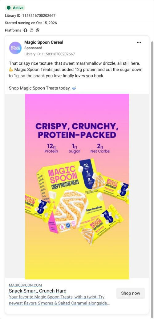
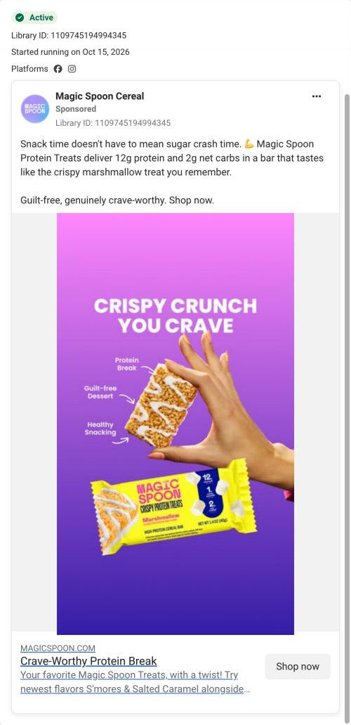

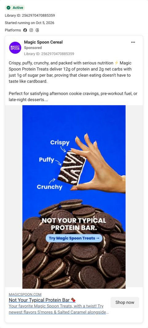
Cereal Treats variety pack
On-The-Go Protein Treats🍫
The video positions the treats as a portable snack and lands on the same assortment as the static protein-bar ad. Compare the creative with the destination and explore the other ads sharing this route.
- Brand
- Magic Spoon
- Observed offer
- Protein Treats Variety 6 · subscription option
- Creative angle
- Use occasion
- Page type
- Product page
- Ad format
- Video · 0:21
- Listed start date
- Oct 5, 2026
- Captured
- Oct 19, 2026
- Library ID
- 2350128642418474
- Destination
- magicspoon.com
Selected for its design and offer structure. Ad performance isn’t available in this collection.
What this ad does well
Opening on new product taste test tells viewers exactly what kind of video this is, a format people know and watch to the verdict. She builds anticipation (she's very excited, it smells amazing) before the bite, and her store mention and love of the brand's cereal add context and trust. Captions place the brand's numbers on screen under her, so the claims ride along with a real reaction. The copy adds the use occasion, satisfying a sweet tooth anywhere, which fits a bar she's eating in her car.
What's missing
This cut takes longer to reach the bite than the version that opens on her texture line, and the verdict, a good sweet treat, is general. The on-the-go angle in the copy isn't said or shown beyond the car setting. If you make one like this, trim the setup so the first bite lands sooner, and ask the creator to say the specific moment she'd eat it (in the car between errands), which matches the ad's headline.
Beat by beat
- 0-4sShe opens with “Alright guys, new product taste test,” holding the box in her car.
Naming the format promises a verdict and keeps viewers watching.
- 4-12sShe says she found the treats at Harris Teeter, compares them to a rice crispy treat and says she loves the brand's cereal.
Context and an existing fan's trust set up the bite.
- 12-21sShe tries the marshmallow bar, calls it a good sweet treat, and captions list 12g protein, 1g sugar and 2g net carbs.
The reaction and claims arrive together.
The offer
The page link carries a subscription option on the variety pack; the ad itself shows no price.
Where it sends people
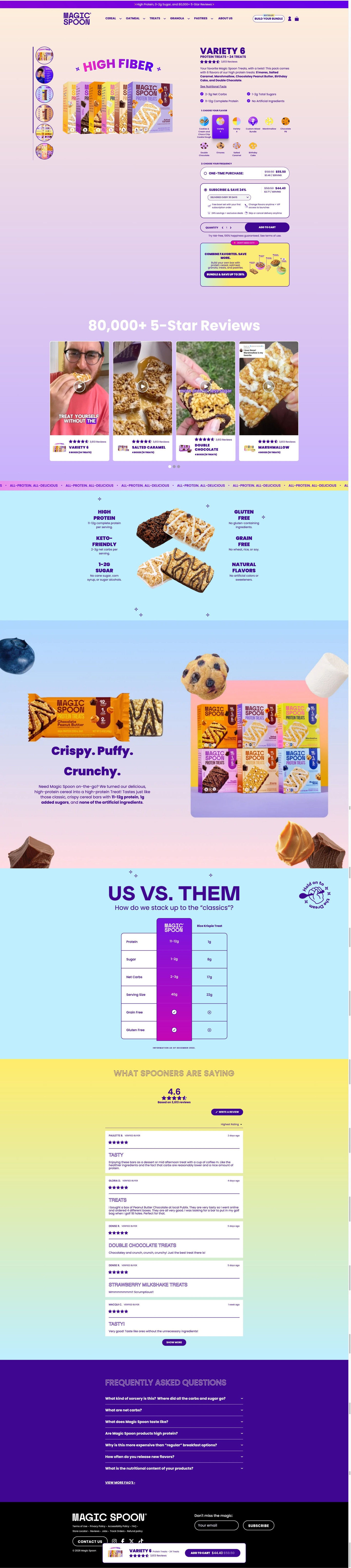
The ad lands on the Cereal Treats variety pack product page. Its customer video carousel continues the taste-test format, and the claims grid and us-vs-them table against a classic treat expand on her captions and her rice crispy comparison. The store she named isn't mentioned on the page, and the on-the-go angle from the headline doesn't come back, so the page reads as a general treats page.
The page it sends people to: How Magic Spoon built its Protein Treats variety pack page
Magic Spoon's product page for its Cereal Treats variety pack. A two-step buy box (choose flavor, choose frequency, with subscription pre-selected) leads into customer videos, a nutrition claims grid, an us-vs-them table, reviews and FAQ. Eight ads in the Fluid library send people here, mostly product-benefit statics plus creator taste tests and use-occasion ads.
How the page is built
- 01Announcement bar and header
A purple line with headline benefits and the review count, plus a Build your bundle pill, set the brand's main claims and ways to shop.
- 02Buy box
A fan of boxes under a curved claim headline beside the name, pack size, rating, flavor list and four check bullets answers what it is.
- 03Flavor and frequency steps
A numbered flavor grid and a pre-selected subscribe card with perks, then Add to cart and a guarantee line, answer which one and how often.
- 04Bundle upsell
A “Don't miss out” card for a mixed build-your-own box offers a bigger order.
- 05Video reviews
A review-count headline and four customer video cards tagged by flavor answer whether it actually tastes good.
- 06Claims grid
Six short nutrition claims around a bar close-up answer what's in it.
- 07Story band
A three-word texture headline, short paragraph and product lineup with ingredient photos answer what it's like to eat.
- 08Us vs. them
A table against a classic treat with nutrition and check-or-x rows answers why switch.
- 09Reviews
An average rating, sorting and verified review cards answer whether buyers are happy.
- 10FAQ
Seven questions, including a price objection, handle the last doubts.
- 11Footer and sticky bar
A floating bar with rating and sale price keeps Add to cart in reach on the scroll.
The first fixes we would make
- Several ads that land here sell a specific moment (the afternoon slump, on the go, the sugar crash), but the page speaks only in general claims. Add a short use-moment row near the claims grid, like afternoon, on the go and after dinner, so those visitors see their reason on the page.
- The creator taste tests mention finding the treats in a store, and the page doesn't say where else to buy. A small where-to-buy line near the buy box would catch shoppers who prefer to pick them up.
Read the full breakdown of this page
Three hooks you could test
- Show a specific moment of use. “Errands done, snack open, rating it before I start the car.”
- Sell the outcome. “A sweet treat you can eat anywhere without a second thought.”
- Make the product the whole scene. “New product, first bite, honest verdict.”
What to borrow for your brand
- Open with the name of a format viewers recognize, like new product taste test, so they stay for the verdict.
- Run two cuts of the same creator video with different opening lines to see which hook holds attention.
- Pair a car taste test with an on-the-go headline so the setting and the message match.
Transcript
All right, guys, new product taste test. I am trying the magic spoon protein treats. I found these at Harris Teeter. There's supposed to be like a rice crispy tree. I am very excited. I've had their cereal before and I love it. I knew the texture was gonna be good. It also smells amazing and I love marshmallows. Cheers. Hmm, this is definitely a good sweet treat. All the boars have Tolgrams protein. I definitely be getting other flavors.
Text on screen
- Magic Spoon protein treats >>>>
- new product taste test.
- MAGIC
- SPOON
- I'm trying PROTEIN TREAS
- PROTEIN TREATS
- Protein Treafs.
- REATS
- Marshmallow
- Marshmaltow
- * 9.99
- 8.4 Jarrie Tester.
- SAVINGS
- 1.50
- * 9.9
- 8.49
- Like a Rice
- SPOOR
- I'm very excited.
- before, and I love it.
- Ilknew the fexture
- It also smells amazing
- and I love marshmallows.
- • 12g of protein
- / 1g of total sugars
- / 2g of net carbs
- definitelya good sweet
- 7 1g of total sugars
- 7 2g of net carbs
- 12.
- 12g of protein.
- SPO
- Marshmallo
- getting the other flavors.
One of 20 Magic Spoon ads in the Fluid Inspiration Library, captured from the Meta Ad Library on Oct 19, 2026. We record that an ad ran publicly, not how it performed.