What this ad does well
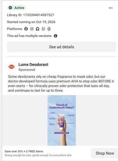
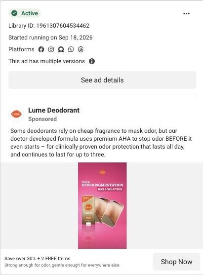
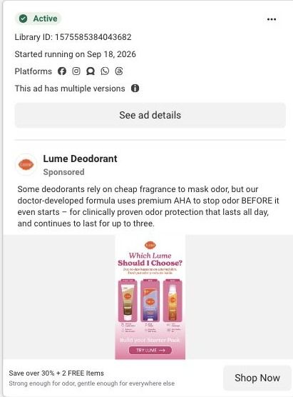
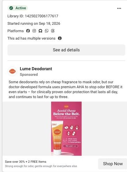
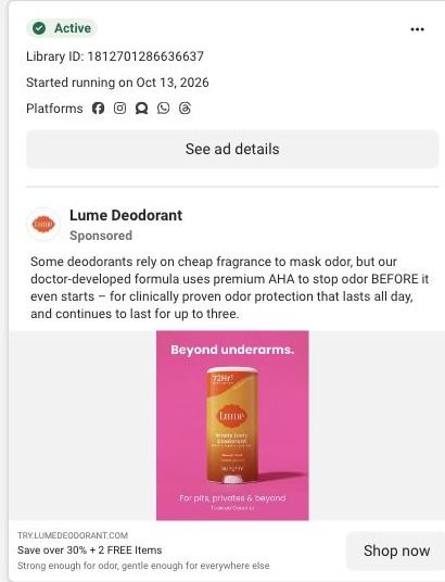
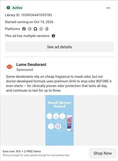
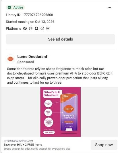
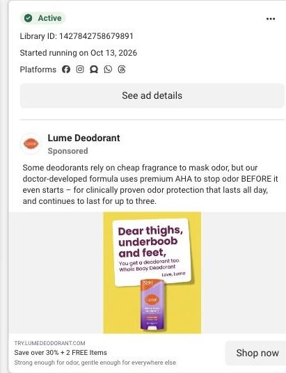
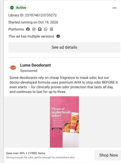
Like Lume's pink version of this static, the image leads with a question about one specific body area, so the right viewer recognizes herself immediately. This version puts the product in a hand against an open sky, which feels lighter and more like a person's photo than a product render. The callouts around the tube follow a classic breakdown layout that points to individual benefits, and the headline field carries the offer, 'Save over 30% + 2 FREE Items', with a line about being gentle enough for everywhere.
What's missing
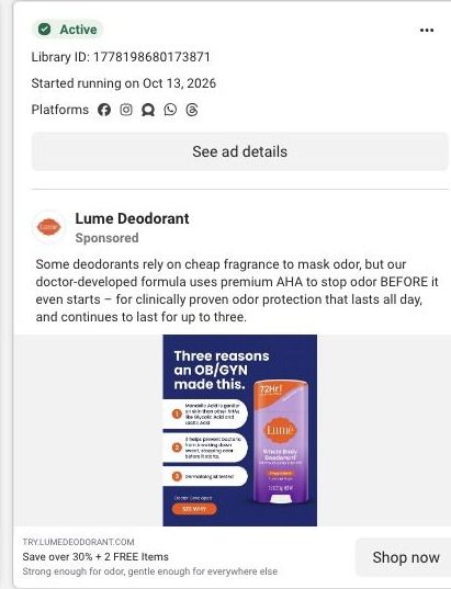
The callouts are too small to read at feed size, so the benefit breakdown doesn't actually get read on a phone. The copy also trails off at 'lasts for up to three' without saying three what, which undercuts the 'clinically proven' claim right where it should be strongest. If you build a callout static like this, use fewer, larger callouts (two or three you can read at a glance) and finish the proof sentence with the number, as Lume's videos do with 72 hours.
Beat by beat
- Image
A hand holds the purple Lume cream tube against a blue sky, with 'Tired of Underboob Odor?' above, small callouts on both sides and a banner at the bottom.The question names the problem and the callouts promise a quick breakdown of why this product answers it.
- Headline
'Save over 30% + 2 FREE Items', plus a line saying it's strong enough for odor and gentle enough for everywhere else.It gives the scroller a concrete reason to tap and explains the whole-body angle.
- Copy
The copy says some deodorants rely on cheap fragrance while Lume's doctor-developed formula uses AHA to stop odor before it starts.It sets up masking fragrance as the enemy the product beats.
The offer
The headline offers over 30% off plus 2 free items, with a Shop Now button.
Where it sends people
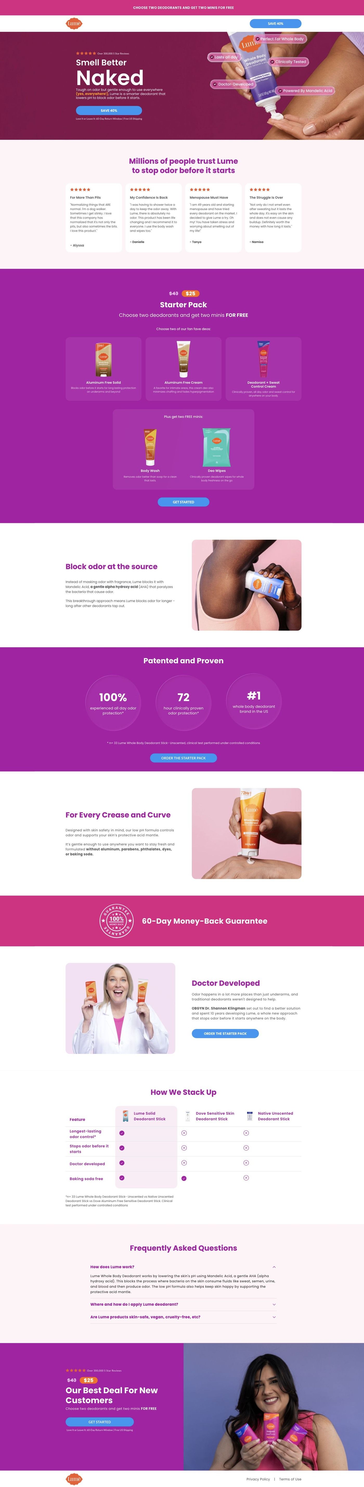
The ad goes to Lume's starter-pack landing page, a focused offer page rather than the homepage. The savings in the headline match the announcement header's savings CTA and the starter-pack offer section's free-gift tiles. The image's callout style has a natural partner in the ingredient mechanism section, which explains a highlighted ingredient with an image. The underboob question itself isn't in the hero, though, and only gets picked up in the whole-body use section, so a hero variant that repeats the question would make the landing feel like the next frame of the ad.
The page it sends people to: How Lume's Smell Better Naked page sells a $25 starter pack
Lume's Smell Better Naked page is a long-form sales page for a $25 starter pack. It moves from a benefit hero through reviews, the offer, ingredient education, study proof, founder story and a comparison table, then repeats the offer. It's where 60 Lume ads in the Fluid library point, mostly creator stories, savings offers and product benefits.
How the page is built
- 01
Announcement and headerA simple logo header with a savings CTA keeps the discount visible and gives the visitor nowhere else to go.
- 02
Split heroA reviews eyebrow, a large benefit headline, body copy and a CTA sit beside a product-use image, answering "what is this and why would I want it?"
- 03
Customer storiesReview cards with stars and short quotes answer "do people like me actually use this?" before any price appears.
- 04
Starter-pack offerPrice treatment, product choices, free-gift tiles and a CTA answer "what do I get and what does it cost?"
- 05
Ingredient mechanismAn image and an explanation of a highlighted ingredient answer "how is this supposed to work?" in Lume's own terms.
- 06
Study proofProminent study metrics with a methodology footnote answer "is there evidence behind the claim?"
- 07
Whole-body useAn application illustration and reassurance copy answer "is it okay to use this beyond my underarms?"
- 08
Founder storyA portrait and origin explanation with a CTA answer "who's behind this and why should I trust them?"
- 09
Comparison tableA highlighted Lume column against alternatives answers "why this instead of what I use now?"
- 10
FAQ and repeated offerAn accordion handles the last objections, then the starter-pack offer repeats above the policy footer so the decision and the button sit together.
The first fixes we would make
- Many of the ads that land here lead with a specific use ("For Boobs That Run Hot"), but the hero speaks to the whole body and the matching reassurance sits much further down in the whole-body section. Send each ad headline to a hero that repeats it (Lume already runs a hero variant on another URL) so the visitor sees their problem in the first screen.
- The blueprint shows no guarantee anywhere on this page, while Lume's sweat-control page has one. Put the guarantee inside the starter-pack panel and again by the final offer, since that's exactly where a first-time buyer hesitates.
Read the full breakdown of this page
Three hooks you could test
- Lead with the uncomfortable problem. “Tired of that smell in the spot your regular one doesn't reach?”
- Make the product the whole scene. “One tube, held up to the sky, and every reason it belongs in your routine.”
- Turn the benefit into a picture people get in a second. “Gentle enough for anywhere, strong enough to skip the midday check.”
What to borrow for your brand
- Run the same question headline across different color and photo treatments to see which visual style your audience stops for.
- Show the product in a real hand against a simple background so it feels like a photo rather than a render.
- Limit breakdown callouts to the two or three you can read on a phone, and make each one a full benefit rather than a label.
One of 100 Lume ads in the Fluid Inspiration Library, captured from the Meta Ad Library on Oct 22, 2026. We record that an ad ran publicly, not how it performed.