What this ad does well
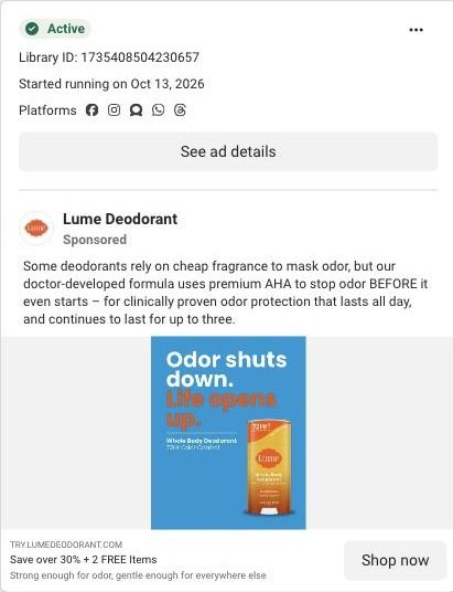
The two-part headline sets up cause and effect: the first half is what the product does, the second half is what you get, and the color switch from white to orange makes the payoff pop. It's an outcome headline, which the persona's checklist favors over a feature list. The stick is large and centered, and the subline repeats the 72-hour claim from the cap, so the main number is hard to miss.
What's missing
Life opens up is the kind of broad promise any brand could make, so the viewer has to decide what it means for them. There's no moment to picture (the gym, a first date, a long flight), and the whole-body angle that sets Lume apart only shows in the small subline. If you make one like this, keep the cause-and-effect structure but make the second half specific: name the thing people stop avoiding once odor isn't on their mind, and add the offer to the image.
Beat by beat
- Headline
Odor shuts down. in white, then Life opens up. in orange.The structure ties the product's job to the reader's reward in one read.
- Subline
Whole Body Deodorant, 72Hr Odor Control under a thin rule.It names the category and the main claim for anyone who keeps reading.
- Image
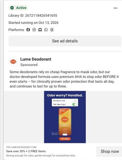
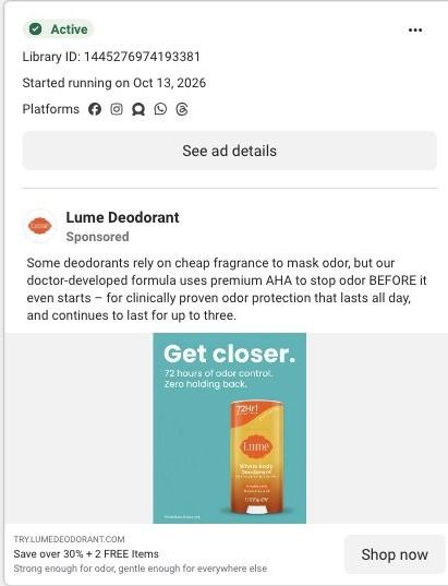
An orange Toasted Coconut stick on bright blue.High contrast keeps the product visible at thumbnail size.
- Copy
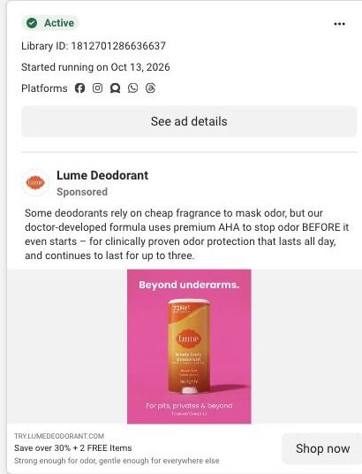
Primary text on fragrance versus AHA, with Save over 30% + 2 FREE Items in the link headline.It gives the mechanism and the offer below the image.
The offer
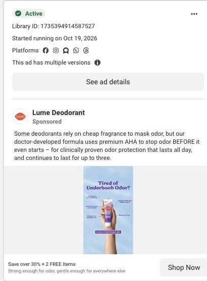
The link headline offers Save over 30% + 2 FREE Items, with a Shop now button. No offer appears on the image.
Where it sends people
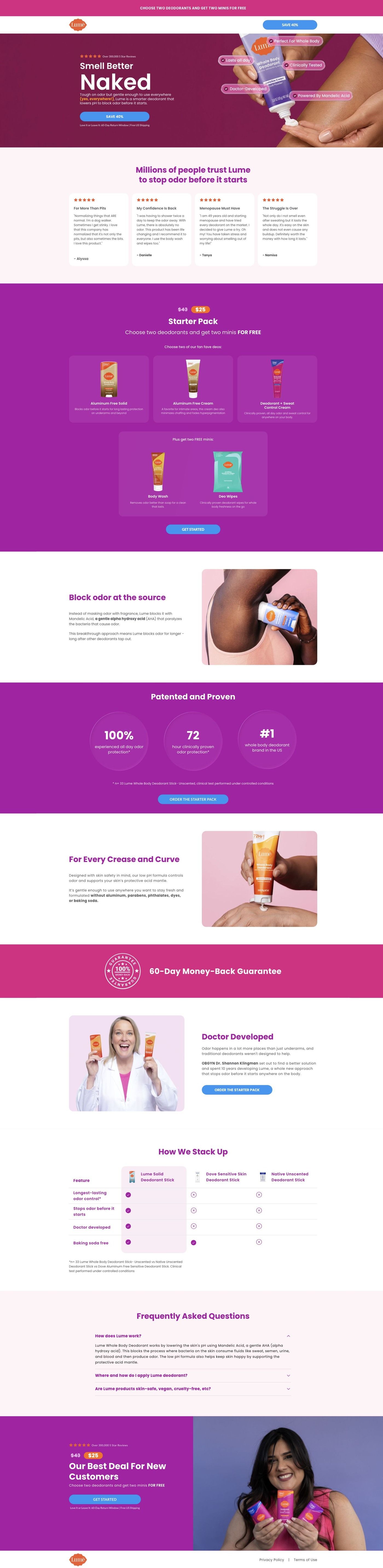
Clicks go to Lume's long-form starter-pack landing page, a focused offer page rather than a homepage. The hero, with a large benefit headline and a product-use image, picks up the outcome framing, and the customer stories right after it can do what this ad didn't, which is show what opened up for real customers. The proof section with study metrics supports the 72-hour claim. Because the ad's promise is broad, the page's reviews carry more of the weight here than they would for a more specific ad.
The page it sends people to: How Lume's Smell Better Naked page sells a $25 starter pack
Lume's Smell Better Naked page is a long-form sales page for a $25 starter pack. It moves from a benefit hero through reviews, the offer, ingredient education, study proof, founder story and a comparison table, then repeats the offer. It's where 60 Lume ads in the Fluid library point, mostly creator stories, savings offers and product benefits.
How the page is built
- 01
Announcement and headerA simple logo header with a savings CTA keeps the discount visible and gives the visitor nowhere else to go.
- 02
Split heroA reviews eyebrow, a large benefit headline, body copy and a CTA sit beside a product-use image, answering "what is this and why would I want it?"
- 03
Customer storiesReview cards with stars and short quotes answer "do people like me actually use this?" before any price appears.
- 04
Starter-pack offerPrice treatment, product choices, free-gift tiles and a CTA answer "what do I get and what does it cost?"
- 05
Ingredient mechanismAn image and an explanation of a highlighted ingredient answer "how is this supposed to work?" in Lume's own terms.
- 06
Study proofProminent study metrics with a methodology footnote answer "is there evidence behind the claim?"
- 07
Whole-body useAn application illustration and reassurance copy answer "is it okay to use this beyond my underarms?"
- 08
Founder storyA portrait and origin explanation with a CTA answer "who's behind this and why should I trust them?"
- 09
Comparison tableA highlighted Lume column against alternatives answers "why this instead of what I use now?"
- 10
FAQ and repeated offerAn accordion handles the last objections, then the starter-pack offer repeats above the policy footer so the decision and the button sit together.
The first fixes we would make
- Many of the ads that land here lead with a specific use ("For Boobs That Run Hot"), but the hero speaks to the whole body and the matching reassurance sits much further down in the whole-body section. Send each ad headline to a hero that repeats it (Lume already runs a hero variant on another URL) so the visitor sees their problem in the first screen.
- The blueprint shows no guarantee anywhere on this page, while Lume's sweat-control page has one. Put the guarantee inside the starter-pack panel and again by the final offer, since that's exactly where a first-time buyer hesitates.
Read the full breakdown of this page
Three hooks you could test
- Sell the outcome. “Say yes to the last-minute plans. You're ready.”
- Show a specific moment of use. “Put it on before the flight, still fresh at baggage claim.”
- Lead with the uncomfortable problem. “How many plans have you skipped because you didn't feel fresh?”
What to borrow for your brand
- Write a two-part headline where the first half is what the product does and the second half is what the customer gets, in different colors.
- Make the outcome half specific enough to picture, naming the plan, place or moment it changes.
- Repeat the number printed on your packaging in the subline so the claim shows up twice.
One of 100 Lume ads in the Fluid Inspiration Library, captured from the Meta Ad Library on Oct 22, 2026. We record that an ad ran publicly, not how it performed.