What this ad does well
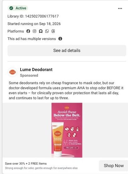
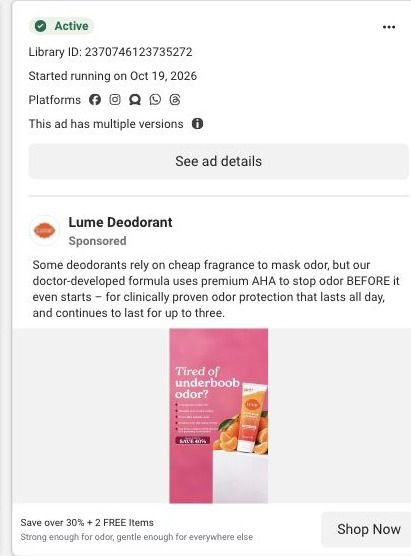
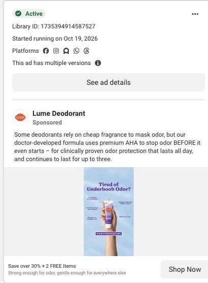
The ad is useful before it sells anything. A list of things to avoid gives the viewer something to learn, and five crossed-out icons are faster to read than five sentences. The line under the headline sets a clear boundary, saying day-to-day odor happens on external skin and that odor products don't go inside, which is the kind of plain talk that builds trust on an intimate topic. Then the product shows up as the one thing on the page that isn't crossed out, labeled for external skin, so the ad makes its point by contrast. Meta shows Lume ran multiple versions of this one.
What's missing
The jump from the avoid list to Lume isn't explained on the image. The viewer learns what Lume says not to use, but not why this cream is the gentler choice, and the primary text talks about fragrance versus AHA rather than the sensitive-skin question this creative raises. That's the proof gap: on a topic this personal, people want a reason to trust it there. If you make one like this, add one line beside the product that says how it was tested or what makes it different from the crossed-out items, in the brand's own claims.
Beat by beat
- Headline
Avoid these Below the Belt. in white on hot pink, with a line about external skin.It promises useful information, which earns attention without leading with a pitch.
- Icons
Five crossed-out icons: high-pH soap, heavy fragrance, douching, suppositories and scented liners.The list does the teaching in a format anyone can scan in a second.
- Image
An Invisible Cream tube in Clean Tangerine, marked 72Hr! and Aluminum Free, with a line about whole-body odor control for external skin.The product appears as the approved alternative to everything on the list.
- Button
A TRY LUME button on the creative, with Save over 30% + 2 FREE Items in the link headline.It turns the lesson into a next step.
The offer
Save over 30% + 2 FREE Items in the link headline, with a Try Lume button on the image and Shop Now below it.
Where it sends people
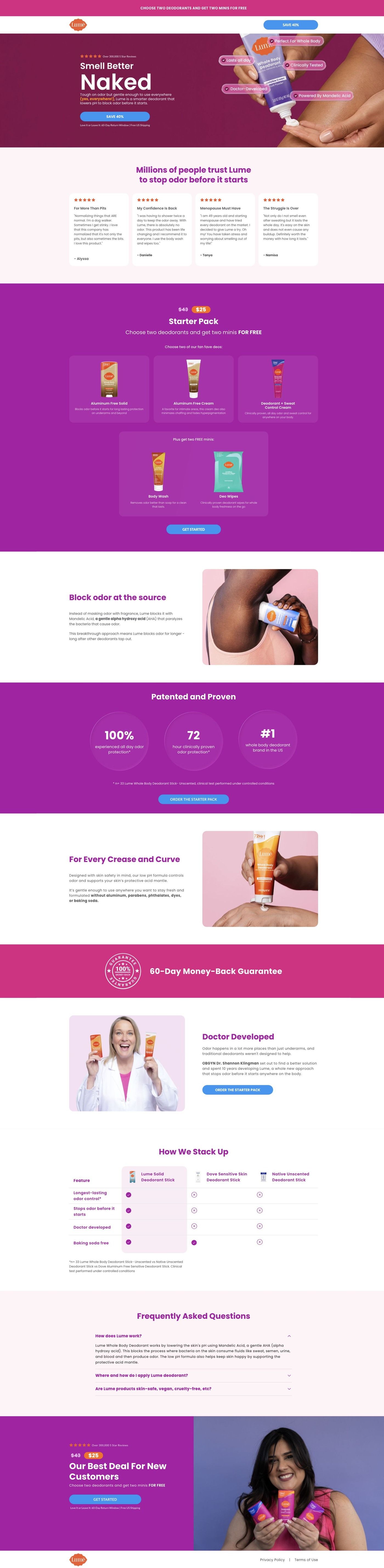
The ad goes to Lume's long-form starter-pack landing page, which is a focused offer page rather than the homepage. The sections that pick up this ad's education angle are the ingredient mechanism section, which explains the highlighted ingredient, and the whole-body use section, whose reassurance copy speaks to where the product goes. The FAQ near the bottom is the natural place for the external-skin boundary, too. The page leads with reviews and the offer instead, so a visitor who came to learn has to scroll to find the part that continues the lesson.
The page it sends people to: How Lume's Smell Better Naked page sells a $25 starter pack
Lume's Smell Better Naked page is a long-form sales page for a $25 starter pack. It moves from a benefit hero through reviews, the offer, ingredient education, study proof, founder story and a comparison table, then repeats the offer. It's where 60 Lume ads in the Fluid library point, mostly creator stories, savings offers and product benefits.
How the page is built
- 01
Announcement and headerA simple logo header with a savings CTA keeps the discount visible and gives the visitor nowhere else to go.
- 02
Split heroA reviews eyebrow, a large benefit headline, body copy and a CTA sit beside a product-use image, answering "what is this and why would I want it?"
- 03
Customer storiesReview cards with stars and short quotes answer "do people like me actually use this?" before any price appears.
- 04
Starter-pack offerPrice treatment, product choices, free-gift tiles and a CTA answer "what do I get and what does it cost?"
- 05
Ingredient mechanismAn image and an explanation of a highlighted ingredient answer "how is this supposed to work?" in Lume's own terms.
- 06
Study proofProminent study metrics with a methodology footnote answer "is there evidence behind the claim?"
- 07
Whole-body useAn application illustration and reassurance copy answer "is it okay to use this beyond my underarms?"
- 08
Founder storyA portrait and origin explanation with a CTA answer "who's behind this and why should I trust them?"
- 09
Comparison tableA highlighted Lume column against alternatives answers "why this instead of what I use now?"
- 10
FAQ and repeated offerAn accordion handles the last objections, then the starter-pack offer repeats above the policy footer so the decision and the button sit together.
The first fixes we would make
- Many of the ads that land here lead with a specific use ("For Boobs That Run Hot"), but the hero speaks to the whole body and the matching reassurance sits much further down in the whole-body section. Send each ad headline to a hero that repeats it (Lume already runs a hero variant on another URL) so the visitor sees their problem in the first screen.
- The blueprint shows no guarantee anywhere on this page, while Lume's sweat-control page has one. Put the guarantee inside the starter-pack panel and again by the final offer, since that's exactly where a first-time buyer hesitates.
Read the full breakdown of this page
Three hooks you could test
- Call out the habit you're replacing. “Five things in your bathroom you should stop using today.”
- Lead with the uncomfortable problem. “Nobody tells you what's actually safe down there. So here's the list.”
- Turn the benefit into a picture people get in a second. “Everything you're using now, crossed out. One thing left.”
What to borrow for your brand
- Lead with a list of things to avoid so the ad teaches something before it sells, then show your product as the one item not crossed out.
- State a clear boundary for how your product should and shouldn't be used, which builds trust on sensitive topics.
- Use simple icons with short labels instead of sentences when you need to cover several items at feed size.
One of 100 Lume ads in the Fluid Inspiration Library, captured from the Meta Ad Library on Oct 22, 2026. We record that an ad ran publicly, not how it performed.