

Lemme with Nichole MaharajSponsored
Esc
How Lemme Debloat ties a seasonal treat to a subscription offer
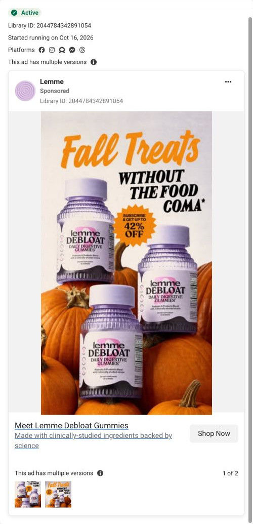
A seasonal static ad for Lemme Debloat Gummies that ran on Meta from Oct 16, 2026, in two versions. Three bottles sit among pumpkins under a headline about fall treats without the food coma, and a starburst badge offers up to 42% off with a subscription. It links to the Debloat landing page, one of 7 ads sending people there.
Lemme
7 creatives lead here1 / 7
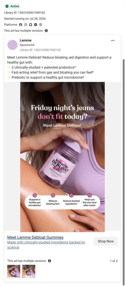
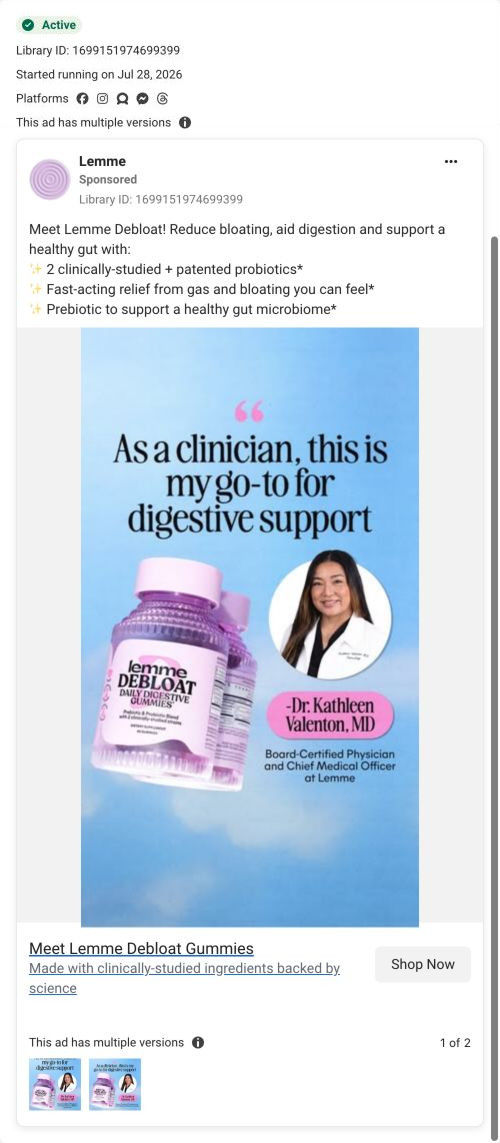
Lemme · Debloat gummies
Captured while scrolling the public page. The page reflects the offer visible on October 20, 2026; it may differ from the original ad.
Meet Lemme Debloat Gummies
A short product-name headline is paired with the brand’s research-backed ingredient language. The recorded CTA points to the Debloat-specific landing URL. Compare the creative with the destination and explore the other ads sharing this route.
- Brand
- Lemme
- Observed offer
- Lemme Debloat Gummies; no price or discount stated
- Creative angle
- Product benefits
- Page type
- Product landing
- Ad format
- Image
- Listed start date
- Oct 16, 2026
- Captured
- Oct 20, 2026
- Library ID
- 2044784342891054
- Destination
- lemmelive.com
Selected for its design and offer structure. Ad performance isn’t available in this collection.
What this ad does well
This is one of the few Lemme ads in the set with a clear reason to act. The starburst badge, “Subscribe & get up to 42% off,” sits right beside the bottles, so the offer is part of the picture instead of fine print. The headline ties the product to a moment everyone knows in October (pumpkin treats and the slump afterward), which gives the viewer a specific occasion rather than a general benefit. The pumpkin patch makes the ad feel timely without needing a model.
What's missing
The ad tells you when you'd want it but not what it does. There's no primary text in this capture and the image carries no benefit lines, so the viewer has to infer from the product name and headline that the gummy is meant for bloating after meals. It also has no proof, while other Debloat ads in the library show a clinician quote and a creator. If you make one like this, add one claimed benefit under the headline and a star rating near the badge.
Beat by beat
- ImageThree Debloat bottles stand among orange pumpkins, with a starburst badge between them.
The pumpkins date the ad to fall, and the multiple bottles hint at a supply you keep on hand.
- HeadlineOrange script reads Fall Treats, followed by bold text about skipping the food coma, with an asterisk.
The headline names a specific seasonal moment the viewer recognizes, so the product has a clear occasion.
- OfferThe orange starburst offers up to 42% off when you subscribe.
Putting the discount on the image gives a reason to tap now and points straight at the subscription.
- CTAThe link card reads Meet Lemme Debloat Gummies, with a line about clinically-studied ingredients and a Shop Now button.
The card adds the brand's research claim as a trust cue right next to the button.
The offer
A starburst badge says “Subscribe & get up to 42% off,” framing the discount as a subscription perk.
Where it sends people
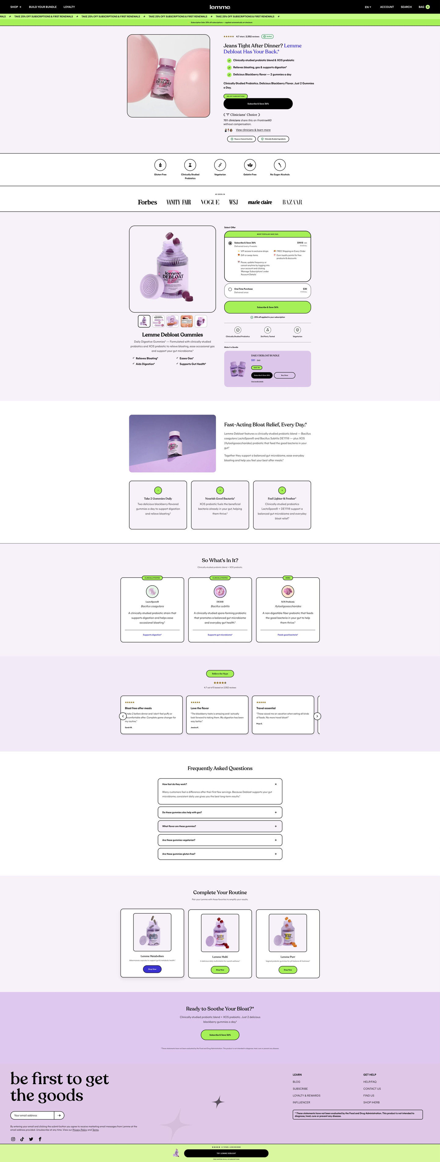
The ad sends people to the Debloat landing page, a focused product page and one of 7 Lemme ads in the library that land there. The page continues the offer immediately: a lime ticker repeats the subscription discount, the hero puts a discount tag over a Subscribe & Save button, and the buy box pre-selects the subscription under a Most popular strip. The hero's after-meal problem question picks up the food-coma headline well. If the page's discount isn't the same up-to-42% figure, matching it would keep the promise consistent from click to checkout.
The page it sends people to: How Lemme's Debloat page opens on the jeans problem its ads name
Lemme's landing page for Debloat, its daily digestive gummy. It opens on an everyday after-meal problem question with a subscribe button in the hero, then a full subscription buy box, a benefit section, ingredient cards, reviews and FAQ. 7 Lemme ads in the library send people here, from brunch and jeans questions to a creator video and a clinician quote.
How the page is built
- 01Header
A black nav with a centered logo, a lime ticker repeating the subscription discount and a thin note line, answering whether there's a deal.
- 02Hero
The bottle between pink balloons beside a verified rating, a problem-question headline answered by the brand name, check bullets, a discount tag over a Subscribe & Save button and a clinicians' choice badge, answering whether this is for you.
- 03Attribute icons
Round line icons for dietary and testing claims, answering whether it fits your diet.
- 04Press bar
An As seen in label with publication logos, answering whether the brand has outside credibility.
- 05Buy box
A product gallery with benefit checks beside a pre-selected subscription under a Most popular strip with perks and per-serving price, a one-time card, an auto-applied discount note and a Make it a bundle card, answering how to buy.
- 06Benefit split
A product photo on purple with two paragraphs on the ingredient blend and numbered cards on daily use, how it works and how you feel, answering how the brand says it works.
- 07Ingredients
“So what's in it?” cards with an illustration, ingredient and scientific name and a short paragraph, answering what's inside.
- 08Reviews carousel
A rating with count and quote cards with titles and first names, answering whether other buyers liked it.
- 09FAQ
Outlined accordions with the first open, answering the remaining questions.
- 10Cross-sell
“Complete your routine” product cards, offering a way to add to the order.
- 11Final CTA band
A question headline restating the problem with a Subscribe & Save button, giving a last prompt.
- 12Newsletter, footer and sticky bar
An email signup, links, a disclaimer and a sticky bar with rating and a full-width CTA, keeping the purchase in reach.
The first fixes we would make
- The two strongest proof assets in the ads (Nichole Maharaj's creator video and Dr. Kathleen Valenton's quote card) don't appear on the page. Add a creator video and the clinician quote band near the reviews, so visitors from those ads see the person who earned the click.
- The copy claims fast-acting relief but the page doesn't say what fast means. Add a what-to-expect line in the benefit cards (when to take it relative to a meal and when the brand says you'll notice a difference), clearly attributed.
Read the full breakdown of this page
Three hooks you could test
- Show a specific moment of use. “Second slice of pie, zero regrets.”
- Sell the outcome. “Enjoy the holiday table and still feel like yourself after.”
- Make the product the whole scene. “Your seasonal must-have, sitting in the pumpkin patch.”
What to borrow for your brand
- Tie your product to a seasonal moment the viewer already plans around, so the ad has a natural reason to run now.
- Put the subscription discount on the image as a badge, so the offer is seen even by people who never read the copy.
- Use seasonal props instead of a model, so you can refresh the creative each season without a new shoot.
One of 25 Lemme ads in the Fluid Inspiration Library, captured from the Meta Ad Library on Oct 20, 2026. We record that an ad ran publicly, not how it performed.