How Lemme's Burn page explains the how before the what
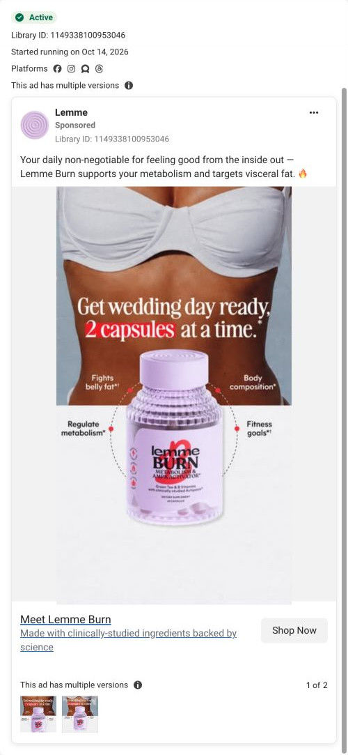
Lemme's landing page for Burn, its metabolism capsule. It opens on a problem-question hero with one subscribe button, then a full buy box after trust icons and press logos, a mechanism explainer, ingredient cards, reviews and FAQ. 1 Lemme ad in the library sends people here, a static about getting wedding day ready.

Captured while scrolling the public page. The page reflects the offer visible on October 20, 2026; it may differ from the original ad.
Lemme · Burn capsules
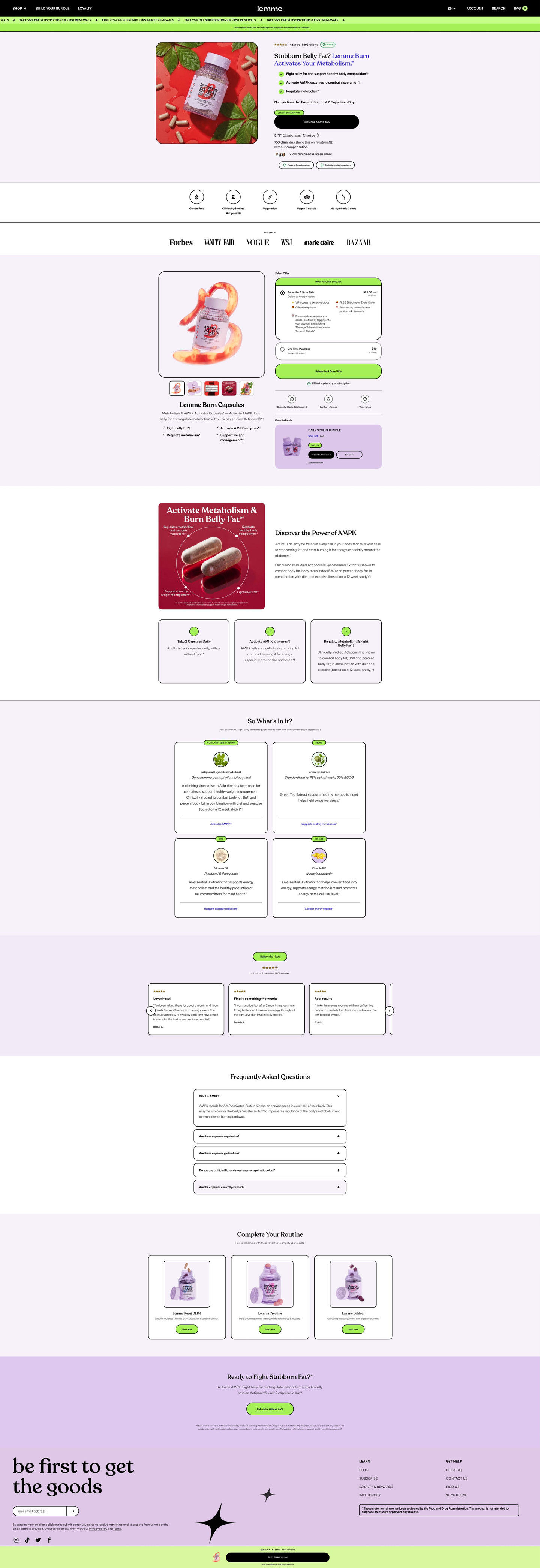
Lemme's landing page for Burn, its metabolism capsule. It opens on a problem-question hero with one subscribe button, then a full buy box after trust icons and press logos, a mechanism explainer, ingredient cards, reviews and FAQ. 1 Lemme ad in the library sends people here, a static about getting wedding day ready.
- Brand
- Lemme
- Page type
- Product landing
- Ads leading here
- 1
- Captured
- Oct 20, 2026
- Destination
- lemmelive.com
Selected for its design and offer structure. Ad performance isn’t available in this collection.
What this page does well
The page gives two buy moments and explains the mechanism before the ingredients. Ready buyers get a single Subscribe & Save button in the hero, and everyone else gets a full plan selector after the attribute icons and press logos, with a Make it a bundle card inside the buy box. The mechanism explainer, a red capsule infographic with labeled callouts, two paragraphs and numbered step cards, tells the reader how the brand says Burn works before listing what's in it. The closing band repeats the hero's problem question, and a sticky bar pairs the rating with a full-width CTA.
How the page is built
- 01Announcement bars
A black nav with shop, bundle and loyalty links, a green ticker with the percent-off subscription line and a note that it applies at checkout, answering whether there's a deal.
- 02Hero
The jar on a red backdrop beside a rated problem-question headline answered in brand purple, check claims, a dosage line and a Subscribe & Save button, answering whether this is for you and how you take it.
- 03Attribute strip
Circled line icons for gluten-free, studied ingredient, vegetarian, vegan capsule and no synthetic colors, answering diet fit.
- 04Press logos
An As seen in row of magazine logos, answering whether the brand has outside credibility.
- 05Buy box
A framed product image with claims beside a pre-selected subscription card with perks, a one-time card, a discount note and a Make it a bundle card, answering how to buy and what you save.
- 06Mechanism explainer
A capsule infographic with labeled callouts, two paragraphs and numbered cards on how to take it, how it works and the result, answering how the brand says it works.
- 07Ingredients
A “So What's In It?” grid of cards with ingredient and botanical names and a paragraph, answering what's inside.
- 08Reviews carousel
A star rating with count and quote cards with titles and names, answering whether other buyers liked it.
- 09FAQ
Bordered accordions with the first open, answering remaining questions.
- 10Cross-sell
“Complete Your Routine” product cards, offering a way to add to the order.
- 11Closing CTA
A lavender band repeating the problem question with a Subscribe & Save button and disclaimer, giving a last prompt.
- 12Newsletter, footer and sticky bar
An email signup, links, a boxed disclaimer and a green sticky bar with a rating line and Try button, keeping the purchase in reach.
What's missing, in the order we'd fix it
- The ad's wedding-day framing doesn't appear on the page. Add a hero subline or a use-case card for big events, so a visitor from that ad sees the occasion that made them click.
- Belly-fat and metabolism claims need their source beside them. Add a short, attributed note on the study behind the main ingredient in the mechanism section, with who ran it and what was measured.
- The page doesn't say when someone should expect to notice anything, which matters most for an event with a date. Add a timeline the brand can support in the step cards, attributed to the brand or its customers.
How the ads set it up
The 1 Lemme ad that lands here ties Burn to wedding prep with a dose in the headline and callouts for belly fat, body composition, metabolism and fitness goals. The page's problem-question hero picks up the body focus and its dosage line repeats the routine, so the core claim carries over. The wedding itself doesn't, which means the specific reason the ad gave to start now is gone by the time the visitor reaches the buy box.
What to borrow for your brand
- Give ready buyers a single subscribe button in the hero, and put the full plan selector after the trust icons for everyone else.
- Explain how the product works (a labeled infographic and numbered steps) before listing ingredients, so the ingredient cards have context.
- Put a Make it a bundle card inside the buy box with its own price and buttons, so a larger order is one click away.
Ads that send people here
Captured from lemmelive.com in October 2026 for the Fluid Inspiration Library. Offers and prices change; this is what the page showed when we captured it.