How IM8's gut-health page explains its formula before it sells | Fluid
Esc

How IM8's gut-health page explains its formula before it sells

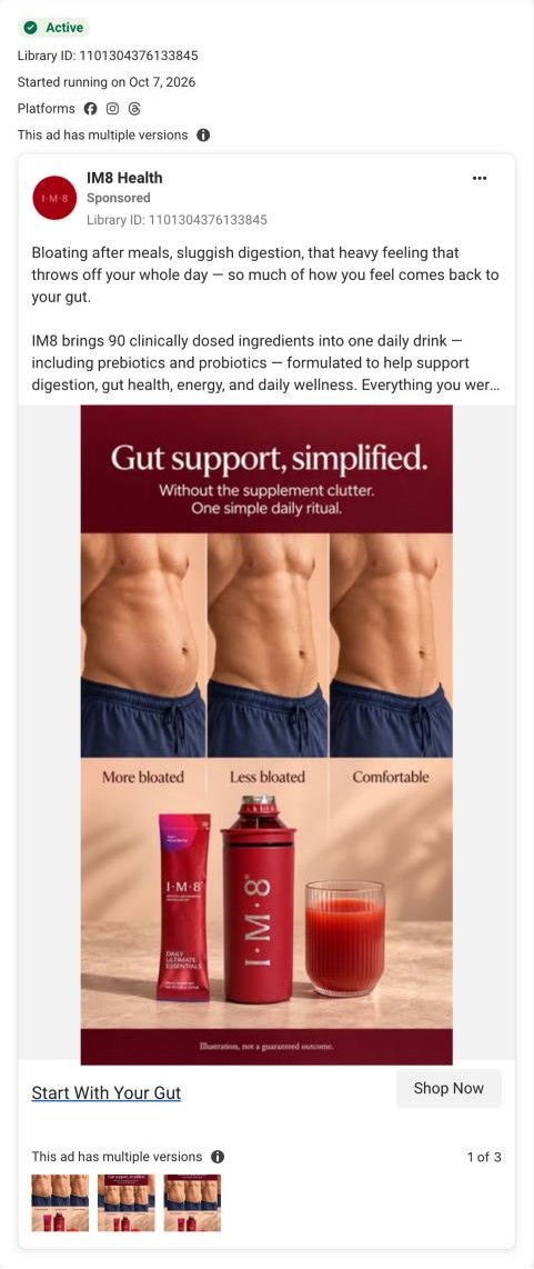
IM8's gut-health campaign landing page, built around one benefit area. A kitchen hero leads to trial figures, four numbered story rows on the formula, clinician reviews, an embedded buy box, a competitor dose table, a guarantee and a gut-focused FAQ. 2 of the 23 IM8 ads in the library send people here: an animated explainer and a bloating static.

IM8
2 creatives lead here1 / 2
IM8 · Gut health · four layers of support

Captured October 20, 2026. Advertiser health claims are shown for design research.

IM8: full page screenshot

IM8 · Gut health · four layers of support

IM8's gut-health campaign landing page, built around one benefit area. A kitchen hero leads to trial figures, four numbered story rows on the formula, clinician reviews, an embedded buy box, a competitor dose table, a guarantee and a gut-focused FAQ. 2 of the 23 IM8 ads in the library send people here: an animated explainer and a bloating static.

Brand
IM8
Page type
Campaign landing
Ads leading here
2
Captured
Oct 20, 2026
Destination
im8health.com

Selected for its design and offer structure. Ad performance isn’t available in this collection.

What this page does well

The page explains before it sells. Trial-result figures sit in a dark card right under the hero, so the problem-solution visitor gets proof on the first scroll, and then four numbered story rows each handle one reason to buy (the layered gut formula, wider daily nutrition, how to take it, flavor), each ending in a fact chip. The buy box arrives mid-page with its own headline and summary paragraph, and proof keeps going below it for people who need more. The FAQ is written around the hook, asking whether it's just another probiotic and how it compares with named rivals, instead of defaulting to shipping and returns.

How the page is built

  1. 01
    Announcement bar

    A welcome-offer line with the free kit and guarantee answers what's the deal.

  2. 02
    Hero

    A kitchen photo and a headline naming the layered benefit and one-drink format, with a clinician badge, rating, offer button and check pills, answer what this is and is it for me.

  3. 03
    Proof ticker and results card

    Four big trial figures with a study footnote answer does it do anything, attributed to the trial.

  4. 04
    Story row 01

    The four layers of gut support, shown as an interactive stacked list, answer how the formula is built.

  5. 05
    Story row 02 and expert quote

    Ingredient chips grouped by category and an advisor's quote answer what else is in it and who designed it.

  6. 06
    Story rows 03 and 04

    Photos of the pour and the three flavors answer how hard is it to take and will I like it.

  7. 07
    Customer panel and clinician reviews

    A customer panel (empty in the capture) and clinician reviews with benefit filters answer what do experts say.

  8. 08
    Embedded buy box

    Two subscription cards with the longer plan pre-selected and a free-kit row answer how much and which plan.

  9. 09
    Below Add to cart

    Perk icons, a What You'll Feel list, accordions and certification labels answer the detail questions at the moment of purchase.

  10. 10
    Creator proof and competitor table

    Creator videos (placeholders in the capture), three stats and a dose table against a leading greens powder answer how it compares.

  11. 11
    Guarantee

    A Risk-Free card with the guarantee length and five pills answers what if it doesn't work for me.

  12. 12
    FAQ and footer

    Gut-specific questions on probiotics, rivals, sensitivities and stacking answer the last objections, with competitor-comparison links in the footer.

What's missing, in the order we'd fix it

  1. Two proof areas rendered empty in the capture: the What customers say panel and the creator video carousel. Make sure both load, or swap in static review quotes, since a gut-health buyer wants to hear from people like them.
  2. The hero doesn't carry the tone of the animated skeleton ad that sends traffic here. Add a short line or visual near the top that echoes the ad's frank bathroom framing so the click feels continuous.
  3. The page explains the formula well but never shows the day-by-day timeline the video uses. A compact what-to-expect strip (first days, first week, first month), attributed to the trial or to customers, would answer when will I notice anything.

How the ads set it up

Both ads that land here set the page up well. The bloating static opens on bloating after meals and sluggish digestion and promises a 90-day guarantee, and the page answers with gut-specific trial figures up top and a Risk-Free guarantee card near the end. The animated explainer promises 30% off and a free welcome kit, which the announcement bar and the plan card both repeat. The page's tone is more polished than the skeleton video, though, so that ad's humor stops at the click.

What to borrow for your brand

  • Put trial or proof figures in a card directly under the hero so a problem-led visitor sees evidence on the first scroll.
  • Use numbered story rows that each answer one reason to buy and end in a short fact chip, before showing the buy box.
  • Write the FAQ around the ad's hook (is this just another probiotic?) instead of shipping and returns.

Ads that send people here

Captured from im8health.com in October 2026 for the Fluid Inspiration Library. Offers and prices change; this is what the page showed when we captured it.