What this ad does well
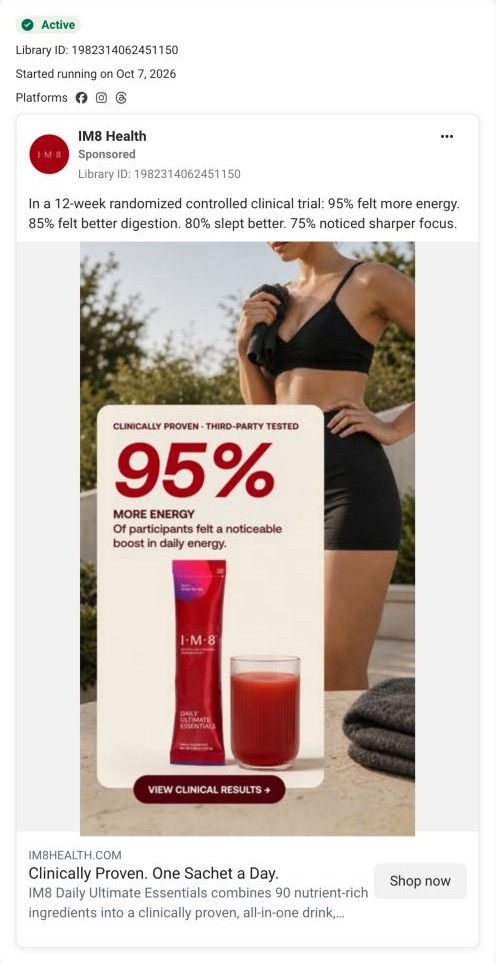
One huge number carries the whole ad: 95% in red reads from across the room, and the line under it attributes the figure to participants who felt a boost in daily energy. The caption backs it with the study design (a 12-week randomized controlled clinical trial) and three more reported results, so the viewer sees it isn't a lone stat. The View clinical results button tells evidence-minded viewers exactly what they'll get by clicking. Setting the figure on a card over a lifestyle photo keeps it from looking like a spreadsheet.
What's missing
The number is clear, but the ad doesn't connect it to a moment the viewer has, such as an afternoon slump, so the 95% floats without anything to attach to. There's also no offer or reason to click today. If you make one like this, pair the stat with a specific situation in the caption's first line (the 3 p.m. crash, the second coffee), and add the first-order offer to the headline. Keep the attribution the ad already uses; a trial figure restated as a promise would read very differently.
Beat by beat
- Image
A card over a lifestyle photo shows 95% more energy in large red type, attributed to participants, with a sachet, a glass and a view clinical results button.One oversized number is the fastest way to show proof in a feed.
- Headline
The line under the image reads “Clinically Proven. One Sachet a Day.” with a description about 90 ingredients.It restates the trial claim and the daily format for anyone skimming.
- Copy
Four results from a 12-week randomized controlled clinical trial: energy, digestion, sleep and focus.Extra figures show the 95% is one of several reported outcomes.
Where it sends people
The ad's link points to a why-IM8 page, and in our capture it lands on the Daily Ultimate Essentials Pro product page. The page answers the stat on its first screens: a bordered trial-results box with five stat columns and a source line sits right under Add to cart, and a proof band later repeats four figures under a certification headline. The View clinical results button promised a results-first view, though, and the page opens on a welcome-kit buy box instead. A study summary near the hero, or a link that lands on the results box, would keep that promise.
The page it sends people to: How IM8's Essentials Pro page builds a subscription-first buy box
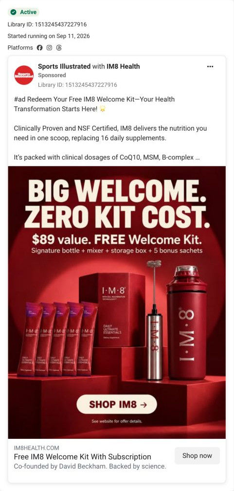
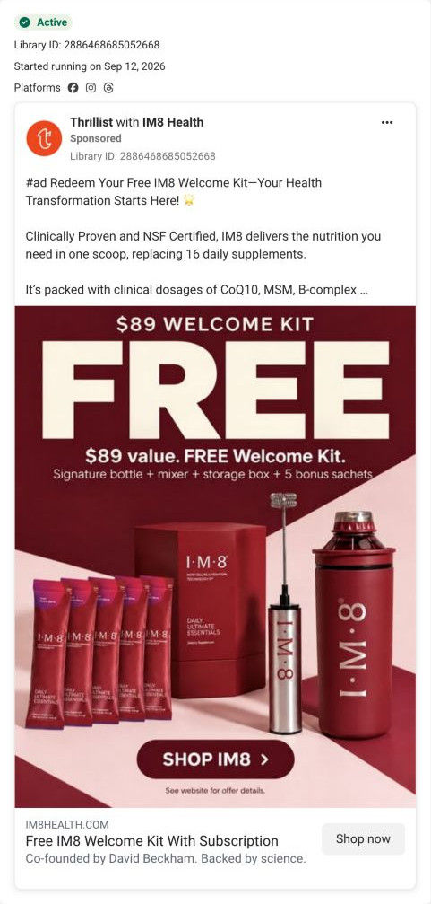
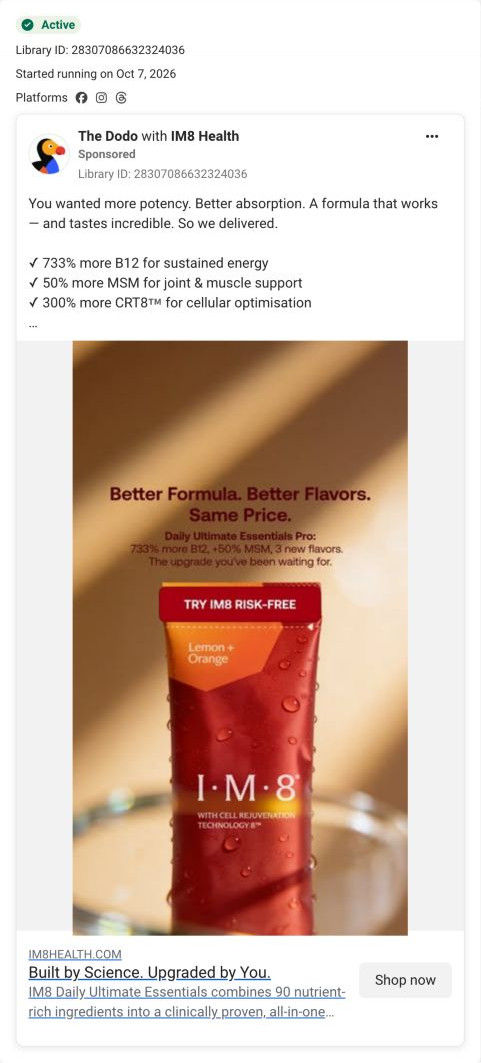
IM8's Daily Ultimate Essentials Pro product page, a long, subscription-first page. A buy box built around the free welcome kit and a pre-selected longest plan leads into trial stats, clinician reviews, ambassadors, comparison tables and an expert board. 8 of the 23 IM8 ads in the library send people here, across welcome-kit, creator, problem-solution, launch and trial-stat angles.
How the page is built
- 01
Announcement bar and headerA welcome-offer line, navigation and three icon assurances (money back, free shipping, sport certification) answer what's the deal and can I trust this.
- 02
Buy box galleryThe multi-month package and the welcome kit, each item with a struck-through value, show exactly what arrives.
- 03
Product details and flavorsA star rating, servings count, founder and advisory-board line, pill badges and flavor swatches answer is this popular and which one do I pick.
- 04
Plan cardsStacked plans with the longest pre-selected, a per-serving price, perks and an inline free-kit row answer how much and what's the best value, with a sticky bar repeating Add to cart.
- 05
Reassurance under Add to cartA lab-verified badge, an HSA/FSA note, guarantee icons and a trial-results box answer what if it doesn't work for me.
- 06
Subscriber program and accordionsAn expert masterclass card, accordions on ingredients, testing, how to enjoy and what it does or doesn't contain, and ambassador videos answer the detail questions.
- 07
Ambassadors and clinician reviewsAthlete and doctor cards, then clinician reviews with a how-they-were-collected strip and benefit filters, answer who else uses it.
- 08
Reviews and proof bandA customer review area (blank in the capture) and a certification band with four stat cards answer what results people report.
- 09
Flavor chooserA mixed pack tagged Most Popular and three single-flavor cards answer which flavor to start with.
- 10
Formula table and body systemsAn old-versus-new dose table and body-system tabs answer what changed in the Pro formula and what each part is for.
- 11
Cost and competitor comparisonAn annual-savings circle, a monthly cost breakdown and a dose table against a leading greens powder answer is it worth the price.
- 12
Experts, offer recap, guarantee and FAQAn expert grid, a video carousel, an offer recap card, the guarantee and FAQ accordions close out the remaining objections before the footer.
The first fixes we would make
- The page answers almost every buying question, but a first-time visitor has to scroll past the buy box to learn why they'd want the product. Add one plain outcome line near the product name (what customers report day to day, attributed to the trial) so a cold visitor knows why the kit matters.
- Several ad angles land here, yet nothing on the first screen acknowledges which ad someone came from. Use URL-based hero variants that echo the ad's angle, starting with the welcome-kit and trial-stat versions.
Read the full breakdown of this page
Three hooks you could test
- Turn the benefit into a picture people get in a second. “95% said they felt it. One sachet a day.”
- Show a specific moment of use. “Still going at 3 p.m. without a second coffee.”
- Sell the outcome. “More energy for the afternoon, from one morning habit.”
What to borrow for your brand
- Build a static around your single strongest proof figure, set large, with the study source in small type right under it.
- Use a results-specific button (view the results) when the ad's job is to earn trust rather than sell.
- Back a headline stat with the study design and two or three other figures in the caption.
One of 23 IM8 ads in the Fluid Inspiration Library, captured from the Meta Ad Library on Oct 20, 2026. We record that an ad ran publicly, not how it performed.