What this ad does well
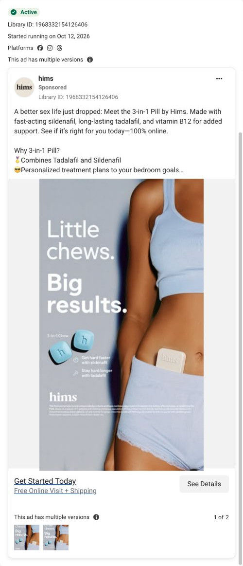
The headline uses contrast (little, big) to make a small product feel like news, and the type is big enough to read at a glance. Putting the tin in the waistband is a clever way to say discreet and portable without spelling it out. The copy opens with “A better sex life just dropped,” which gives the launch energy. It started running on October 12, so it's a useful look at how Hims announces a new format.
What's missing
The image says chews and the copy says 3-in-1 Pill, so the product name shifts between the two. On top of that, the landing page leads with Sex Rx + Climax Control, so a visitor looking for the new 3-in-1 has to find it in the treatment carousel. If you make one like this, keep one product name everywhere and send launch traffic to a page whose hero is the new product. Proof is missing too, and a first-batch review or two would make big results more than a slogan.
Beat by beat
- Image
A woman in loungewear with a tin tucked in her waistband, two blue chews labeled by ingredient.It shows the product as small and easy to carry, and ties each chew to a benefit.
- Headline
“Little chews. Big results.” in large white type.It uses a size contrast to make a small format feel like big news.
- Copy
The launch line, the sildenafil and tadalafil combination, personalized plans and discreet shipping.It frames the product as new and lists the practical reasons to try it.
The offer
Free online visit and discreet shipping advertised; prescription eligibility required.
Where it sends people
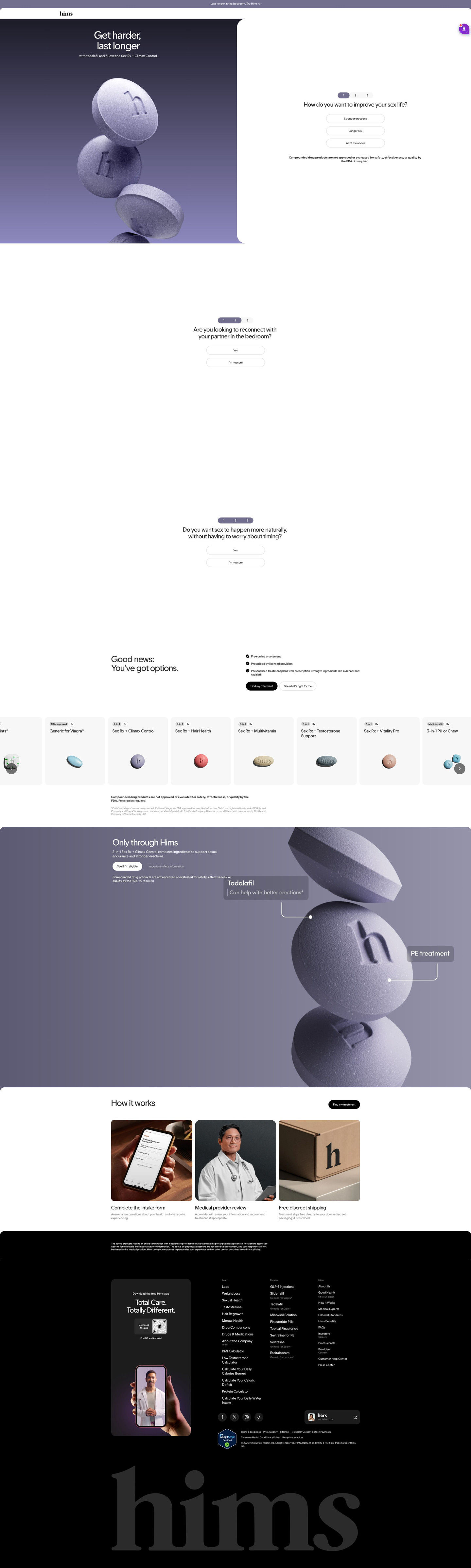
The click goes to the refreshed Climax Control consultation page, a focused entry page where the first of three tap-to-answer questions sits in the hero beside a render of stacked tablets. Two more yes / “I'm not sure” prompts follow, then a “good news” block with free online assessment, licensed providers and personalized plans, a treatment carousel and a mechanism band with callouts naming each component. That band and the two-line benefit headline pick up the get-harder, last-longer promise directly, so the visitor isn't hunting for the product the ad named. The page is shared with other Sex Rx ads, so the hero stays on Climax Control rather than on this exact creative. For this launch ad in particular, the new 3-in-1 only shows up as a card in the carousel.
The page it sends people to: How Hims's refreshed Climax Control page handles five different ads
Hims's refreshed Climax Control consultation page, a focused entry page with the first of three questions beside a tablet render under “Get harder, last longer.” Options, a treatment carousel, a mechanism band and how-it-works follow. Five ads in the Fluid library send people here, mostly product-benefit statics and videos for the 2-in-1 pill plus a launch static for the 3-in-1.
How the page is built
- 01
Announcement bar and headerOne benefit line with a Try link and a logo-only header keep focus on the hero.
- 02
Split heroA two-line benefit headline and stacked-tablet render beside the first question answer what this is and how to start.
- 03
Questions two and threeYes / “I'm not sure” pairs on their own screens keep the intake low-commitment.
- 04
Options introA good-news headline, three check items and two buttons answer whether the process is easy and safe.
- 05
Treatment carouselGrey cards with format and Rx tags answer which treatments are available.
- 06
Mechanism bandA purple panel with callouts naming each component answers what's in the combination.
- 07
How it worksThree photo cards (intake form, provider, shipping box) answer what happens after the questions.
- 08
FooterAn eligibility disclaimer, app card and link columns close the page.
The first fixes we would make
- The 3-in-1 launch ad lands here, but the new product only appears as a card in the carousel. Give launch traffic its own hero variant, or a short banner pointing to the new format.
- There's no proof on the page, while the ads lean on partner-voice stories. Add a short review carousel after the mechanism band so the page backs up what the ads describe.
Read the full breakdown of this page
Three hooks you could test
- Turn the benefit into a picture people get in a second. “Small enough for a pocket. Big enough to notice.”
- Sell the outcome. “Our newest format just dropped, and it's made for the moments that matter.”
- Show a specific moment of use. “Tuck it in your bag before date night.”
What to borrow for your brand
- Use a size contrast in the headline (little product, big result) to make a small format feel like news.
- Place the product somewhere that shows a benefit (a waistband for portability) instead of saying the benefit.
- Send launch traffic to a page whose hero is the new product, not a shared page for the whole line.
One of 25 Hims ads in the Fluid Inspiration Library, captured from the Meta Ad Library on Oct 20, 2026. We record that an ad ran publicly, not how it performed.