How Hims turns a planter head into a before/after joke
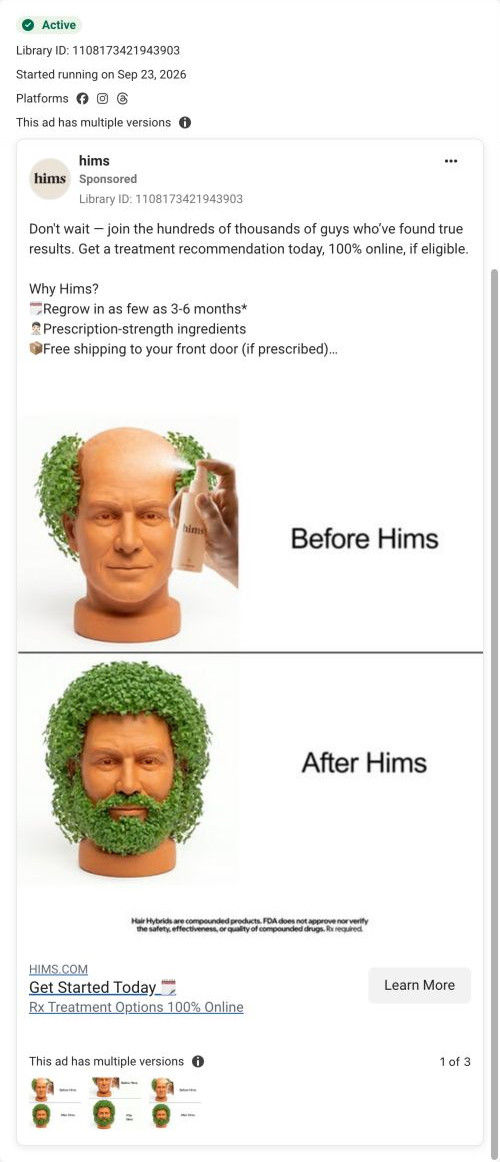
A static Hims image ad that stacks two photos of a terracotta planter head: a sparse sprout with a spray bottle labeled “Before Hims,” then a full head and beard of greens labeled “After Hims.” The copy is the shared hair-treatment message with the 3-6 month claim. It sends people to Hims's comparison-named hair landing page.

Captured while scrolling the public page. Opening prompts are shown without answering health questions. A browser shopping-extension badge may appear in the right margin.
Rx Treatment Options, 100% Online
Social proof and a result-timing claim introduce an online hair-treatment recommendation, subject to eligibility. The recorded CTA points to a hair-specific treatment entry URL. Compare the creative with the destination and explore the other ads sharing this route.
- Brand
- Hims
- Observed offer
- Online hair-treatment recommendation; free shipping if prescribed advertised
- Creative angle
- Product benefits
- Page type
- Consultation entry
- Ad format
- Image
- Listed start date
- Sep 23, 2026
- Captured
- Oct 20, 2026
- Library ID
- 1108173421943903
- Destination
- hims.com
Selected for its design and offer structure. Ad performance isn’t available in this collection.
What this ad does well
It's funny, and that matters: in a feed full of crowns and hairlines, a planter head stops the scroll without making anyone feel bad about their own photo. The joke is a before/after, so the viewer instantly understands the promise even though there's no real person in it. It also sidesteps the paid-testimonial disclaimers a real before/after needs. Hims ran several versions of this ad, which shows how one simple visual idea can carry several variations.
What's missing
The joke stands in for proof rather than adding to it, so a skeptical viewer has nothing real to look at. If you make one like this, put a small real before/after or a review line in the copy, so the humor earns attention and the proof earns the click. The image also doesn't name the product or format at all. A small product shot or a line like the per-day price would tell the viewer what they'd actually be buying.
Beat by beat
- ImageTop panel: a terracotta planter head with a few sprouts and a spray bottle, labeled “Before Hims.”
It sets up the joke with a familiar object and a clear starting point.
- HeadlineBottom panel: the same head covered in a full crop of greens, labeled “After Hims.”
It delivers the punchline as a before/after, so the promise reads without words.
- CopyThe shared hair copy with regrowth timing, prescription-strength ingredients and free shipping if prescribed.
It supplies the real product details the image deliberately leaves out.
The offer
An online treatment recommendation, if eligible, with free shipping if prescribed.
Where it sends people
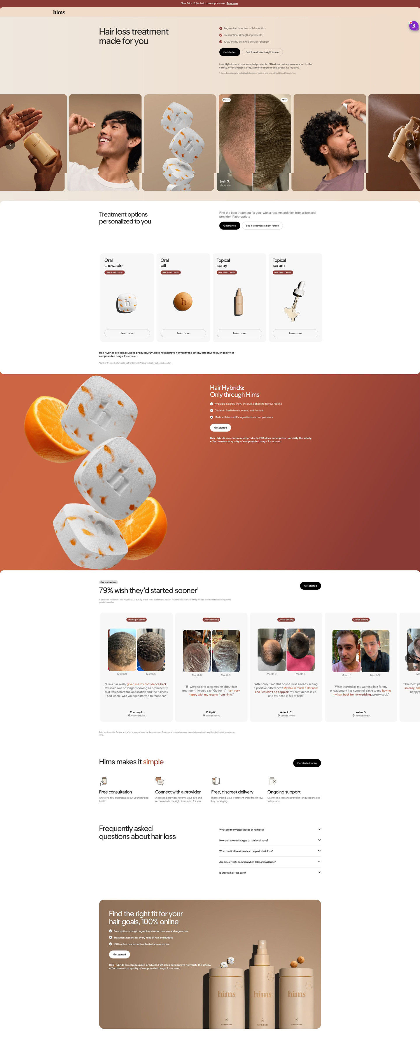
The ad sends people to the comparison-named hair page, a focused landing page that reads as a sales page first: there's no intake question in the hero, just “Hair loss treatment made for you” with three check claims and two buttons. An image strip, four format cards with per-day price tags, an only-through-Hims band and month-labeled before/after reviews follow. Those real before/afters are exactly what the joke ad is missing, so the page fills the ad's proof gap. A visitor who came for the laugh does have to read a while before anything echoes the planter head.
The page it sends people to: How Hims's “made for you” hair page sells before it asks
A Hims hair-treatment landing page on a comparison-named route that reads as a sales page first: no question in the hero, just “Hair loss treatment made for you” with three check claims and two buttons. Format cards, before/after reviews, how-it-works and FAQ follow. One ad in the Fluid library sends people here, the planter-head before/after static.
How the page is built
- 01Announcement bar
A new-price line with a link answers whether there's a reason to look now.
- 02Header
A logo-only header keeps the visitor on the page.
- 03Hero split
A made-for-you headline, three check claims and two buttons answer what this is and how to start.
- 04Image strip
Tall cards mixing lifestyle shots, product renders and a labeled before/after answer what it looks like in real life.
- 05Treatment options
Four format cards with per-day prices answer which version fits and what it costs.
- 06Product feature band
An only-through-Hims headline with three checks answers why get it here.
- 07Before/after reviews
Month-labeled photo pairs with highlighted quotes answer whether it works for people like me, as customers describe it.
- 08How it works
Four icon steps answer what happens after I click Get Started.
- 09FAQ
Five accordions answer practical questions.
- 10Closing CTA panel
A warm card with checks, Get Started and a product lineup asks once more.
The first fixes we would make
- Despite the route's name, there's no comparison on the page against other treatments or doing nothing. Add a short table near the format cards that shows what makes this different from shampoos or over-the-counter options.
- The intake sits behind Get Started, so visitors don't see how quick it is. Add a line under the buttons saying how many questions it takes.
Read the full breakdown of this page
Three hooks you could test
- Turn the benefit into a picture people get in a second. “Here's our before/after, explained with a houseplant.”
- Make the product the whole scene. “One spray, one object, one obvious result.”
- Sell the outcome. “From patchy to full, no explanation needed.”
What to borrow for your brand
- Use a familiar object as a stand-in before/after when real before/afters feel too personal for a cold audience.
- Keep the joke to two labeled panels so the promise reads in a second.
- Run several versions of one visual gag before deciding it's tapped out.
One of 25 Hims ads in the Fluid Inspiration Library, captured from the Meta Ad Library on Oct 20, 2026. We record that an ad ran publicly, not how it performed.