What this ad does well
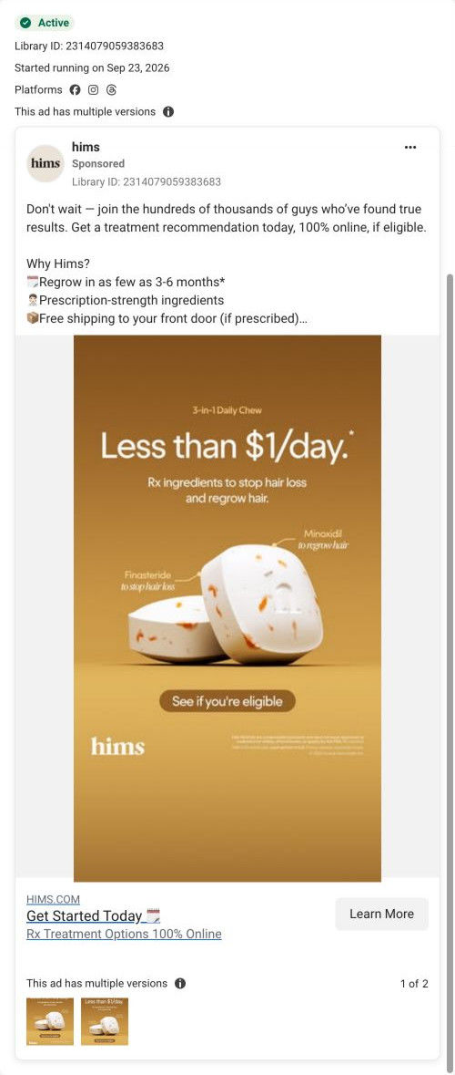
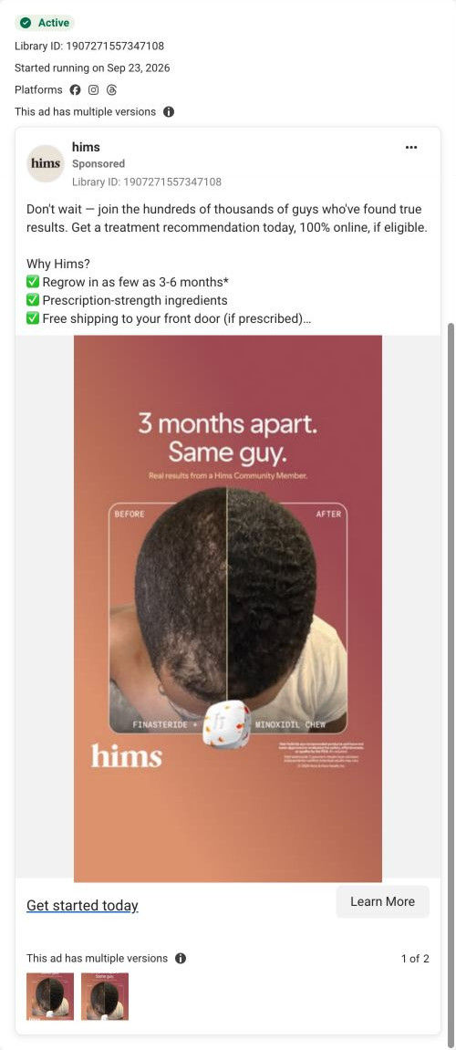
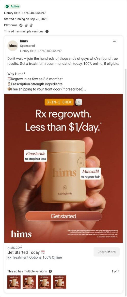
Leading with a daily price is a clean move for a product people assume is expensive, and the headline is the biggest thing in the frame. The product shot is close and simple, with two callouts that tell you what each ingredient is for in a few words. The eligibility button inside the image sets the right expectation: this is a check first, not a checkout. Hims ran this alongside its photo-led hair ads, which is a good example of testing a price angle against a proof angle on the same page.
What's missing
The image never says what problem it solves in the viewer's terms; “Rx ingredients to stop hair loss” is the closest it gets, and it's small. A per-day price works best when the viewer already wants the outcome, so pair it with a picture of that outcome. If you make one like this, add a small before/after or a line that names the moment (thinning at the crown, the hairline in photos) above the price. The copy's “Don't wait” could also become a real reason to act now.
Beat by beat
- Image
Two chews on a warm gradient with callouts naming finasteride and minoxidil and what each is for.It makes the product concrete and explains it without a paragraph of copy.
- Headline
“Less than $1/day.” above a line about Rx ingredients to stop hair loss and regrow hair.It answers the price question before the viewer has a chance to assume the worst.
- Copy
The shared hair copy: social proof, regrowth timing, prescription-strength ingredients and free shipping if prescribed.It adds the timeframe and the online process the image leaves out.
The offer
Framed as less than $1 a day, with a footnote on the image; eligibility check and free shipping if prescribed.
Where it sends people
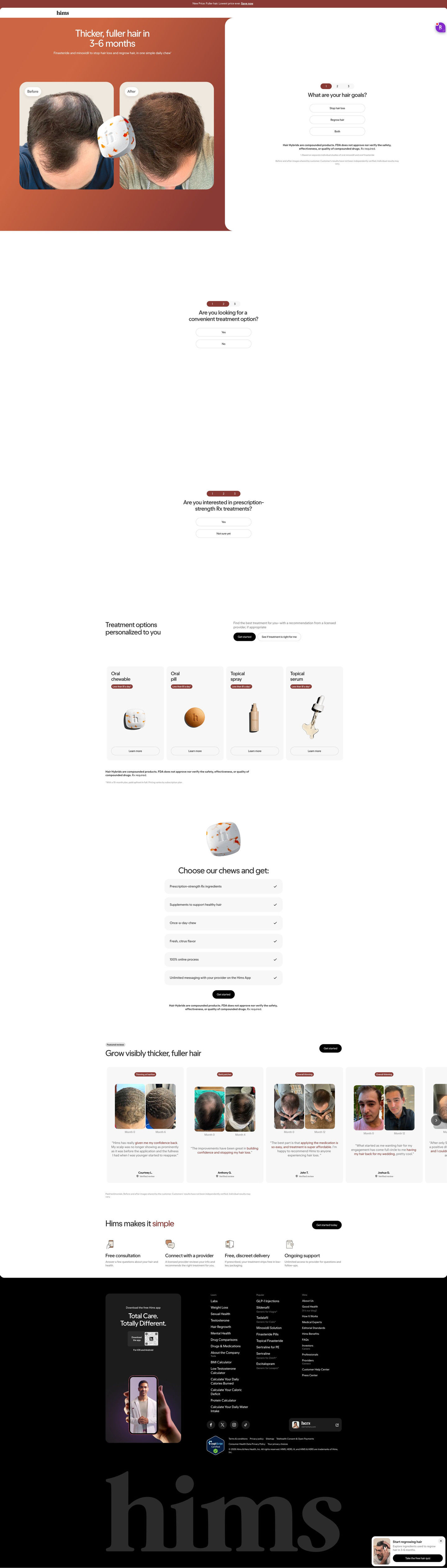
The ad sends people to Hims's personalized hair-treatment consultation page, a focused landing page that sits closer to a quiz than a product page. Its hero puts an outcome-and-timeframe headline and a customer before/after pair right beside the first assessment question, so the promise in the ad and the first tap live on the same screen. Below the prompts, the treatment options section shows four format cards with per-day prices, then month-labeled before/after review cards and a four-step process. The hand-off is tight: the visitor who came for the 3-6 month claim sees the same claim, the same product and a question to answer within one screen. The per-day price tags on the format cards pick up this ad's price headline specifically.
The page it sends people to: How Hims's hair treatment page starts the consultation in the hero
Hims's personalized hair-treatment consultation page, built as a focused landing page with the quiz in the hero. It pairs a 3-6 month headline and a customer before/after with the first assessment question, then format cards, reviews and a process row. Seven ads in the Fluid library send people here, all product-benefit ads in image and video.
How the page is built
- 01
Announcement barOne line about a new price with a link answers whether there's a reason to look now.
- 02
Hero splitAn outcome-and-timeframe headline and before/after pair sit beside the first assessment question, answering what the treatment promises and how to start.
- 03
Follow-up promptsTwo more one-tap questions about convenience and prescription interest keep the visitor moving before any account step.
- 04
Treatment optionsFour format cards with per-day prices answer which version fits and what it costs.
- 05
Format benefitsSix check rows (ingredients, supplement, once a day, flavor, online process, provider messaging) answer what's included with the featured format.
- 06
Before/after reviewsA carousel of concern-tagged, month-labeled before/after cards with verified labels answers whether it works for people like me, as customers describe it.
- 07
ProcessFour icon steps (free consultation, provider review, discreet delivery, ongoing support) answer what happens after I start.
- 08
FooterAn app download card, link columns and a sticky quiz card give a last way back into the assessment.
The first fixes we would make
- The page never explains what happens if a visitor answers the prompts and isn't a fit, or how long the consultation takes. Add one line under the hero question (how many minutes, when a provider replies) so the commitment is clear.
- There's no comparison against what visitors are already trying, like shampoos or doing nothing. A short side-by-side under the format cards would answer why this instead of the cheaper habit.
Read the full breakdown of this page
Three hooks you could test
- Sell the outcome. “Less than a coffee a day for the result you actually want.”
- Make the product the whole scene. “This is the whole routine. Two ingredients, one chew.”
- Call out the habit you're replacing. “Still spending more on workarounds than on the fix?”
What to borrow for your brand
- Break the price down to a per-day number and make it the headline when people assume your category is expensive.
- Use two short callouts on the product shot to say what each key ingredient does.
- Put an eligibility or “see if it's right” button inside the image when the next step is a check rather than a purchase.
One of 25 Hims ads in the Fluid Inspiration Library, captured from the Meta Ad Library on Oct 20, 2026. We record that an ad ran publicly, not how it performed.