How Hims's testosterone page gives visitors two ways in
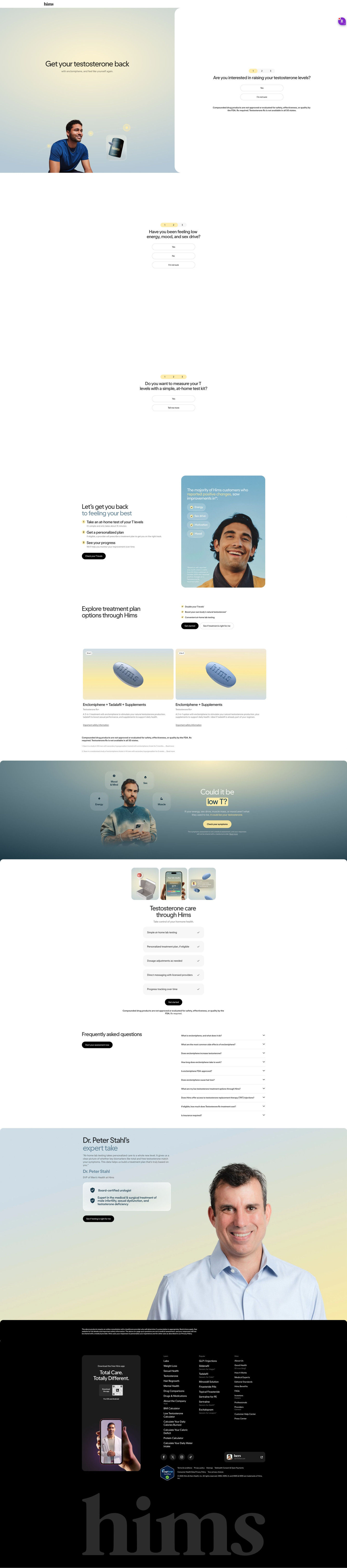
Hims's testosterone treatment entry page, opening on “Get your testosterone back” beside the first question about raising testosterone levels. A three-step path, plan options, a symptom-checker band, FAQ and an expert quote follow. One ad in the Fluid library sends people here, a problem-led static for a new 3-in-1 testosterone pill.

Captured while scrolling the public page. Opening prompts are shown without answering health questions. A browser shopping-extension badge may appear in the right margin.
Hims · Testosterone treatment entry
Hims's testosterone treatment entry page, opening on “Get your testosterone back” beside the first question about raising testosterone levels. A three-step path, plan options, a symptom-checker band, FAQ and an expert quote follow. One ad in the Fluid library sends people here, a problem-led static for a new 3-in-1 testosterone pill.
- Brand
- Hims
- Page type
- Consultation entry
- Ads leading here
- 1
- Captured
- Oct 20, 2026
- Destination
- hims.com
Selected for its design and offer structure. Ad performance isn’t available in this collection.
What this page does well
The questions use soft exits, “I'm not sure” and “Tell me more,” so no visitor is turned away, and the third question pivots to an at-home test kit, which picks up the ad's copy. The full-width symptom-checker band mid-page gives a second, lower-commitment way in for people who skipped the hero questions. The three-step path (test, plan, track progress) explains the whole journey in one row. A doctor's quote with a credentials card near the footer adds a final trust cue.
How the page is built
- 01Header
A logo-only header keeps the visitor on the page.
- 02Split hero
A treatment-led headline, model and product jar sit beside the first question, answering what this is and how to start.
- 03Stacked question steps
A symptom question and an at-home test kit question, with soft exits, answer whether this is right for me.
- 04Three-step path
Test, plan and track progress, with a customer-survey card, answer what the journey looks like.
- 05Plan options
Two treatment cards with tags and safety links answer which plans exist.
- 06Symptom-checker band
A question headline and a Check your symptoms button offer a second way in.
- 07Care checklist
Five rows of what's included answer what I get with the plan.
- 08FAQ
About ten accordions on medication, eligibility and cost answer remaining questions.
- 09Expert take
A doctor's quote and credentials card answer who stands behind the treatment.
- 10Footer
A disclaimer, app card and link columns close the page.
What's missing, in the order we'd fix it
- No price shows on the plan cards in the captured sections. Add a monthly price to each card so the cost doesn't wait until after the quiz.
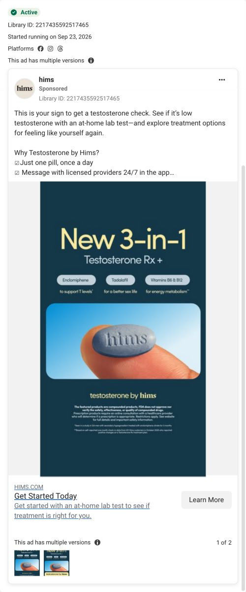
- The ad's 3-in-1 ingredient chips aren't repeated on the page. Show the same three ingredients on the treatment card so ad visitors recognize the product.
- Proof is limited to a customer-survey card and an expert quote. A short member story with their own timeline would make the path more believable.
How the ads set it up
The one ad that lands here is a dark teal static announcing a new 3-in-1 Testosterone Rx+ with chips for enclomiphene, tadalafil and B vitamins, while its copy prompts a testosterone check with an at-home test. The page covers both: the hero leads with treatment and names the medication, and the third question offers the at-home test kit. That makes it a better fit for this creative than the test-first page its cream sister ad goes to. The ingredient chips themselves don't return, so the product story is told a little differently on arrival.
What to borrow for your brand
- Give every intake question a soft exit (“I'm not sure,” “Tell me more”) so no one hits a dead end.
- Add a mid-page symptom checker as a second, lower-commitment way in for people who skipped the hero quiz.
- Show the full journey (test, plan, track) as three numbered steps in one row.
Ads that send people here
Captured from hims.com in October 2026 for the Fluid Inspiration Library. Offers and prices change; this is what the page showed when we captured it.