How Hims's Climax Control page turns the hero into a question card | Fluid
Esc

How Hims's Climax Control page turns the hero into a question card

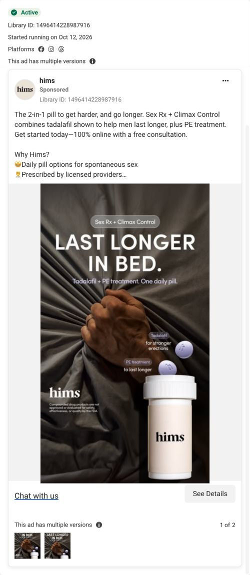
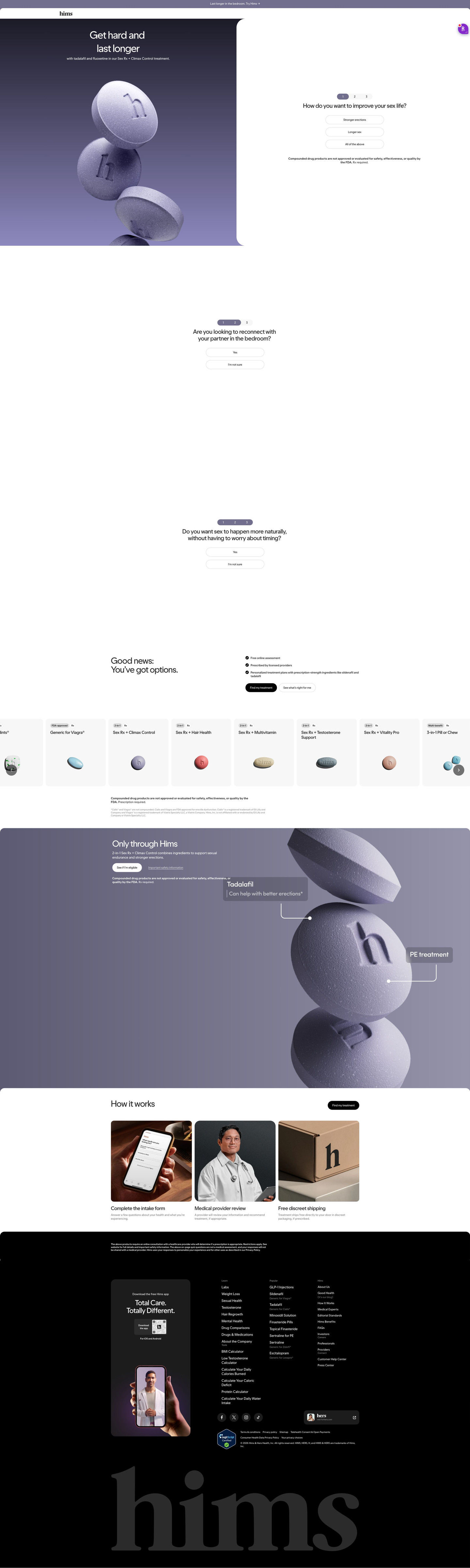
Hims's original Climax Control consultation page, a focused entry page whose split hero pairs “Get hard and last longer” with a three-step question card. Reassurance, a treatment carousel, a feature band and how-it-works follow. Two ads in the Fluid library send people here: a product-launch video for a combination pill and a product-benefit static for the 2-in-1 pill.

Hims
2 creatives lead here1 / 2
Hims · Climax Control consultation

Captured while scrolling the public page. Opening prompts are shown without answering health questions. A browser shopping-extension badge may appear in the right margin.

Hims: full page screenshot

Hims · Climax Control consultation

Hims's original Climax Control consultation page, a focused entry page whose split hero pairs “Get hard and last longer” with a three-step question card. Reassurance, a treatment carousel, a feature band and how-it-works follow. Two ads in the Fluid library send people here: a product-launch video for a combination pill and a product-benefit static for the 2-in-1 pill.

Brand
Hims
Page type
Consultation entry
Ads leading here
2
Captured
Oct 20, 2026
Destination
hims.com

Selected for its design and offer structure. Ad performance isn’t available in this collection.

What this page does well

The question card replaces the buy button, so the first thing a visitor does is answer how they want to improve their sex life (stronger erections, longer sex, all of the above). Those answers are goals, not symptoms, which keeps a sensitive topic comfortable. The follow-up questions only offer Yes or “I'm not sure,” so nobody hits a dead end. After that, the “Good news” block lists free online assessment, licensed providers and personalized plans with two buttons, a direct one and a guided one, for people at different levels of readiness.

How the page is built

  1. 01
    Announcement bar and header

    A slim purple bar with one line and a logo-only header keep attention on the hero.

  2. 02
    Split hero

    A two-line treatment headline and tablet render sit beside the first question card, answering what this is and how to begin.

  3. 03
    Stacked question steps

    Questions two and three, each with Yes and “I'm not sure,” keep the visitor moving without forms.

  4. 04
    Reassurance

    Three check lines and two buttons answer whether the process is safe, online and tailored.

  5. 05
    Treatment carousel

    Grey cards with tag chips and tablet renders answer which treatments exist and how they differ.

  6. 06
    Product feature band

    A lavender panel with callouts naming each component answers what's in the featured treatment.

  7. 07
    How it works

    Three photo cards (intake form, provider, discreet shipping) answer what happens after I start.

  8. 08
    Footer

    A consultation disclaimer, app card and link columns close the page.

What's missing, in the order we'd fix it

  1. The page has no customer proof at all, no reviews or testimonials. Add a short carousel of verified reviews after the feature band, the way the Hard Mints page does.
  2. Ads for two different products land here, but the hero only names Sex Rx + Climax Control. Give the treatment carousel a short line that tells visitors from other ads where to find their product.
  3. There's no price or cost cue anywhere in the captured sections. A from-price on each carousel card would answer the question most visitors have before they finish the quiz.

How the ads set it up

The two ads that land here tell different stories: one is a launch video for a combination pill with a multivitamin, the other a static that says to last longer in bed. The hero's “Get hard and last longer” matches the static closely, and the feature band's component callouts pick up its 2-in-1 idea. The launch video's product isn't named in the hero, so those visitors rely on the carousel. The ad's Chat with us button on the static also promises a conversation, while the page starts a questionnaire.

What to borrow for your brand

  • Replace the buy button with a three-step question card in the hero, and ask about goals rather than symptoms.
  • Offer Yes and “I'm not sure” as the only answers on follow-up questions so no visitor feels turned away.
  • Put a direct and a guided button side by side after the quiz for visitors at different levels of readiness.

Ads that send people here

Captured from hims.com in October 2026 for the Fluid Inspiration Library. Offers and prices change; this is what the page showed when we captured it.