What this ad does well
The opening works because it starts with things everyone recognizes (ordering groceries, booking flights, doing schoolwork) and lets the viewer arrive at the question themselves: why isn't healthcare like this? It's a comparison, not a claim, which suits a category where the brand can't promise outcomes. She explains the process in plain steps (answer questions about your health history and goals, a licensed provider reviews them and decides if a prescription is appropriate), so the viewer knows exactly what clicking leads to. Screens from the Hers flow, including a desired-weight question and a How Hers works panel, back up that explanation visually.
What's missing
The convenience angle is clear, but the ad doesn't name the frustration it replaces in a way that stings, so it reads more like a thought than a reason to start today. There's also no proof and no offer in the video, and her own life details (college, tennis, content) are mentioned once and dropped. If you make one like this, show the old way for a beat (a waiting room, a phone hold screen, a pharmacy line) before the phone, and close on a concrete next step with the starting price. The contrast is what makes convenience feel like a real benefit.
Beat by beat
- 0-8s
She arranges pink flowers at the kitchen sink while captions list ordering groceries, booking flights and doing schoolwork from her phone.Familiar online tasks set up the comparison without any health claim.
- 8-15s
She asks why healthcare shouldn't be just as accessible.The question reframes telehealth as the obvious next thing to move online.
- 15-32s
She says she's partnering with Hers but isn't a customer, then explains the intake and provider review while Hers screens appear.Walking through the steps tells the viewer exactly what happens after they click.
- 32-43s
She mentions balancing college, tennis and content creation and points to the link in her bio.Her schedule gives the convenience point a real person behind it.
Where it sends people
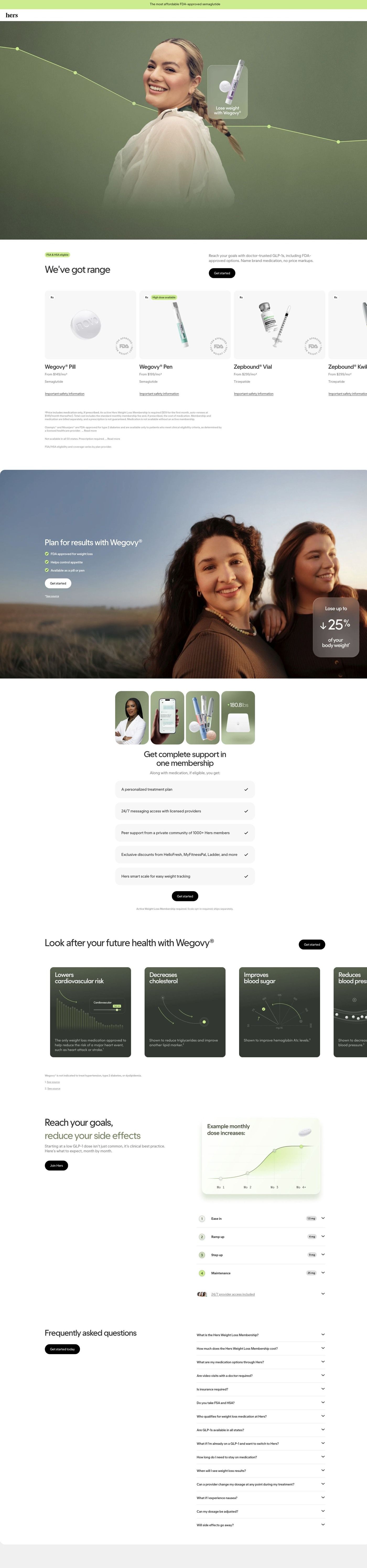
The ad sends people to Hers's Wegovy consultation entry page, a focused landing page whose hero opens with the first intake question, which delivers on her description of answering a few questions online. The hero card's provider-recommendation answer suits a viewer who came for convenience rather than a specific medication. The page's FAQ covers visits, insurance and eligibility, which are the practical doubts her convenience pitch raises. The comparison she opens with (everything else is already online) doesn't appear on the page, so a short line in the announcement bar about starting from your phone would tie the two together.
The page it sends people to: How Hers starts its Wegovy consultation inside the page hero
Hers's Wegovy consultation page opens with the first intake question in a card over the hero, then scrolls through medication cards with "from" monthly prices, a results band, membership perks, a dosing schedule and a long FAQ. 53 ads in the Fluid library send people here, including price-led, food-noise, membership-value and creator-story ads.
How the page is built
- 01
Announcement bar and headerA single line on affordability sits above a logo-only header, so the price question gets a nod before anything else and there's no navigation to wander off into.
- 02
Hero with intake cardA full-bleed portrait with a descending line-graph overlay frames a centered card that asks whether the visitor already has a treatment in mind, answering "where do I start?" with three one-tap choices.
- 03
Options carouselHorizontal medication cards show the product, prescription and availability tags, a "from" monthly price and a safety link, answering "what are my options and what do they cost?" with pricing and eligibility fine print below.
- 04
Results bandAn outdoor photo of two women carries a headline, three check items and a frosted card with a large outcome figure, which is the page's main answer to "what could this look like for me?"
- 05
MembershipA four-photo collage (provider, app, product, smart scale) sits over five check-row perks, answering "what am I paying the membership for?"
- 06
Health-marker carouselDark cards pair data-visualization illustrations with short benefit claims and footnotes, covering what the page says treatment can involve beyond the scale.
- 07
Dosing scheduleA chart of example monthly dose increases and a numbered four-step accordion with dose pills explain how treatment eases in, answering "what happens month to month?"
- 08
FAQA long accordion covers membership, cost, options, visits, insurance, HSA, eligibility, switching and side effects, catching the practical objections that are left.
- 09
FooterDisclaimers, an app-download card with a QR code, a pharmacy certification badge and a sister-brand card close the page with trust signals and legal detail.
The first fixes we would make
- The membership fee is separate from the medication price, and that detail lives in fine print under the carousel. Put the combined monthly cost (medication plus membership) right under each "from" price, so a visitor who came from a price ad sees the number they'll actually pay before they start the intake.
- Creator-story ads send people here, but the page has no member stories or reviews to pick up that voice; the results band shows a single outcome figure instead. Add a short strip of member stories (with the same disclaimers Hers uses elsewhere) near the results band, so someone who clicked a creator's documentary finds people like that creator on the page.
Read the full breakdown of this page
Three hooks you could test
- Call out the habit you're replacing. “You book flights from your couch. Why are you still sitting in a waiting room?”
- Show a specific moment of use. “I started my consultation between watering the plants and my next class.”
- Turn the benefit into a picture people get in a second. “Groceries, flights, homework and now this, all from the same phone.”
What to borrow for your brand
- Open with a list of everyday things your audience already does online, then ask why your category isn't one of them, so the viewer makes the argument for you.
- Have the creator walk through your actual process in plain steps, so the click feels predictable instead of risky.
- Film the creator doing an ordinary task while they talk, which keeps the video native and shows the product fitting into a real day.
Transcript
I was thinking the other day about how almost everything in our lives has moved online. I can order groceries, book flights, do schoolwork, and basically manage my entire schedule for my phone. So it made me wonder why shouldn't healthcare be just as accessible? I'm partnering with hers on this video and while I'm not a hers customer, I recently learned that they connect you with licensed healthcare providers who provide access to personalized weight loss treatment plans completely online for people who are eligible. You answer a few questions about your health history and goals, then a licensed healthcare provider reviews everything to determine if a prescription is appropriate for you. As someone balancing college, dealing tennis, and content creation. I really appreciate when things fit into my schedule instead of the other way around. If you've been curious to learn more, check out hers through the link in my bio.
Text on screen
- was thinking the otherday
- about hay almost everything
- in our lives has movedionline.
- I can order grocerics, book
- flights, do school work
- I can order grocere», book
- fights, do schout york
- and basically manage my entire
- schedule from my phone.
- why shouidn't healthcare be just
- as accessible?
- why shouldn't healthcare be just
- I'm partnering with Hers on this
- video,
- and while I'm not a Hers
- customers
- recently learned that the
- connect you with Beensed
- recently learned that they
- connect you with licensed
- healthcare providers who provide
- access to personalized
- Presuriptiomproducts require an omine consultation with a healthcare
- provider who wilficiermine if a prescription is appropriate. Restrictions apply.
- ners
- Breakthrough
- treatments, made
- affordable
- provider who will determine a previption is appropriute. Pestrictions apply.
- completely online for people whe
- are eligible,
- Personalized
- healthcare
- Tor you.
- Get the treatment you need today!
- Prescribed onine with free devery
- Contal your cyche
- L 100
- for you.
- You unswera Few question about
One of 125 Hers ads in the Fluid Inspiration Library, captured from the Meta Ad Library on Oct 22, 2026. We record that an ad ran publicly, not how it performed.