

GrazaSponsored
Esc
How Graza launched its chips with a creator's raw first-bite reaction
A short creator video for Graza's chip launch: a woman opens a bag in her hallway, smells it, notes how big the chips are and reacts as she eats. It runs with Graza's launch copy about chips cooked in 100% EVOO and four new flavors. No discount. It links to the chips product page, which ends in Find in Store.
Graza
4 creatives lead here1 / 4


Olive Oil Potato Chips
Cooked in 100% EVOO
A short video announces Graza’s chips. The destination presents a large pack image, flavor choices, product information, and a store-finder call to action. Compare the creative with the destination and explore the other ads sharing this route.
- Brand
- Graza
- Observed offer
- Olive-oil potato chips launch
- Creative angle
- New launches
- Page type
- Product page
- Ad format
- Video · 0:40
- Listed start date
- Aug 24, 2026
- Captured
- Oct 19, 2026
- Library ID
- 1298462392218608
- Destination
- graza.co
Selected for its design and offer structure. Ad performance isn’t available in this collection.
What this ad does well
The video starts on a real first reaction instead of a pitch. She opens the bag, and her first line is that it smells like Caesar dressing, which tells you the flavor faster than any caption could. Then she pulls out what she calls maybe the biggest chip she's ever seen, a visual moment that gives the product something to film. The unpolished hallway setting and the unscripted reactions make it read like a post, while the copy underneath carries the facts (100% EVOO, yellow potatoes, four flavors).
What's missing
Her reaction is all superlatives, so beyond the Caesar smell and the big chips, a viewer learns little about why these are different, and nothing ties her excitement to the olive oil. She also swears, which limits where the cut can run and who'll share it. If you make one like this, ask the creator to say one thing about the oil or the crunch in her own words, keep the bleeped or cleaner take for paid, and add a caption with the flavor name and where to buy.
Beat by beat
- 0-5sShe opens a bag of Zesty Caesar in her hallway and says it smells like Caesar dressing.
A sensory first reaction tells the viewer the flavor before any explanation.
- 5-15sShe pulls out an oversized chip, then grabs a smaller one that's still big.
A visual surprise gives the product a moment worth watching.
- 15s-endShe keeps eating and says they might be her new favorite, rating them far past 10 out of 10.
Escalating enthusiasm acts as social proof, though it stays general.
Where it sends people
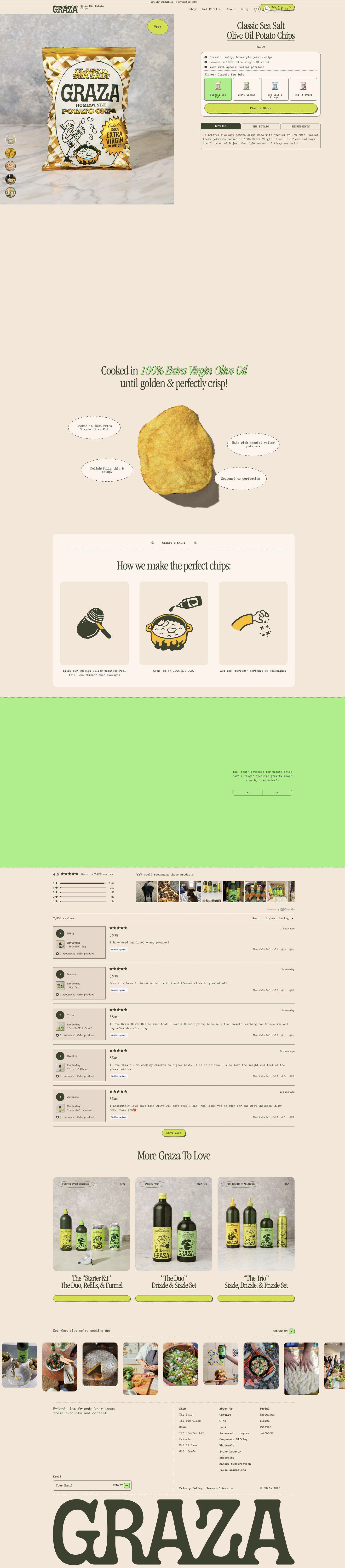
The ad sends people to the chips product page, a basic product page. The flavor tiles let the viewer find the Zesty Caesar she just tried, and the annotated chip shot and slice, cook, season explainer fill in the olive oil story her reaction skipped. But the Shop now button leads to a Find in Store button, not a cart, and the reviews on the page are about Graza's oils, so the page doesn't keep up the chip-specific excitement the creator built.
The page it sends people to: How Graza built a product page for chips you can only buy in stores
Graza's product page for its olive oil potato chips, a retail-only snack. It pairs a buy box with flavor tiles and a Find in Store button with an annotated chip shot, a slice, cook, season explainer, reviews and bundle cross-sells. Four ads in the Fluid library send people here: a founder story, factory footage and creator taste tests.
How the page is built
- 01Announcement bar and header
A sitewide discount-applied-in-cart line and standard navigation set the context for shoppers browsing the store.
- 02Buy box
A pack shot with a New sticker, the product name and price, three bullets, flavor tiles and a full-width Find in Store button answer what it is, what flavors exist and where to get it.
- 03Details tabs
Tabs for details, the key raw ingredient and the ingredient list answer what's in it for shoppers who check labels.
- 04Blank area
A large empty block follows the buy box in the capture, likely content that didn't load.
- 05Annotated product shot
A headline and a single chip surrounded by four dashed-oval callouts answer what makes this chip different.
- 06Process explainer
Three illustrated steps, slice, cook and season, answer how it's made and back the olive oil claim.
- 07Brand fact band
A brand-color band with a single fact line and arrows adds one more reason to believe, though its image didn't load in the capture.
- 08Reviews widget
An average rating, customer photos and verified reviews answer whether people like Graza, though the reviews cover the brand's other products.
- 09Bundle cross-sell
Three bundle cards tagged by type of cook give chip visitors something they can buy online today.
- 10Social strip and footer
A photo row with Follow us, a newsletter field and an oversized wordmark close the page.
The first fixes we would make
- The reviews are for Graza's oils, not the chips, so the page has no proof about the product it's selling. Add chip-specific reviews or the creator taste-test clips from the ads right under the buy box.
- The ads say Shop now, but the page can only send people to a store locator. Change the ad CTA to match, or name the retailers next to the Find in Store button so visitors know where to go before they tap.
Read the full breakdown of this page
Three hooks you could test
- Show a specific moment of use. “First bag, first sniff, and I already know which flavor it is.”
- Make the product the whole scene. “Look at the size of this one. I'm not even mad.”
- Sell the outcome. “The snack that ended my search for a new favorite.”
What to borrow for your brand
- Film the first open of the bag so the smell and first bite do the talking before any claim.
- Ask creators to find one visual surprise in the product (size, color, texture) and hold it up to the camera.
- Pair a raw reaction video with fact-heavy ad copy so the video carries emotion and the copy carries the details.
Transcript
Oh my god, it literally smells like Caesar dressing. Oh my god, this may be the biggest chip I've ever seen. Okay, let's grab a smaller one. Still really big. Yeah, yeah. Oh, my God. these are incredible. These might be my new favorite. But these are it. 1000 out of 10. Like, holy shit.
Text on screen
- 1101
- 3200
- 200₺
- HOMER LATE
One of 7 Graza ads in the Fluid Inspiration Library, captured from the Meta Ad Library on Oct 19, 2026. We record that an ad ran publicly, not how it performed.