

Brittany CartwrightSponsored
Esc
How Fridays presents a choice of GLP-1s in one static ad
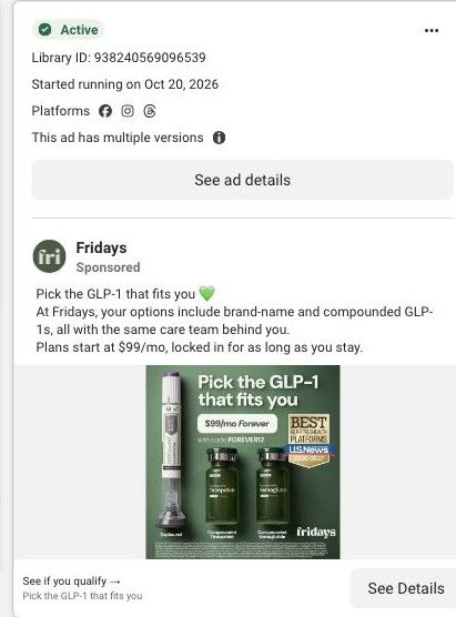
A static Fridays ad that lines up Zepbound beside compounded tirzepatide and compounded semaglutide vials on a green background, under a headline about picking the GLP-1 that fits you. A $99/mo forever price with code FOREVER12 and a U.S. News badge sit between them. It's one of 12 Fridays ads in the library landing on the price-lock page.
Fridays
12 creatives lead here1 / 12





GLP-1 care · price-lock landing page
Native Meta creative and exact outbound link observed October 22, 2026. Redirects were followed to the captured public destination. The selection includes GLP-1 care and NAD+ creator messages. The peptide waitlist is a separately sourced page reference. Advertiser claims are source material; activity does not establish performance. No personal, health or payment details were entered.

See if you qualify →
A dedicated offer page combines pricing presentation, treatment plans, customer stories, care inclusions and the online-care entry. Compare the creative with the destination and explore the other ads sharing this route.
- Brand
- Fridays
- Observed offer
- See if you qualify →
- Creative angle
- Product choice
- Page type
- Dedicated offer
- Ad format
- Image
- Listed start date
- Oct 20, 2026
- Captured
- Oct 22, 2026
- Library ID
- 938240569096539
- Destination
- exclusive.joinfridays.com
Selected for its design and offer structure. Ad performance isn’t available in this collection.
What this ad does well
Showing the options side by side answers a question buyers in this category ask early (which one is right for me?) and makes Fridays look like a place with choices rather than a single product. Each item is labeled clearly, and the U.S. News badge adds outside credibility. The copy is short and covers the essentials: brand-name and compounded options, the same care team behind all of them, and plans from $99 a month locked for as long as you stay. Fridays ran several versions of this from October 20, 2026.
What's missing
The $99 price sits above all the products, but the fine print says it's the starting price for compounded semaglutide, and the landing page lists tirzepatide at a higher price. A viewer who wants Zepbound may click expecting $99. The code is also a mismatch: the ad says use FOREVER12 while the page hero says no code needed. Put a price under each product, and use one code story across ad and page.
Beat by beat
- ImageThe headline Pick the GLP-1 that fits you runs across the top of a green background.
Framing the ad as a choice speaks to the buyer who doesn't know which option to pick.
- ImageA Zepbound pen stands beside compounded tirzepatide and compounded semaglutide vials, each labeled.
Lining up the options shows range and makes the brand feel like a full-service provider.
- ImageA pill reads $99/mo Forever with code FOREVER12, next to a U.S. News badge.
The price and badge give a reason to click, though the price only covers one option.
- CopyThe text says options include brand-name and compounded GLP-1s with the same care team, and plans start at $99 a month locked in.
The copy explains that the care stays the same whichever option you choose.
The offer
Plans from $99 a month, locked as long as you stay, with code FOREVER12; the fine print ties the price to compounded semaglutide on a 12-month plan.
Where it sends people
The ad lands on the price-lock offer page, a focused landing page. The hero coupon says as low as $99 a month with no code needed, and the block below spells out semaglutide at $99 and tirzepatide at a higher starting price, then the plans section compares options. That's the right structure for a choice ad, but the per-product prices arrive after the click instead of in the ad.
The page it sends people to: How Fridays builds a GLP-1 landing page around a locked-in price
A dedicated Fridays offer page for GLP-1 care that opens on a coupon-style card promising as low as $99 a month with forever pricing, then moves through drug prices, plans, customer stories, the care team and safety information. 12 Fridays ads in the library send people here, mostly creator stories and price-lock statics.
How the page is built
- 01Coupon hero
A dashed coupon card announces GLP-1 care as low as $99 a month with forever pricing, a countdown and a Lock in my price button, answering what's the deal.
- 02Price and advantages block
A Now as Low as $99/mo GLP-1 Weight Loss headline lists semaglutide and tirzepatide prices, included clinical care and a two-minute qualification, answering what exactly do I get for that price.
- 03Before-and-after and rating line
A before-and-after photo pair with a vial sits beside a rating line that cites reviews and a success-rate figure, answering does anyone like this.
- 04Press logos
A row of media logos (Bloomberg, Forbes, Healthline, WebMD, Fortune, Fast Company) answers is this a company people have heard of.
- 05Treatment plans and comparison
Plans and a comparison lay out the options side by side, answering which one should I pick.
- 06Customer stories
Stories from customers answer what was it like for someone like me.
- 07Care inclusions and clinical team
This section shows the care that comes with the plan and the clinicians behind it, answering who's actually looking after me.
- 08Start process
The steps to get started answer what happens after I click.
- 09FAQs and safety information
Questions and safety details close the page, answering the remaining what-ifs and the required disclosures.
The first fixes we would make
- The hero pairs a countdown timer (09:58 in our capture) with an offer the same card calls forever pricing, so urgency and permanence pull against each other. If the price really holds as long as you're subscribed, drop the timer or tie it to something real, like when this promotional link expires.
- Several of the ads that land here say take the 2-minute quiz, but the hero's main button says Lock in my price and the qualifying step only shows up as a bullet. Name the quiz in the button or right under it so the first step matches what the ad promised.
Read the full breakdown of this page
Three hooks you could test
- Make the product the whole scene. “Here are your options, side by side, with a price under each.”
- Lead with the uncomfortable problem. “Not sure which one is right for you? You're not supposed to know yet.”
- Sell the outcome. “Pick the option that fits, keep the same team either way.”
What to borrow for your brand
- Line up your product options in one image with clear labels when buyers' first question is which one to pick.
- Put the price under each option rather than one price over all of them.
- Use the same discount mechanism (a code or automatic) in the ad and on the landing page.
One of 21 Fridays ads in the Fluid Inspiration Library, captured from the Meta Ad Library on Oct 22, 2026. We record that an ad ran publicly, not how it performed.