What this ad does well
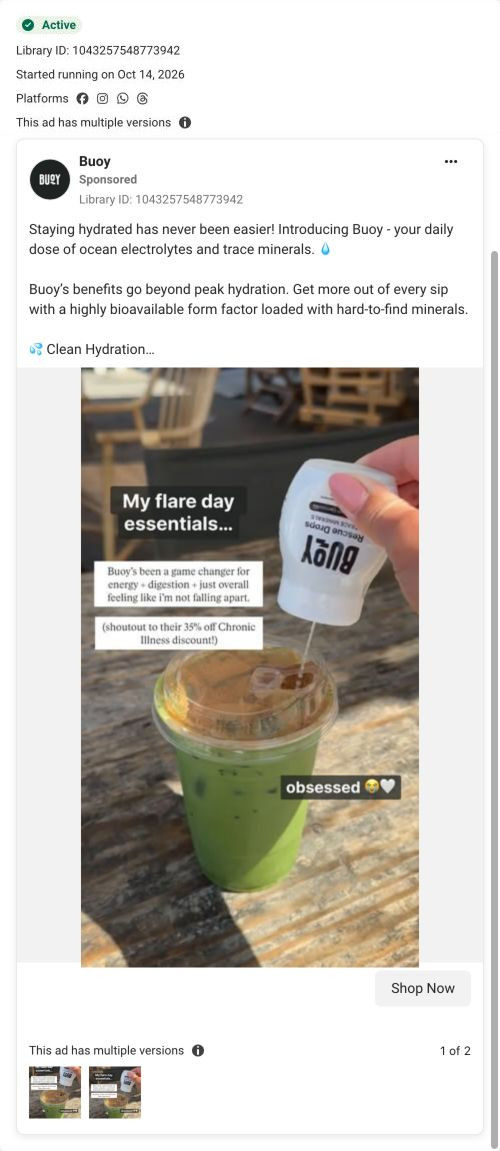
The image looks like a post from a customer's own feed: a phone photo of an iced matcha, a hand squeezing the bottle and casual captions. The phrase "flare day" is how people with chronic conditions describe a bad day, so the right viewer recognizes themselves right away. The product demo is built in (you see it go into an ordinary drink), which answers how you use it without a word. The caption shouting out the 35% off chronic illness discount makes the offer feel like a tip from a friend.
What's missing
The primary text switches to a general list (clean hydration, liquid form factor, clinically tested) and loses the flare-day voice that makes the image work. The caption's claims about energy and digestion are one person's experience but aren't labeled as such. If you make one like this, write the copy in the same customer voice as the image, mark any health claim as that person's experience, and keep the discount line near the top so it lines up with the page's headline.
Beat by beat
- Image
A hand squeezes Rescue Drops into an iced matcha on a wooden table.It shows how the product is used inside an everyday drink.
- Image
Captions read My flare day essentials and a shoutout to the 35% off Chronic Illness discount.It speaks to people with chronic conditions in their own language and puts the offer in a customer's mouth.
- Copy
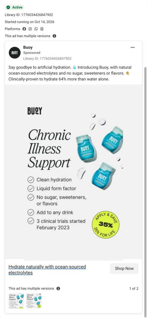
The primary text lists clean hydration, liquid form, no sugar or flavors, add to any drink and clinically tested, plus a review from Anna K.It gives the product details and a named review for readers who want more.
- Copy
It closes with 35% off plus free shipping through the Chronic Illness Support Program.It states the offer the landing page is built around.
The offer
The copy offers 35% off plus free shipping through Buoy's Chronic Illness Support Program.
Where it sends people
The ad sends people to Buoy's Chronic Illness Support page, a focused landing page built around one audience and one offer, which is a strong rung on the landing-page ladder. Its hero reads "Get 35% Off For Life" under a Chronic Illness Support Program badge and a 4.7/5 rating from 12,248 reviews, with free shipping, a 30-day guarantee and an Approval in 2 minutes button, followed by a timeline of product standards, an FAQ, condition-tagged creator videos, best sellers and a reviews wall. The ad's flare-day framing and 35% discount match the page's headline exactly, so the visitor lands on the offer they were promised. The page's condition-tagged creator videos continue the customer-post look of the image.
The page it sends people to: How Buoy turned a lifetime discount into a chronic illness program
Buoy's Chronic Illness Support page frames a lifetime 35% discount as a program with quick approval, then backs it with product standards, an FAQ, condition-tagged creator videos, best sellers, a donation callout and a reviews wall. Six of the 10 Buoy ads in the Fluid library send people here, mostly migraine and chronic illness creator videos and benefit statics.
How the page is built
- 01
HeaderMenu, Shop All, logo, account and cart with no announcement bar keep the focus on the program.
- 02
HeroA 4.7/5 rating from 12,248 reviews, the program badge, the 35% for life headline, three perks and the approval button answer what's the offer and how do I get it.
- 03
Standards timelineA study-based hydration claim, clinical study and third-party test links and six standards (no sugar or sweeteners, no unnecessary additives, third-party tested and more) answer is this product safe for my sensitivities, as the brand describes it.
- 04
FAQ with videoA pour video beside accordions on conditions supported, what to expect, ingredients avoided and commitment answer the program questions.
- 05
Creator carousel"We didn't just go viral, we found our community" with videos tagged by condition answers does anyone like me use this.
- 06
Best sellersThree product cards that each restate the discount and use a Shop your discount link answer which product should I start with.
- 07
Donation calloutThree nonprofit logos and a line about donating with every order answer what does this brand stand for.
- 08
Reviews wallA two-column wall of text reviews with product thumbnails answers what do other customers say.
- 09
FooterSupport, socials, a disclaimer and an email signup with a first-order offer close the page.
The first fixes we would make
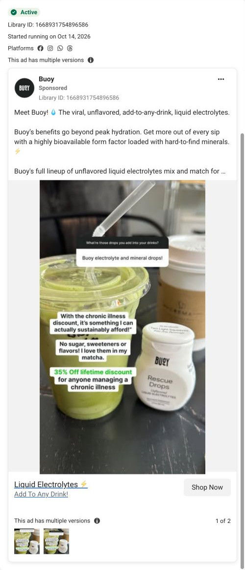
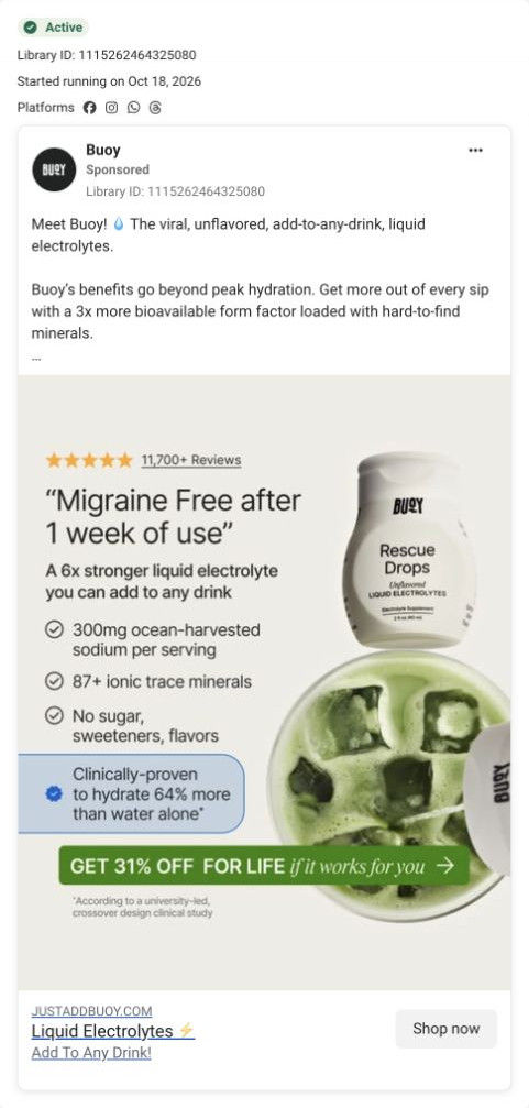
- Several ads that land here quote 31% (the review-led static and the matcha Q&A copy), while the hero says 35%. Align every ad to 35% for life, or add a line explaining the difference, so visitors don't wonder which deal is real.
- The approval step is promised in two minutes, but the page doesn't say what you'll be asked or whether you need proof of a diagnosis. Add one sentence under the button explaining the application so people with privacy worries aren't put off.
Read the full breakdown of this page
Three hooks you could test
- Show a specific moment of use. “My bad-day routine: same drink, one extra squeeze.”
- Make the product the whole scene. “One bottle, one iced drink, one squeeze.”
- Lead with the uncomfortable problem. “Rough day? Here's what's in my cup.”
What to borrow for your brand
- Shoot the product going into an everyday drink with a phone camera so the ad looks like a customer's post.
- Use the phrase your audience uses for its worst days in the caption so the right person stops.
- Put the offer inside the customer's caption, as a shoutout, so it reads like a tip rather than a promo.
One of 10 Buoy ads in the Fluid Inspiration Library, captured from the Meta Ad Library on Oct 19, 2026. We record that an ad ran publicly, not how it performed.