How Brello introduced Sermorelin with a single-vial carousel
A carousel ad whose first card is a Compounded Sermorelin vial on a pale lavender background, with a gold $116 per month special badge (three months minimum) and a prompt to slide for details. Brello ran several versions of it. The caption, though, is Brello's Tirzepatide copy, while the ad sends people to its Sermorelin product page.

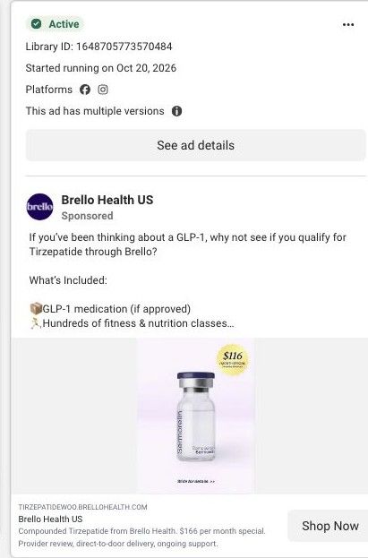
Native Meta creative and exact outbound link observed October 22, 2026. Redirects were followed to the captured public destination. The visible creative and captured footer link are Sermorelin-specific; the caption and display domain refer to GLP-1. That source mismatch is retained. Advertiser claims are source material; activity does not establish performance. No personal, health or payment details were entered.
Brello Health US
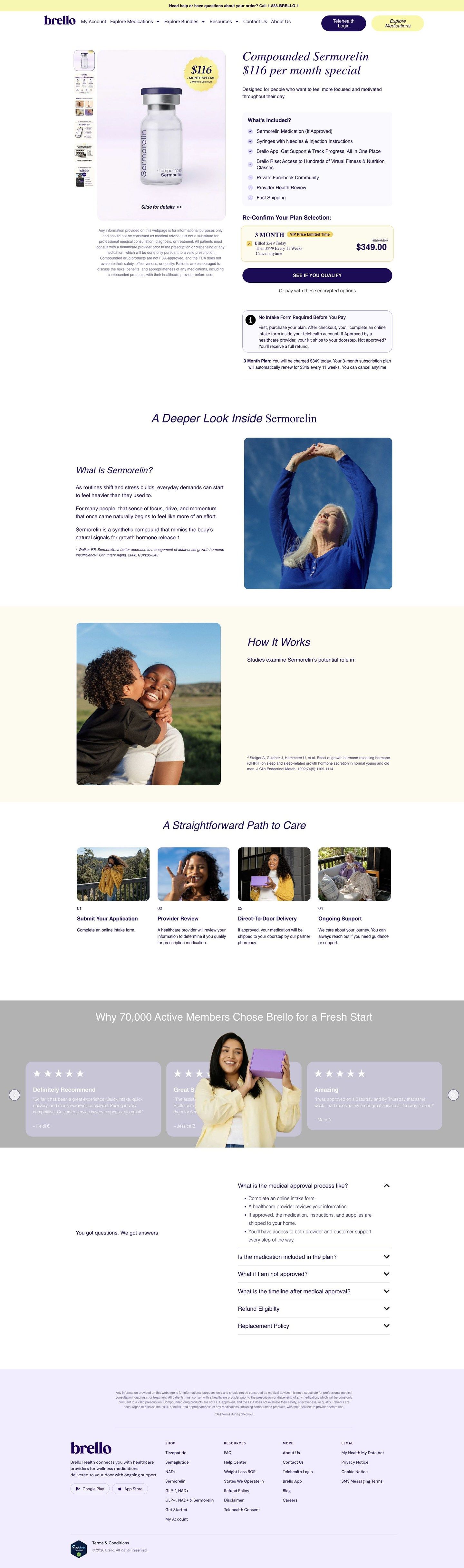
A treatment purchase page presents its plan, included services, recurring-order details and checkout entry. Compare the creative with the destination and explore the other ads sharing this route.
- Brand
- Brello Health
- Observed offer
- Brello Health US
- Creative angle
- Product introduction
- Page type
- Product page
- Ad format
- Image
- Listed start date
- Oct 20, 2026
- Captured
- Oct 22, 2026
- Library ID
- 1648705773570484
- Destination
- brellohealth.com
Selected for its design and offer structure. Ad performance isn’t available in this collection.
What this ad does well
The first card is clean and easy to read on a phone: one product, one price, and a clear cue that there's more if you swipe. The gold badge states the price and the three-month minimum together, so the commitment isn't hidden behind the special. It's also the same vial image and badge the product page opens with, so anyone who taps lands on something that looks exactly like what they saw.
What's missing
The words around the image are about a different product. The headline is just the advertiser name, Brello Health US, and the caption asks if you've been thinking about a GLP-1 and links to the Tirzepatide domain, so nothing in the ad says what Sermorelin is, who it's for or why someone would want it. A viewer who doesn't already know the name has no reason to swipe. Write a Sermorelin-specific caption and headline that state what the product page says it's designed for, attributed and with its terms, and make the second card answer who it's for.
Beat by beat
- ImageA single Compounded Sermorelin vial on a pale lavender background.
One product on a plain field makes the item obvious at a glance.
- Price badgeA gold seal reading $116 / month special, 3 months minimum.
It pairs the price with the commitment so the special doesn't feel like a trick.
- Swipe cueSlide for details at the bottom of the first card.
It invites the viewer into the rest of the carousel, where the explanation is supposed to live.
- CopyThe headline is Brello Health US and the caption is Brello's Tirzepatide GLP-1 copy.
The text is meant to explain the offer, but here it describes a different product than the image.
The offer
The first card shows Compounded Sermorelin at $116 per month as a special with a three-month minimum; the product page frames it as $349 billed today, then every 11 weeks.
Where it sends people
The ad sends people to brellohealth.com/product/compounded-sermorelin, a standard product page with the full site navigation, and it's the only Brello ad in the library that lands there. Visually the match is exact: the product and plan hero opens on the same vial and $116 badge, then a headline of Compounded Sermorelin $116 per month special and a What's Included list. The words don't match, though. Someone who read the Tirzepatide caption arrives on a page about Sermorelin, which the page says is designed for people who want to feel more focused and motivated, so the ad's copy and its destination are telling two different stories.
The page it sends people to: How Brello's Sermorelin product page lays out plan and checkout
Brello's Compounded Sermorelin product page is a standard site page with full navigation. It opens on a $116 a month special, a What's Included list and a plan box with renewal terms, then moves into education, a care path, reviews and FAQs. It's where one Brello ad in the library lands, a Sermorelin vial carousel.
How the page is built
- 01Product and plan hero
The vial with a $116 badge, the headline and a line saying the product is designed for people who want to feel more focused and motivated, answering what it is and who it's for.
- 02Included services
A What's Included list of medication, supplies, the app, classes, community, provider review and shipping, answering what you get for the price.
- 03Plan confirmation
A 3 Month plan box with a VIP Price Limited Time badge, $599 crossed out and $349 billed today, answering how much you'll pay now.
- 04Order and renewal details
An intake box (pay first, intake form after, full refund if not approved) and a note that the plan renews for $349 every 11 weeks, answering what happens after you pay.
- 05Checkout entry and supporting information
A See if you qualify button with encrypted payment options and a disclaimer, answering how to start.
- 06Treatment education
A deeper look inside Sermorelin, with the page's description of the compound, a footnoted source and a How It Works heading, answering what the product is.
- 07Care path
A straightforward path to care in four steps (submit your application, provider review, direct-to-door delivery, ongoing support), answering how the process works.
- 08Reviews and FAQs
A review carousel headed with 70,000 active members and an FAQ on approval, inclusions, timelines, refunds and replacements, answering whether others have done it and the last practical doubts.
The first fixes we would make
- In our capture, the How It Works section shows its intro line about what studies examine and then an empty space where the list should be. Fix the rendering so the section has content, or remove the heading.
- The reviews section says 70,000 active members, while Brello's other pages say 80,000+. Use one current figure across every page so the number reads as fact rather than a slip.
Read the full breakdown of this page
Three hooks you could test
- Make the product the whole scene. “One vial, one price, and everything else is a swipe away.”
- Lead with the uncomfortable problem. “Afternoons feel heavier than they used to? Here's what we offer.”
- Sell the outcome. “Built for people who want their days to feel more focused.”
What to borrow for your brand
- Open a carousel on a single product with the price and minimum in one badge, then use the next cards to answer who it's for and what's included.
- Reuse the exact hero image from your product page as the ad's first card, so the click lands on something people recognize.
- Write a caption for each product you advertise instead of reusing another product's copy, so the image, words and page tell one story.
One of 22 Brello Health ads in the Fluid Inspiration Library, captured from the Meta Ad Library on Oct 22, 2026. We record that an ad ran publicly, not how it performed.