How Brello's GLP-1 start page turns two plans into one clear choice | Fluid
Esc

How Brello's GLP-1 start page turns two plans into one clear choice

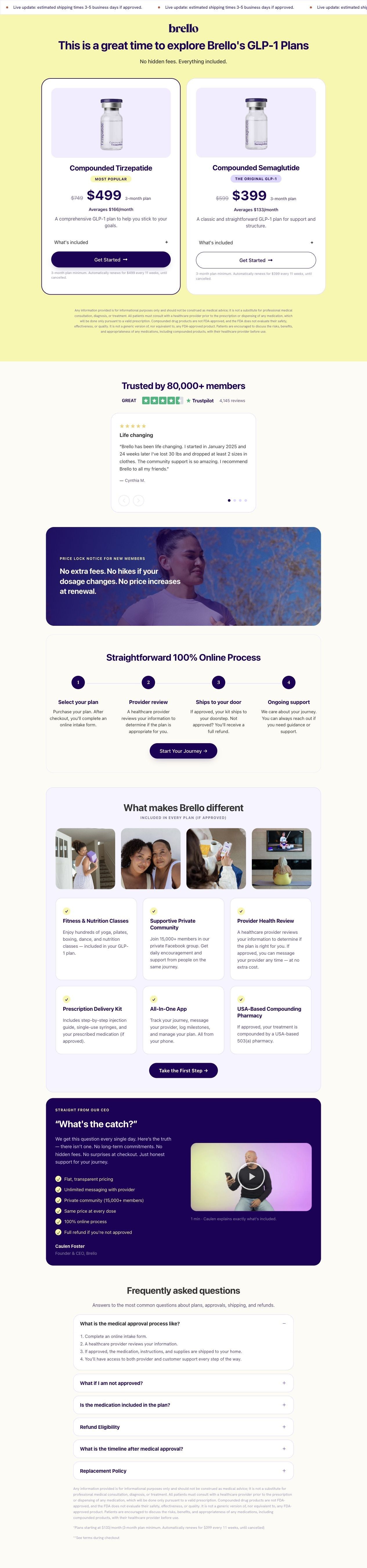
Brello's /start page is a focused landing page with no site navigation in our capture. It opens on two plan cards (Compounded Tirzepatide and Compounded Semaglutide), then moves through reviews, a price lock, a four-step process, inclusions, a CEO video and FAQs. It's where 2 Brello ads in the library land, both creator videos about price.

Brello Health
2 creatives lead here1 / 2
GLP-1 plans Β· eligibility landing page

Native Meta creative and exact outbound link observed October 22, 2026. Redirects were followed to the captured public destination. Advertiser claims are source material; activity does not establish performance. No personal, health or payment details were entered.

Brello Health: full page screenshot

GLP-1 plans Β· eligibility landing page

Brello's /start page is a focused landing page with no site navigation in our capture. It opens on two plan cards (Compounded Tirzepatide and Compounded Semaglutide), then moves through reviews, a price lock, a four-step process, inclusions, a CEO video and FAQs. It's where 2 Brello ads in the library land, both creator videos about price.

Brand
Brello Health
Page type
Service landing
Ads leading here
2
Captured
Oct 22, 2026
Destination
brellohealth.com

Selected for its design and offer structure. Ad performance isn’t available in this collection.

What this page does well

The treatment choices section does the hardest job right away: two cards side by side, each with a crossed-out anchor price ($749 and $599), the three-month price, the monthly average and the renewal terms under the button, with a Most popular badge steering most visitors to Tirzepatide. The page then answers the questions in a sensible order, with a Trustpilot rating and reviews, a price lock banner, a four-step online process that states you get a full refund if not approved, and six inclusion cards. The CEO section is a smart touch, opening on the question people ask most and answering it on camera.

How the page is built

  1. 01
    Care offer hero

    A shipping-time ticker, the brello logo and a headline inviting visitors to explore Brello's GLP-1 plans, with no hidden fees and everything included underneath, answering whether there's a catch on price.

  2. 02
    Treatment choices

    Two plan cards for Compounded Tirzepatide ($499, averaging $166 a month) and Compounded Semaglutide ($399, averaging $133 a month), each with an anchor price, a What's included toggle and renewal terms, answering which plan to pick and what it costs.

  3. 03
    Customer conversations

    Trusted by 80,000+ members with a Trustpilot rating based on 4,145 reviews and a review carousel, answering whether other people have done this.

  4. 04
    Price lock notice

    A photo banner promising no extra fees, no hikes if your dosage changes and no price increases at renewal, answering whether the price will rise later.

  5. 05
    Care process

    A four-step 100% online process (select your plan, provider review, ships to your door, ongoing support) with a refund if not approved, answering what happens after you pay.

  6. 06
    Program inclusions

    Six cards under What makes Brello different (classes, community, provider review, delivery kit, app, pharmacy) with photos and a Take the First Step button, answering what you get beyond the medication.

  7. 07
    Founder video

    A section titled What's the catch? with a one-minute video from Founder and CEO Caulen Foster and a checklist, answering the skeptic's question directly.

  8. 08
    FAQs and start CTA

    Questions on approval, not being approved, what's included, refunds, timelines and replacements, followed by the disclaimer and plan terms, answering the last practical doubts.

What's missing, in the order we'd fix it

  1. The hero headline is generic and says nothing about the person arriving from a creator video. Replace it with one line that speaks to the shopper's real question (one price that doesn't change, say), since both ads that land here are about cost.
  2. The page gives two shipping promises: the ticker says three to five business days, while one of the creator ads says two to three. Pick one figure and use it in the ads, the ticker and the FAQ.
  3. The CEO video and the price lock banner, the page's best answers to skepticism, sit below the plan cards. Move a short version of the price lock promise right under the plan cards so it's read at the moment of choosing.
  4. Both plan cards hide their inclusions behind a What's included toggle. Show two or three inclusions on each card, so visitors comparing plans can see the difference without tapping.

How the ads set it up

Both ads that land here are creator videos about money, and the page picks that thread up well. The reasons-to-choose video quotes $499 for three months of tirzepatide and $399 for semaglutide, and the treatment choices section shows exactly those two plans, with the monthly averages and renewal terms. The money-well-spent video is more emotional, built on guilt about spending on yourself, and the page doesn't carry that tone; it moves straight to plans and prices. A hero line that speaks to investing in yourself, or the creator's clip in the reviews, would let the page continue both stories.

What to borrow for your brand

  • Put your plan choices side by side at the top of the page, each with an anchor price, a monthly average and the renewal terms right under the button.
  • Answer the question people ask most (here, what's the catch) with a short founder video and a checklist beside it.
  • Strip the site navigation from the landing page so the plan cards and the start buttons are the only places to go.

Ads that send people here

Captured from brellohealth.com in October 2026 for the Fluid Inspiration Library. Offers and prices change; this is what the page showed when we captured it.